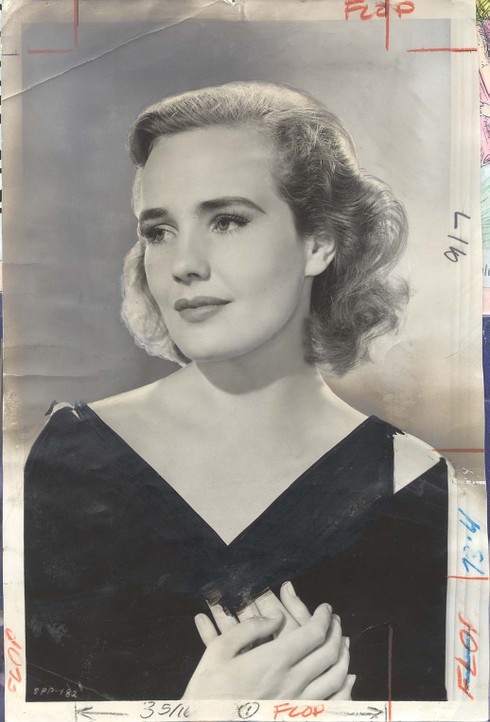
Larry Harnisch of the L.A. Times blog The Daily Mirror sent in some old images from the Times archives that show how photos of stars were touched up to show less skin. Here’s one of Frances Farmer (from Larry’s post about her):
frances_farmer_1940_0910_flowing_go

The image comes from the 1940 movie “Flowing Gold.” Apparently it was considered too revealing and the Times had someone draw in a dress above her wrap…with what appears to be a black magic marker.

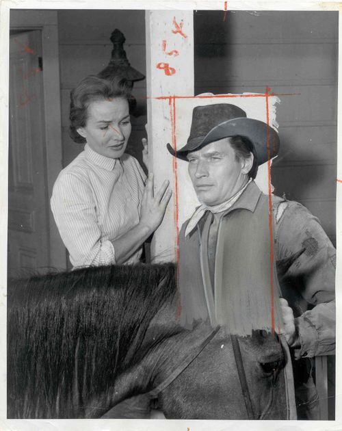
Charlton Heston was also retroactively covered up. Both of the following images come from The Daily Mirror. This is a still from a 1957 episode of “Shlitz Playhouse.” Someone very obviously, and badly, drew a shirt on him:
6a00d8341c630a53ef01156f112b81970c-500wi

Though the photo was touched up by the L.A. Times staff, it’s not clear whether it actually appeared in the paper. This photo most definitely did, however; it accompanied a review of “The Omega Man” from August 27, 1971. They did an even better job with the shirt this time:

6a00d8341c630a53ef01157008260e970b-500wi

It provides some perspective on how ideas of how much uncovered skin is appropriate to run in a mainstream media outlet have changed over the years. It’s also interesting that both men’s and women’s chests were covered. But mostly they just crack me up. The last one is my favorite.

Also check out the post about Sacha Baron Cohen naked on the cover of GQ and spoofing magazine covers that have naked people on them.

Men and women are often pitted against each other, as if they are naturally and inevitably in opposition. This creates the conditions for a “battle of the sexes.” The implication is, of course, that it’s a zero sum game. When women win, men lose.

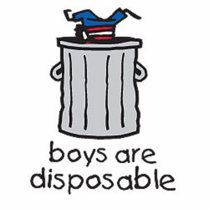
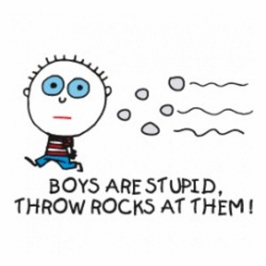
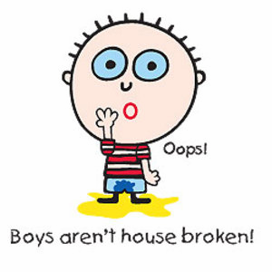
We socialize young children into thinking with gender (it’s always, somehow, boys vs. girls) and seeing the other sex as an enemy or competitor. Illustrating this, izhero sent us links to a set of t-shirts for young girls sold at David & Goliath Tees. The message for girls is, essentially, “boys drool, girls rule,” situating women and men in opposition, and setting girls up for a lifetime of battling the “opposite” sex.

Picture3Picture4Picture5Picture6

Picture7Picture8

—————————

Lisa Wade is a professor of sociology at Occidental College. You can follow her on Twitter and Facebook.

Clayton W. alerted us to this September’s issue of Harper’s Bazaar. Paul Goude decided to photograph Naomi Campbell as if she were in Africa with animals.  Clayton writes that it “…very nearly turns her into some sort of animal.”  Below are some images from the photo shoot, courtesy of Womanist Musings (via Feministing):

image[3]

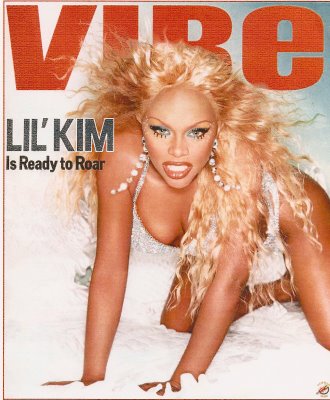
On this cover of Vibe, Lil’ Kim is posed animalistically and, it is asserted, she is “ready to roar”:

NEW! Naomi Campbell, is also put in leopard print in this photo in the December 2008 issue of Russian Vogue (found here):

Naomi-Campbell

ALSO NEW! Iman with a cheetah, and with a cheetah print scarf on her head, as photographed by Peter Beard, 1985 (found here):

Iman-Cheetah-Peter-Beard-1985

ALSO ALSO NEW! These two pictures of Grace Jones (from here) involve animalization (explicitly in the second case). These images may not be safe for work, so I’ve put them after the jump, along with another example:

more...


This clip from The Daily Show nicely illustrates how ridiculous and utterly meaningless the statistics we encounter can be:

This probably goes without saying, but there are multiple problems here:

1. Viewers of these shows are a self-selected group who are quite likely watching because they agree with the hosts to some degree, so it wouldn’t be surprising they’d agree with the hosts’ views.

2. Viewers who care enough to text are an even more unusual group, likely to be those who feel most passionately about an issue.

3. Only those people watching the show and are able to text right then are able to vote.

4. The wording of the questions is clearly intended to lead to a particular answer, using leading phrases like “are you outraged,” which responsible social scientists would never use–any question that uses something along the lines of “don’t you agree” or “wouldn’t you say that” makes it more likely the respondents will, indeed, agree with the point.

5. The hosts actively cajole viewers to give a specific answer if they aren’t getting as many of that answer as they wanted.

Of course, the hosts aren’t trying to present factual, useful information and almost certainly know very well that they’re manipulating questions to get results that will appear to overwhelmingly support their position. But we’re inundated with “statistics” such as these every day that are completely meaningless, but many many people don’t know how to evaluate them. This little clip shows some of the things a person should look for as an indication that a number was created to support a particular viewpoint and should be viewed with extreme skepticism, if not dismissed altogether.

Gwen Sharp is an associate professor of sociology at Nevada State College. You can follow her on Twitter at @gwensharpnv.

The income gap between the rich and the poor is larger in the U.S. than in most other industrialized countries.  Last year we posted data about the percent of total U.S. income that went to the top 1% of earners (23% as of 2006).

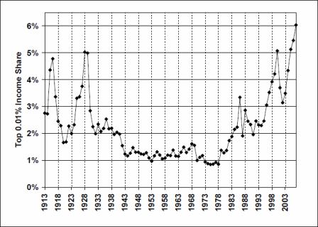
The graph below, recently updated to 2007, shows the percent of total U.S. income that went to the top 0.01%, that is 1/100th of one percent, of earners:

Picture1

As you can see, in 2007,  the top 1/100th of 1% of earners in the U.S. brings home 6% of the total income earned in the U.S.  This represents the largest proportion of total income since at least 1913, and is the endpoint in a trajectory of rising inequality that began in the early 1980s.

Also see our posts breaking down CEO compensation, on the disproportionate tax burden by social class, and on class inequality across U.S. states.

Data borrowed from economist Emmanuel Saez, via Matthew Yglesias.

—————————

Lisa Wade is a professor of sociology at Occidental College. You can follow her on Twitter and Facebook.

In a list of 15 contrasting billboards on Buzzfeed, I found these three:

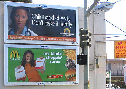
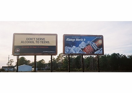
Picture1Picture2Picture3

I usually think of public service announcements as a form of education.  Presumably there’s a harmful ignorance out there somewhere that can be corrected.  But these contrasts bring into stark relief the fact that public service announcements aren’t only fighting ignorance, they’re fighting corporations.  The battle isn’t just between misinformation and information, it’s between for-profit and non-profit organizations.

—————————

Lisa Wade is a professor of sociology at Occidental College. You can follow her on Twitter and Facebook.

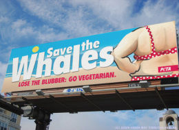
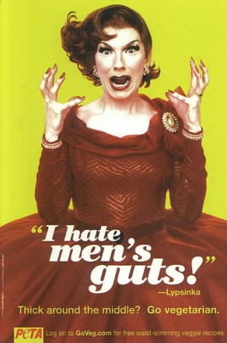
Often when we have an image related to PETA we add it to one of our existing posts, since they tend to be similar–mostly sexualizing women or showing them as bloody meat. But Jessica B. and Dmitriy T.M. told us about a PETA billboard that takes a different angle, and I thought it was worth its very own post:

s-SAVE-THE-WHALES-large

Found at The Huffington Post.

This is just…ugh. Erg. !!! ??? !!!

I’m sorry, but that’s the most coherent I can be about this. I’m sure our commenters will be able to make more useful points about it.

Well, ok, I have one more thought: the implication is that being a vegetarian will automatically make you lose weight. That’s just dumb, or more likely intentionally misleading.

UPDATE: Anomie let me know that there’s at least one version about men (found here):

41963

Two more examples with men here.

Related posts: women in (fake) lettuce bikinis, Dutch animal rights ad shows stripper brutally murdered, not sexualizing older women, PETA ad banned from Superbowl, women as bloody packaged meat, Holocaust on Your Plate campaign, using domestic violence to oppose animal abuse, Christina Applegate naked, more naked celebrities, and leftist balkanization.

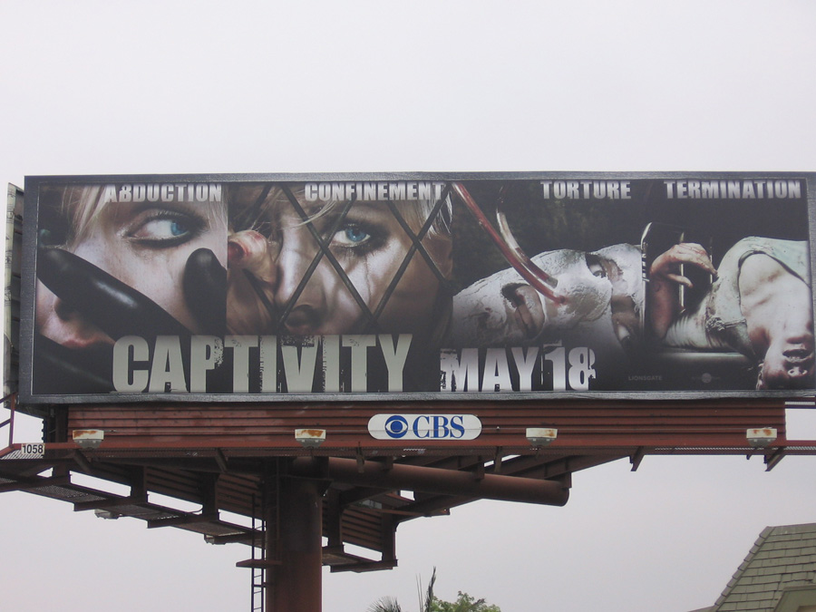
Matt C. snapped some pictures of the advertising campaign for the movie Captivity (2007) in Los Angeles.  According to this billboard, it’s about abduction, confinement, torture, and termination:

banned2

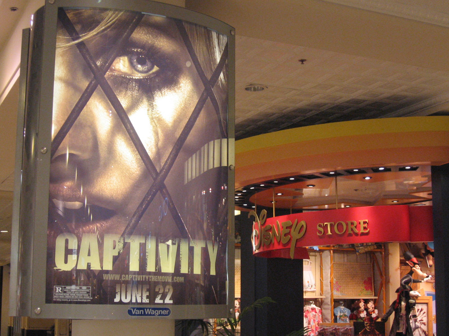
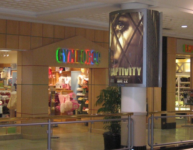
What Matt found interesting was that some of this advertising was placed immediately outside of stores that cater to small children and their parents.  Check it out:
disney
gymboree
Does this suggest to you that we have become so desensitized to violent imagery that no one thinks to, or is empowered to, object when such images are placed at the entrance to children’s spaces?  Or, is the image in question considered tame compared with other imagery we regularly consume (the billboard, for example) and, therefore, unremarkable?

More pictures on Matt’s blog.

—————————

Lisa Wade is a professor of sociology at Occidental College. You can follow her on Twitter and Facebook.