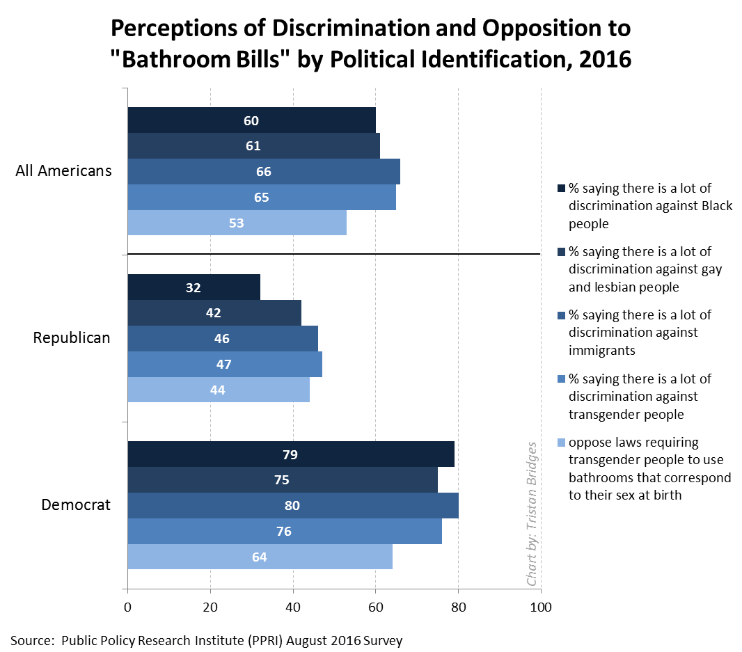
Where you grow up is consequential. It plays a critical role in shaping who you are likely to become. Where you live affects your future earnings, how much education you’re likely to receive, how long you live, and much more.
Sociologists who study this are interested in the concentrated accumulations of specific types and qualities of capital (economic, cultural, social) found in abundance in certain locations, less in more, and virtually absent in some. And, as inequalities intersect with one another, marginalization tends to pile up. For instance, those areas of the U.S. that are disproportionately Black and Latino are also areas struggling economically (see Dustin A. Cable’s racial dot map of the U.S.). Similarly, those areas of the country with the least upward mobility are also areas with some of the highest proportions of households of people of color. And, perhaps not shockingly (although it should be), schools in these areas receive fewer resources and have lower outcomes for students.
How much education you receive is, in part, a result of where you grow up. Think about it: you’re be more likely to end up with at least a bachelor’s degree if you grow up in an area where almost everyone is at least college educated. It’s not a requirement, but it’s more likely. And, if you do and go on to live in a similar community and have children, your kids will benefit from you carrying on that cycle as well. Of course, this system of advantages works in reverse for communities with lower levels of educational attainment.
Recently, a geography professor, Kyle Walker, mapped educational attainment in the U.S. Inspired by Cable’s map of racial segregation, Walker visualizes educational inequality in the U.S. from a bird’s eye view. And when we compare Walker’s map of educational attainment to Cable’s map of racial segregation, you can see how inequalities tend to accumulate.
Below, I’ve displayed paired images of a selection of U.S. cities using both maps. In each image, the top map illustrates educational attainment and the bottom visualizes race.
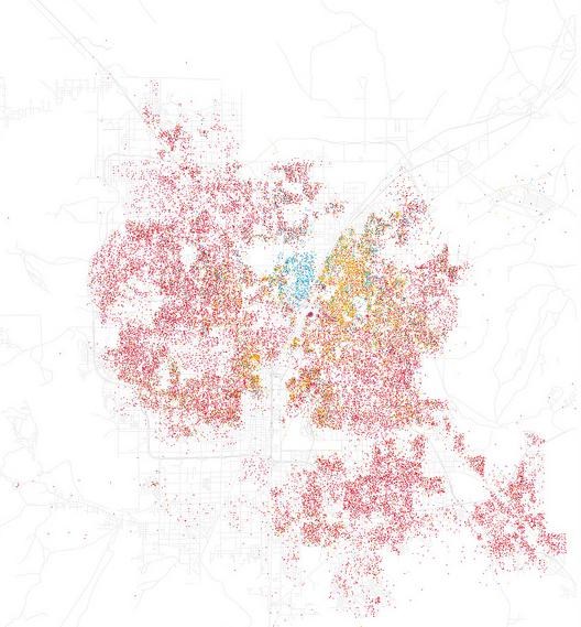
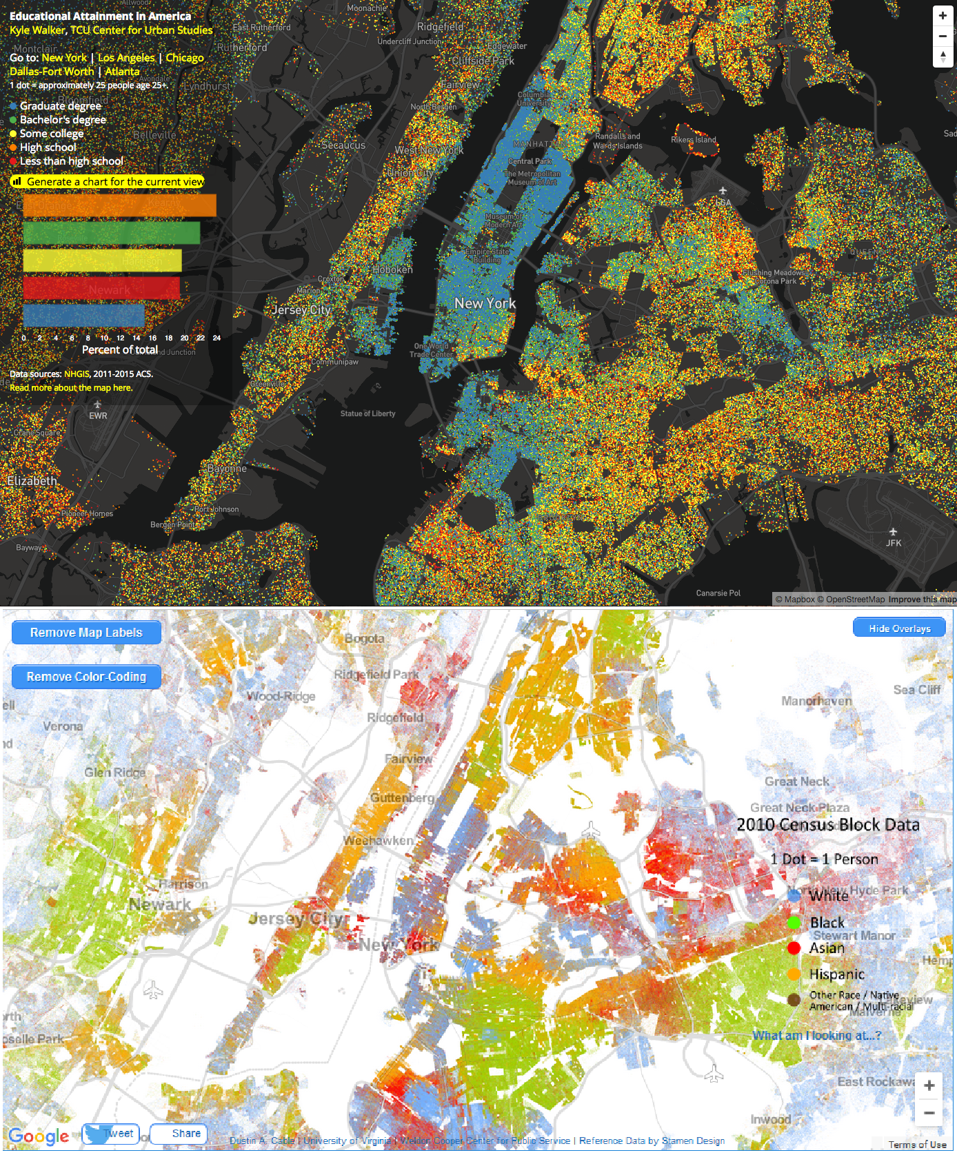
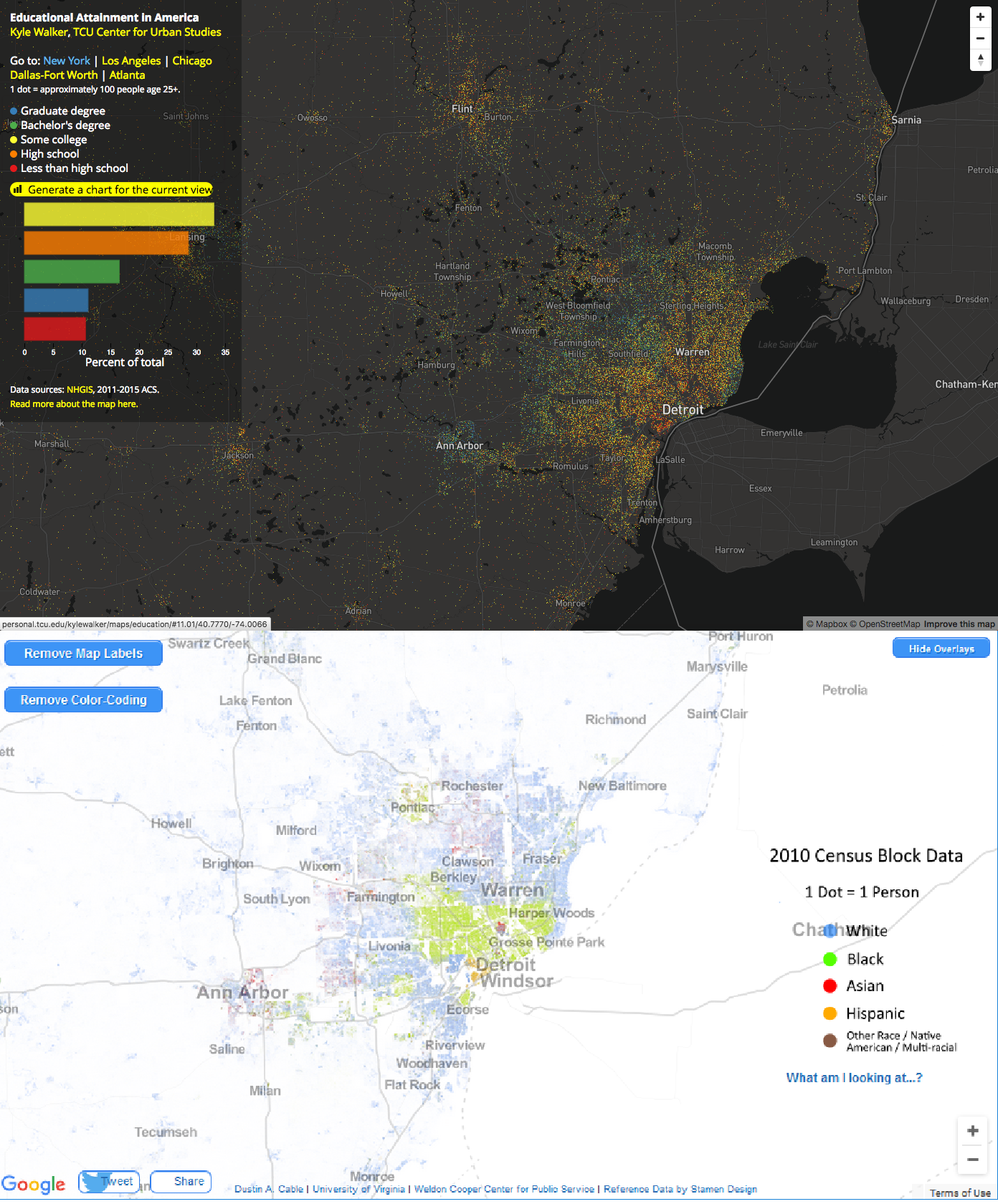
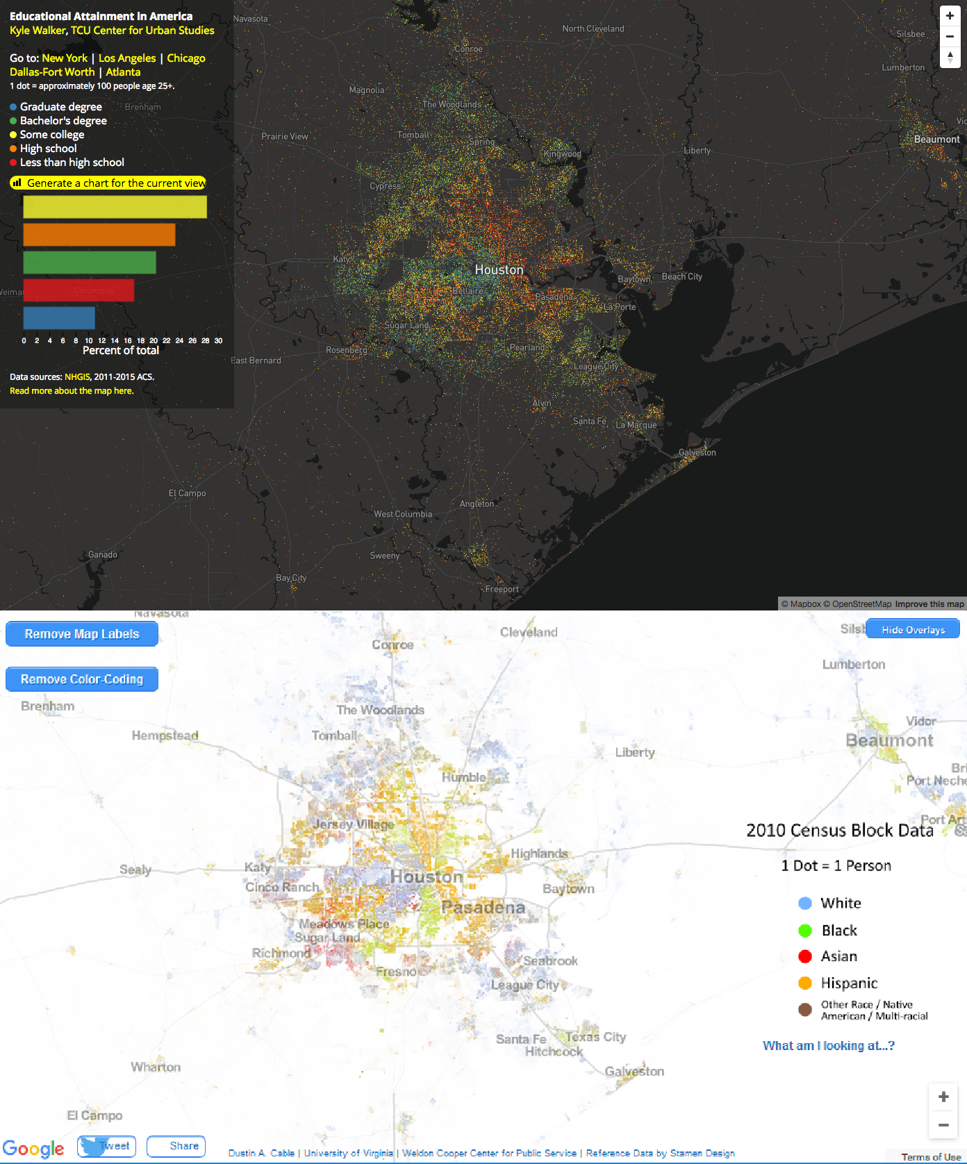
- On Walker’s map of educational attainment (top images in each pair), the colors indicate: less than high school, high school, some college, bachelor’s degree, and graduate degree.
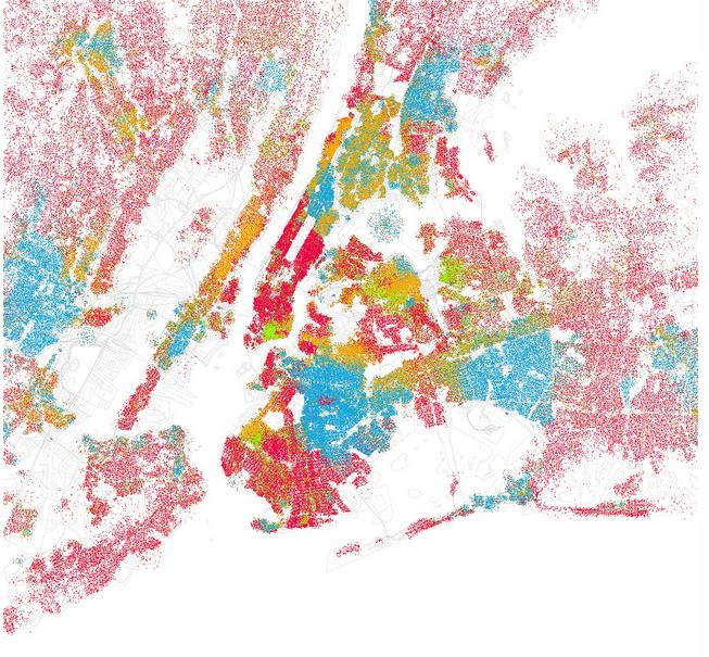
- On Cable’s map of racial segregation (bottom images in each pair), the colors indicate: White, Black, Hispanic, Asian, and Other Race/Native American/Multi-Racial.
So, one way of comparing the images below is to look at how the blue areas compare on each map of the same region.
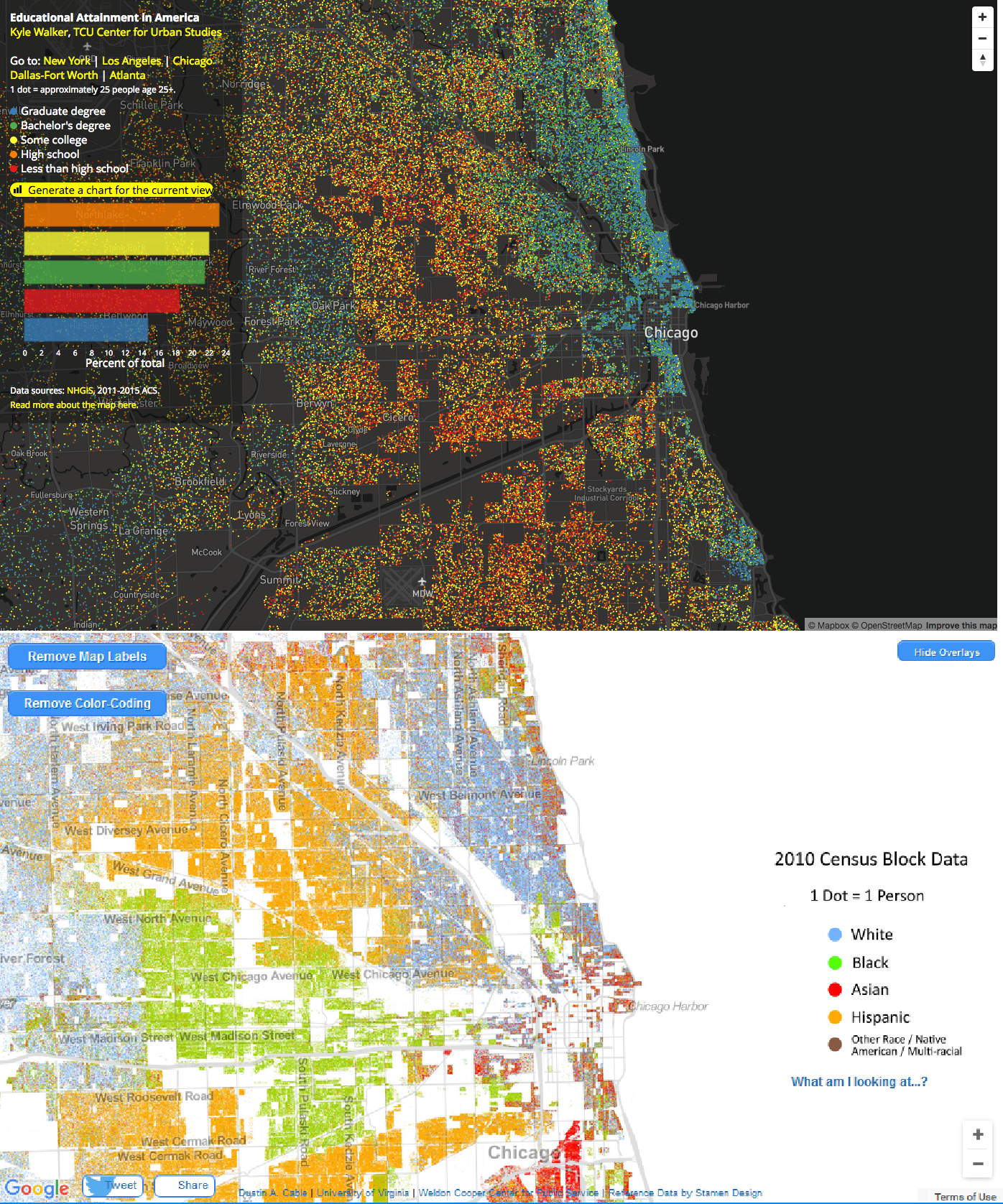
Below, you can see San Francisco, Berkeley, and San Jose, California in the same frame using Walker’s map of educational attainment (top) over Cable’s racial dot map (bottom).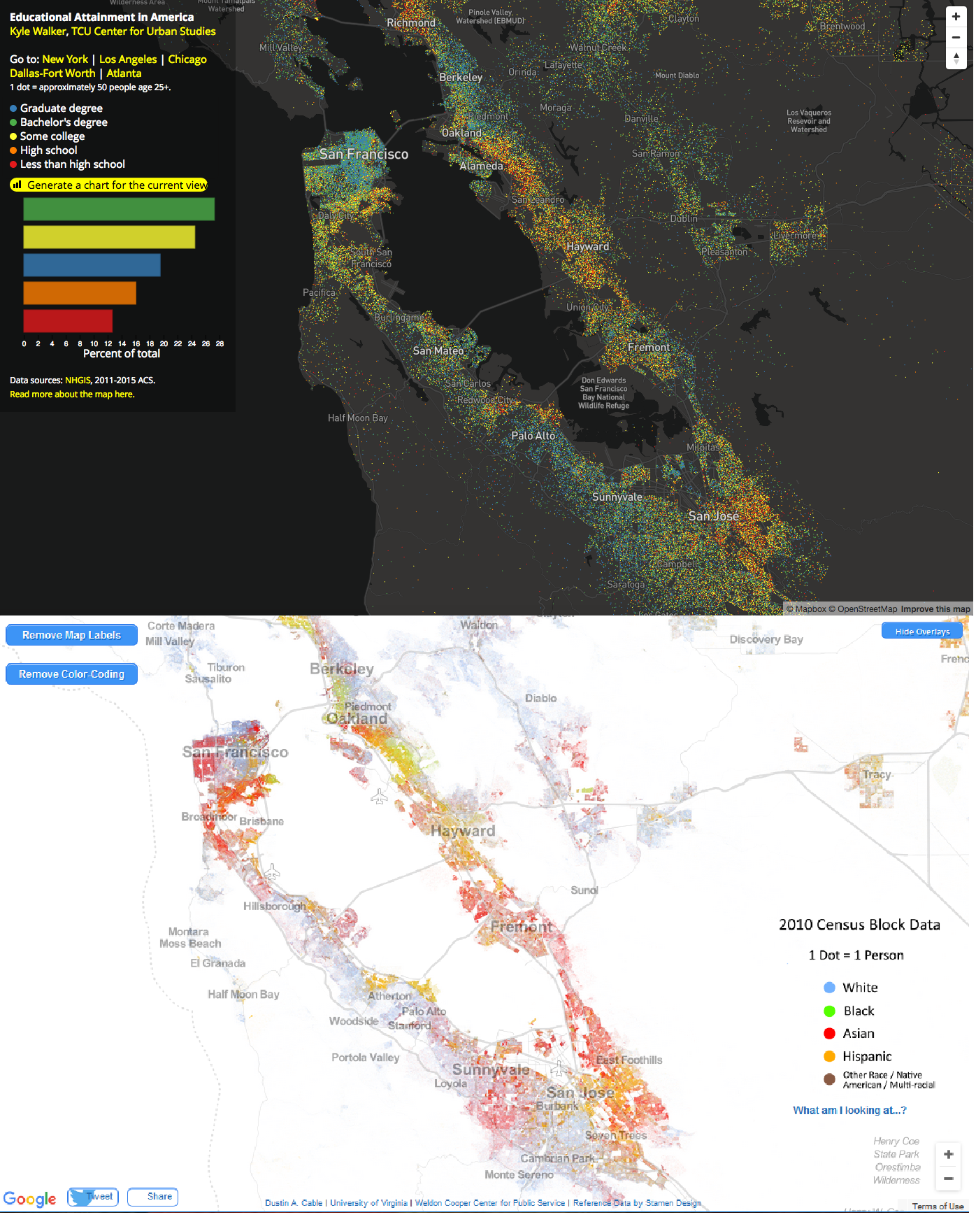 See how people are segregated by educational attainment (top image) and race (bottom image) in Chicago, Illinois:
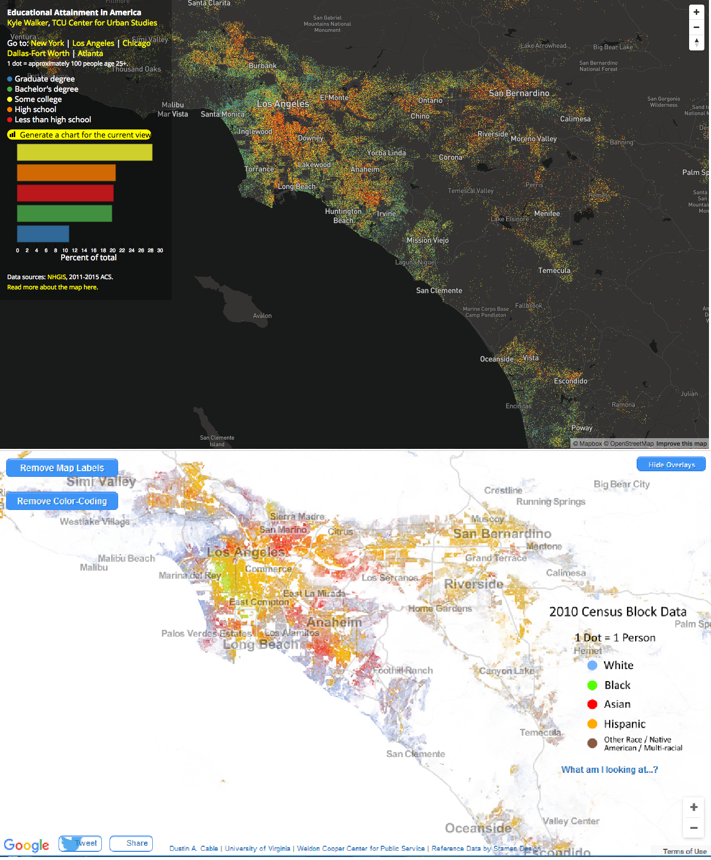
 Los Angeles, California:
 New York City:
 Detroit, Michigan:
 Houston, Texas:
 Compare regions of the U.S. examining Walker’s map with Cable’s racial dot map, you can see how racial and educational inequality intersect. While I only visualized cities above for comparison on both maps, if you examine Walker’s map of educational attainment, two broad trends with respect to segregation by educational attainment are easily visible:
- Urban/rural divide–people with bachelors and graduate degrees tend to be clustered in cities and metropolitan areas.
- Racial and economic inequalities–within metropolitan areas, you can see educational achievement segregation that both reflects and reinforces racial and economic segregation within the area (this is what you see above).
And, as research has shown, the levels of parents’ educational attainment within an area impacts the educational performances of the children living in that area as well. That’s how social reproduction happens. Sociologists are interested in how inequalities are passed on to subsequent generations. And it is sometimes hard to notice in your daily life because, as you can see above, we’re segregated from one another (by race, education, class, and more). And this segregation is one way interlocking inequalities persist.
Tristan Bridges, PhD is a professor at the University of California, Santa Barbara. He is the co-editor of Exploring Masculinities: Identity, Inequality, Inequality, and Change with C.J. Pascoe and studies gender and sexual identity and inequality. You can follow him on Twitter here. Tristan also blogs regularly at Inequality by (Interior) Design.

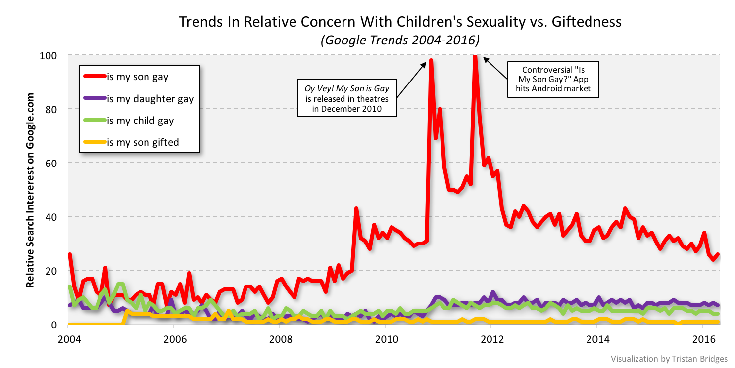
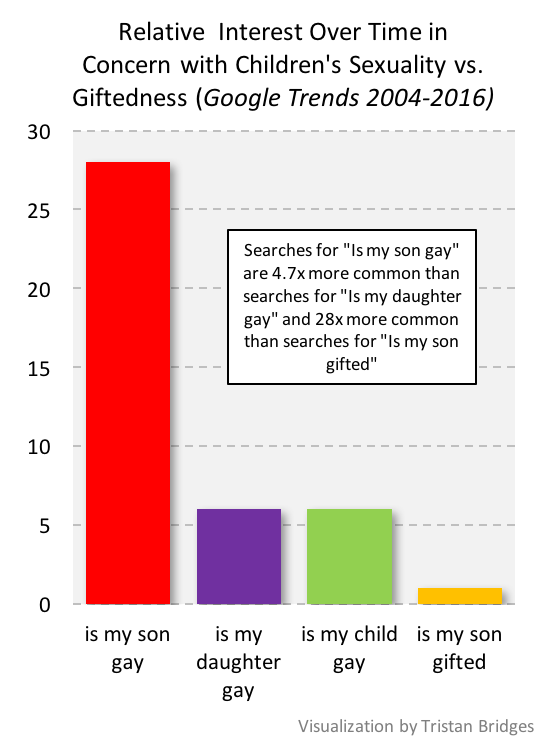 Indeed, over the period of time illustrated here, people were 28x more likely to search for “is my son gay” than they were for “is my son gifted.” And searches for “is my son gay” were 4.7x more common than searches for “is my daughter gay.”