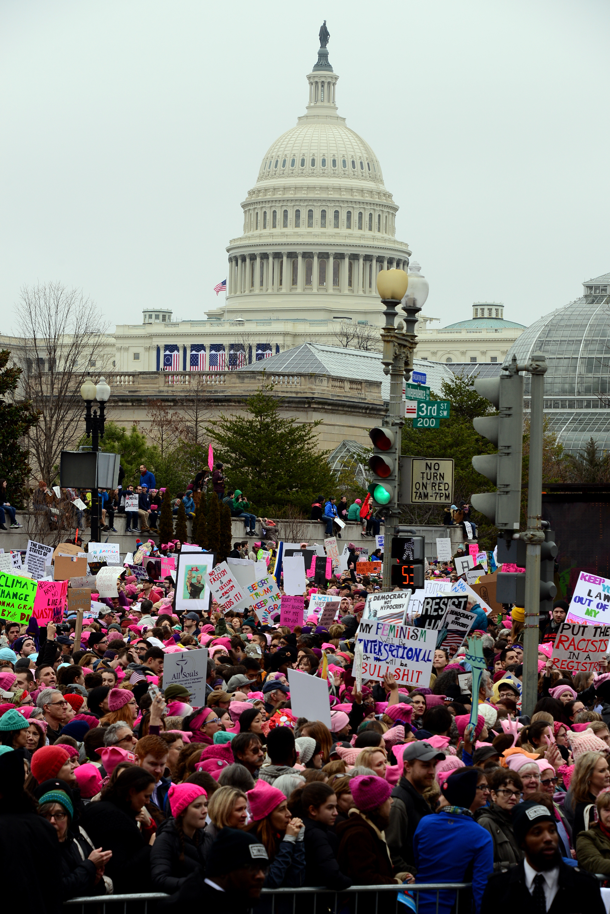
The Women’s March in Washington had three times more people in attendance than did President Trump’s inauguration. Many have argued about the reasons for these numbers (see here, here, and here), and used them both individually and together to make claims about activism and political support. But something is missing from these conversations. In order to fully understand the differences in attendance at these events in D.C., and to avoid taking these numbers to mean something they do not, we must account for class and race.

Gender, education and race may have been the biggest rifts in voters this past presidential election, but class is part of this political shift. At least part of why people didn’t show up for President Trump’s inauguration in droves but did show up to the Women’s Marches is a story of class privilege and the cultural capital that comes with it. Upper middle class white women and urban dwellers from all classes had easy access to Women’s Marches, both in D.C. and around the country. Many of Trump’s voters would have had to fly to D.C. Because research shows that only about 50% of the population in the US flies each year, and because that tracks with income and education, Women’s March supporters may have been more likely to fly than Trump voters were. If we look at data from just the five counties with the largest vote share for Trump, we see that, except for Buchanan, Virginia, these locations present great travel distance. Further, President Trump received 4.1% of the vote in Washington, D.C., and lost in surrounding states by large percentages. As CNN points out, a trip to inauguration would be a long one for a critical mass of Trump supporters.

White voters from rural areas and those without a college education represent the largest demographics to turn out for Trump. Many of Trump’s supporters reside in more rural areas that are struggling economically. Cost and familiarity with travel, ease and options in taking time off of work, and geographic proximity to D.C. may have affected participation in Inauguration events. Sociologists talk about cultural capital—or the non-financial goods that help with social mobility beyond economic means. Such capital can include knowledge, skills, and education—things that are both material and symbolic. When Emily lived in rural Arkansas, many people she met had never left the state or in some cases even the county. Indeed, when she told a friend there that she flew home for Christmas and it cost $70, he was surprised that a plane ticket cost less than it did to fill up his truck, because he’d never flown before. Emily’s knowledge of air travel is a form of cultural capital, and one that could put her at an advantage in planning a trip to fly to Washington, D.C. for the March. There is an intimidation that comes from not having done that or been there before—your cultural capital can determine how well versed you are in navigating AirBnB and the slew of cheap flight websites that exist.

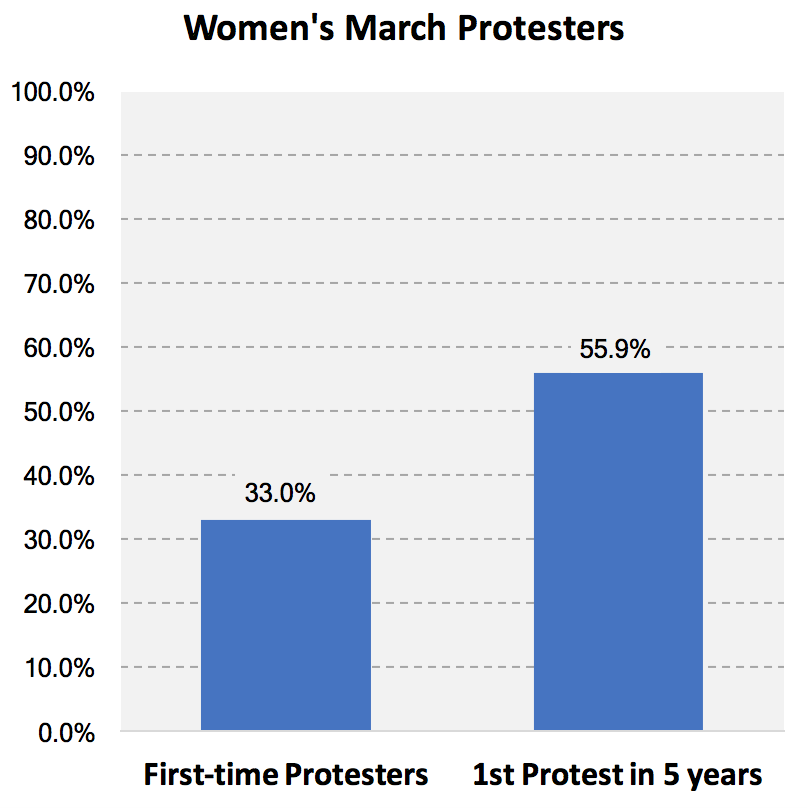
Why was the Women’s March so highly attended? Many have analyzed the mass turn-out in D.C., nationally, and internationally. For the first time, the Women’s March brought out highly educated, more affluent white women who have the forms of capital to plan and attend a weekend in D.C. Of course, there were many—millions, in fact—who did not go to D.C., but who showed support in sister marches around the country and globe. For many, their lack of attendance in D.C. could be due to the same barriers that perhaps inhibited many from attending the Inauguration. For others, their participation was possible because demographics likely to participate in Women’s Marches – LGBTQA+ folks and people of color – are more likely to reside in urban communities. But to compare these attendance rates without talking about class, and without talking about the mobilization of white women, muddies the realities of who is ready and willing to act at more local levels.

While the Women’s March may have kicked off a movement that has the tools in place for success, we need to remember that Trump’s path to success was unpredicted. To take his inauguration attendance numbers to mean that his initial supporters have changed their minds or that Trump has lost political support would be a potentially grave mistake. To take what is now the largest protest in U.S. history as evidence of mass, continued mobilization, that may also be inaccurate. White women are just starting to show up—will they continue to do so? In talking about the intersections of class and race, we remember who is able to mobilize and show support when, and we must bring these intersections to the fore in future conversations about mobilization and activism.

Sarah Diefendorf is a PhD candidate in Sociology at the University of Washington. Her research centers on sexuality, gender, and evangelical religious groups. You can follow her on Twitter here.

Emily Kalah Gade is a PhD candidate in Political Science at the University of Washington. Her research centers on political violence, civil resistance and militancy.

The 2017 Women’s March was a historic event.  Social media alone gave many of us the notion that something happened on an incredibly grand scale.  But measuring just how “grand” is an inexact science.  Women’s Marches were held around the world in protest of Trump on the day following his inauguration.  Subsequently, lots of folks have tried to find good ways of counting the crowds.  Photos and videos of the crowds at some of the largest marches are truly awe-inspiring.  And the media have gotten stirred up attempting to quantify just how big this march really was.

Think about it.  The image below is taken of some of the crowds in Los Angeles.  The caption Getty Images associates with the image includes the estimate “Hundreds of thousands of protesters…”  But, was it 200,000?  Or was it more like 900,000?  Do you think you could eyeball it and make an educated guess?  We’d bet you’d be off by more than you think.  Previous research has found, for instance, that march participants and organizers are not always the best source of information for how large a protest was.  If you’re there and you’re asked how many people were there, you’re much more likely to exaggerate the number of people who were actually there with you.  And that fact has spawned wildly variable estimates for marches around the U.S. and beyond.

More than one set of estimates exist attempting to figure this out.  The estimates that have garnered the most media attention (deservedly) are those produced by Jeremy Pressman and Erica Chenoweth.  They collected as many estimates as they could for marches all around the world to try to figure out just how large the protest was on a global scale.  Pressman & Chenoweth collected a range of estimates, and in their data set they classify them by source as well as providing the lowest and highest estimates for each of the marches for which they were able to collect data. You can see and interact with those estimates visually below in a map produced by Eric Compas (though some updates were made in the data set after Compas produced the map).

By Pressman & Chenoweth’s estimates, the total number of marchers in the U.S. was between 3,266,829 and 5,246,321 participants.  When they include marches outside the U.S. as well they found that we can add between 266,532 and 357,071 marchers to that number to understand the scale of the protest on an international scale.  That is truly extraordinary.  But, the range is still gigantic.  The difference between their lowest and highest estimate is around 2.1 million people!  Might it be possible to figure out which of these estimates are better estimates of crowd size than others?

Nate Silver at FiveThirtyEight.com tried to figure this out in an interesting way.  They only attempted to answer this question for U.S. marches alone.  And Silver and a collection of his statistical team produced their own data set of U.S. marches.  They collected as many crowd estimates as they could for all of the marches held in the U.S.  And there are lots of holes in their data that Pressman and Chenoweth filled.  March organizers collect information about crowd size and are eager to claim every individual who can be claimed to have been present.  But, local officials estimate crowd sizes as well because it helps to give them a sense of what they will need to prepare for and respond to such crowds.  As a part of this, some marches had estimates from march organizers, news sources, official estimates, as well as estimates from non-partisan experts (so-called crowd scientists)–this is especially true of the larger marches.  Examining their data, they discovered that for every march in which they had both organizer and official estimates, the organizers’ estimate was 50-70% higher than the officials’ estimates.  As Silver wrote: “Or put another way, the estimates produced by organizers probably exaggerated crowd sizes by 40 percent to 100 percent, depending on the city” (here).  The estimates Silver produced at FiveThirtyEight are mapped below.

You can interact with the map to see Nate Silver’s team estimate, but also the various estimates on which that estimate is based.  And you may note that the low and high estimates are often the same for Silver and for Pressman & Chenoweth (though not always).  Additionally, there were a good number of marches in FiveThirtyEight’s data set that lacked any estimates at all. And those marches are not visible on the map above.  Just to consider some of what is missing, you might note that there are no marches on the map immediately above in Puerto Rico, though Silver’s data set includes four marches there–all with no estimates.

Interestingly, Silver took a further step of offering a “best guess” based on patterned differences between types of estimates they found for marches for which they had more than a single source of data (more than one estimate).  For instance, where there were only organizers’ estimates, they discounted that estimate by 40%, assuming that it was exaggerated.  They discounted news estimates by 20% for similar reasons.  Sometimes, non-partisan experts relying on photographs and videos provide estimates were available, which were not discounted (similar to official estimates).

It might be possible then, as Pressman & Chenoweth collected many more estimates, to fine-tune Silver’s formula and possibly come up with an even more accurate estimate of crowd sizes at marches around the world based on the source of the estimate. It’s a fascinating puzzle and a really interesting and simple way of considering how to resolve it with a (likely) conservative measure.

By these (likely conservative) estimates, marches in the U.S. alone drew more than 3,000,000 people across hundreds of separate locations across the nation.  In the U.S. alone, FiveThirtyEight estimated that 3,234,343 people participated (though, as we said, some marches simply lacked any source of data in the data set they produced).  And that number, you might note, is strikingly close to Pressman & Chenoweth’s low estimate for the U.S. (3,266,829).  Even by this conservative estimate, this would qualify the 2017 Women’s March as certainly among the largest mass protests in U.S. history.  It may very well have been the largest mass protest in American history.  And in our book, that’s worth counting.

Tara Leigh Tober, PhD is a Lecturer in the Sociology Department at the University of California, Santa Barbara.  She studies the sociology of memory, is writing a book on how the Irish have remembered being neutral during WWII, and is presently engaged in a study on mass shootings in the U.S.  You can follow her on Twitter here.

Tristan Bridges, PhD is a professor at the University of California, Santa Barbara. He is the co-editor of Exploring Masculinities: Identity, Inequality, Inequality, and Change with C.J. Pascoe and studies gender and sexual identity and inequality. You can follow him on Twitter here. Tristan also blogs regularly at Inequality by (Interior) Design.

Flashback Friday.

In August of 2010, NPR reported on a scale developed by a forensic psychologist, Michael Stone, on which murderers could be placed according to how evil they are (from slightly evil to really, really really evil).  To illustrate the scale, NPR developed this graphic:

Let’s say, for the sake of argument, that the artists designing this graphic did not purposefully associate darker skin-like colors with more evil and lighter skin-like colors with less evil.  I think this is a fair assumption, though I don’t know for sure that this is true.  But let’s give them the benefit of the doubt.

If they didn’t do this on purpose, then race never consciously entered their minds.  Once you notice that the colors are skin-like colors, and if you are a member of a society that discriminates against darker-skinned people, you immediately see that this graphic reproduces those stereotypes… AND YOU CHANGE THE COLORS.   Any color, going from light to dark, will illustrate intensity.  How about red?  In Western societies, red is associated with anger.   If you insist on using black because black signifies evil in our culture, how about using a true black (that is very rarely if ever seen on people) and a gray scale?  How about any color other than brown?

I think this is likely a case in which the producers of the image did not think.  And not thinking is one of the most insidious ways that racism and other bigotries get reproduced.  People who don’t think about race are the most likely to endorse racial stereotypes.  When people who think about race are distracted — with another task, or loud music, or some other intervening stimulus — they are more likely to think stereotypically than when they are not distracted.  We can’t be colorblind.  Our unconscious is steeped in racial meanings.  Consciously fighting those associations is the only way to be less racist.

Not thinking about race is a cousin to thinking racist thoughts.  Only thinking hard about race helps alleviate racism.  And this graphic is an excellent example of why.

Originally posted in 2010.

Lisa Wade, PhD is an Associate Professor at Tulane University. She is the author of American Hookup, a book about college sexual culture; a textbook about gender; and a forthcoming introductory text: Terrible Magnificent Sociology. You can follow her on Twitter and Instagram.

Originally posted at the Contexts blog.

Among the many forces contributing to the surprising Trump election was the shift of many White working class voters to vote for the upstart candidate. For years, these working-class families had been hurting; their incomes stagnated, good jobs became hard to find, and their health suffered. More importantly, entire working-class communities declined. It was not just personal economic misfortune, it was a class.

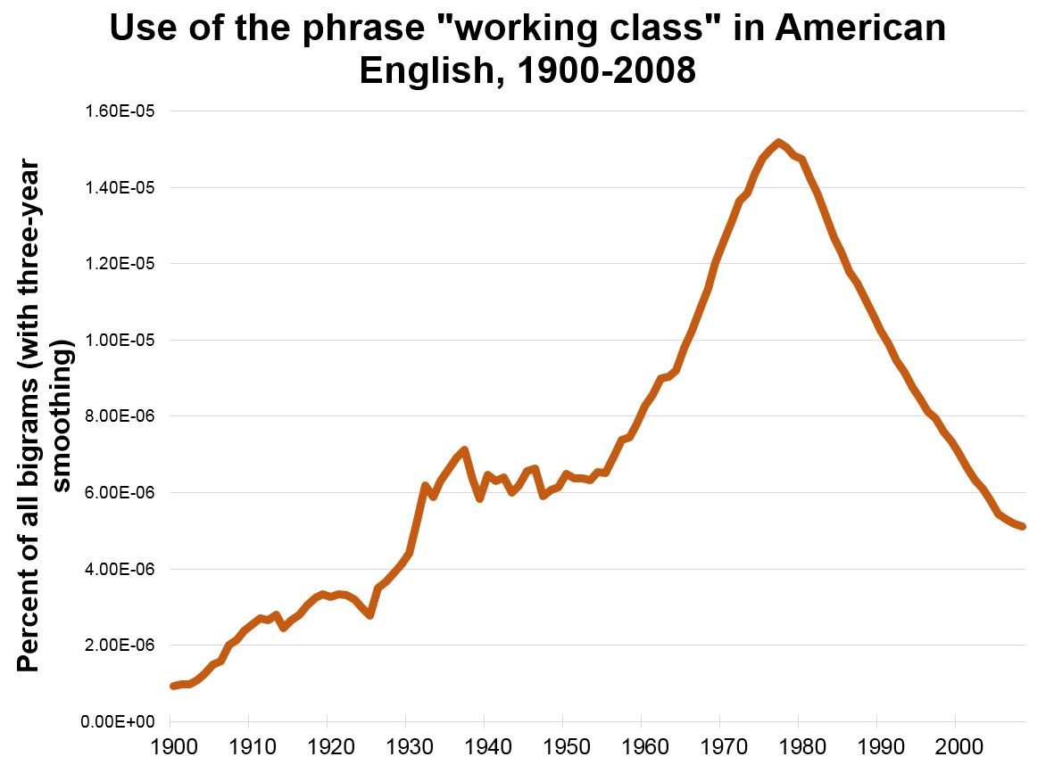
The problems of the White working class were not unknown, but they were not often addressed very directly. Sometimes, the most common advice was they should get more training or send their kids to college – advice that could sound more like a middle-class put-down than a realistic policy addressing their problems. But, for the most part, the working class was just ignored, a neglect that made them ripe for Trump’s appeals. This neglect was a general cultural phenomenon; a Google ngram count of the phrase “working class” in American books shows a spike in the Depression Thirties and an even stronger growth from the mid-1950s to the mid-1970s. But after the mid-1970s, there is a steady decline, implying a lack of discussion just as their problems were growing.  The implicit message seemed to have been that their problems didn’t matter.

vanf1

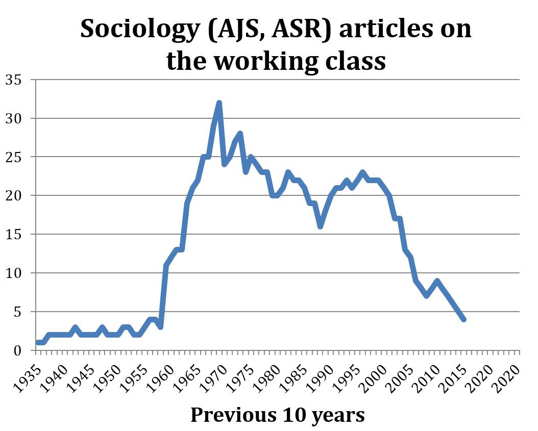
U.S. sociology was not immune from this broader cultural trend. A count of the frequencies of “working class” in the titles or abstracts of articles in the American Journal of Sociology and the American Sociological Review shows a quite similar if even more dramatic pattern: rapid growth in the 1960s, peaking in the 1959-1969 period, a steady interest for the next two decades and then an abrupt decline beginning in the 1990s. These articles on the working class were not insignificant; even through the 21st century, the authors include a number of ASA presidents. But overall, working-class issues seem to have lost their salience, as if even American sociology was also telling them that they didn’t matter.

vanf2

Perhaps the Trump election, which was in part a symptom of this neglect, may also produce its cure. Election post-mortems in the media have focused more attention on the white working class than they have received in years.  Academe may soon follow.  Arlie Hochshild’s Strangers in Their Own Land, and, in political science, Katherine Cramer’s The Politics of Resentment, are encouraging signs. But Trump was certainly dangerous medicine for what ails our professional discourse.

Reeve Vanneman, PhD is in the sociology department at the University of Maryland.

Gender gaps are everywhere.  When we use the term, most people immediately think of gender wage gaps.  But, because we perceive gender as a kind of omni-salient feature of identity, gender gaps are measured everywhere.  Gender gaps refer to discrepancies between men and women in status, opportunities, attitudes, demonstrated abilities, and more. A great deal of research focuses on gender gaps because they are understood to be the products of social, not biological, engineering.  Gender gaps are so pervasive that, each year, the World Economic Forum produces a report on the topic: “The Global Gender Gap Report.”

I first thought about this idea after reading some work by Virginia Rutter on this issue (here and here) and discussing them with her.  When you look for them, gender gaps seem to be almost everywhere.  As gender equality became something understood as having to do with just about every element of the human experience, we’ve been chipping away at all sorts of forms of gender inequality.  And yet, as Virginia Rutter points out, we have yet to see gender convergence on all manner of measures.  Indeed, progress on many measures has slowed, halted, or taken steps in the opposite direction, prompting some to label the gender revolution “stalled.”   And in many cases, the “stall” starts right around 1980.  For instance, Paula England showed that though the percentage of women employed in the U.S. has grown significantly since the 1960s, that progress starts to slow in the 1980s.  Similarly, in the 1970s a great deal of progress was made in desegregating fields of study in college.  But, by the early 1980s, about all the change that has been made had been made already.  Changes in the men’s and women’s median wages have shown an incredibly persistent gender gap.

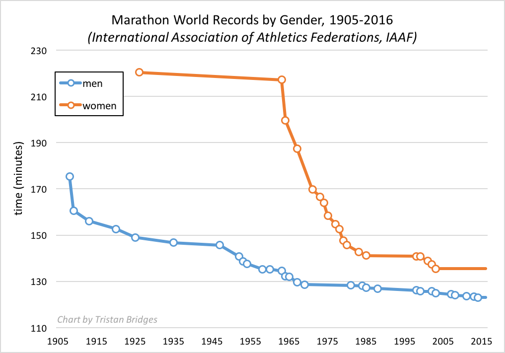
A set of gender gaps often used to discuss inherent differences between men and women are gaps in athletic performance – particularly in events in which we can achieve some kind of objective measure of athleticism.  In Lisa Wade and Myra Marx Ferree’s Gender: Ideas, Interactions, Institutions, they use the marathon as an example of how much society can engineer and exaggerate gender gaps.  They chart world record times for women and men in the marathon over a century.  I reproduced their chart below using IAAF data (below).

marathon-world-record-progression-by-gender

In 1963, an American woman, Merry Lepper, ran a world recording breaking marathon at 3 hours, 37 minutes, and 7 seconds.  That same year, the world record was broken among men at 2 hours, 14 minutes, and 28 seconds.  His time was more than 80 minutes faster than hers!  The gender gap in marathon records was enormous.  A gap still exists today, but the story told by the graph is one of convergence.  And yet, I keep thinking about Virginia Rutter’s focus on the gap itself. I ran the numbers on world record progressions for a whole collection of track and field races for women and men.  Wade and Ferree’s use of the marathon is probably the best example because the convergence is so stark.  But, the stall in progress for every race I charted was the same: incredible progress is made right through about 1980 and then progress stalls and a stubborn gap remains.

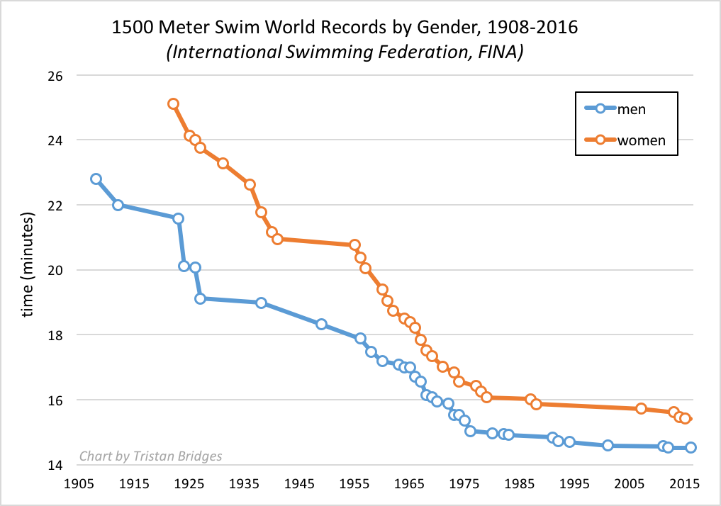
Just for fun, I thought about considering other sports to see if gender gaps converged in similar ways. Below is the world record progression for men and women in a distance swimming event – the 1500-meter swim.

1500-meter-swim-world-record-progression-by-gender

The story for the gender gap in the 1500-meter swim is a bit different.  The gender gap was smaller to begin with and was primarily closed in the 1950s and early 60s.  Both men and women continued to clock world record swims between the mid-1950s and 1980 and then progress toward faster times stalled out for both men and women at around that time.

One way to read these two charts is to suggest that technological innovations and improvements in the science of sports training meant that we came closer to achieving, possibly, the pinnacle of human abilities through the 1980s.  At some point, you might imagine, we simply bumped up against what is biologically possible for the human body to accomplish.  The remaining gap between women and men, you might suggest, is natural.  Here’s where I get stuck… What if all these gaps are related to one another?  There’s no biological reason that women’s entry into the labor force should have stalled at basically the same time as progress toward gender integration in college majors, all while women’s incredible gender convergence in all manner of athletic pursuits seemed to suddenly lose steam.  If all of these things are connected, it’s for social, not biological reasons.

Tristan Bridges, PhD is a professor at the University of California, Santa Barbara. He is the co-editor of Exploring Masculinities: Identity, Inequality, Inequality, and Change with C.J. Pascoe and studies gender and sexual identity and inequality. You can follow him on Twitter here. Tristan also blogs regularly at Inequality by (Interior) Design.
Originally posted at Made in America.

Explaining how such an unfit candidate and such a bizarre candidacy succeeded has become a critical concern for journalists and scholars. Through sites like Monkey Cage, Vox, and 538, as well as academic papers, we can watch political scientists in real time try to answer the question, “What the Hell Happened?” (There are already at least two catalogs of answers, here and here, and a couple of college-level Trump syllabi.) Although a substantial answer will not emerge for years, this post is my own morning-after answer to the “WTHH?” question.

I make three arguments: First, Trump’s electoral college victory was a fluke, a small accident with vast implications, but from a social science perspective not very interesting. Second, the deeper task is to understand who were the distinctive supporters for Trump, in particular to sort out whether their support was rooted mostly in economic or in cultural grievances; the evidence suggests cultural. Third, party polarization converted Trump’s small and unusual personal base of support into 46 percent of the popular vote.

Explaining November 8, 2016

Why did Donald Trump, an historically flawed candidate even to many of those who voted for him, win? With a small margin in three states (about 100,000 votes strategically located), many explanations are all true:

* Statistical fluke: Trump won 2.1 percentage points less of the popular vote than did Clinton, easily the largest negative margin of an incoming president in 140 years. (Bush was only 0.5 points behind Gore in 2000.) Given those numbers, Trump’s electoral college win was like getting two or three snake-eye dice rolls in a row. Similarly, political scientists’ structural models–which assume “generic” Democratic and Republican candidates and predict outcomes based on party incumbency and economic indicators–forecast a close Republican victory. “In 2012, the ‘fundamentals’ predicted a close election and the Democrats won narrowly,” wrote Larry Bartels. “In 2016, the ‘fundamentals’ predicted a close election and the Republicans won narrowly. That’s how coin tosses go.” But, of course, Donald Trump is far from a generic Republican. That’s what energizes the search for a special explanation.

* FBI Director Comey’s email announcement in the closing days of the election appeared to sway the undecided enough to easily make the 100,000 vote difference.

* Russian hacks plus Wikileaks.

* The Clinton campaign. Had she visited the Rust Belt more, embraced Black Lives Matter less (or more), or used a slogan that pointed to economics instead of diversity… who knows? Pundits have been mud-wrestling over whether her campaign was too much about identity politics or whether all politics is identity politics. Anyway, surely some tweak here would have made a difference.

* Facebook and Fakenews.

* The weather. It was seasonably mild with only light rain in the upper Midwest on November 8. Storms or snow would probably have depressed rural turnout enough to make Clinton president.

* The Founding Fathers. They meant the electoral college to quiet vox populi (and so it worked in John Q. Adams’s minus 10 point defeat of Andrew Jackson in 1824).

* Add almost anything you can imagine that could have moved less than one percent of the PA/MI/WI votes or of the national vote.

* Oh, and could Bernie would have won? Nah, no way, no how. [1]

Small causes can have enormous consequences: the precise flight of a bullet on November 22, 1963; missed intelligence notes about the suspicious student pilots before the 9/11 attacks; and so on. Donald Trump’s victory could become extremely consequential, second only to Lincoln’s in 1860, argues journalist James Fallows, [2] but the margin that created the victory was very small, effectively an accident. From an historical and social science point of view, there is nothing much interesting in Trump’s electoral college margin.

Trump’s Legions

More interesting is Trump’s energizing and mobilizing so many previously passive voters, notably during the primaries. What was that about?

One popular answer is that Trump’s base is composed of people, particularly members of the white working class (WWC), who are suffering economic dislocation. Because their suffering has not been addressed, they rallied to a jobs champion.

Another answer is that Trump’s core is composed of people, largely but not only WWC, with strong cultural resentments. While often suffering economically and voicing economic complaints, they are mainly distinguished by holding a connected set of racial, gender, anti-immigrant, and class resentments–resentments against those who presumably undermined America’s past “greatness,” resentments which tend to go together with tendencies toward authoritarianism (see this earlier post).

The empirical evidence so far best supports the second account. Indicators of cultural resentment better account for Trump support than do indicators of economic hardship or economic anxiety. [3]

In-depth, in-person reports have appeared that flesh out these resentments in ways that survey questions only roughly capture. They describe feelings of being pushed out of the way by those who are undeserving, by those who are not really Americans; feelings of being neglected and condescended to by over-educated coastal elites; feelings of seeing the America they nostalgically remember falling away. [4]

trump-supportersDefenders of the economic explanation would point to the economic strains and grievances of the WWC. Those difficulties and complaints are true–but they are not new. Less-educated workers have been left behind for decades now; the flat-lining of their incomes started in the 1970s, with a bit of a break in the late 1990s. Moreover, the economy has been in an upswing in the last few years; the unemployment rate was about 8 percent when Obama was re-elected in 2012, but about half of that when Trump was elected. Economic conditions do not explain 2016.

Nor are complaints about economic insecurity new. For example, the percentage of WWC respondents to the General Social Survey who said that they were dissatisfied with their financial situations has varied around 25 percent (+/- 5 points) over the last 30 years. The percentage dissatisfied did hit a high in the early years of the Great Recession (34 percent in 2010), but it dropped afterwards (to 31% in 2012 when Obama was re-elected and 29% in 2014). Economic discontent has been trending down, not up. [5] That only one-fifth of Trump voters supported raising the minimum wage to $15 further undercuts the primacy of economic motives.

To be sure, journalists can find and record the angry voices of economic distress; they do so virtually every election year. (Remember the painful stories about the foreclosure crisis and about lay-offs during the Great Recession?). There was little distinctive about either the economic distress or the economic anxiety of 2016 to explain Trump.

Some have noted, however, what appear to be a significant number of voters who supported Obama in 2008 or in 2012 and seemed to have switched to Trump in 2016 (e.g., here). Do these data not undermine a cultural, specifically a racial, explanation for Trump? No. In 2008, Obama received an unusual number of WWC votes because of the financial collapse, the Iraq fiasco, and Bush’s consequent unpopularity. These immediate factors overrode race for many in the WWC. But WWC votes for Obama dropped in 2012 despite his being the incumbent. Then, last November, the WWC vote for a Democratic candidate reverted back to its pre-Great Recession levels. [6] Put another way, Clinton’s support from the WWC was not especially low, Obama’s was unusually high for temporary reasons.

What was special about 2016 was the candidate: Donald Trump explicitly and loudly voiced the cultural resentments and authoritarian impulses of many in the WWC (and some in the middle class, too) that had been there for years but had had no full-throated champion–not Romney, not McCain, not the Bushes, probably not even Reagan–since perhaps Richard Nixon. What changed was not the terrain for a politics of resentment but the arrival of an unusual tiller of that soil, someone who brought out just enough of these voters to win his party’s nomination and to boost turnout in particular places for the general election. As one analyst wrote, “Trump repeatedly went where prior Republican presidential candidates were unwilling to go: making explicit appeals to racial resentment, religious intolerance, and white identity.”

But this is still less than half the story.

Party Polarization

To really how understand how Trump could get 46 percent of the vote, it takes more than identifying the distinctive sorts of people whom Trump attracted, because they are not that numerous. Trump won only a minority of the primary votes and faced intense opposition within his party. In the end, however, almost all Republicans came home to him–even evangelicals, to whose moral standards Trump is a living insult. The polarization of American politics in recent years was critical. Party ended up mattering more to college-educated, women, and suburban Republicans than whatever distaste they had for Trump the man.

Consider how historically new this development is. In 1964, the Republican nominee, Barry Goldwater, was considered to be at the far right end of the political spectrum. About 20 to 25% of Republicans crossed over and voted for Democrat Lyndon Johnson. (This crossover was mirrored by Democrats in the 1972 election. [7]) In 2016, by contrast, fewer than 10% of Republicans abandoned Trump–a far more problematic candidate than Goldwater–so much has America become polarized by party in the last couple of decades. [8]

Conclusions

Readings of the 2016 election as the product of a profound shift in American society or politics are overblown. In particular, notions that the WWC’s fortunes or views shifted so substantially in recent years as to account for Trump seem wrong.

What about the argument that the Trump phenomenon is part of a general rise across the western world of xenophobia? I don’t see much evidence outside of the Trump case itself for that in the United States. Long-term data suggest a decline–too slowly, for sure–rather than an increase in such attitudes.[9] And let’s not forget: Hillary Clinton won the popular vote.

The best explanation of why Trump got 46% of the ballots: Advantages for the out party in a third-term election + Trump’s unusual cultural appeal to a minority but still notable number of Americans + historically high party polarization. That Trump actually won the electoral college as well is pretty much an accident, albeit a hugely consequential one.


NOTES____________________

[1] Basically no one, including Trump, said anything bad about Bernie Sanders from the moment it became clear that Sanders would lose the primaries to Clinton. Had he been nominated, that silence would have ended fast and furiously. Moreover as the always astute Kevin Drum pointed out, Sanders is much too far to left to get elected, even way to the left of George McGovern, who got creamed in 1972. Finally, the “Bernie Brothers” who avoided Clinton would have been more than outnumbered by Hillary’s pissed-off sisters if she had been once again displaced by a man.

[2] On the other hand, economist-blogger Tyler Cowen is skeptical: If the doomsayers are right, why aren’t investors dumping equities, shorting the market, or fleeing to safer commodities?

[3] See these sources: 1, 2, 3, 4, 5, 6.

[4] For examples: 1, 2, 34.

[5] My analysis of the GSS through 2014. White working class is defined as whites who have not graduated college.

[6] Again, I used the GSS. In 2000 and 2004, the Democratic candidates, Gore and Kerry, got about 35 percent of the WWC vote, about what Bill Clinton got in his first run in 1992. Obama got substantially more, 48%, in 2008, then somewhat less, 42%, in 2012. Hillary Clinton got, according to a very different sort of survey, the exit polls, 29% of the WWC, but it is hard to compare the two methods. Note that the GSS reports of who people voted for in the previous election tend to skew toward the winners, but the point still stands that Obama’s jump in support from the WWC, especially in 2008, was quite unusual, not Hillary Clinton’s apparent slump in support.

[7] According to Gallup’s last poll before the 1964 election, 20% of Republicans were going to vote for Johnson. According to my analysis of the American National Election Survey, which is retrospective, 26% actually did. In 1972, the Democrats nominated the most left-leaning candidate of postwar era. According to Gallup data, 33% of Democrats crossed over to vote for Nixon. ANES data suggest that about 40 percent did. Whatever the specifics, there was much more cross-over voting 40 to 50 years ago, even under milder provocation.

[8] On the decline of ticket-splitting, see here.

[9] For example, one of the longest-running items in the GSS is the question, “I’d like you to tell me whether you think we’re spending too much money … too little money, or about the right amount … improving the conditions of Blacks.” In the 1970s, 28% of whites said too much; in the 2000s, 19% did. Another question was asked only through 2002: “Do you agree or disagree… (Negroes/blacks/African-Americans) shouldn’t push themselves where they’re not wanted?” In the 1970s, 74% of whites agreed; from 1990 to 2002, 15% did. More striking, in the 1970s, 11% of whites “strongly disagreed”; from 1990 to 2002, 32% did. On immigrants: David Weakliem has graphed responses to a recurrent Gallup Poll question, “Should immigration be kept at its present level, increased or decreased?”. From 1965 to the mid-1990s, the trend was strongly toward “decreased,” but since then the trend has strongly been toward “increased” (although that’s still a minority view).

Claude S. Fischer, PhD is a sociologist at UC Berkeley and is the author of Made in America: A Social History of American Culture and Character. This post originally appeared at his blog, Made in America.

The 2020 Summer Olympics will be held in Japan.  And when the prime minister of Japan, Shinzo Abe, made this public at the 2016 Olympics in Rio de Janeiro, Brazil, he did so in an interesting way.   He was standing atop a giant “warp pipe” dressed as Super Mario.  I’m trying to imagine the U.S. equivalent.  Can you imagine the president of the United States standing atop the golden arches, dressed as Ronald McDonald, telling the world that we’d be hosting some international event?

Prime minister Abe was able to do this because Mario is a cultural icon recognized around the world.  That Italian-American plumber from Brooklyn created in Japan is truly a global citizen. The Economist recently published an essay on how Mario became known around the world.

Mario is a great example of a process sociologists call cultural globalization.  This is a more general social process whereby ideas, meanings, and values are shared on a global level in a way that intensifies social relations.  And Japan’s prime minister knew this.  Shinzo Abe didn’t dress as Mario to simply sell more Nintendo games.  I’m sure it didn’t hurt sales.  In fact, in the past decade alone, Super Mario may account for up to one third of the software sales by Nintendo.  More than 500 million copies of games in which Mario is featured circulate worldwide.  But, Japan selected Mario because he’s an illustration of technological and artistic innovations for which the Japanese economy is internationally known.  And beyond this, Mario is also an identity known around the world because of his simple association with the same human sentiment—joy.  He intensifies our connections to one another.  You can imagine people at the ceremony in Rio de Janeiro laughing along with audience members from different countries who might not speak the same language, but were able to point, smile, and share a moment together during the prime minister’s performance.  A short, pudgy, mustached, working-class, Italian-American character is a small representation of that shared sentiment and pursuit.  This intensification of human connection, however, comes at a cost.

We may be more connected through Mario, but that connection takes place within a global capitalist economy.  In fact, Wisecrack produced a great short animation using Mario to explain Marxism and the inequalities Marx saw as inherent within capitalist economies.  Cultural globalization has more sinister sides as well, as it also has to do with global cultural hegemony.  Local culture is increasingly swallowed up.  We may very well be more internationally connected.  But the objects and ideas that get disseminated are not disseminated on an equal playing field.  And while the smiles we all share when we connect with Mario and his antics are similar, the political and economic benefits associated with those shared smirks are not equally distributed around the world.  Indeed, the character of Mario is partially so well-known because he happened to be created in a nation with a dominant capitalist economy.  Add to that that the character himself hails from another globally dominant nation–the U.S.  The culture in which he emerged made his a story we’d all be much more likely to hear.

Tristan Bridges, PhD is a professor at the University of California, Santa Barbara. He is the co-editor of Exploring Masculinities: Identity, Inequality, Inequality, and Change with C.J. Pascoe and studies gender and sexual identity and inequality. You can follow him on Twitter here. Tristan also blogs regularly at Inequality by (Interior) Design.
Counting the number of lesbian, gay, bisexual, and transgender people is harder than you might think.  I’ve written before on just how important it is to consider, for instance, precisely how we ask questions about sexuality.  One way scholars have gotten around this is to analytically separate the distinct dimensions of sexuality to consider which dimension they are asking about.  For research on sexuality, this is typically done by considering sexual identities as analytically distinct from sexual desires and sexual behaviors.  We like to imagine that sexual identities, acts, and desires all neatly match up, but the truth of the matter is… they don’t.  At least not for everyone.  And while you might think that gender might lend itself to be more easily assessed on surveys, recent research shows that traditional measures of sex and gender erase our ability to see key ways that gender varies in our society.

Gallup just released a new publication authored by Gary J. Gates.  Gates has written extensively on gender and sexual demography and is responsible for many of the population estimates we have for gender and sexual minorities in the U.S.  This recent publication just examines shifts in the past 5 years (between 2012 and 2016).  And many of them may appear to be small.  But changes like this at the level of a population in a population larger than 300,000,000 people are big shifts, involving huge numbers of actual people.  In this post, I’ve graphed a couple of the findings from the report–mostly because I like to chart changes to visually illustrate findings like this to students.  [*Small note: be aware of the truncated y axes on the graphs.  They’re sometimes used to exaggerate findings.  I’m here truncating the y axes to help illustrate each of the shifts discussed below.]

lgbt-demo-1

The report focuses only on one specific measure of membership as LGBT–identity.  And this is significant as past work has shown that this is, considered alongside other measures, perhaps the most conservative measure we have.  Yet, even by that measure, the LGBT population is on the move, increasing in numbers at a rapid pace in a relatively short period of time.  As you can see above, between 2012 and 2016, LGBT identifying persons went from 3.5%-4.1% of the U.S. population, which amounts to an estimated shift from 8.3 million people in 2012 to more than 10 million in 2016.

lgbt-demo-2-generations

The report also shows that a great deal of that increase can be accounted for by one particular birth cohort–Millennials.  Perhaps not surprisingly, generations have become progressively more likely to identify as LGBT.  But the gap between Millenials and the rest is big and appears to be growing.  But the shifts are not only about cohort effects.  The report also shows that this demographic shift is gendered, racialized, and has more than a little to do with religion as well.

The gender gap between proportion of the population identifying as LGBT in the U.S. is growing.  The proportion of women identifying as LGBT has jumped almost a full percentage point over this period of time.  And while more men (and a larger share of men) are identifying as LGBT than were in 2012, the rate of increase appears to be much slower.  As Gates notes, “These changes mean that the portion of women among LGBT-identified adults rose slightly from 52% to 55%” (here).

lgbt-demo-3-gender-and-race

The gap between different racial groups identifying as LGBT has also shifted with non-Hispanic Whites still among the smallest proportion of those identifying.  As you can see, the shift has been most pronounced among Asian and Hispanic adults in the U.S.  Because White is the largest racial demographic group here, in actual numbers, they still comprise the largest portion of the LGBT community when broken down by race.  But, the transitions over these 5 years are a big deal.  In 2012, 2 of every 3 LGBT adults in the U.S. identified as non-Hispanic White.  By 2016, that proportion dropped to 6 out of every 10. This is big news.  LGBT people (as measured by self-identification) are becoming a more racially diverse group.

They are also diverse in terms of class.  Considering shifts in the proportion of LGBT identifying individuals by income and education tells an interesting story.  As income increases, the proportion of LGBT people decreases.  And you can see that finding by education in 2012 as well–those with less education are more likely to be among those identifying as LGBT (roughly).  But, by 2016, the distinctions between education groups in terms of identifying as LGBT have largely disappeared.  The biggest rise has been among those with a college degree.  That’s big news and could mean that, in future years, the income gap here may decrease as well.

There were also findings in the report to do with religion and religiosity among LGBT identifying people in the U.S.  But I didn’t find those as interesting.  Almost all of the increases in people identifying as LGBT in recent years have been among those who identify as “not religious.”  While those with moderate and high levels of religious commitment haven’t seen any changes in the last five years.  But, among the non-religious, the proportion identifying as LGBT has jumped almost 2 percentage points (from 5.3% in 2012 to 7.0% in 2016).

All of this is big news because it’s a powerful collection of data that illustrate that the gender and sexual demographics of the U.S. are, quite literally, on the move.  We should stand up and pay attention.  And, as Gates notes in the report, “These demographic traits are of interest to a wide range of constituencies.”  Incredible change in an incredibly short period of time.  Let the gender and sexual revolution continue!

Edit (1/17/17): The graph charting shifts by age cohort may exaggerate (or undersell) shifts among Millennials because the data does not exclude Millennials born after 1994.  So, some of those included in the later years here wouldn’t have been included in the earlier years because they weren’t yet 18.  So, it’s more difficult to tell how much of that shift is actually people changing identity for the age cohort as a whole as opposed to change among the youngest Millennials surveyed.

Tristan Bridges, PhD is a professor at the University of California, Santa Barbara. He is the co-editor of Exploring Masculinities: Identity, Inequality, Inequality, and Change with C.J. Pascoe and studies gender and sexual identity and inequality. You can follow him on Twitter here. Tristan also blogs regularly at Inequality by (Interior) Design.