
Flashback Friday.
A set of maps from Eric Fischer illustrate racial/ethnic populations in a number of U.S. cities, based on Census 2000 data. They’re great for showing levels of segregation, as well as comparing racial/ethnic diversity and population density in different regions.
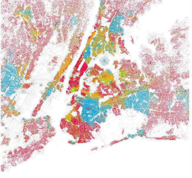
On the maps, red = White/Caucasian, blue = African American, green = Asian, orange = Hispanic, and gray = Other. Each dot represents 25 people. At Fischer’s website, if you hover over the images you can identify individual neighborhoods/regions.
Here’s NYC, which not surprisingly has the highest apparent population density of any of the cities mapped and a high level of diversity, though also clearly the racial/ethnic groups are residentially segregated to a large degree:
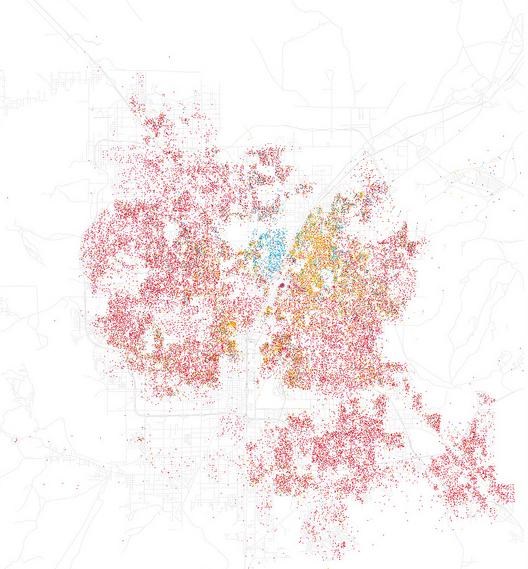
 Vegas still shows the distinctive residential segregation of African Americans that first emerged when they were forced to live in a segregated neighborhood called Westside, physically separated from other parts of town by Boulder Highway (see Las Vegas: The Social Production of an All-American City for a history of its development), and the predominantly-White neighborhoods ringing the Vegas Valley:
Fischer has up 102 different city maps, so there’s lots to play with and compare.
Originally posted in September, 2010.
Gwen Sharp is an associate professor of sociology at Nevada State College. You can follow her on Twitter at @gwensharpnv.
Comments 20
Yngve Digernes — September 24, 2010
Why is "White/Caucasian" listed as a "racial" category and the other groups listed as ethnicities? Shouldn't sociologists have enough sense to refer to people as European-Americans rather than "White/Caucasian"?
Starfoxy — September 24, 2010
One interesting thing about the Phoenix map that people unfamiliar with the area might miss is on the right hand side of the image. That clear line between densely populated area and sparse population isn't a physical thing like a mountain, or river, or lake. That is the border of the Pima Maricopa Indian Reservation.
http://www.srpmic-nsn.gov/economic/
SaintPeter — September 24, 2010
There was some research and simulations done by Thomas Schelling a few years ago about the dynamics of segregation. Researchers built some simple models that showed that the bulk of individual choices tends to create "naturally occurring" segregation.
The theory goes that, even if two groups are perfectly happy to live near one another, they also prefer not to be a "minority" in the area they live. So when people individually choose to live near others who are like them, or not move into areas where there are few like them, over a few years you end up with de facto segregation.
Here is a high level explanation of the simulator and theories:
http://www.faculty.ucr.edu/~hanneman/spatial/schelling/schelling.html
Here is the simulator (Requires Java):
http://www.dartmouth.edu/~segregation/index.html
Obviously, real life is not as simple as the model - there are many other historical, economic, and social effects that come into play. I just think it's interesting to see how choices by individuals can combine to create complex and seemingly directed behavior.
A. D. Pask-Hughes — September 24, 2010
I'd be willing to bet that any visible changes between these maps and those based on 2010 data are negligible. Considering each dot represents 25 people, you'd need huge numbers of one group being 'displaced' by another in order for the statistics to have any impact graphically.
Having said that, as I'm from the UK, I'd love to see similar maps for UK cities. My guess is that UK cities (certainly if you don't include London) won't exhibit the same extent of segregation that is quite clear in the case of the Chicago map.
Sadie — September 24, 2010
Yes, it would be interesting to see some major international cities (London, Paris, Toronto, Vancouver, Berlin, Hong Kong and so on). These are incredibly fascinating!
Syd — September 24, 2010
:D I can see my dinky suburb from here!
Heather Leila — September 24, 2010
I'd be very interested in seeing the New Orleans map updated with 2010/post-K data. The 2000 map shows almost no Hispanics anywhere in the city. That has certainly changed by now.
renee — September 25, 2010
Woo hoo! Portland, ME made the top 102! I'm sure we'll see changes after the 2010 census--the peninsula (the most densely populated part) now has a large population of African immigrants, so while you can't really discern any blue dots in 2000 (I blew it up to look), you definitely can now.
Timm! — September 27, 2010
Yes, as a life-long resident I can tell you Boise is very white, but I don't think the 2010 data would be as nearly uniform. We've had a lot of immigration, particularly from African Nations in the last decade.
LIE Links | Love Isn't Enough - on raising a family in a colorstruck world — September 28, 2010
[...] Maps of Racial/Ethnic Populations in U.S. Cities [Sociological Images] [...]
Waiting Room Reading 9/28 « Welcome to the Doctor's Office — September 28, 2010
[...] Maps of Racial/Ethnic Populations in U.S. Cities [...]
Around the Web | Savage Minds — October 8, 2010
[...] If you haven’t already seen this Flickr set of maps of major U.S. cities illustrating residential segregation as recorded by census data take a long break and flip through them. There’s 103 to view, so if you want to get the main points in digest form check out Gawker or Sociological Images. [...]
Ladybird: What we think is cute wants to kill us. | Anders Herzberg.com — May 10, 2012
[...] Don’t believe me, take a look at these maps of the US broken down along Racial lines. http://thesocietypages.org/socimages/2010/09/24/maps-of-racialethnic-populations-in-u-s-cities/ Clear Racial lines are drawn as the “hyphen” Americans wall themselves off from others. [...]
Friendly neigborhoods - City-Data Forum — January 3, 2014
[…] […]
Dreddy — July 7, 2021
Well, thanks for your info! I will definitely save it for my apkworlds
Cailan Phylicia — June 20, 2023
You might also like:CharlotteOlympia 'Encore' Shoe Collection 2013Charlotte OlympiaCruise 2013 ShoesPhotos: Charlotte Olympia. Air Jordan Shoes