Many of you may have heard about NPR’s decision to fire commentator Juan Williams last week after he appeared on The O’Reilly Factor and made the following comments:

Look, Bill, I’m not a bigot. You know the kind of books I’ve written about the civil rights movement in this country. But when I get on the plane, I got to tell you, if I see people who are in Muslim garb and I think, you know, they are identifying themselves first and foremost as Muslims, I get worried. I get nervous.

Williams was widely criticized for the remarks after video of his appearance showed up on a number of liberal websites, and NPR quickly fired him, arguing that his comments about Muslims discredited him as a commentator (more on that below).

Muriel Minnie Mae, Duff M., and an anonymous contributor all let us know about the site Pictures of Muslims Wearing Things, created in response to the incident. The site deconstructs the idea of “Muslim garb” by showing…well, pictures of Muslims wearing things. New images (with awesome captions) are currently going up every few minutes, and it’s a great example of the diversity that exists among Muslims, variety that tends to get ignored in stereotypical depictions of Muslims (who are often conflated with Arabs and Middle Easterners, though the world’s largest Muslim population — over 200 million — is in Indonesia and only 20% of all  Muslims live in the Middle East and North Africa).

Even in the cases where individuals are wearing something that others might identify as clearly “Muslim”, such as hijab, is it fair to say they are “identifying themselves first and foremost as Muslims,” as Williams stated? Is it that Dalia, above, is stressing her Muslim identity above all else (say, more than being a professional, with the suit, or a married woman, with a wedding ring) by covering her hair? Or, perhaps, does covering her hair make individuals who are uncomfortable with Muslims unable to see her as anything but “first and foremost” a Muslim?

Side note: Since this post brings up the whole Juan Williams situation, I think I would be remiss if I didn’t point out that a number of commentators argue Williams’s comments are being unfairly decontextualized with a selectively-edited video. If you watch the full segment, he starts out with the comments above (the only part that got widely distributed), which indicate a personal discomfort with Muslims, but goes on to disagree with O’Reilly, saying that we don’t blame all Christians for the actions of Timothy McVeigh and that the concern should be not about Muslims, but about extremists. William Saletan of Slate says,

I’m not saying Williams is the world’s most enlightened guy. He’s wrong, for example, about the proposed Islamic Center near Ground Zero. And it’s certainly unsettling to hear him admit that he worries when he sees Muslims in distinctive dress. But admitting such fears doesn’t make you a bigot. Sometimes, to work through your fears, you have to face them honestly. You have to think through the perils of acting on those fears. And you have to explain to others why they, too, should transcend their anxieties or resentments and treat people as individuals.

Gwen Sharp is an associate professor of sociology at Nevada State College. You can follow her on Twitter at @gwensharpnv.

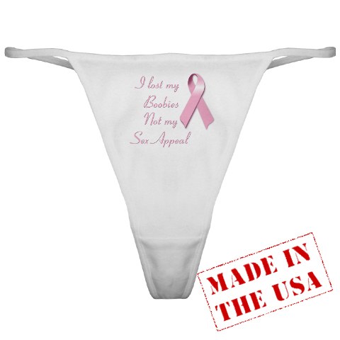
October is National Breast Cancer Awareness Month. Accordingly, during October we come across more than the normal number of pink-ribbon-adorned items that variously give a portion of proceeds to breast cancer research, remind women to conduct breast exams, contain supportive messages for breast cancer survivors, or just sort of, you know, support the existence of boobs and oppose cancer. For instance, Alicia, the moderator of Think Before You Pink, found this thong

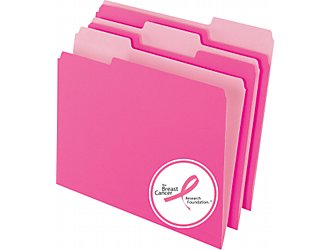
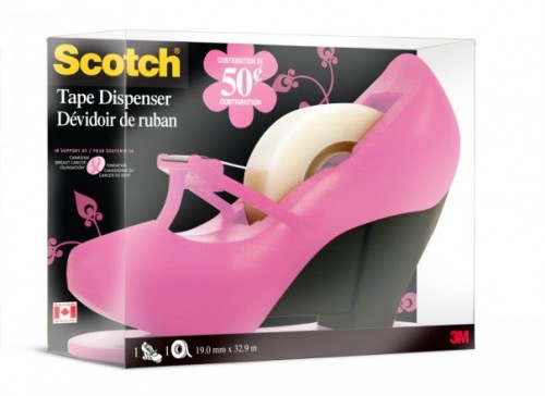
And Renée Yoxon noticed that Staples, among other office-supply stores, has a lot of pink ribbon products for sale, including pink-ribbon paper, file folder, calculators, daily planners, pens, and, in Canada, a tape dispenser from 3M shaped like a high-heeled shoe:

We’ve posted on the whole issue of breast cancer awareness branding before. And one response that always comes up is, basically, yes, companies may be using breast cancer as a marketing tool to increase sales, but if by doing so they also donate money for breast cancer research or prevention, who cares? By buying pink-ribbon address labels, money goes to fight breast cancer that probably wouldn’t have been donated otherwise, so the net effect is good, right?

In his book Buying In: What We Buy and Who We Are, Rob Walker suggests perhaps not. He summarizes a number of studies that found that “doing good in one area of life provided a rationale to worry less about such things in another” (p. 222). Specifically, feeling they had contributed in some way (by imagining they had agreed to volunteer at a community organization) significantly increased subjects’ preference for “luxury” items. It appears that feeling we have done a good deed makes us feel like we deserve rewards in other arenas, or at least frees us to make decisions we might otherwise be a bit embarrassed about.

Walker connects this research to the wide array of companies that either create a particular product that is slightly more eco- or labor-friendly than their regular line or that donate a tiny portion of profits to a charity of some sort. He suggests that the ability to easily “do good” through consumption — that is, I can choose the pink-ribbon file folders and feel good about myself for being a good citizen — may contribute some money to a particular charity, but may ultimately lead us to be less concerned about the impacts of our other consumption choices. As Walker summarizes the effect,

These various efforts each add just enough options to the miles of retail shelves to give us all an ethical fix — to do our one good shopping deed. Then we can push our basket a little farther down the aisle, letting other rationales take over: Here’s a bargain, here’s a great product…and here, yes, here is something ethical. I’ll take one of those, too. (p. 223)

From this perspective, this type of branding may benefit companies not just by making it more likely we’ll buy the specific product they’ve attached a pink (or red, or yellow, or whatever color) ribbon to, but by satisfying our need to feel like we’re aware, concerned consumers, and thus making us less likely to question the production practices of the other items we’re choosing among.

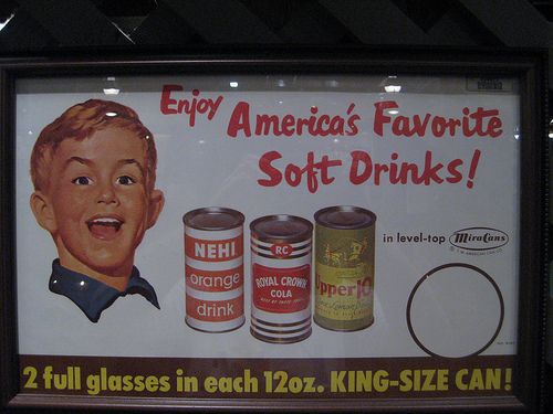
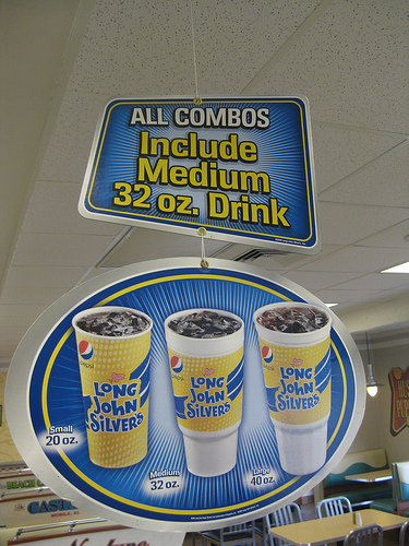
As we’ve talked about before, one marketing strategy to get people to buy more stuff is to manipulate sizes. In the case of clothing, companies often use “vanity sizing,” labeling clothes as a smaller size than they really are. Food serving sizes have followed a form of vanity sizing of their own, with portions getting larger over time. Ben Ostrowsky sent in a great example of changing norms of consumption, highlighting the enormous increase in what is considered a standard serving of soda.

In this 1950s ad for soda, the text proudly proclaims that a 12-oz. can is “king-size,” and includes 2 full servings:

Compare it to this sign at Long John Silver’s, where the smallest size is 20 oz., and a 32-oz. medium soda, presented as the default size, is nearly 3 times as large as the 1950s king-size double serving (though, as a reader pointed out and I didn’t think to mention, we do have to make some allowance for ice in the cup):

The gas station nearest me used to have fountain drink cups that started at 20 oz. I noticed recently they’ve completely dropped that size; the smallest cup you can now buy is 32 oz. The largest is a whopping 64 oz. I am actually curious how a person gets it home in their car, as I don’t see how it would fit in a standard cup holder. Perhaps you buckle it into an empty seat?

Of course, the larger the default size, the more product a company sells. For other examples of the push to increase portions or serving sizes, see Lisa’s post on manufacturers’ instructions for use.

Emma M.H. sent us a link (via Jewish Philanthropy) to a study by the Center of Philanthropy, at Indiana University, about differences in financial donating by men and women. The report looks at data from a 2007 nationally representative survey of households, in which respondents were asked about their charitable giving in 2006. To isolate differences in giving, the report includes data only on single heads of household (whether never-married, divorced, or widowed), since in married households it’s difficult to distinguish who made the decision to donate (they point out that the literature is also very clear that married households are much more likely to donate than non-married households). You can get a copy of the actual questionnaire here.

They break the data down by income as well, dividing them into quintiles (that is, each category contains 20% of respondents). The income quintiles are: Q1 = $23,509 or less, Q2 = over $23,509 but less than $43,500, Q3 = over $43,500 but less than $67,532, Q4 = over $67,532 but less than $103,000, and Q5 = $103,000+.

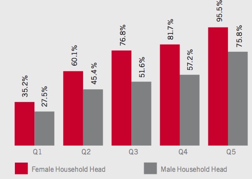
As we see, in each income category non-married women were more likely to donate to charities of some sort:

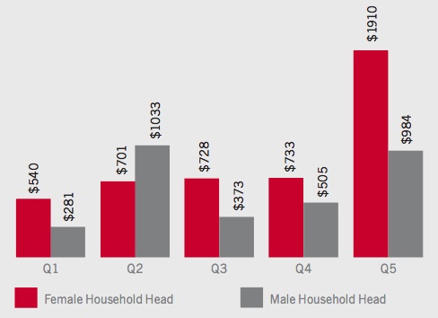
Women also generally gave more:

It’s interesting to me that the total amount of the giving doesn’t vary more by income for non-married women (the amount of reported giving is basically the same for the 2nd, 3rd, and 4th quintiles), yet varies so much for non-married men. Thoughts on what’s going on there?

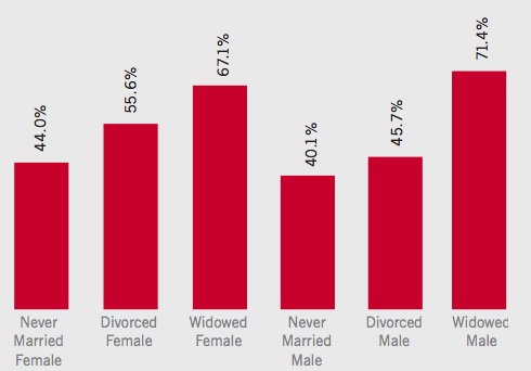
Likelihood of giving also varies quite a bit depending on type of single status — those who are widowed are quite a bit more likely to donate than the never-married, which is probably partially a factor of age and related factors like generally higher incomes/wealth:

As we’ve posted on in the past, women are also more likely to be involved in volunteer work.

I’d love to see a breakdown of where men and women donate, but the report didn’t provide that level of detail.

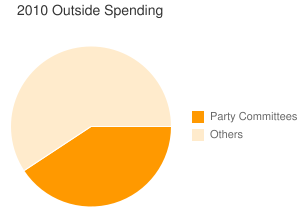
The Sunlight Foundation, a non-profit group interested in government transparency, has a couple of charts that reflect the enormous growth in spending by outside groups (i.e., organizations other than the parties or the candidates themselves):

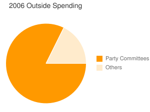
According to data obtained from the Federal Election Commission, fifty-nine percent of all outside spending on independent expenditures has come from non-party aligned groups while only forty-one percent comes from the party committees. This is a dramatic change from the 2006 midterms (as of October 19, 2006) when party committees accounted for eighty-two percent of all outside spending on independent expenditures and non-party aligned committees accounted for eighteen percent.

This includes those that actively support or oppose a candidate and advocate voting in a particular way; it isn’t counting the independent “electioneering communications,” where groups take a clear stance toward a candidate’s policies but don’t explicitly say to vote for or against them.

Here is the breakdown of spending from 2006:

And 2010:

Of course, the major cause for this was the Supreme Court’s decision in Citizens United v. Federal Election Committee. The decision allows outside groups to spend unlimited amounts and to actively take positions in ads, as long as they don’t specifically advocate voting for or against candidates and don’t coordinate with campaigns. They also are not required to disclose their donors.

Both Democrats and Republicans receive support from such groups, though Republicans benefit more thus far. For a breakdown of specific types of spending (including both independent spending and electioneering communications), the Sunlight Foundation has a great database here.


Michelle N. sent us a video by the ever-fabulous Sarah Haskins, this time on the use of scientific imagery and language in skin care commercials. Michelle says,

In these advertisements, complex, scientific-sounding language is used to obscure the actual simplicity of the beauty product and the “conditions” they aim to correct (body-aging anyone?)…Since when do we refer to lotion as a “serum”?


Prolific sender-inner Dmitriy T.M. found a fascinating PSA from the New York State Department of Health aimed at encouraging women to breastfeed (via the NYT). What’s their angle? Why, breastfeeding as a diet plan, of course! See for yourself:

They certainly  manage to get the tone of a diet commercial down perfectly. And don’t ever forget, ladies: one of your main responsibilities as a new mom is to lose the weight as quickly as possible.

As Lauren Feeney points out at The Daily Need, getting women to increase rates of breastfeeding will likely require more than efforts to change individual behaviors — it requires changes in the workplace and family leave policies that make it possible for women to realistically combine breastfeeding with the demands of their jobs.

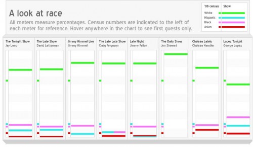
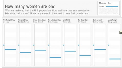
Dmitriy T.M. sent in a link to an interesting breakdown of the race/ethnicity and gender of guests on a number of late-night talk shows, found at Edlundart.

Edlund explains the methodology:

The data for this graphic was gathered over 6 weeks in August and September of 2010. Numbers are based on guest lists as presented on Late Night Lineups. Determining race/ethnicity can be a rather dicey and imprecise activity, and it’s also worth noting that the relationship between census and guest numbers is not a pure one – for example, some of the guests I counted as white are British white people who are visiting the United States.

Of course, a few guests were neither White, Hispanic, Black, nor Asian. These guests were left out, as their numbers were insignificant on the whole…

Edlund also points out that since The Daily Show only has one guest per night, it has a much smaller dataset than the others, so the lack of diversity may be somewhat overstated due to such a small sample.

Here are the results for race (presented as % of all guests); the small dots show the percent in the Census, the wider bars the percent on the show:

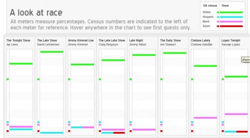
Here is the same data but for the top-billed guests only, where the over-representation of Whites goes up even more for most of the shows:

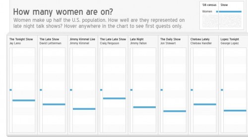
Here’s equivalent data for women:

And, again, for just top-billed guests:

As Edlund says, these data both reflect and reinforce broader cultural patterns. Given that Whites still dominate the political system, for instance, it’s not surprising that political guests would be disproportionately White; and if more movies have male stars than female stars, guest spots will reflect that as well. But at the same time, these shows include people from a range of industries/careers, and their selection of guests helps raise the profile of some individuals more than others, potentially contributing to more opportunities and star power for them. So they don’t just reflect existing realities; they amplify them.

It would be great to get more info on how an individual is selected when there are multiple possibilities — say, you have a movie with several prominent cast members. In that case, are there patterns related to race/ethnicity and gender in which person is most likely to get booked?