I’m always interested when I see ads that play on parents’ fears of neglecting their children as a way to sell them stuff. Middle and upper-middle class parents often encounter, and adopt, a parenting ideology that requires the input of lots of money, time, and emotional energy to be a “good” parent. Parenting is commodified into a set of things parents feel a lot of pressure to buy to prove that they love their children and care about their futures–and don’t want them to be social outcasts.

My mom got pregnant with me when she was 16 and I grew up decidedly working class, and the parenting style I was used to was basically, “The kid’s still alive, so I guess I did a pretty good job.” My mom may have taken this attitude to extremes a bit, since she was known to put me in a harness and tie me out to the clothesline so she didn’t have to keep such a close eye on me when she was busy around the house. Give her a break–she was a teenager! It seemed like a really good idea! (And admit it: there’s part of you that is thinking, “That’s brilliant!”)

My point is, I’m always interested in the ways we seem to always be raising the bar on what is considered good parenting, and “good” parenting is usually defined by middle class standards–though we also often criticize middle and upper-middle class parents for supposedly being distant and self-centered and for pushing their kids too much to succeed. So it’s a catch-22: working-class parents don’t have the money to buy a lot of the products or services we think loving parents must provide their kids, and middle-class parents who do provide them may be criticized for doing so.

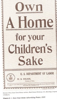
Anyway, the other day I came upon these two ads, both of which try to sell products by making parents afraid that if they don’t, they’ll be neglecting their kids. This first one makes it clear that this tactic isn’t new; it’s from 1919:

I found it in the article “Standardizing Childrearing through Housing,” by Paul C. Lukin and Suzanne Vaughan, in Social Problems, volume 53, issue 3, p. 299-331 (the poster is on p. 310).

I found this ad in a Las Vegas community magazine. The text lets you know that silver crowns can be unattractive, and that for your child’s sake you better pay for the white fillings (which are more expensive, and the extra cost is often not covered by dental insurance, even when people have it). I also like that metal fillings are called “bling.” Awesome.

Some of the text below the picture:

Being able to see the dental work in your child’s mouth is not always an appealing appearance. A healthy, natural looking smile for your child is our goal…Now you have a choice!

A couple of months ago, on a lark, I sent an email to Bitch magazine’s reviews department telling them about Sociological Images. If you’ve never read Bitch, you’re missing out–it has great articles on various elements of pop culture, and my only complaint is that it only comes out four times a year.

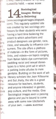
Anyway, this afternoon issue no. 40 showed up in my mailbox…and look what’s #14 on “the bitch list: an annotated guide to some of our favorite things”:

It’s on p. 71. Sadly my follow up email about the website address change got lost, so it has the old web address, but still! Yay!

This may overshadow the day I passed my Ph.D. defense in terms of excitement.

Dawn A. sent us these posters for The Sarah Connor Chronicles.  Notice how, in three out of four posters, the women are not making eye-contact and, in all of them, they are in a passive pose with a passive facial expression.  Dawn adds:

I’m alarmed by the disembodiment of the character.  While she may be a part of the Terminator series, would we ever see Arnold Schwarzenegger (or other male characters) portrayed like this in posters?

Thanks Dawn!

NEW: After a discussion with my friend Jason, I decided to offer some more images and commentary as food for thought.

Here are the Terminator posters I could find featuring Schwartzenegger.  There are a lot of things separating and potentially separating these posters from those above other than gender: about 20 years, maybe the moral of the movies/series or the feeling of the show, and surely producers/directors etc.  Even so, I think it’s worth putting up the images for contrast.

Back to The Sarah Connor Chronicles:  Below are some additional promotional images that do not reproduce the passivity we see in the first set.  Word on the street is (or so I have heard some people say), the women are not as feminized in the series as they are in the promotional material (which, if true, is interesting in itself).

Still, Jason notes that the empowerment of the women in the series as protectors, comes at the cost of disempowering John Connor and that disempowerment is achieved, in part, through his feminization.  His task, then, as the series progresses, is to finally become a “man.”  At that point, supposedly, he would no longer need the protection of women. 

So, femininity is still associated with weakness.  And, insofar as femininity is equated with weakness, and women are more-or-less required to do at least some femininity (lest they be called “dykes” or “bitches”), women are more-or-less required to appear at least a little bit weak in their daily lives. 

The images below are from a slide show to accompany the cover of a British magazine, Bizarre. You can see the slide show and the article accompanying her cover here. Thanks to Jason S. for the link!

What makes Viktoria “bizarre”? Is it her amputated leg? Is it the fact that she has an amputated leg and is still incredibly sexy? Or is it that she has an amputated leg and still considers herself a sexual person?

Is this empowering? And to who? Surely the disabled are desexualized in this country, so it’s nice to see that challenged even, I suppose, in a magazine about weirdos. And yet, I suspect her sexuality is acceptable, fetishizable, only because she conforms to expectations of feminine beauty. In the big scheme of things, does she reproduce the standard of beauty, unattainable for most women, that crushes women’s self-esteem and sense of self-worth? And will disabled women, most of whom (like most non-disabled women) could never dream of being so beautiful, actually look at her and be able to identify? Or will this just draw attention to another way in which they don’t match up?

Also, are these images really about her sexual-ness, her desire? Or are they about how sexy she is, the extent to which she can inspire desire in others? That is, is she just an object like any other pin-up girl? How are her images any different than those in mainstream pornography and men’s magazines? She speaks in the article about her own sexual curiosity and openness, but this is standard porn star talk and it’s very difficult to know whether it is genuine or performance. Would it matter if we knew?

This photo shoot of Viktoria for Bizarre magazine actually seems incredibly ordinary to me.

UPDATE: Comments on this post have been closed.

This is a two-page ad for the Tiguan, a “compact” SUV from Volkswagen. Whereas most SUV ads stress how big and powerful they are (often using images and language that associate them explicitly with masculinity), this one does the opposite–its small size compared to other SUVs is an asset in these ads.

I wonder who the target audience for the Tiguan is supposed to be. And are gas prices finally affecting what people are looking for in vehicles? Is being huge no longer the positive characteristic it was, like, 3 months ago?

As you may recall, we’re now occasionally adding to previous posts instead of creating new ones. Below is a list of our newly enriched posts for your perusal.  Look for the bold, red “NEW.”

But first!

Ongoings that have been going on at Sociological Images:

Out of gratitude for your support, I put together a new page in which we link back to those of you who are linking to us.  Please feel free to peruse those of us who find us link-worthy and, if you link to us and don’t find yourself on our list, please send an email to socimages@thesocietypages.org.

I was honored that Racialicious asked to republish my post on the anti-female genital cutting ads.  I mention it here because it’s worth a look to see how differently my commentary was received on this versus that blog.  It might make for an interesting discussion about audience and positionality.

You might like to know that Sociological Images was “news” in Iceland!  Our post of an Icelandic cartoon featuring Barack Obama and Hillary Clinton caused quite the stir in the comments thread (a fascinating sociological phenomenon in its own right) and an Icelandic newspaper thought it worthy of coverage and commentary.  (FYI: We personally think “news” is overstating our relevance to current events… but who are we to judge!) 

And now!

Our enriched posts:

For context, we added a Wonder Woman comic book cover in which she claims to be “helpless” and uses her sexuality as a weapon to our post of a satirical Wonder Woman comic strip.  Thanks to Brady for the link!

It turns out the pseudo-feminist rescuing of women from the drugeries of housework without actually allowing them to opt out isn’t anything new.

Toph sent us a second Canadian Club ad that we added to this post illustrating hegemonic masculinity.  The second ad is useful for demonstrating the sexual double standard.

To our post about the way in which women were made to personify STDs during World War II, we added another poster, a matchbook, and a fascinating pamphlet that was passed out to soldiers. The pamphlet features “Gonnie” and “Syph,” two “gals” who “travel around arm-in-arm with ‘easy’ women.” All were submitted by Marc.  Yay!

If you enjoy our posts about the social construction of girlhood, you’ll enjoy the two T-shirts we added to this post that have sayings that depict little girls as future spoiled divas (scroll down). Sent in by aa bb. Thanks!

Craig T. sent in a Nestle Quick ad that we added to our post on “subliminal” sex in advertising (scroll down a ways). Thanks Craig!

We added a second example to this post about the way in which “scoring” with women is equated with success at sports.

A recent PETA protest included women in bikinis posed as “chicks” in cages. We added the image to our post about the way in which PETA sacrifies the humanity of women and men in order to save animals. Is it too strong to say that PETA “sacrifies the humanity” of men and women? I’m not sure. Isn’t that what objectification is? And what does it mean when they dress women up as animals and put them in cages? It’s your call. Visit the post (scroll about halfway down). Found thanks to Feministing.

Meghan B. sent us another Svedka fembot ad. This one calls for us to “support socialized plastic surgery” and features a grossly disproportionate “robot” version of an idealized female body.

If you “enjoy” Axe ads, check out our newest one here, sent it by Krystal-Lynn M.

To this post about the use of spread legs as a repetitive design motif, we added this very different image of Michelle Obama as seen through Barack Obama’s legs… a very interesting comparison!

We added a second commercial in the Carl’s Jr. it’s-hot-to-be-covered-in-condiments theme to the x-rated Paris Hilton one. This one involves eating a hamburger while on a mechanical bull. Sexily, of course.

As if we didn’t have enough on the conflation of hot women with hot food, we added a commercial for Pot Noodle in which the woman literally becomes noodles to one of our posts on the sexualization of food. We also added a coffee ad from the Netherlands to this post about gender and food (you gotta scroll way down for that one). Thanks to Penny for that last one!

We added three more ads to this post about gender and “meanness” in car ads. They are useful for illustrating, as Gwen points out, “that advertisers have many different motifs and meanings to draw from when creating marketing strategies, and that the ones they pick are just that–CHOICES among many, many different ways you could advertise a product, none of which are necessarily more ‘obvious’ or ‘natural’ than others.”

Rap is fascinating in that, in the short history of the art form, it represents both the power of resistance by marginalized and disempowered groups and the power of appropriation by mainstream culture and capitalist commodification.  With this in mind, I bring your attention to the cover of Nas‘ new album cover (tentatively set to release on July 1st) (found here):

The image immediately brings to mind (I can only imagine deliberately) the famous photograph of the back of a whipped slave from 1863 (found here).  I’ll go ahead and put it after the jump, as it’s a very real and troubling historical photograph:

more...

Caroline Cossey (also known as Tula) is a British male-to-female transsexual who had a successful career as a model and some small movie roles; Cossey also appeared in Playboy in 1981. In 1982 a tabloid broke the story that she was a transsexual, which ended her modeling career. Here is the cover (found here) of her autobiography, which she wrote soon after being outed:

Cossey was born with Klinefelter’s syndrome, a form of genetic intersexuality.

Here are some other pictures of her:

Found here.

Found here.

You can watch a segment on her that aired on the TV program Hard Copy here.

These might be interesting for discussions of intersexuality, sex-reassignment surgery, and our ideas of the gender binary that everyone must fit into–as well as the outrage people often feel if they’ve been “fooled” by someone who manages to “pass” as a gender different from what they “really” (read “biologically”) are. You might compare this to the story of Brandon Teena, a female-to-male transsexual who was raped, beaten, and murdered by two men in a small town in Nebraska in 1994 after they discovered he was a transsexual (who had not had sex-reassignment surgery). Teena was, of course, the subject of the movie “Boys Don’t Cry,” but there is also a documentary about him, “The Brandon Teena Story,” which includes interviews with his girlfriend and members of the community.