
Originally Posted at Montclair SocioBlog
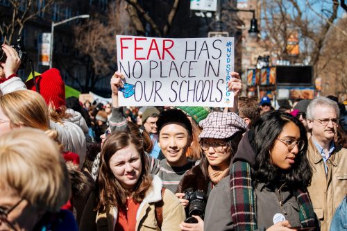
A question that few people seem to be asking about Enough Is Enough and the March for Our Lives is: Why now? Or to paraphrase a question that some people soon will be asking: How is the shooting at Marjory Stoneman Douglas High School different from other school shootings?
There’s #MeToo and #Time’sUp, of course. These may have inspired advocates of other liberal causes like gun control. But just three weeks earlier, a 15-year old in Benton, Kentucky brought a handgun to school and started shooting – 2 dead, 18 injured. The incident evoked only the usual responses, nothing more.
Here’s my hunch: when I first saw the kids in Parkland speaking out, organizing, demanding that adults do something, I immediately thought of a sociology book that had nothing to do with guns –Unequal Childhoods by Annette Lareau published in 2003.
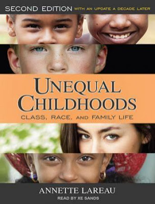
These high-schoolers, I thought, are the children of “concerted cultivation.” That was the term Lareau used for the middle-class approach to raising kids. It’s not just that middle-class parents cultivate the child’s talents, providing them with private coaches and organized activities. There is less separation of the child’s world and the adult world. Parents pay attention to children and take them seriously, and the children learn how to deal with adults and with institutions run by adults.
One consequence is the notorious sense of “entitlement” that older people find so distressing in millennials. Here is how Lareau put it:
This kind of training developed in Alexander and other middle-class children a sense of entitlement. They felt they had a right to weigh in with an opinion, to make special requests, to pass judgment on others, and to offer advice to adults. They expected to receive attention and to be taken very seriously.
It is this sense of entitlement – the teenager’s sense that she is entitled to have some effect on the forces that affect her life – that made possible the initial protests by the students at Marjory Stoneman Douglas High School. And once word of that protest spread, it was this same sense of entitlement, these same assumptions about their place in the world, that made so many other high school students join the movement.
Conservatives just could not believe that kids could or should be so adept at mounting an effective movement or that they could or should speak intelligently about political issues. So right-wing commentary insisted that the students were paid “crisis actors” or pawns of various forces of evil – adult anti-gun activists, the media, or the “deep state.” They also claimed that the students were “rude” and that they did not have standing to raise the issue of gun control.
[the students] say that they shouldn’t be able to own guns even though they can go to war, but they think that they should be able to make laws. None of this makes any sense at all. (See the excerpts in the transcript here.)
In a way, Fox and their friends are hauling out the old notion that children should know their place. But the motivation isn’t some newfound independence, it’s middle-class values. As Lareau says, concerted cultivation makes children far more dependent on parents than does the “natural growth” parenting more common in working-class families. Besides, foreign visitors since the early days of the republic have remarked on the independence of American children. What’s new, and what is so upsetting to exponents of older ideas, is how parents themselves have taught teenagers to demand that they have a say in the decisions that shape their lives.
Jay Livingston is the chair of the Sociology Department at Montclair State University. You can follow him at Montclair SocioBlog or on Twitter.


 Originally posted at