Do we have enough historical context when we talk about race in America?  This past week there was a celebration of Screen Shot 2013-09-01 at 2.32.44 PM
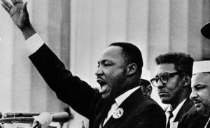
the 50th anniversary of the March on Washington for Jobs and Freedom. This larger historical event included Dr. Martin Luther King Jr.’s “I have a dream…” speech.

First, I think we are too quick as a society to want to talk thoughtfully about something as it is happening (e.g. multiple 24-hour cable news networks, Twitter, etc). With our students I think we need to encourage Screen Shot 2013-09-01 at 2.34.43 PMthe idea that critical thinking takes time and rigorous reflection. That doesn’t mean we can’t discuss events as they happen, but too often, in the public sphere, that has become the extent of it. As academic researchers we know it can take years to formulate, collect, analyze, and publish rigorous research.

Back to the issue of race in the US…

Eighteen year-old college students seem to be at great risk of lacking any historical context (just ask them about the Cold War). This is especially true regarding race. The idea of racially segregated services, restaurants, busses, drinking fountains and more supported by Jim Crow laws seems foreign to many. That is a good thing in many respects, but for a complete understanding of race in the United States, we all need a taste of what it used to be like in the not too distant past. After all, I was not alive then either.

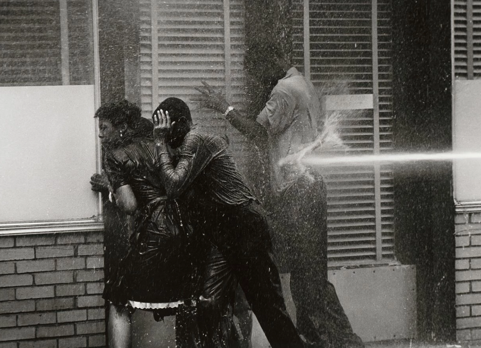
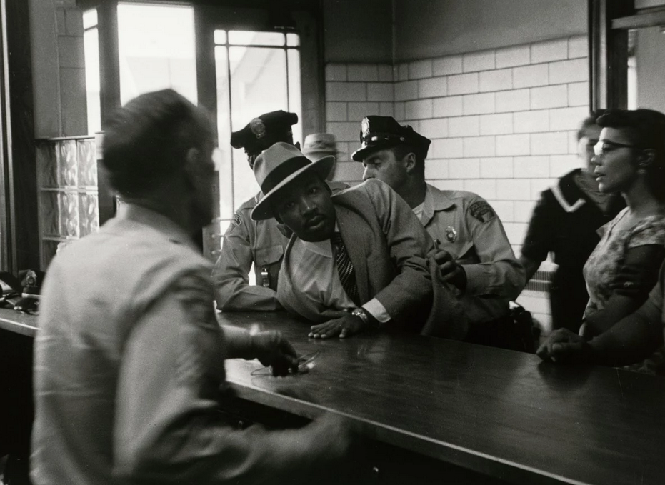
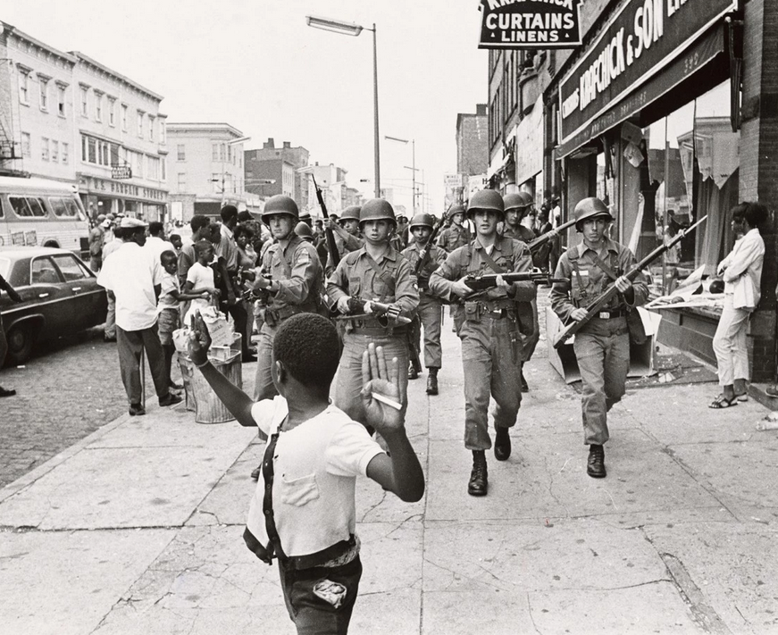
The first of two great resources for illumintaing this history is the Emmy-award winning film, Eyes on the Prize, a 3-DVD documentary covering the crux of the civil rights movement from 1954-1965. I do notScreen Shot 2013-09-01 at 2.38.39 PM show the entire film in my introductory courses, but some of the most striking footage is of the National-Guard-escorted integration of Screen Shot 2013-09-01 at 2.38.57 PM
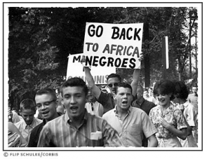
Little Rock’s Central High School. Also, if available, it may be valuable to dig up a bit of research on the integration of your college or university as well. It often brings the issue “home” when students discover that Blacks were not allowed into the student union until 1955, for example. You can find some clips on YouTube.

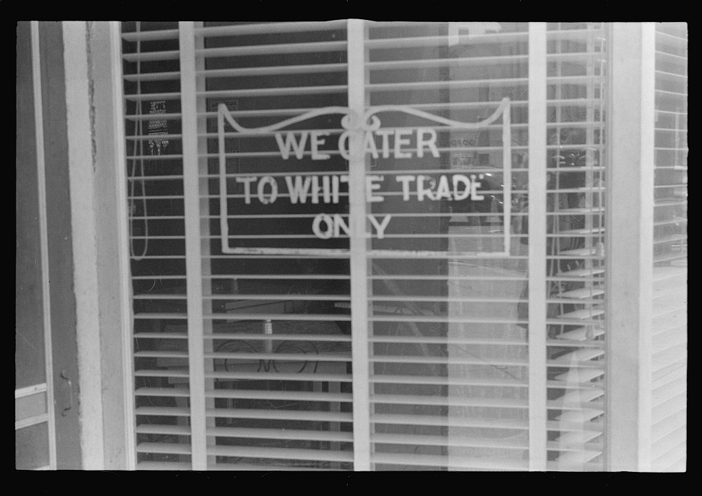
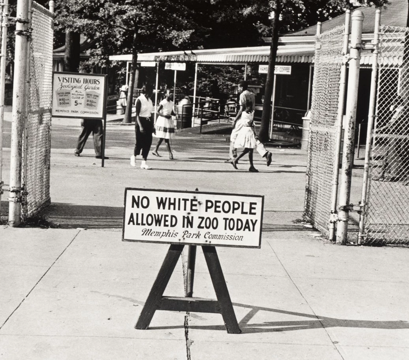
The other valuable resource was brought to my attention from a resource site maintained by Chad Gesser, an Associate Professor at Owensboro Community and Technical College. The Library of Congress Prints and Photographs Division has a collection of photographs documenting the enforced racial discrimination of the Jim Crow laws.

Jim Crow pic 7

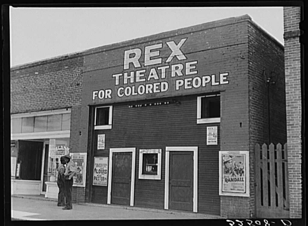
Fortunately, to most students, the idea of legal segregation seems preposterous, but it should not seem either impossible or unreal. It was very real and these photographs help bring that reality a bit closer.

Jim Crow pic 2

Jim Crow pic 8

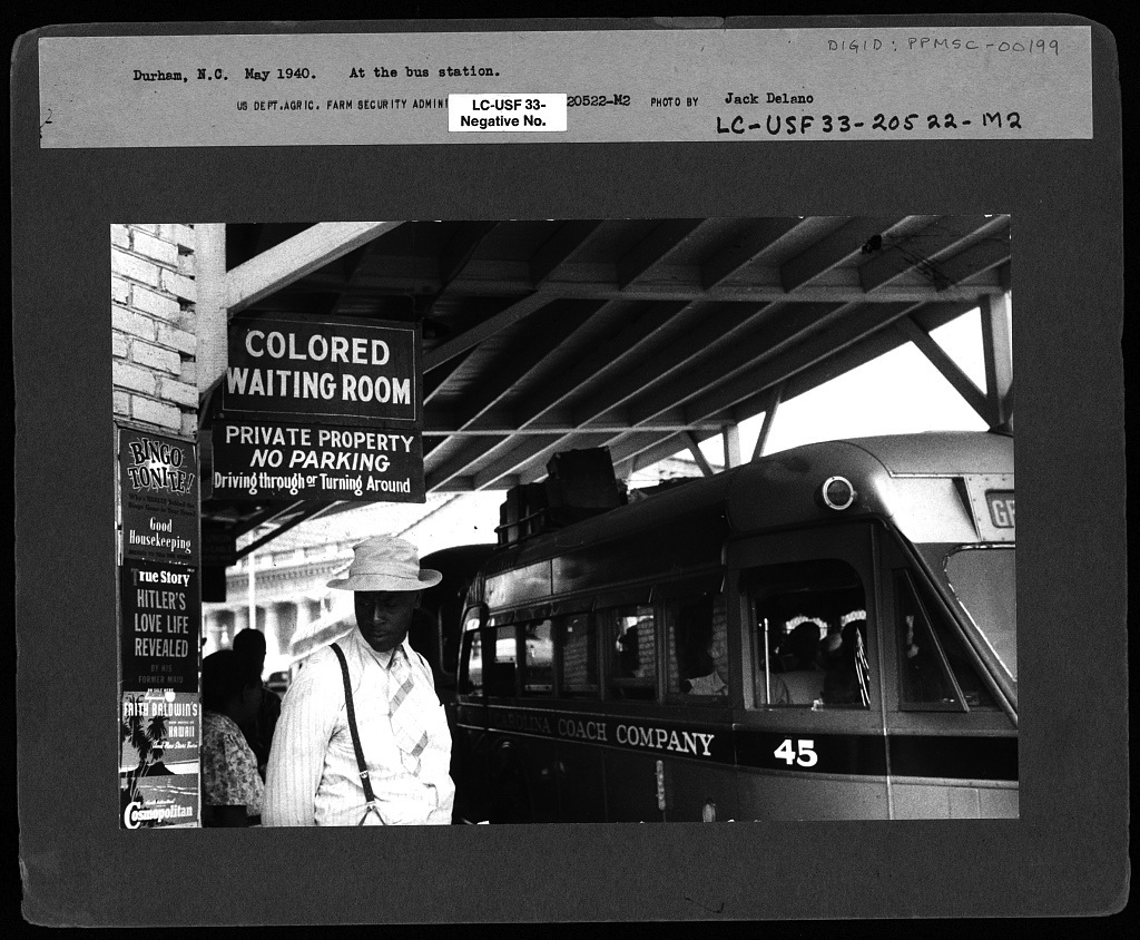
Making sure students understand the realities of the past is a necessary part of their fully comprehending the situation today.

Teach well, it matters.

. . .

ADDENDUMS

July 18th, 2015

The Washington Post published a photo essay, what they consider captures the definitive black American experience. I think it is very important to begin any class or section on race with a historical look. Few of today’s students have a concept of how far we have come and how bad it was.

See all of the photos here.

Screen Shot 2015-07-18 at 3.14.30 PM Screen Shot 2015-07-18 at 3.14.05 PM Screen Shot 2015-07-18 at 3.13.57 PM Screen Shot 2015-07-18 at 3.13.41 PM

. . .

Screen Shot 2013-08-19 at 11.46.40 AMScreen Shot 2013-08-19 at 11.47.01 AM

Race (still) matters. How do we best teach this and shake up some deeply engrained beliefs about a post-racial, color-blind society? I have found one of the best ways to teach the ongoing impact of race is through the issues of surveillance and racial profiling. There are numerous tools available to combine academic research with online videos and everyday media stories that awaken students to the ongoing impacts of race.

Arguably, racially biased surveillance and racial profiling played a key role in George Zimmerman’s decisions that led him to shoot unarmed black teenager, Trayvon Martin. Would he have made the same assumptions if Trayvon was someone other than a young black male wearing a hoodie? Other examples that demonstrate remaining societal racial bias about non-white males include:

  • Recently, plain clothes NYC police officers did not recognize out-of-uniform, off-duty (but sitting in a department-issued SUV with an ID around his neck) three-star police chief, Douglas Zeigler. He is Screen Shot 2013-08-18 at 6.52.47 PMAfrican American. Clearly, in the officers’ minds, his image fit closer to that of a criminal than their superior. Not even his departmental ID could alter the white officers’ belief that this 60 year-old black male was a trouble maker and not their commanding officer. They didn’t believe the ID was credible. His race trumped other credentials. Read more here.
  • This one first came to my attention via the blog, Sociological Imagination. New York city is home to one of the most aggressive “stop and frisk” programs that encourages/requires Screen Shot 2013-08-18 at 7.08.29 PMpolice officers to, well it’s all in the name, stop and frisk people on the streets. Again, one’s race matters, as it seems to determine if you in fact get stopped and frisked – if you appear “suspicious”. A 2012 report states that 84% of the 1.6 million stopped in 2010-12 were African Americans and Latinos. More data is available here.  This video recaptures one young person’s experience and some testimony from officers themselves. A federal judge recently declared the implementation of this program unconstitutional and may require police officers to wear cameras to document their actions. Mayor Bloomberg argues that it has made the city safer (trumping any concerns of the racial profiling).
  • I always use this next video in class, as it generates some real gasps (a key indicator of learning) among students. While not a scientifically controlled experiment (that fact should be used as another teachable moment in class), ABC news creates a situation in a public park where Screen Shot 2013-08-19 at 8.22.45 AMdifferent individuals attempt to steal a locked bike – a white male, a black male, and a white female. The white male is inquisitively questioned by passers-by but only one bothers to do anything beyond look completely perplexed. Take the same scene, same bike, location, and dress, but insert a young black male and within SECONDS he is confronted by people in the park, in fact a crowd gathers determined to take action. “Is that your bike?” The attractive white female actually gets assistance in cutting the lock, although the sample selection process could likely be skewed by video editing.
  • My last example for this post is the Screen Shot 2013-08-19 at 10.50.21 AMhighly publicized case of police treatment of Dr. Henry Louis Gates Jr. This case, similar to Chief Zeigler’s experience, shows that status is often not enough to overcome race. A Harvard professor, Gates had trouble getting into his own home near Harvard Square in the early afternoon when the lock became jammed. The police arrived to investigate a reported attempted break-in. One of his neighbors and the subsequently responding police assumed he was a burglar, not a frustrated homeowner. By this time Gates was already in HIS home and was able to show officers his drivers license and Harvard ID. He was still booked for disorderly conduct. President Obama commented on the event and Screen Shot 2013-08-19 at 10.55.41 AMeventually invited the arresting officer and Dr. Gates to the White House to talk over a beer. While not harrassed by the police, Obama was once mistaken as a waiter at a party when he was actually a state senator.

Race continues to matter as police officers and the general population continue to profile non-whites as more suspicious and lower status than whites. If you are white, like myself, you may not observe this occurring to others and subsequently not be aware of the additional surveillance and racial profiling that non-whites are subject too, even if they are police chiefs, Harvard professors, or state legislators. These vivid examples help us understand how racial profiling continues and we can’t rely on our individual observations or experience to make conclusions about racial groups’ collective experience in our society.

This is also a good case for teaching how structure is reflected in individual action. Here we see a larger, socially-constructed racial system embedding cognitive categories in individuals’ minds, over ridding other markers of status and driving assumptions of suspicion.

SOME ACADEMIC RESOURCES

Ronald Weitzer has an interesting article on perceptions of police bias in three different neighborhoods in a 2000 edition of Law & Society Review.

In 2005, Weitzer and Tuch wrote more about the determinants of public perception of racially biased policing in Social Forces.

This article by Schidkraut adds racial profiling based on Arab appearance for counterterrorism compared to racial profiling of black drivers in a post-9/11 world.

The Russell Sage Foundation has an entire working group on the issue of racial bias in policing with numerous resources.

This article in the Journal of Personality and Social Psychology by Eberhart, Goff, Purdie, and Davies investigates the visual processing that underlies racial bias and crime.

I will leave you with a positive note. Due to legal enforcement, it is getting easier for non-whites to catch a cab in NYC.

– Teach well. It matters.

ADDENDUM October 27th, 2014

Screen Shot 2014-10-27 at 9.23.20 AM

Recently a black teen in North Carolina was handcuffed and pepper sprayed in his own home after White neighbors called the police upon seeing him enter the home. DeShawn Currie, an 18 year-old Black male, is the foster son of an all White family. After returning home from school, he went downstairs to investigate noises only to find police with their guns drawn and pointed at him. He tried to explain but the police were not convinced. His frustration grew and the police eventually handcuffed and pepper sprayed him. It was reported that one of the officers pointed to the photos on the mantle of the family’s three White children as evidence that he did not belong there.

Screen Shot 2014-10-27 at 9.13.05 AM

How much wealth inequality do you think there is in the US? What is the ideal distribution of wealth? What is it in reality? Screen Shot 2013-07-31 at 2.00.22 PMThis is always an active and fascinating way to begin any section on inequality/stratification in the classroom. This resource, a 6:23 minute video, visually demonstrates the stratification of wealth and answers those questions. (The short answers are a lot, somewhat fair, and way more than your think!)

I usually begin class by drawing fiveScreen Shot 2013-08-01 at 4.59.58 PM stacked layers (rectangles) representing each income quintile, but I leave off the income amounts that distinguish each level. I usually have to take a minute to explain the idea of a quintile and that each block represents 20% of the total population of households (in this case). When explaining this, be sure to note whether the data you are presenting is individual or household levels and income or wealth. Most of the time, because of available data, I focus on household income.

More than just an understanding of the levels of stratification of income in the US, this activity demonstrates to the Screen Shot 2013-07-31 at 2.03.09 PMstudents that our individual assumptions about the state of society can (and maybe even often) differ from empirical facts (what I like to refer to as reality). Plus, showing students how wrong their assumptions are reminds them that they are learning something in your class (this may be worth pointing out on occasion just in case there is doubt).

I usually start at the top, “What’s the minimum level of annual income that places a US household in the top 20%?” The initial guesses by students usually land between $200,000 and $350,000, occasionally as high a half million. The REALITY is that a household income of just over $100,000 places one in the top 20% (in 2011 dollars). An income of $186,000 or more places a household in the top 5%. Check here for the most up-to-date numbers from the US Census.

A previous post linked to a good visualization of the income inequality in the US asked individual viewers to indicate what they thought it should be and what they thought it was, but unlike the video featured in this post, it did not show collectively what individuals thought it should be and actually is. “What does everyone else predict?” Another difference is that this resource primarily looks at the distribution of wealth, although it jumps to income occasionally (encourage your students to watch with a critical eye because, although correlated, there is a difference between wealth and annual income).

Data sources listed for the video are secondary, but here are some useful primary sources:

The US Census “Income” page that has numerous reports and downloadable data. http://www.census.gov/hhes/www/income/index.html

Screen Shot 2013-08-01 at 4.14.39 PM

The AFL-CIO’s page on CEO salaries relative to the average worker. This site also has information on levels of productivity, potential revenue from taxing profits, and a tool to search the CEO pay of specific companies

For a global perspective, this database allows you to look over time across numerous countries: The World Top Incomes Database Screen Shot 2013-08-01 at 4.20.31 PM

“Income Inequality in the United States 1913-1998” by Thomas Piektty and Emmanuel Saez in The Quarterly Journal of Economics (find their tables and figures in Excel here). By the way, this article has been cited over 1400 times since 2003.

Building a Better America−−One Wealth Quintile at a Time by Michael I. Norton and Dan Ariely (author of Predictably Irrational) in Perspectives on Psychological Science


Often we are not consciously aware of the prevailing social norms that dominate our culture until they are violated. Many faculty demonstrate the power of social norms to their students with an assignment for them to engage in norm violations – intentionally altering their behavior outside of the classroom to see how others react and how it disrupts social interaction. The risk of this assignment is that students take the norm violation too far, harming others or getting in trouble (try explaining to the Dean that you actually assigned them to do that). Therefore, rules and guidelines must be made clear if this is assigned.

Due to the risks, I tend to enact or discuss examples in class – facing the “wrong” way in a full elevator, acting like a crazed football fan at an opera (including bringing one of those big foam number-one hands), wearing a tuxedo to class, what it means to “act white”, doing gender, etc. One of the most effective and funniest examples I have found that has also received good response from students involves the use of cell phones in public.

A clip from Larry David’s television show Curb Your Enthusiasm clearly demonstrates that theScreen Shot 2013-07-25 at 9.03.45 AM norms around cell phone use in public remain in flux as the technology becomes increasing pervasive in our individual and social lives. The clip shows Larry trying to enjoy a meal alone in restaurant. Someone on a Bluetooth headset next to him interrupts his experience by yapping away. I’ll let you watch the rest.

It is a short clip, just under 2 minutes, so it does not consume too much of that precious class time. Also, cell phones and their norms of use are an issue that seems easy for students to relate to and provide additional examples or personal anecdotes. “What age is it appropriate for children to own a cell phone? When is it appropriate to answer and talk on your phone?Screen Shot 2013-07-25 at 9.04.13 AM When is it not? Why do we feel the need to answer the phone every time it rings?” You can always come back to this example later in the semester when, inevitably, one of your students’ cell phones will ring during class, or worse yours! “Woops!”

While not of great social significance, this norm violation is a good way to begin the discussion, generate laughter (which refreshes students’ attention), and demonstrate the social processes of norm enforcement. From here, you can make the leap to the power of social norms of more consequence.

*A note of warning, if you are not comfortable with cussing making an occasional appearance in your classroom, you will not want to use this f#@king clip.

A few related pieces of academic research (click on the title to link to the piece):

“Making Sociology Relevant: The Assignment and Application of Breaching Experiments” by Adam Rafalovich

“Random Acts of Kindness: A Teaching Tool for Positive Deviance” by Angela Lewellyn Jones

Constructions of Deviance: Social Power, Context, and Interaction, edited by Patricia Adler and Peter Adler

As the consequences of highly consumptive capitalism continue to cause problems around the Screen Shot 2013-07-25 at 8.21.28 AMworld, teaching about the impacts of our consumption is an increasing necessity in every classroom. One of the best ways I have found to demonstrate the structure/agency dynamic to students is to have them calculate their ecological footprint.

Formulated by Dr. Mathis Wackernagel and his team at the Global Footprint Network, this interactive online tool allows individuals to enter specific practices of theirScreen Shot 2013-07-25 at 8.14.59 AM individual consumption such as: the quantity of meat in their diet, the proximity of the sources of their food, the amount of trash they generate, frequency of purchasing clothing and household goods, size of residence, and modes of transportation. There are two options for reporting individual characteristics and I require my students to do the more specific reporting method.

Upon completing the dozen or so questions, the website calculates the number of planets it would Screen Shot 2013-07-25 at 8.15.14 AMtake for the individual’s consumption to be aligned with the generative bio-capacity of the earth. For Americans this is almost always in the range of 5 or 6 planets and of course we only have one.

Screen Shot 2013-07-25 at 8.21.38 AM

Additional tools allow for the exploration of reducing your overall footprint.


As usual, I try to utilize resources in the classroom that have an explanation of their methods and data. This one is no exception as it contains both a brief summary and much more extensive documents.
Click here to check out their methods section.In case students doubt that humanity is consuming the earth faster than it can produce new resources or filter our waste, the site also publishes a free Living Planet Report that can be downloaded or viewed dynamically online.

Academic articles that are related to or use the ecological footprint include (click on titles for links):

“Footprints on the Earth: The Environmental Consequences of Modernity” by Richard York, Eugene A. Rosa and Thomas Dietz

“Consumption and Environmental Degradation: A Cross-National Analysis of the Ecological Footprint” by Andrew K. Jorgenson

“Driving the human ecological footprint” by Thomas Dietz, Eugene Rosa, and Richard York

“Societies consuming nature: A panel study of the ecological footprints of nations, 1960–2003” by Andrew K. Jorgenson, Brett Clark

Take the quiz and see how big your ecological footprint is.

Screen Shot 2013-07-23 at 2.28.03 PM
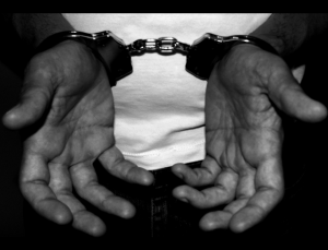
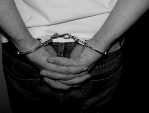
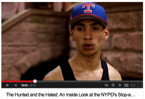
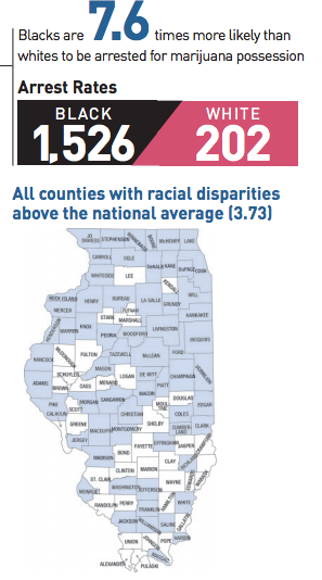
The war on drugs impacts people differently based on race. The rate of drug use among populations does not correspond to the rate of incarceration for drug use. Many students often assume that the higher rate of African American males in US prisons is simply a reflection of higher rates of crime. After all, it is called the justice system. An extensive report by the ACLU provides a short video, graphic presentations of the data, and a pdf of the full report on marijuana use and arrest rates among blacks and whites.

The results demonstrate that Screen Shot 2013-07-23 at 2.00.23 PMdrug use and arrest rates are not correlated. In fact, in 2010 blacks were nearly four times as likely to be arrested for marijuana possession as whites nationwide despite reporting very similar rates of use (within 1 – 2.5%). The rates of use among 18-25 year olds from 2001-2010, show consistently higher rates of use by whites (2 – 5% higher). Looking at those who report never having smoked pot, blacks report higher levels (of non-use) than whites.

Moving beyond empirical reporting to theoretical explanations the report references relevant sociological research such as Sampson and Raudenbush’s 2004 article in Social Psychology Quarterly.

This material is an excellent resource for a criminology, deviance, or race section of any course. The full report (nearly 200 pages) has more extensive explanations of the multiple sources of data that were used and the rationale behind simplifying the race categories to black and white. The macro data is supplemented with a few personalized vignettes that individualize the larger social consequences – something I have found helps students more fully comprehend any issue.

The full report (which is free to download) ends with a state by state analysis of arrest rates by race, expenditures on enforcing laws against marijuana, and a map showing counties that exceed the national average in the racial disparity of arrests. These individual state reports allow students to see the issue from a national and more local level. “Here is the situation nationally in the US, how does our county compare?”  Screen Shot 2013-07-23 at 1.45.00 PMThe state by state reports also contain pie charts showing the percentage of all drug related arrests that are  for marijuana possession. With all the graphs in the report it could easily be used as an example in a quantitative methods course or some of the figures could be extracted to test the students’ quantitative literacy in reading charts and graphs.

Deviance is socially constructed and the policing of certain types of deviance have real consequences for people. Additionally, that policing continues to impact African Americans more than whites despite similar rates of, in this case, marijuana use.

Students may believe that being if you are arrested that means you were violating the law. Arrests have more to do with the presence of police in the community, the public nature of some communities socializing versus the private nature of others, and who is suspected of being criminal.

Teach well. It matters.

In today’s complex world students often have a hard time placing themselves in the broader social context, especially in relation to other’s income – something we rarely talk about and is generally considered a private matter in the US. Because of this, many students also struggle to talk about income inequality on a personal level. On top of that, a historical perspective beyond, well…say last week can be difficult for undergraduates to maintain.

This interactive animation created Screen Shot 2013-07-23 at 11.00.32 AMby the Economic Policy Institutea non-profit, non-partisan think tank, addresses many of these challenges to fully understanding the current state of income inequality. Students can choose what portion of the total income pie they would assign to the top 10%, guess what it actually is, and then see the current reality. It contains a good graph comparing the stratification of income among the top 10% of the population and the other 90% since 1948.

Students can also enter individual demographics (gender, race, age, and education) and see what the average income is for individuals with those characteristics and the existing inequality. Each data point is well Screen Shot 2013-07-23 at 11.20.41 AMsourced, allowing students to think critically about where the numbers come from and their reliability. Additionally, students can compare average incomes of individuals that differ from themselves in all ways but one (gender or race are the defaults, but it can be customized).

For example, as a white male between 35-44 years old with an advanced degree, we on average earn $98,052 (huh!), while white women in that same age and education bracket, on average, earn $74,968 and Black males in the same age and education bracket, on average, earn $73,768. The site also demonstrates the growing gap between labor’s productivity and actual wages, animating the increasing gap in wages compared to profits and the incomes of the top 1% between 1948 and 2011.

Lastly, the site addresses how the current level of income inequality occurred and how it can be fixed: exploring myths of mobility, overall Screen Shot 2013-07-23 at 11.23.07 AMincome growth in different policy eras, and how education makes only a limited impact in decreasing inequality. This great tool explores ideas of full employment, greater workplace democracy through labor laws, the role of global trade, and regulation of the financal sector. At the bottom of the animation is an additional button to activate an animated “video” of former US Secretary of Labor and current Chancellor’s Professor of Public Policy at UC Berkeley, Robert Reich, explaining the growth of inequality.

The site is easy to navigate and contains language and concepts that are accessible to undergraduates, especially with some complimentary reading about income inequality of your choice. This site could be explored by students outside of class, and a written analysis of the arguments and their experience could serve as a nice assessment of the topic.

Check out the web site: http://inequality.is/real