
In today’s complex world students often have a hard time placing themselves in the broader social context, especially in relation to other’s income – something we rarely talk about and is generally considered a private matter in the US. Because of this, many students also struggle to talk about income inequality on a personal level. On top of that, a historical perspective beyond, well…say last week can be difficult for undergraduates to maintain.
This interactive animation created 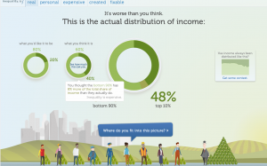 by the Economic Policy Institute, a non-profit, non-partisan think tank, addresses many of these challenges to fully understanding the current state of income inequality. Students can choose what portion of the total income pie they would assign to the top 10%, guess what it actually is, and then see the current reality. It contains a good graph comparing the stratification of income among the top 10% of the population and the other 90% since 1948.
Students can also enter individual demographics (gender, race, age, and education) and see what the average income is for individuals with those characteristics and the existing inequality. Each data point is well 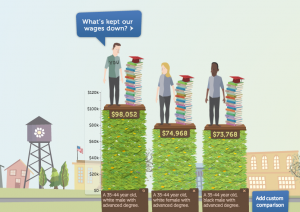 sourced, allowing students to think critically about where the numbers come from and their reliability. Additionally, students can compare average incomes of individuals that differ from themselves in all ways but one (gender or race are the defaults, but it can be customized).
For example, as a white male between 35-44 years old with an advanced degree, we on average earn $98,052 (huh!), while white women in that same age and education bracket, on average, earn $74,968 and Black males in the same age and education bracket, on average, earn $73,768. The site also demonstrates the growing gap between labor’s productivity and actual wages, animating the increasing gap in wages compared to profits and the incomes of the top 1% between 1948 and 2011.
Lastly, the site addresses how the current level of income inequality occurred and how it can be fixed: exploring myths of mobility, overall 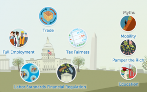 income growth in different policy eras, and how education makes only a limited impact in decreasing inequality. This great tool explores ideas of full employment, greater workplace democracy through labor laws, the role of global trade, and regulation of the financal sector. At the bottom of the animation is an additional button to activate an animated “video” of former US Secretary of Labor and current Chancellor’s Professor of Public Policy at UC Berkeley, Robert Reich, explaining the growth of inequality.
The site is easy to navigate and contains language and concepts that are accessible to undergraduates, especially with some complimentary reading about income inequality of your choice. This site could be explored by students outside of class, and a written analysis of the arguments and their experience could serve as a nice assessment of the topic.
Check out the web site: http://inequality.is/real
Comments 2
INEQUALITY IN THE U.S.: IMAGINED VERSUS REALITY — August 1, 2013
[...] previous post linked to a good visualization of the income inequality in the US asked individual viewers to [...]
TOOLS FOR TEACHING SOCIOLOGY: Teach well. It matters. - Sociology Toolbox — December 7, 2016
[…] US INCOME INEQUALITY: AN INTERACTIVE WEB SITE In today’s complex world students often have a hard time placing themselves in the broader social context, especially in relation to other’s income – something we rarely talk about and is generally considered a private matter in the US. Because of this, many students also struggle to talk about income inequality on a personal level. On top of that, a historical perspective beyond, well…say last week can be difficult for undergraduates to maintain. […]