
How much wealth inequality do you think there is in the US? What is the ideal distribution of wealth? What is it in reality? 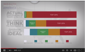 This is always an active and fascinating way to begin any section on inequality/stratification in the classroom. This resource, a 6:23 minute video, visually demonstrates the stratification of wealth and answers those questions. (The short answers are a lot, somewhat fair, and way more than your think!)
I usually begin class by drawing five stacked layers (rectangles) representing each income quintile, but I leave off the income amounts that distinguish each level. I usually have to take a minute to explain the idea of a quintile and that each block represents 20% of the total population of households (in this case). When explaining this, be sure to note whether the data you are presenting is individual or household levels and income or wealth. Most of the time, because of available data, I focus on household income.
More than just an understanding of the levels of stratification of income in the US, this activity demonstrates to the 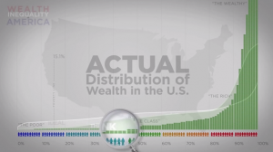 students that our individual assumptions about the state of society can (and maybe even often) differ from empirical facts (what I like to refer to as reality). Plus, showing students how wrong their assumptions are reminds them that they are learning something in your class (this may be worth pointing out on occasion just in case there is doubt).
I usually start at the top, “What’s the minimum level of annual income that places a US household in the top 20%?” The initial guesses by students usually land between $200,000 and $350,000, occasionally as high a half million. The REALITY is that a household income of just over $100,000 places one in the top 20% (in 2011 dollars). An income of $186,000 or more places a household in the top 5%. Check here for the most up-to-date numbers from the US Census.
A previous post linked to a good visualization of the income inequality in the US asked individual viewers to indicate what they thought it should be and what they thought it was, but unlike the video featured in this post, it did not show collectively what individuals thought it should be and actually is. “What does everyone else predict?” Another difference is that this resource primarily looks at the distribution of wealth, although it jumps to income occasionally (encourage your students to watch with a critical eye because, although correlated, there is a difference between wealth and annual income).
Data sources listed for the video are secondary, but here are some useful primary sources:
The US Census “Income” page that has numerous reports and downloadable data. http://www.census.gov/hhes/www/income/index.html
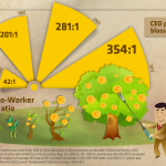
The AFL-CIO’s page on CEO salaries relative to the average worker. This site also has information on levels of productivity, potential revenue from taxing profits, and a tool to search the CEO pay of specific companies
For a global perspective, this database allows you to look over time across numerous countries: The World Top Incomes Database 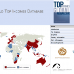
“Income Inequality in the United States 1913-1998” by Thomas Piektty and Emmanuel Saez in The Quarterly Journal of Economics (find their tables and figures in Excel here). By the way, this article has been cited over 1400 times since 2003.
Building a Better America−−One Wealth Quintile at a Time by Michael I. Norton and Dan Ariely (author of Predictably Irrational) in Perspectives on Psychological Science
Comments