work

I happened upon a list of figures that display lots of information about who majors in science and engineering (S&E), all available at the NSF page on Women, Minorities, and Persons with Disabilities in Science and Engineering. All are for institutions in the U.S. only, as far as I can tell.

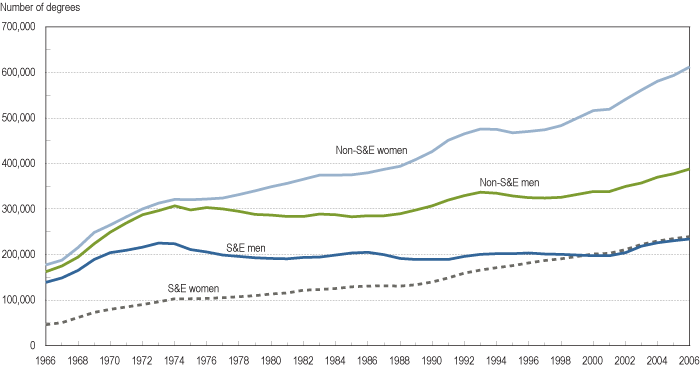
Here we see the number of bachelor’s degrees in S&E and non-S&E fields, by sex:

figc-12

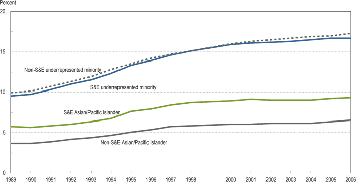
Percent of S&E and non-S&E bachelor’s degrees earned by racial minorities:

figc-21

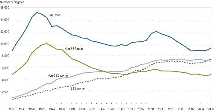
Number of doctoral degrees earned by sex:

figf-1

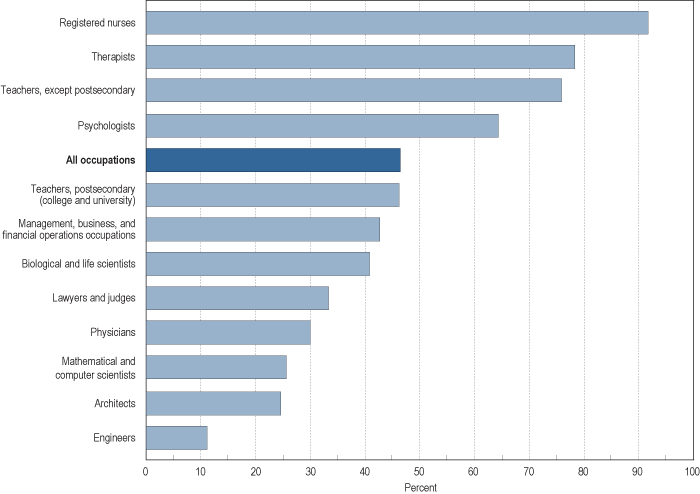
Percent of female workers in selected occupations in 2007:

figh-1

Percent of S&E Ph.D.-holding employees at 4-year colleges and universities that are women:

figh-3

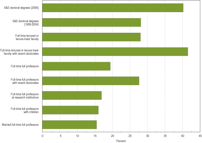
Notice that while women are pretty well represented among “full-time tenured or tenure-track faculty,” they make up barely 15% of “full-time full professors with children,” “married full-time full professors,” and “full-time full professors at research institutions.” Some of this may be a matter of time, in that because being promoted to full professor takes years, an increase in the number of women getting Ph.D.s in a particular field will take a while to show up as a similar increase in number of women as professors in that field, everything else being equal.

But everything else isn’t equal. Women, even highly-educated ones, still do the majority of childcare and housework, and are more likely than men to consider how potential jobs could conflict with future family responsibilities when they are deciding what type of career to choose. So the lower proportion of female full professors at research institutions is likely a combination of some old-school unfriendliness to women in some departments, but also of women opting out of those positions–that is, deciding that the time and energy required to get tenure in a science/engineering department at a research school would conflict too much with family life, so they pursue other career options (for instance, women make up a higher proportion of faculty at community colleges, which are often perceived as being easier to get tenure at, since you don’t necessarily have to do lots of publishing–though anyone who has ever taught 5 courses a semester may question the assumption that it takes less time and work to teach than to publish).

And of course some women try to combine a tenure-track job with their family responsibilities and find it difficult, and either leave academia voluntarily or are turned down for tenure because they have not published enough or are not see as adequately involved and committed. Because of inequalities in the family, men are less likely to face those situations, though certainly some do.

I wish the report had a graph for non-S&E faculty, although it might just depress me.

UPDATE: Commenter Sarah says,

Check out the report “Women in Science: Career Processes and Outcomes” by Yu Xie and Kimberlee A. Shauman.  They find no evidence to support the hypothesis that women are under-represented at the tenure level due to a lag between getting PhDs and acquiring tenure track positions.  In the life sciences, women have been getting PhDs at the same rate as men for many years now, but inequality persists at the tenure-track level.  Xie and Shauman find that a variety of  social factors are responsible for actively hindering women at the highest levels of academia.

Yes, it’s another table from Nate Silver at FiveThirtyEight. He’s had some great stuff up lately. Here we have changes in compensation (per employee) between 1992 and 2007 for various industries, based on Bureau of Labor Statistics data:

finpay2

I do question some of these classifications–for instance, is “performing arts, spectator sports, museums, and related activities” really a coherent category? Nonetheless, it provides a relatively consistent measurement of compensation, which is useful for comparing change over time.

I wandered over to the BLS website and ended up on their Occupational Injuries and Illnesses page. There I discovered this in the National Census of Fatal Occupational Injuries in 2007:

picture-18

Along with the graph, we learn,

Workplace homicides involving police officers and supervisors of retail sales workers both saw substantial increases in 2007.

Police officers makes sense. But retail supervisors? Huh. I wonder what the actual numbers are.

From the same report we get the number and rate of fatalities by industry:

picture-19

The extraction industries (mining, forestry, farming, fishing, hunting) are noticeable outliers here, with significantly higher fatality rates (though not overall numbers) than any other industries.

So there’s some totally unconnected information about the labor force for you.

stimulus_large

(Found here, via Thick Culture.)

We may have flight attendants instead of stewardesses these days, but the call button on this Greyhound bus (on its way from Sioux Falls to Omaha) reminds us that the serving class is figuratively, if not literally, female:

cimg2722

Also see this post on sexism in aviation (then and now) and this contemporary Continental ad with sexual innuendo.

Thanks to Stephen W. for the picture!

Singapore Airlines  is known for its “Singapore girls.” Here is a video that shows lots of images of how pretty Asian women, there to serve others, have been used in their advertising (the creator of the video claims to be a Singapore girl):

Apparently the Singapore Girl is such a phenomenon, she’s a figure at Madame Tussaud’s:

I had no idea that when most people think of Singapore, they think of this “pretty, smiling…girl.”

Anyway, I think it’s an interesting example of the way non-White women are often portrayed as exotic (the Singapore girls have become a symbol of Singapore itself) and also of what sociologists refer to as emotion work. The Singapore girls aren’t there just to bring us drinks and make sure we’re buckled in; there’s there to make us feel pampered and to warm our hearts–to do the type of emotion work (constantly smiling, being extremely attentive, being at the passengers’ service and making it seem like a joy) that makes customers feel cared-for and special…and thus willing to pay high prices for those business seats. And clearly these women are part of the decor–pretty, polite, accommodating women for passengers to enjoy while they fly.

Gwen Sharp is an associate professor of sociology at Nevada State College. You can follow her on Twitter at @gwensharpnv.

Larry H. (of the L.A. TimesDaily Mirror blog) sent in a link to an interactive map at the NYT that shows December 2008 unemployment rates by county. Here’s a screenshot:

picture-11

If you go to the link you can hover over counties and get their individual unemployment rates.You can also filter by manufacturing counties, rural counties, and counties that experienced a housing boom, as well as the 1-year change in unemployment rate.

Of course, you might want to combine this with a discussion of how unemployment is calculated–the 7.6% is most likely what is called the U3 rate, which is always lower than the more comprehensive U6. If we look not just at unemployment but at underemployment–people who can’t get enough hours to support themselves–and people who have given up looking for work, the rate would be higher.

The New York Times features an interactive graphic about the wage gap between men and women. It shows how different types of professions are distributed along the wage gap.  At the website, you can see click on each dot to see wage gaps for specific professions (e.g., female professors make 22% less than male professors).

capture31

Also about the wage gap, see posts herehere, here, and here.

Bri A. sent sent in photos of two ads found in complimentary magazines provided on a recent flight she took (she doesn’t remember the names of the magazines). Both have some interesting gender aspects.

The first is for Magnolia Hotels:

second1

Notice the suggested reasons women might be visiting the hotel: party, wedding, reunion, shopping, weekend, date, meeting, girl’s night, skiing (maybe? They’re light purple…). For men: big contract, date, presentation. Bri says,

The only professional woman presented to us in the ad is a woman who is going to a “meeting”. The woman’s shoes however, are a little racy for business and unlike her male colleagues, one of which is doing some sort of jig and the other which has forgotten his pants, she is giving us a little flirty heel raise rather than being humorous or professional. Another interesting difference that stuck out to me was the attire of the man and woman going on a date. The man going on a date is wearing a nice white suit, while the woman is wearing a much less formal and good deal more provocative outfit.

Actually, almost all the female feet are doing flirty little heel raises or half-kicks or something, which somehow doesn’t have quite the same effect as the kick the “big contract” guy is doing.

From another complimentary magazine Bri found on the same trip, an ad for Selective Search, a dating service for the business class:

first

The company technically serves men and women. But notice that the image only depicts women, and in the second paragraph we learn that “we hand select the must-meet women for our clients.” Close-ups of the lists for “selectively single” men and women:

picture-14

picture-22

Notice the men are described as “clientele,” while the women are described as “candidates.” Here are two screenshots from the website, the first from the women’s section, the second from the men’s section:

picture-21

picture-13

So ladies, they’ll find you a guy who is commitment-minded, but there aren’t many other specifics–he’ll be a quality, eligible guy, but that could mean a lot of things. Guys get some more specifics–she’ll be attractive and desirable. Somehow a “guy who brings just as much to the table as you do” doesn’t sound quite the same to me as a woman “who meets your exacting standards and criteria.” Bringing as much to the table as you do implies equality. But having exacting standards that must be met doesn’t imply anything about equality–you can have standards for other people even though you couldn’t meet most of them yourself.

Aside from the specifics of the two images themselves, you might talk about the seeming assumption that though the dating service caters to both male and female customers, the people most likely to be reading an ad placed in a business magazine on an airline will be male, and thus the ad should target a male audience (by having images only of women and stressing meeting women in the text). The presumption is either that business people who fly aren’t women, or that women remember to bring their own reading material so they aren’t stuck reading the complimentary magazines the airlines provide.

Thanks, Bri!

UPDATE: In a comment, OP Minded says,

My brother has been in the dating service industry for about 10 years and he tells me that their internal research on this stuff is compelling and very very clear. In searching for a date on a dating service:

95% of women care most about 1) Educational level, and 2) Income.
95% of men  care most  about 1) Looks, and 2) Weight.

Other issues come in to play later in the process, but at the beginning, this is what most of the folks are looking for.

In another comment, Sandra points out,

…I do remember being taught in my undergrad speech department classes that, for instance, in studies on gender effects, when asked to fill out surveys on the street by either a male or a female, women are more likely to respond to the women poll-takers, but the men are also more likely to respond to the women poll-takers [than] men [poll-takers]. So perhaps the marketing move behind the photograph in this dating service ad was based on the idea that, women appeal to women, and women appeal to men. Hence, the women in the image.  It could be the women are intended to see themselves in the photos, as people using this service, and men are intended to see the women as possible dates. 

Good point, Sandra!