work

In capitalism, owners of the “means of production” (things like land, factories, technologies, and natural resources, or the money to buy these things) employ labor to do the work of actually producing things.  If the system is working correctly, the value of the labor that goes into making something is worth less than the value of the thing.  This way the capitalist can sell the thing, pay the worker, and skim some profit off the top.

But how much profit?  In a less exploitative system, the worker is paid close to what his work is worth (after accounting for the expenses of maintaining the means of production). In a more exploitative system, the capitalist takes a larger chunk of the enhanced value for himself and gives less to the worker.

What kind of system do we have in the U.S.?  Let’s take a look at some data.

Over at Reports from the Economic Front, Martin Hart-Landsberg posted this graph. It shows that  workers have become increasingly productive since 1948 (i.e., they have created more and more surplus value).  Employers largely shared the increase in profitability with their workers… until the mid-1970s.  Since then, wages have remained stagnant even as worker productivity has continued to rise.  “In other words,” Hart-Landsberg writes, “the owners of the means of production have basically stopped sharing gains in output with their workers.”

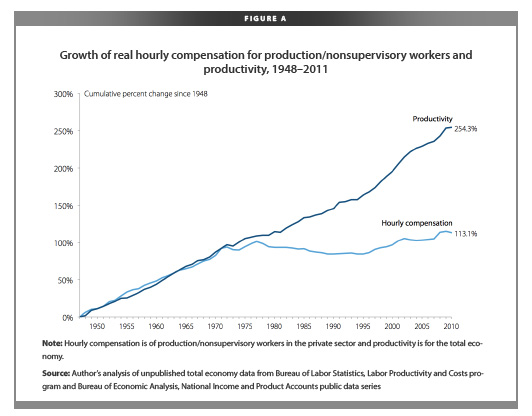
You wonder why the middle class is shrinking?  This is one reason.

Lisa Wade, PhD is an Associate Professor at Tulane University. She is the author of American Hookup, a book about college sexual culture; a textbook about gender; and a forthcoming introductory text: Terrible Magnificent Sociology. You can follow her on Twitter and Instagram.

Remapping Debate has posted an interactive graph that lets you look at the decreasing relative value of the federal minimum wage. The graph shows the gap, at various points in time, between the annual income of a full-time worker earning minimum wage and the poverty line for a family of four (all expressed in 2011 dollars; you can see specific historical, unadjusted minimum wage rates here). In 1968, a single minimum-wage earner made about 94% of the federal poverty line for four people:

By 2011, the gap had widened significantly; one minimum-wage worker earns about 66% of the poverty threshold for a family of four:

Though the federal minimum wage has gone up over time, its relative value covers less and less of the costs of living in the U.S.

On this day in 1963 the U.S. Congress passed the Equal Pay Act, a law designed to end wage discrimination against women.

How to get the word out? Advertising of course!

Thanks to Sean D. for the link!

Lisa Wade, PhD is an Associate Professor at Tulane University. She is the author of American Hookup, a book about college sexual culture; a textbook about gender; and a forthcoming introductory text: Terrible Magnificent Sociology. You can follow her on Twitter and Instagram.

Cross-posted at Family Inequality.

Lots of buzz over a New York Times article about men moving into female-dominated occupations, which reported that “more and more men are starting to see the many benefits of jobs long-dominated by women.”

The Times produced this table, which shows the fastest growing occupations for (for some reason) college-educated White men, ages 25-39:

The ones with the pink dots are 70% female or more. The increase of young college educated White men in these occupations over 10 years appears striking, but the numbers are small. For example, compare that increase of (round numbers) 10,000 young White male registered nurses to the 1,900,000 full-time year-round nurses there were in 2010.

Moreover, consider that increase of 10,000 nurses in light of the overall growth of registered nurses from 2000 to 2010: about 500,000. Overall, the representation of men among full-time year-round registered nurses increased from 9.4% to 10.3% during the decade.

The Times article attempts to describe a broad trend of men moving into “pink-collar” jobs:

The trend began well before the crash, and appears to be driven by a variety of factors, including financial concerns, quality-of-life issues and a gradual erosion of gender stereotypes. An analysis of census data by The New York Times shows that from 2000 to 2010, occupations that are more than 70 percent female accounted for almost a third of all job growth for men, double the share of the previous decade.

Bold claims. But check the next sentence: “That does not mean that men are displacing women — those same occupations accounted for almost two-thirds of women’s job growth.” So, lots more men are in these jobs, but even more women are? How does that reflect an “erosion of gender stereotypes”? It seems like it reflects an increase in the size of female-dominated occupations.

In fact, as I reported briefly before, occupational gender segregation dropped barely a hair in the 2000s, from 51 to 50 on a scale of 0 to 100, compared with drops of 5 or 6 points in the decades before 1990. That is a lost decade for integration.

And if you look specifically at the category the Times chose — occupations that are 70% female or more — the percentage of men in those occupations increased, but only from 5.0% to 6.1%. And nurses? In 2010, 0.4% of all full-time year-round working men were nurses, up from 0.3% in 2000. Women are still 11-times more likely to be nurses than men.

Now that’s what you call a “gradual erosion of gender stereotypes.”

Sources: U.S. Census tables for 2000 and 2010 (table B24121).

Each year the Department of Housing and Urban Development (HUD) calculates the fair market rents for apartments throughout the U.S. in order to set standards for housing assistance payments and vouchers for Section 8. Using data from the Census and the American Community Surveys, HUD figures out the average cost for various sizes of apartments. You can easily look up data for fiscal year 2012 here.

The generally-accepted standard for affordable, sustainable housing costs is that they should be about a third of a household’s income. The National Low Income Housing Coalition recently released a report on the mismatch between minimum wage — currently set at $7.25 nationally, with some states and municipalities having higher minimum wages within their boundaries — and the standard of living. The NLIHC report included this map showing the hourly wage that would be required for the HUD-calculated fair market rent to be about 30% of a full-time worker’s income:

In no state does the minimum wage pay enough to hit the 30%-of-income standard of affordable housing costs. How many hours would a minimum-wage worker need to work per week to make enough that the fair market rent would be about a third of their income? A lot, from a low of 63 hours a week in West Virginia to a high of 175 in Hawaii:

Thanks to Dmitriy T.M. for the tip!

NPR’s Planet Money asks an interesting question.  If there are more women in the workforce now than there were forty years ago (and there are), where did all the additional jobs come from?

The pie charts below tell some of the story.  On the left are charts representing the percentage of women in various occupations in 1972.  The size of the circle corresponds to the size of the sector: larger is equivalent to more total jobs; on the right are the same charts for 2012.

Notice two trends: first,  in almost all categories today women are a larger percentage of the workers than they were in 1972 and, second, many of the occupational sectors that have high percentages of women have grown (e.g., education and health), whereas many in which men dominate have shrunk (e.g., manufacturing, media/telecommunications).

So, as women have joined the workforce, they’ve contributed to the overall growth of the American workforce and, specifically, filled the demand for employees in growing occupations.

Lisa Wade, PhD is an Associate Professor at Tulane University. She is the author of American Hookup, a book about college sexual culture; a textbook about gender; and a forthcoming introductory text: Terrible Magnificent Sociology. You can follow her on Twitter and Instagram.

This weekend is commencement at my college, Occidental, and I thought it the perfect day to post new data on the job experiences of recent graduates.  The data, a survey of 444 people in who graduated between 2007 and 2011, comes from a report out of Rutgers.

Just over half of the sample had a full-time job; 12% were un- or underemployed and looking for full-time work.

The recession appears to have depressed earnings by about $3,000. Pre-recession grads were making, on average, $30,000, while post-recession grads took in $27,000:

A third of students (35%) reported that their first job out of college was “not at all related” or “not very closely related” to their major. Almost half saw their first job as temporary and just “to get you by” (though this would drop to 36% when asked about their current job). Only half thought that their first job required a college degree.

A significant proportion of students felt that they’d had to sacrifice something important to secure their job: 27% reported that they were working below their level of education, 24% took a job that paid less than they expected to earn, and 23% were working outside of their interests and training:

Many graduates would have done things differently. Notably a third said they would have re-thought their choice of major:

And most of them would have been more likely to have chosen a professional major (e.g., education or nursing) or one in a “STEM” field (e.g., science, technology, engineering, or math).

Recession-era grads are much more likely to be getting help from their parents, compared to pre-recession grads:

Lisa Wade, PhD is an Associate Professor at Tulane University. She is the author of American Hookup, a book about college sexual culture; a textbook about gender; and a forthcoming introductory text: Terrible Magnificent Sociology. You can follow her on Twitter and Instagram.

The National Bureau of Economic Research recently released a paper by  Emin Dinlersoz and Jeremy Greenwood about unionization in the U.S.. They argue that economic shifts that changed the relative prevalence of different types of occupations partially explain decreasing union membership.

So what occupations are growing, and which are declining? Jordan Weissmann, at The Atlantic, adapted two graphs from the NBER paper that illustrate larger economic changes. Of the twenty fastest-declining occupations (in terms of % decrease), many are factory or industrial production jobs — machine operators of various types fare especially poorly (also, sorry, fellow sociologists):

The color of the graph indicates the level of unionization for each occupation; blue = less than 20%, green = 20-40%, red = over 40%. Nine of these occupations were over 40% unionized; their decline means the loss of many decently-paid jobs that provided benefits to employees without high levels of formal education.

So which occupations are growing, then? Take a look (though note this reflect % change, not overall # of employees):

Notice that top category: numerical control machine operators. Those words reflect a profound shift in manufacturing in the U.S. Numerical control machine operators program and operate computerized machinery, which requires a very different type of human operation than the classic assembly line machinery did — less input of physical labor and more technical management and troubleshooting.

Many of the other fastest-growing occupations require specialized, and often lengthy, higher education or licensing: health-diagnosing practitioners, teachers, scientists, physical therapists, and dentists, for instance. And unionization is consistently low in these types of occupations, contributing to overall declines in the prominence of unions in the U.S. over time.