discourse/language

If you followed media coverage of the Democratic party convention last week, you may have heard about the short-lived controversy that broke out over the lack of the word “God” in the party platform (as well as the platform not explicitly mentioning Jerusalem as the capital of Israel). Fox News picked up on the lack of religious references and highlighted it as a major failing. Both items were hastily added to the platform.

Over at Organizations, Occupations and Work, Chris Prener posted a graph showing the number of times “God” appears in the party platforms over the last century. As Prener mentions, explicit references to a deity  were rare before World War II. After including it a few times in the ’40 and ’50s, the Democratic party platform mostly left it out until the 1996. The Republican party has much more consistently included “God” at least once in each platform since 1948, but 2012’s platform stands out, since it has more than double the mentions as in any prior platform:

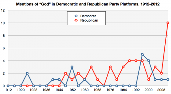
Using the word “God” in official party platforms isn’t a tradition inherited from the earliest days of the two parties. It’s a relatively recent change, illustrating a trend toward more explicit inclusion of or reference to religion in U.S. politics and by political candidates.

Cross-posted at Montclair SocioBlog.

The New York Times ran these graphics showing the word frequencies of the Republican and Democratic conventions.  I’ve added underlining on the keywords that seem to differentiate the two conventions. (The data on the Democrats runs only through Sept. 4, but it looks like the themes announced early on will be the ones that are repeated.)

Both parties talked about leadership, the economy, jobs, and families.  More interesting are the differences.  Democrats talked a lot about Women, a word which seems to be absent from the Republican vocabulary.  The Democrats also talked about Health and Education.  I find it curious that Education does not appear in the Republican word cloud.

The Republican dictionary falls open to the page with Business – ten times as many mentions as in the Democrats’ concordance.  If you go to the interactive Times graphic, you can click on Business and see examples of the contexts for the word.  Many of these excerpts also contain the word Success.

You can put the large-bubble words in each graphic in a sentence that condenses the party’s message about government, though that word – Government – does not appear in either graphic.   For the Republicans, government should lower Taxes so that Business can Succeed, creating Jobs.

For the Democrats, government should protect the rights of Women and ensure that everyone has access to Health and Education.

Perhaps the most telling most interesting word in the Democratic cloud is Together.  The Republican story is one of individual success in business, summed up in their repeated phrase, “I built that.”  The Democrats apparently are emphasizing what people can accomplish together.  These different visions are not new.  They go back at least to the nineteenth century.  (Six years ago, I blogged here about these visions as NFL brands — Cowboys and Steelers — and their parallels in US politics.)

(HT: Neal Caren who has posted his own data about the different balance of emotional expression at the two conventions.)

Last year I posted about a map several geographers put together showing the distribution of last names across the U.S. Historical immigration and internal settlement patterns are reflected in the concentrations of names across the country.

Now one of the geographers involved in that project, James Cheshire, has done the same for London. Using 2001 electoral rolls, Cheshire plotted the 15 most common surnames in 983 separate London districts. Here’s a section of the map of the most common name:

The size of the font is scaled to represent the number of people with each name. They’re color-coded by place or origin (though since many immigrants have Anglicized names, origin of a name may not reflect a person’s ancestry).

As Cheshire points out, a few names fill the top slot throughout most of London. As you go a bit further down the list, London’s diversity becomes more apparent. Here’s a small slice of the map of the 10th most common surnames:

Those of you with more knowledge of London, what noteworthy patterns do you see?

Originally posted at YouGov.

Race has recently taken center stage in the presidential campaign.  From Joe Biden’s suggestion that a Romney-Ryan presidency would re-enslave African-Americans, to some liberal commentators’ contentions that the Romney campaign is using racial code words like “welfare” and “anger” to mobilize anti-black sentiments against President Obama, charges and counter-charges of playing the race card now abound.

Part of this racialized turn in the campaign involves Romney’s welfare ad earlier this month—an ad that questionably accused Obama of ending welfare for work requirements.  While that charge may seem race-neutral, there is a long-standing and strong association in white Americans’ minds between welfare and “undeserving” African-Americans (see here and here).  According to Jonathan Chait, then, “the political punch of this messaging derives from the fact that white middle-class Americans understand messages about redistribution from the hard-working middle-class to the lazy underclass in highly racialized terms.”  An extensive body of social science research described as racial priming seems to support Chait’s contention.  That research shows that such code words as “welfare” and “inner-city,” especially when combined with racial imagery (e.g., the hardworking whites in Romney’s ad), can make racial attitudes a more central determinant of political evaluations (see: 12345).  One might therefore expect the welfare ad to activate racial attitudes in public opinion.

We can test that expectation thanks to some unique experimental data collected last week by YouGov.  The survey randomly assigned half of its 1,000 respondents to view the Romney welfare ad (see above) while the remaining half of the sample did not see the ad.  Respondents then answered a series of questions to discern whether and how the ad affected their opinions.  Unfortunately, these follow-up questions did not include vote choice or candidate favorability, which were asked earlier in the survey.  We did, however, ask respondents how well Mitt Romney and Barack Obama’s policies would benefit the following groups in society: the poor, the middle class, the wealthy, African-Americans and white Americans.  Answers were then recoded to range from 0 (“hurt them a great deal”) to 100 (“help them a great deal”).

The welfare ad did not appear to affect people’s overall answers to those questions.  However, it did make attitudes toward blacks a stronger predictor of respondents’ views about the consequences of Romney’s policies for the poor, the middle class, and African-Americans.  To measure attitudes toward blacks, we use a scale called “racial resentment” in the scholarly literature.  For respondents to this survey, we actually assessed racial resentment much earlier, when these respondents were first interviewed in a December 2011 survey.  The four questions that make up this measure are here.

The figure below shows that there was almost no relationship between racial resentment and the opinions of people who did not see the ad.  But among those who saw it, racial resentment affected whether people thought Romney will help the poor, the middle class, and African-Americans.  Moreover, seeing the ad did not activate other attitudes, such as party or ideological self-identification.  It only primed racial resentment:

(Note: Predicted values were calculated from OLS coefficients by setting partisanship, ideology, and race to their sample means.  Source: YouGov Survey, August 2012)

At the same time, the ad failed to “racialize” views of whether Romney’s policies would benefit whites and the wealthy.  This likely stems from the fact that Romney favorability ratings are strongly related to thinking his policies will help the poor, the middle class, and blacks, but only weakly related to believing he’d help whites and the wealthy.

Interestingly, the ad did not appear to further racialize the perceived consequences of Obama’s policies, either.  This is probably because racial attitudes are already linked to Obama, and a single political ad isn’t enough to significantly strengthen an already strong relationship.

Nevertheless, the results from our experiment suggest that ads like the one in this post may well contribute to the growing polarization of public opinion by racial attitudes beyond the voting booth in the age of Obama.

[I thank Brendan Nyhan for suggesting a study of this topic, and John Sides and Lynn Vavreck for help in designing the survey questions.]

—————

Michael Tesler is Assistant Professor of Political Science at Brown University and co-author of Obama’s Race:The 2008 Election and the Dream of a Post-Racial America.

In Gay Rights at the Ballot Box, I analyze the long history of transgender smear tactics used by the Religious Right, a large social movement that opposes LGBT rights. One area where this occurs is the production of campaign ads addressing attempts to protect transgender individuals from discrimination. The ads almost always focus on either children or bathrooms.

Back in April, voters in Anchorage, Alaska, rejected Proposition 5, which would have created a law protecting residents from discrimination based on sexual orientation or gender identity. Such laws are primarily to protect lesbian, gay, bisexual and transgender (LGBT) residents. Transgender inclusion in the potential law was the focus of two commercials by the organization Protect Your Rights.

In both of these political ads, figures of large, hairy male-bodied individuals in dresses, described as “transvestites”, represented transgender inclusion. They present transgender individuals as grotesque and threatening. At the heart of these ads and other transgender smear tactics is anxiety about bodies in gender-segregated spaces that are typically occupied by women.

The women’s bathroom in particular is a site where gender conformity is policed. According to scholar Judith Halberstam in her book Female Masculinity, women’s bathrooms “operate as an arena for the enforcement of gender conformity…a sanctuary of enhanced femininity, a ‘little girl’s room’ to which one retreats to powder one’s nose or fix one’s hair” (p. 24). In this ad, the locker room operates in parallel way, as a space where gender conformity and bodies are strictly policed:

The other ad focused on the possibility of a “transvestite” getting hired at a daycare facility:

In addition to the use of stereotypically-presented “transvestites” to represent all transgender individuals as grotesque and laughable, the ads also argue that employers should have the right to discriminate if they think their customers are prejudiced toward a particular group or uncomfortable with them in certain jobs — an argument that has been used to resist allowing racial minorities and women into various careers. The ads also suggest that Anchorage is already sufficiently tolerant and thus doesn’t need to address the issues Proposition 5 supporters claimed were a problem.

Ads that raise fears about transvestites teaching in the classroom have been used since the 1970s during ballot measure campaigns, and the Religious Right has been raising concerns about transgender women in women’s bathrooms since the late 1980s. These two ads from the Anchorage Proposition 5 campaign are among the newest additions to the long tradition of ads that rely on stereotypes of LGBT individuals as predatory, dangerous to have around children, and having ulterior motives.

—————

Amy L. Stone is an associate professor of sociology at Trinity University in San Antonio, Texas.

Cross-posted at Montclair SocioBlog.

Isabella was the second most popular name for baby girls last year.  She had been number one for two years but was edged out by Sohpia.  Twenty-five years ago Isabella was not in the top thousand.

How does popularity happen?  Gabriel Rossman’s new book Climbing the Charts: What Radio Airplay Tells Us about the Diffusion of Innovation offers two models.*   People’s decisions — what to name the baby, what songs to put on your station’s playlist (if you’re a programmer), what movie to go see, what style of pants to buy —  can be affected by others in the same position.  Popularity can spread seemingly on its own, affected only by the consumers themselves communicating with one another person-to-person by word of mouth.  But our decisions can also be influenced by people outside those consumer networks – the corporations or people produce and promote the stuff they want us to pay attention to.

These outside “exogenous” forces tend to exert themselves suddenly, as when a movie studio releases its big movie on a specified date, often after a big advertising campaign.  The film does huge business in its opening week or two but adds much smaller amounts to its total box office receipts in the following weeks.   The graph of this kind of popularity is a concave curve.  Here, for example, is the first  “Twilight” movie.

Most movies are like that, but not all.  A few build their popularity by word of mouth.  The studio may do some advertising, but only after the film shows signs of having legs (“The surprise hit of the year!”).  The flow of information about the film is mostly from viewer to viewer, not from the outside.

This diffusion path is “endogenous”; it branches out among the people who are making the choices.  The rise in popularity starts slowly – person #1 tells a few friends, then each of those people tells a few friends.  As a proportion of the entire population, each person has a relatively small number of friends.  But at some point, the growth can accelerate rapidly.  Suppose each person has five friends.  At the first stage, only six people are involved (1 + 5); stage two adds another 25, and stage three another 125, and so on.  The movie “catches on.”

The endogenous process is like contagion, which is why the term “viral” is so appropriate for what can happen on the Internet with videos or viruses.   The graph of endogenous popularity growth has a different shape, an S-curve, like this one for “My Big Fat Greek Wedding.”

By looking at the shape of a curve, tracing how rapidly an idea or behavior spreads, you can make a much better guess as to whether you’re seeing exogenous or endogenous forces.  (I’ve thought that the title of Gabriel’s book might equally be Charting the Climb: What Graphs of Diffusion Tell Us About Who’s Picking the Hits.)

But what about names, names like Isabella?  With consumer items  – movies, songs, clothing, etc. – the manufacturers and sellers, for reasons of self-interest, try hard to exert their exogenous influence on our decisions.  Nobody makes money from baby names, but even those can be subject to exogenous effects, though the outside influence is usually unintentional and brings no economic benefit.  For example, from 1931 to 1933, the first name Roosevelt jumped more than 100 places in rank.

When the Census Bureau announced that the top names for 2011 were Jacob and Isabella, some people suspected the influence of an exogenous factor — “Twilight.”

I’ve made the same assumption in saying (here) that the popularity of Madison as a girl’s name — almost unknown till the mid-1980s but in the top ten for the last 15 years — has a similar cause: the movie “Splash” (an idea first suggested to me by my brother).  I speculated that the teenage girls who saw the film in 1985 remembered Madison a few years later when they started having babies.

Are these estimates of movie influence correct? We can make a better guess at the impact of the movies (and, in the case of Twilight, books) by looking at the shape of the graphs for the names.

Isabella was on the rise well before Twilight, and the gradual slope of the curve certainly suggests an endogenous contagion.  It’s possible that Isabella’s popularity was about to level off  but then got a boost in 2005 with the first book.  And it’s possible the same thing happened in 2008 with the first movie. I doubt it, but there is no way to tell.

The curve for Madison seems a bit steeper, and it does begin just after “Splash,” which opened in 1984.   Because of the scale of the graph, it’s hard to see the proportionately large changes in the early years.  There were zero Madisons in 1983, fewer than 50 the next year, but nearly 300 in 1985.  And more than double that the next year.  Still, the curve is not concave.  So it seems that while an exogenous force was responsible for Madison first emerging from the depths, her popularity then followed the endogenous pattern.  More and more people heard the name and thought it was cool.  Even so, her rise is slightly steeper than Isabella’s, as you can see in this graph with Madison moved by six years so as to match up with Isabella.

Maybe the droplets of “Splash” were touching new parents even years after the movie had left the theaters.

————————

* Gabriel posted a short version about these processes when he pinch hit for Megan McCardle at the Atlantic (here).

Tanita S. sent along a link to an interesting observation made over at Whatever.  John Scalzi, preparing to make lunch, noticed that he had two bags of an identical food product, except one was named “tortillas” and one was named “wraps.”

John did some sleuthing and discovered that the bag of wraps cost 26¢ more than the tortillas.  Moreover, since there were only 6 wraps in the package of wraps, but 8 tortillas in the package of tortillas, each wrap cost 19¢ more than each tortilla.

So, there is an interesting marketing story here.   Mission has figured out that they can sell their product for a higher price if they name it “wraps” (or, at least, they think they can). Let’s crowd source this.  After all, Mission is counting on our collective network of ideas (and a failure to notice the count difference) to push us towards the wraps instead of the tortillas.  What does “wraps” make you think of?  What else is that word linked to that might make a person prefer it?  Would you feel different bringing home a package of wraps?  In other words, what ideas, lying just beneath the surface, are they tapping into with this marketing strategy?

Lisa Wade, PhD is an Associate Professor at Tulane University. She is the author of American Hookup, a book about college sexual culture; a textbook about gender; and a forthcoming introductory text: Terrible Magnificent Sociology. You can follow her on Twitter and Instagram.

Often, the most socio-economically disadvantaged individuals of a group are used as a wide brush to paint a picture of an entire minority race or ethnicity.  Common examples include stereotyping all Black men as members of the inner-city underclass or as uneducated, unemployed, urban criminals, or all African-American women as “welfare queens.”  In the current cultural and political discourse, Hispanics are often prejudicially construed  as murderous drug-smugglers or as destitute immigrants who illegally cross the border to “drop babies” and exploit U.S. social programs.  As Eduardo Bonilla-Silva has argued, these prejudices then disadvantage minorities of all social classes who are stereotyped and experience discrimination regardless of their individual socio-economic status or accomplishments.

However, focusing on the marginal members during the social construction of an entire racial group does not usually occur with Whites.  The existence of poor Whites is often ignored as Caucasians are stereotyped as upper-class—which usually entails assumptions that they are hardworking, highly-moral, successful exemplars of American individualism, as Kirby Moss explains in The Color of Class.  “The Whitest People,” a skit from Carlos Mencia (a controversial comedian who built his career drawing upon his Hispanic background to explore race in America), illustrates the connections between whiteness and heightened class status (sorry about the ad):

Mencia’s construction of whiteness critiques the excesses and frivolousness of the upper-middle class lifestyle often conflated with whiteness.  While Mencia pokes fun at this lifestyle, outside comedy these same stereotypes mean Caucasians are usually viewed positively as many presume the upper class can only be reached through hard work and strong morals.  Whereas minorities are often presumed poor and thus viewed with suspicion, whites are often prejudged favorably.  For instance, Mencia himself mentions that because people are viewed through prejudicial lenses, when whites drink alcohol they are thought “sophisticated” but when Blacks drink they are accused of being “drunks.”  These differential prejudgments based on race are the basis of white privilege that replicates and reinforces both class, and racial stratification.

The open expression of Latino stereotypes and slurs in this video also highlights why Mencia’s comedy is controversial.  Detractors claim he engages in a process symbolic interactionists call trading power for patronage (see Schwalbe et al. 2000)This process occurs when an individual embodies a marginal identity in order to receive personal benefits that come at the expense of the larger group.  For example, while Mencia’s comedy career benefits from the self-deprecating humor in this video about low wage employment, family violence, and food insecurity his jokes might also reinforce negative stereotypes about Hispanics.

However, Carlos Mencia’s supporters describe the open confrontation of race and racial disadvantage in his comedy as contesting stigma (Goffman) by celebrating a minority group’s ability to persevere despite their marginalization.  To this group, Mencia’s frequent use of ethnic slurs to describe himself and other Latinos is an example of re-appropriation (Galinsky et al.), reclaiming a pejorative label in a way that redefines the meaning of racist slights and infuses the word with positive and empowering meanings.

—————

Jason Eastman is an Assistant Professor of Sociology at Coastal Carolina University who researches how culture and identity influence social inequalities.