race/ethnicity: Blacks/Africans

Yesterday, one of my favorite blogs, Sociological Images, picked apart amputee alt model Viktoria’s appearance in Bizarre Magazine.

What makes Viktoria “bizarre”? Is it her amputated leg? Is it the fact that she has an amputated leg and is still incredibly sexy? Or is it that she has an amputated leg and still considers herself a sexual person? Is this empowering? And to who? Surely the disabled are desexualized in this country, so it’s nice to see that challenged even, I suppose, in a magazine about weirdos. And yet, I suspect her sexuality is acceptable, fetishizable, only because she conforms to expectations of feminine beauty. In the big scheme of things, does she reproduce the standard of beauty, unattainable for most women, that crushes women’s self-esteem and sense of self-worth? And will disabled women, most of whom (like most non-disabled women) could never dream of being so beautiful, actually look at her and be able to identify? Or will this just draw attention to another way in which they don’t match up?

Now really, I think that SocImages went a little overboard with Viktoria (especially when they dismissed her comments about sexuality as “standard porn star talk”). Maybe it’s because I know her little better than they do, but I think that they oversimplify the genuine place that she comes from in choosing to be a model. However, they do bring up an important discussion that’s been nagging me for some time. What is an alternative model, and what is an alt model’s role in visual culture? In my life, at various points, I came up with 3 different definitions. I believe in each of them, and I have a problem with each of them as well. Here they are below. Which one resonates with you? Do you think it’s a combination of the three below, or something completely different? Opinions, please.

1. The model who challenges society’s notions of beauty.

Examples:

Kenyan-born trans model Biko Beauttah, photographed by Bode Helm.
Velvet D’Amour, photography credit unavailable.

I love these models, but the issue here is that, while they appear to push the boundaries of beauty in some direction, they usually wind up brutally reinforcing another traditional notion in the process. For example, trans models make us rethink gender/beauty, but with their self-presentation they usually reinforce the ideal of a sleek, hairless feminine figure, thus fueling the hair-removal industry. In fact, epilator-manufacturer Philips Norelco has already found a way to to capitalize on this to great effect – just watch this ad. And large models like Velvet D’Amour and skinny-by-comparison but still-considered-plus-size recent ANTM winner Whitney Thompson help to redefine weight in modeling, but what makes them “legitimately beautiful” in the eyes of the mainstream world is their “correct” bone structure, their blond hair. Without some “redeeming quality” of this sort, the world doesn’t recognize them as models, and wouldn’t even give them a shot at making a difference. Mainstream media often presents them as beautiful “in spite of,” not “because of.” While their individual messages are empowering (I love Velvet’s interviews), I don’t find our culture’s use of these models empowering at all.

2. The hottie with strange hair/tattoos/piercings/latex.

Examples:

Mosh, photographed by Vance.
Scar13, photograhed by Nadya Lev.

Like it or not, it’s a valid definition – arguably the most widely-embraced one at that. This idea is epitomized by the Suicide Girls motto: “redefining beauty, one hot, naked chick at a time.” Underneath all the hair dye and black eyeliner, the ideal remains the same: symmetrical faces, clear skin and slim figures with a slightly above-average degree of variation as compared to mainstream modeling. Alterna-porn sites and alt modeling agencies such as Nocturnal Models helped cement this concept, but the biggest reinforcement came from self-proclaimed “alt photographers” and “alt models,” in whom they chose to include and exclude as they built up their online “spheres of influence.” This definition doesn’t make me happy now, though I had no problem with it at 21, when all I did was go clubbing and take pictures that reminded me of how I felt when I was dressed-up on the dance floor. When I realized that my own photography was reinforcing the same standards of beauty that make it difficult for women to have a healthy self-image, I took a step back.

3. The self-made persona.

Examples:

Feisty Diva wearing a hairpiece she created, photographed by Nadya Lev.
Anachronaut, photographed by Nadya Lev.

Another definition of alt model is someone who completely reinvents themselves from head to toe. This could be someone you’d never otherwise notice on the street, yet through inventive styling, self-applied makeup, self-styled clothing and hair, they create a whole new persona for themselves. The ultimate example of this is Mana, who goes from being a middle-aged man to a gothic Loli. These people make up their own beauty, owning their look from head to toe for the purpose of expressing an artistic ideal, proving a political point, etc. But are are they really “models,” or artists who allow you to take their portrait? It’s the most positive concept to me, but is it a valid definition of “model”?

So there you have it. Three definitions, some of which conflict with each other. And still, even after writing all of this out, I’m not sure if I’m even satisfied with my own personal definition, which draws on all three. Something’s bothering me. Something’s missing. Anyone have any idea?

—————————-

Nadya Lev, a photographer, blogs for the Coilhouse.

Lisa Wade, PhD is an Associate Professor at Tulane University. She is the author of American Hookup, a book about college sexual culture; a textbook about gender; and a forthcoming introductory text: Terrible Magnificent Sociology. You can follow her on Twitter and Instagram.

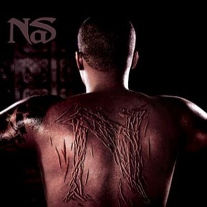
Rap is fascinating in that, in the short history of the art form, it represents both the power of resistance by marginalized and disempowered groups and the power of appropriation by mainstream culture and capitalist commodification.  With this in mind, I bring your attention to the cover of Nas‘ new album cover (tentatively set to release on July 1st) (found here):

The image immediately brings to mind (I can only imagine deliberately) the famous photograph of the back of a whipped slave from 1863 (found here).  I’ll go ahead and put it after the jump, as it’s a very real and troubling historical photograph:

more...

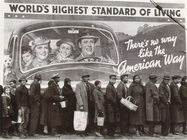
Marc sent in this image (found here):

According to this site, the photo was taken by Margaret Bourke-White; this site, where you can buy old issues of LIFE magazine, lists the photo in the index for the February 15, 1937, issue. Apparently the people standing in line were flood victims.

This is a great image for sparking discussion about “the American Way” and what that was meant to be (clearly white and presumably middle-class, from the mural), and the ways in which non-whites (and poor whites) are often invisible in depictions of what America is. And, of course, it could be a great image for a discussion of rhetoric and propaganda (for instance, murals proclaiming how wonderful the standard of living is even though the Great Depression was by no means over).

Thanks, Marc!

One of my students last semester wrote a paper in which she looked at sexist images of Condoleezza Rice. Interestingly, much of the online discourse was very similar to the way people talk negatively about Hillary Clinton. It was fascinating to see the same themes used by people with different political viewpoints in their criticisms–both Hillary and Condoleezza were described as bitches and whores and as ugly man-hater lesbians. My student argued persuasively that the reason the online attacks on the two women were so similar was because they weren’t being viewed as politicians or through the lens of their policies, but instead the attacks used a sexist lens that focused on their femaleness–and willingness to trespass on male-dominated political terrain–as the thing to attack, rather than any specific action or policy. Unfortunately for the blog, though good for humanity, I didn’t find as many images that had been made to accompany the hateful rhetoric about Condi as about Hillary.

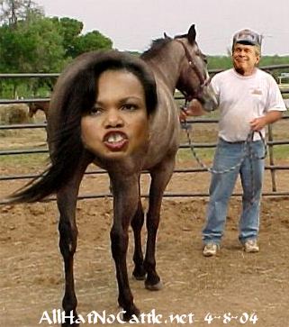
Here’s an image (found here) I came across (note that George Bush’s face has been super-imposed on the handler):

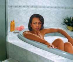
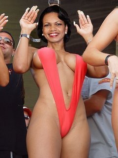
Both Hillary and Condi are often described as ugly. However, I noticed when searching for images of Condoleezza that both supporters and critics occasionally sexualized her (especially in reference to a pair of stiletto-heeled boots that got a lot of public attention at one point). I haven’t found similar images of Hillary from either supporters or critics (whether it would be preferable to be sexualized by a supporter or opponent, I’m not sure). I found this image of Condi in a bathtub here, though it was posted on several other websites I came across in a really brief search.

This bathing suit image came from here.

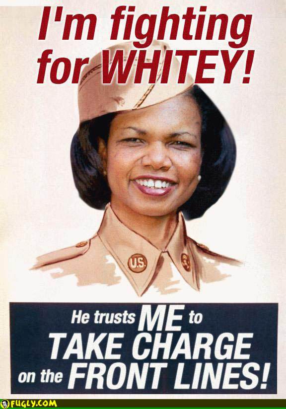
Unsurprisingly, Condoleezza’s race is also a focus in online discussions in a way that Hillary’s isn’t, such as this image (found here) that plays on the idea of the Uncle Tom (the implication being that Black Republicans or military hawks are puppets used by Whites for their own agenda–that is, that they are either duped or are trying to get power by appeasing Whites):

NEW: p.j. sent in this sexualized picture of Condi:

Thanks, p.j.!

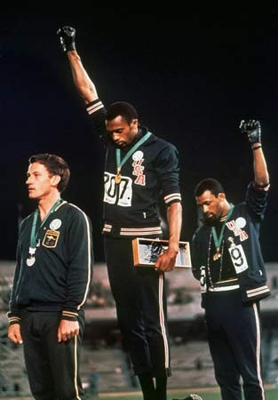
This is the iconic photo of Tommie Smith and John Carlos (found here) from the 1968 Olympics in Mexico City. They raised their arms, wearing black gloves, in a symbol of protest against racism in the U.S. Less often noticed is that they were wearing beads to symbolize victims of lynching and went barefoot to protest the fact that the U.S. still had such extreme poverty that some people went without basics, such as sufficient clothing. Peter Norman, the Australian 2nd-place winner, grabbed a button produced by the Olympic Project for Human Rights (see below) when he found out what the other two were going to do and wore it in solidarity (if you look closely you can see that all three are wearing matching white buttons).


The reaction was immediate and negative. Carlos and Smith were stripped of their medals, ejected from the Olympic Village, and returned to the U.S. to widespread anger. In David Zirin’s book What’s My Name, Fool? Sports and Resistance in the United States (2005, Chicago: Haymarket Books), several black athletes discuss the difficulties they faced as a result of their actions. This 2003 interview with Tommie Smith covers some of the same issues.

Below is a button like the ones they were wearing. Much like we often think Rosa Parks spontaneously decided not to give up her seat on the bus (ignoring the fact that she attended training with other African Americans determined to protest inequality in the South), the assumption is often that Smith’s and Carlos’s gesture was something they decided on at the moment. In fact the Olympic Project for Human Rights, organized by Black U.S. athletes, had tried to organize an athletes’ boycott of the 1968 Olympics. When that was unsuccessful, tactics switched to making statements at the Olympics. This was part of an organized plan on the part of a number of Black athletes who were tired of representing the U.S. but being expected to stay silent about racism in the U.S.

Some of these buttons are for sale ($300 each!) on Tommie Smith’s website.

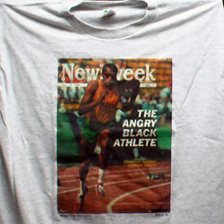
A t-shirt with the cover of the July 15, 1968, issue of Newsweek about “the angry black athlete.”
I looked for a photo of the cover itself but could not find one online. Clearly the nation was anxious about the attitudes of Black athletes even before the Olympics (in October) caused such a stir.

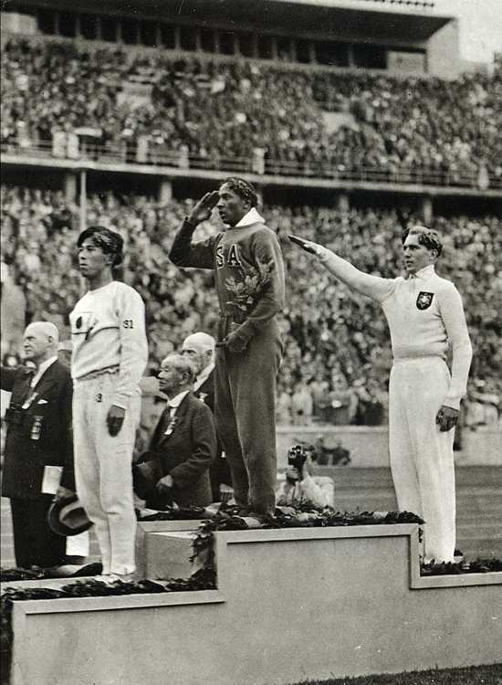
I think these images are useful in a couple of ways. I use them to undermine the idea of the individualistic protester and to bring attention to the ways Civil Rights activists organized and planned their actions. It could also be useful for discussions of politics in sports–the ways in which athletes have at times used their position to bring attention to social inequality, as well as the repercussions they may face for doing so. It might also be interesting to ask why this image caused so much furor, and how the Olympics is constructed as this non-political arena for international cooperation (a topic I cover in my Soc of Sports course). You might compare the image from the 1968 Olympics to this image (found here) from the 1936 Olympics in Germany:

Here we also see the Olympics being used to make a political statement, but in this case the athlete was not thrown out of the Olympic Village or stripped of his medals. What is the difference? Just that time had passed and attitudes toward political statements at the Olympics changed? In the 1936 pose, the athlete was showing pride in and support for his country, whereas Smith and Carlos meant their gesture as a protest of conditions in the U.S.–thus shaming their nation in an international arena (this was a major cause of the anger they faced when they returned to the U.S.–the idea that they were airing the nation’s “dirty laundry,” so to speak, for others to see). Could that be part of the difference in the reaction?

Of course, a cynical person might argue that these seemingly ungrateful, misbehaving black athletes who refused to smile and play along were being publicly punished in the media for getting “uppity” (in a time period where white Americans were also wearying of minorities’ continued demands for equality and social change).

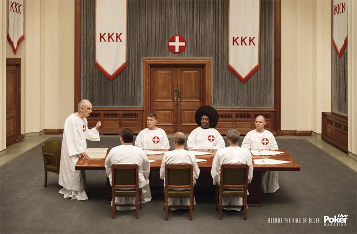
Jenelle N. sent in this French ad for Live Poker Magazine, which she found here. The text at the bottom says, “Become the king of bluff.” You know, like a black guy managing to join the KKK.

That’s somethin’.

Thanks, Jenelle!

While whiteness is the neutral category (for example, see here and see here for the same phenomenon related to gender) and most, but not all, advertising is aimed at white people first, we all know that people of color DO appear in advertising, even when it’s obvious that the intended audience is mostly white. In this series, I’m going to offer some examples of how people of color are used in ads and some of the conditions under which they are included.

In this first post of the series, I offer you examples of ads that include people of color in order to associate the collectively-held meaning of the racial minority group (i.e., stereotypical traits, the social construction of the group) with the product.

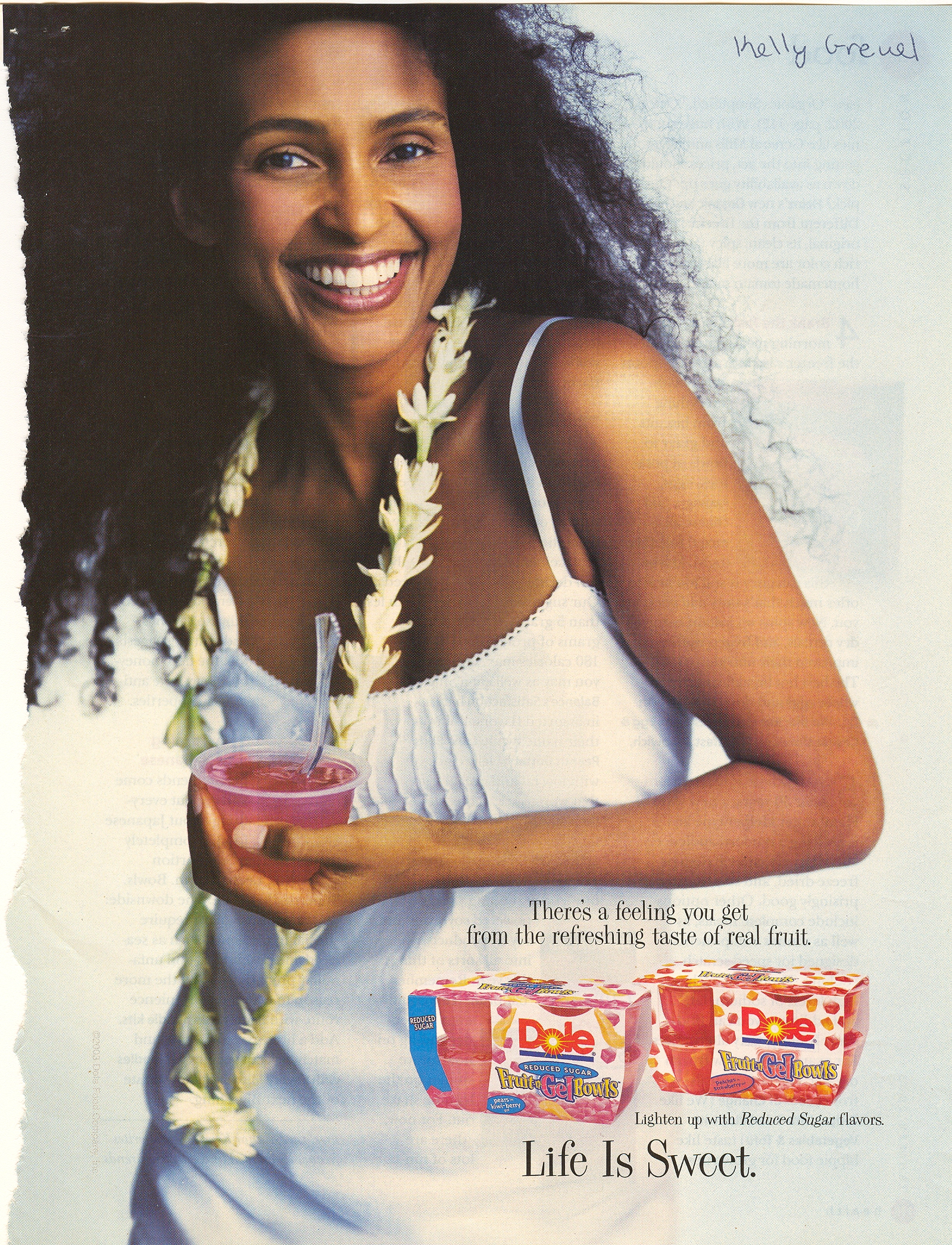
This first one is my favorite (thanks to my student Kelly for submitting it).  The product is Dole Fruit Gel Bowls.  The text is: “There’s a feeling you get from the refreshing taste of real fruit.  Lighten up with Reduced Sugar flavors.  Life Is Sweet.”  So how do they convince us that “Fruit Gel” is “real fruit”?  By putting a “native” appearing woman with a “natural” hairstyle in a white cotton frock with flowers around her neck.

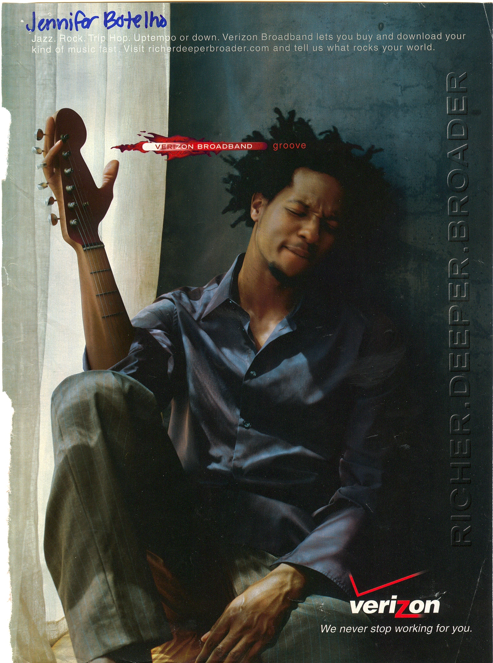
In this ad (thanks to my student, Jennifer, for submitting it) Verizon Broadband is telling us that we can download music fast.  What kind of music?  The kind associated with black folks, of course.  The text along the top reads: “Jazz. Rock. Trip Hop. Uptempo or down.”

Compare that version of the ad with this one (thanks to my student, Laura).  In this ad, the person is now an Asian woman and the type of music mentioned is “Classical. Soul. Hip Hop.”


This ad for IBM products features a middle aged Asian man, a type of person associated with high technology.

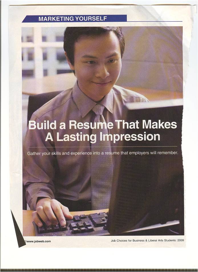
NEW:  This ad uses an Asian man to invoke the idea of a good worker.

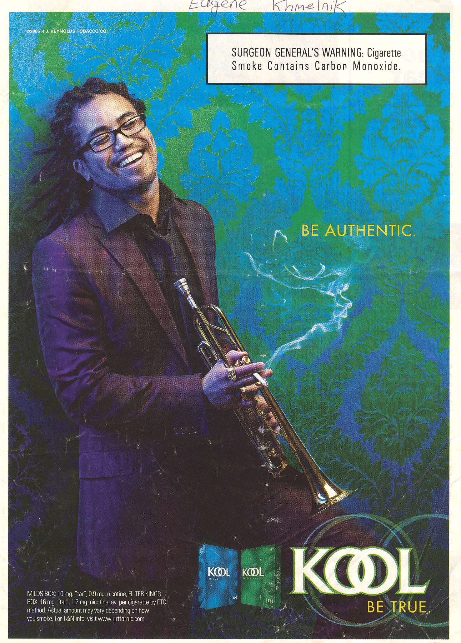
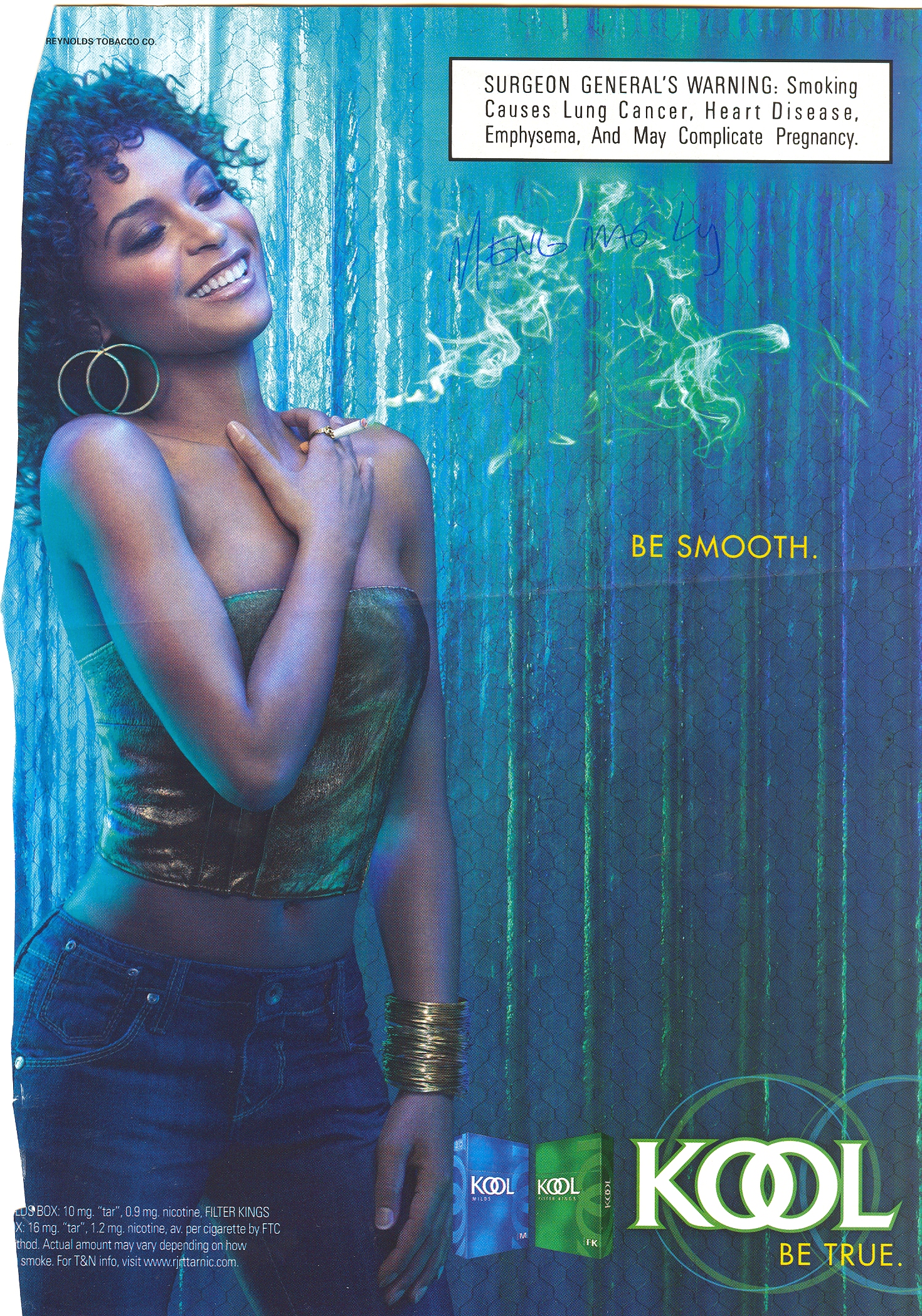
These two ads for Kool cigarettes (thanks to my student, Eugene, for the first one, and this blog for the second) use Black men doing stereotypically Black things (playing the trumpet and djing) in order to try to transfer some of the cool associated with Black men to Kool cigarettes.  (Alternatively, these ads may be targeted directly at a Black audience.)

This one too:


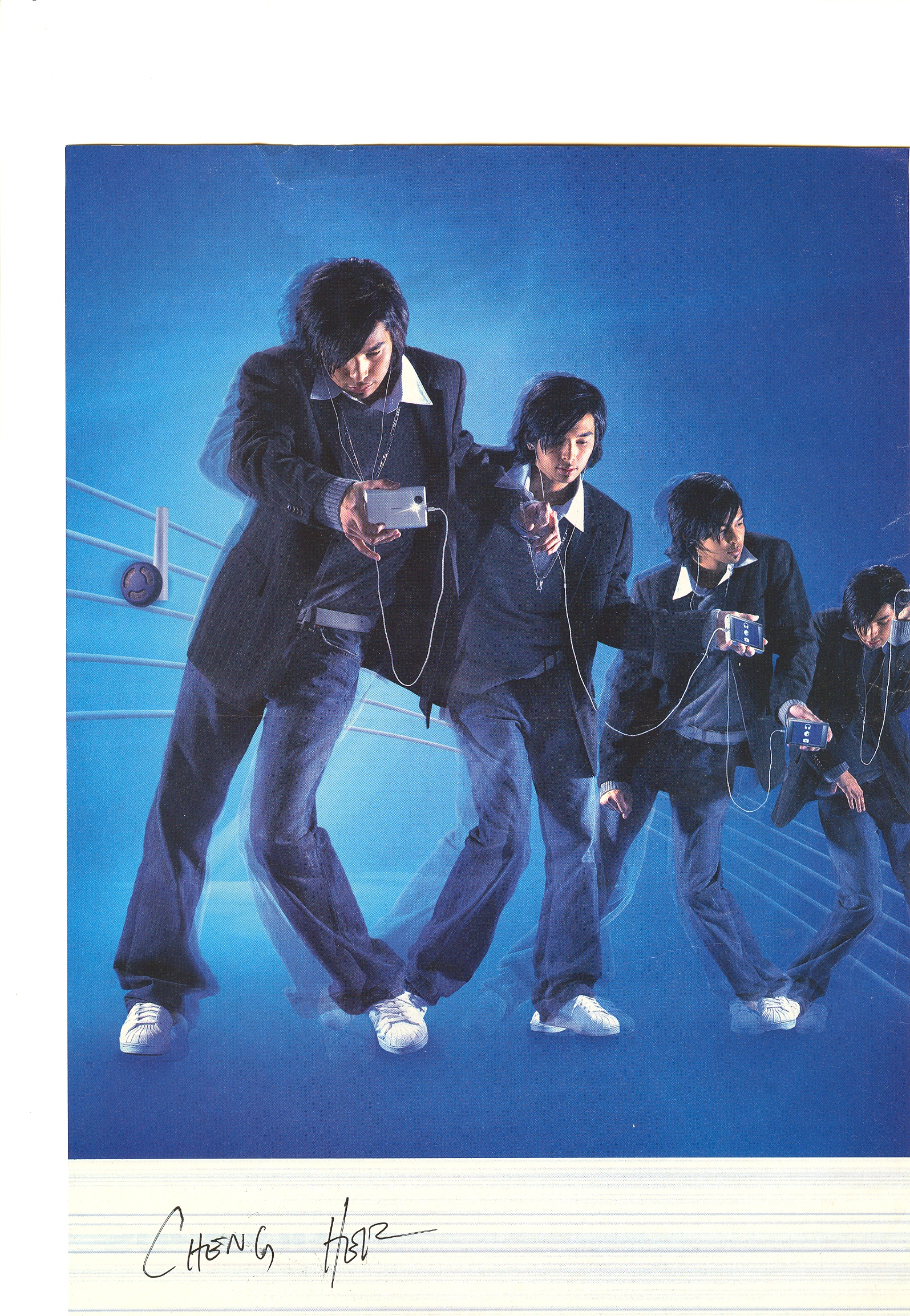
Finally, this ad for the Ipod ipod-type thing (submitted by my student, Cheng) uses a young Asian man dancing.  We all know that white men can’t dance.


NEW!  In this ad, rhythm is represented by a black woman:

Rhythm


If anyone has more examples, I’d love to see them!

Next up: using people of color to signify, literally, color, or even spice or flavor.

This video, produced by Mother Jones, shows Pastor Rod Parsley arguing that America was founded to destroy Islam and has a divine mandate to do so.  It is interesting on at least two levels:

First, as a response to the Reverend Wright story, it reminds us that Wright is not the only preacher who says outrageous things, and Obama is not the only politician to get “spiritual guidance” from a controversial figure.  In which case, the question might be: Which outrageous preachers are most likely to be targeted as problematic?  And by who?

Second, the video could be used to demonstrate how a person can be made to appear frightening or evil through editing.  In this case, the move to slow motion, the use of black-and-white, the strategic stills.

In many ways, this video, produced by the left, uses many of the same tactics as the anti-Reverend Wright clips on Fox News and elsewhere. For comparison, The Daily Show put together a montage of coverage that appears in the clip below (at about 6 minutes, 51 seconds) that uses choice words (“fiery”), tone of voice, and fast motion:

Thanks to Joe DeM. for tipping us off to the Mother Jones video!

Lisa Wade, PhD is an Associate Professor at Tulane University. She is the author of American Hookup, a book about college sexual culture; a textbook about gender; and a forthcoming introductory text: Terrible Magnificent Sociology. You can follow her on Twitter and Instagram.