race/ethnicity: Blacks/Africans

On the heels of our post on food desertsFamily Inequality‘s Philip Cohen posted about “care vacuums.”  In this case the research is referring to the shrinking number of nursing homes in the U.S., leaving people farther and farther away from the nearest nursing home.

Zhanlian Feng and colleagues found that between 1999 and 2008 we lost about 5% of all nursing home beds and these losses were disproportionately in neighborhoods populated by Blacks and Latinos. The maps below overlays the racial composition of neighborhoods (darker = higher percent minority) with open nursing homes (in black) and nursing home closures (in red). Both seem to be disproportionately in minority neighborhoods, but Feng et al. showed that the closures are even more so.

Here’s Chicago as an example:


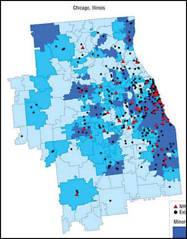
Just as food deserts make it more difficult for people without access to personal, reliable transportation to get fresh, affordable food, care vacuums make it more difficult for those same people — disproportionately Black and Latino, and disproportionately poor — to visit loved ones in nursing homes.  Ironically, this is despite the fact that use of nursing homes by minorities is rising and, among whites, falling.

Lisa Wade, PhD is an Associate Professor at Tulane University. She is the author of American Hookup, a book about college sexual culture; a textbook about gender; and a forthcoming introductory text: Terrible Magnificent Sociology. You can follow her on Twitter and Instagram.

Cross-posted at Love Isn’t Enough.

Brandy B. let us know about an interesting article by Isis the Scientist at Science Blogs on the apparent whitening of a children’s cartoon character for the Christmas toy market. PBS’s cartoon, “Super Why!”, includes a female character, Princess Presto, who has the power to spell. Here’s what she looks like:

Yet the plush doll version of Princess Presto (who is supposed to have one White and one African American parent) looks significantly different:

I found another Princess Presto doll online as well:

I did find one set where she looks more like the original:

Isis the Scientists says that in comments to an article on the topic at the Orlando Sentinel, someone claiming to represent the company says the plush doll looks more like the original in person than the pictures online and says the following:

…The hair on the doll is more purple than black and this was an aesthetic choice…The placement of the facial features was intentionally tweaked to make the embroidered beanies look cute, so there is a slight difference from the onscreen character. The alterations were similarly made across all characters in the line, not just Princess Presto. There are almost always slight differences when translating the onscreen characters to off-air product especially with regard to colors because we have to use PMS or CMYK color choices for products.

Isis says BS — that having seen an actual version of the plush toy, it looks like it does in the photo, with very light skin, and that aside from that, other manufacturers seem to be able to make African American dolls just fine. And saying you changed things for “aesthetic” purposes doesn’t explain why you thought her existing characteristics were insufficiently aesthetically pleasing. Of course, we also don’t know for sure the person writing the comment was from PBS.

I tend to side with Isis here: the idea that technical limitations prevent making a more accurate representation of a dark-skinned doll is…sketchy, to say the least, and makes me think PBS needs to partner with a better toy design firm. And the choices about what the Princess Presto doll should look like in doll form put PBS in the position of appearing to think that a mixed-race character needs to be whitened to sell. PBS’s dolls exist in a marketplace where we’ve seen controversies about African American dolls being literally valued less than White dolls, and whatever their supposed reasons, it’s hard to get around the fact that all of the choices made in the name of aesthetics added up to a doll that looks awfully White.

A while back Kale let us know that the New York Public Library had made their images collection available online.The collection has images on a huge array of topics, from fashion to the military to slavery to insects to a whole category for stilts, and including political cartoons, illustrations from publications, photographs, and so on.

Kale found the collection particularly interesting as a way to look at historical racism and rhetoric about race relations in publications aimed at White readers. This 1875 cartoon, titled “A Privilege?”, presents segregation as actually protecting African Americans from the scourge of alcohol:

Text:

A PRIVILEGE?

Wife, “I wish you were not allowed in here.”

It’s a fascinating example of the use of institutionalized racial inequalities that hurt African Americans to, instead, garner sympathy for White women and children and present African Americans as, really, better off.

Another, published in Life in 1899, implies African American men are burdens on their families, making their wives take on the role of providing for everyone:

Text:

Parson Featherly: De Lawd hab took yo’ husban’ an’ lef’ yo’ wid six chilluns; but ‘membah, Sistah, dat dar’s some good in all de Lawd does.

“I does, Parson. I realizes dat dar’s one less for me to perwide foh.”

This 1860 cartoon from Harper’s Weekly shows an African American woman (presumably a slave) in the South using the “Bobolitionists” — that is, abolitionists, who wanted to outlaw slavery — as a threat, a type of monster that will come steal him if he’s not good:

Text:

“Now den Julius! If yer ain’t a good litte nigger, mudder’l call de big old Bobolitionist and let um run away wid yer.”

I’m sure it must have been very comforting to some readers to think of slaves viewing abolitionists as threats rather than potential allies.

Other cartoons mock African Americans’ physical attributes, marking them as laughable or even grotesque:

Text:

“Would de gemman in front oblige by removing de hat?”

“Would de same gemman oblige by puttin’ de hat on agin?”

(Details.)

Text:

“Now we’ll see ef dat sawed off Peterson man kin escape de issue dis time.”

(Details.)

There are also examples that criticized U.S. race relations, such as this 1848 cartoon from Punch [Note: a reader thinks this might be about France, which banned slavery in 1848, but the NYPL has it listed as relevant to U.S. slavery, so there may be so lost context here]:

Enjoy!

[Note: A commenter has expressed concern that I ended this post with “Enjoy!” I apologize for my insensitivity. I meant it in terms of “Enjoy browsing this fascinating archive,” of which racist imagery is only a small part, not, I hope it would be clear, “Enjoy looking at racist cartoons!” I wasn’t thinking about how it might appear immediately after those set of images, and I should have been more careful.]

Lee D.T. sent in an Australian ad for Fernwood Fitness. It’s a great example of the sexualization of women of color, specifically (compared to white women). Notice that the white women in the ad simply exercise, but the ambiguously-raced woman with darker hair and skin gyrates, pumps, and poses.

See also a history of the hypersexualization and exploitation of black women by white people, the hot Latina, the fetishization of black women’s butts as symbolic of their (supposed) hypersexuality, the only thing important about black people is their butts, and the frequent exposure of black women’s bodies.

Lisa Wade, PhD is an Associate Professor at Tulane University. She is the author of American Hookup, a book about college sexual culture; a textbook about gender; and a forthcoming introductory text: Terrible Magnificent Sociology. You can follow her on Twitter and Instagram.

Meant to reveal the unbearable whiteness of the TV show Friends, this video by The DocFuture Show, is a pretty hilarious account of all of the black characters to ever grace the screen alongside the cast. It’s, um, funny:

Via BoingBoing.

Lisa Wade, PhD is an Associate Professor at Tulane University. She is the author of American Hookup, a book about college sexual culture; a textbook about gender; and a forthcoming introductory text: Terrible Magnificent Sociology. You can follow her on Twitter and Instagram.

Emory University has a very detailed database about the Atlantic slave trade, titled Voyages: The Trans-Atlantic Slave Trade Database, which I don’t believe we’ve posted before (my apologies if we have). It includes nine maps providing information on major points of departure and destination ports for the trans-Atlantic trade; here’s a general overview:

Initially the vast majority of slave voyages were organized by firms or individuals in Spain and Portugal; however, over time the slave trade was dominated by groups from northern Europe. Great Britain eventually played a major role, and over 1/3 of documented slave voyages were organized there.The description of Map 6 explains, “vessels from the largest seven ports, Rio de Janeiro, Bahia, Liverpool, London, Nantes, Bristol, and Pernambuco carried off almost three-quarters of all captives removed from Africa via the Atlantic Ocean.”

This map shows where voyages were organized, and the % of all documented African slaves that voyages from that country/area transported:

In the U.S., students generally learn about slavery in relation to cotton plantations and, to a lesser extent, tobacco. However, overall those two crops played a relatively minor role in the growth of the global slave trade. It was the growing taste for sugar, and the creation of sugar plantations, particularly in the Caribbean and South American coastal areas, that produced such an enormous demand for African slaves in the Americas. According to the Voyages website, less than 4% of all Africans captured were sold in North America.

The website also has a database of thousands of documented trips in the trans-Atlantic slave trade, including everything from point of origin, destination, number of slaves, % who died during voyage, length of trip, and so on. Some include many more details than others, as you’d expect. You can also create tables to display the variables you’re interested in. Here’s the table showing the slave trade, broken into 25-year intervals and by destination. We can clearly see that the slave trade made one big jump in the late 1500s (going from 4,287 in the 1551-1575 interval to 73,865 between 1576 and the end of the century) and another huge jump in the late 1600s, with the height of the slave trade occuring in the 1700s through the mid-1800s:

You can also create various graphs and charts. Here is a graph of the % of slaves who died during the trip, by year:

I presume the extremely high numbers in the 1550s must be skewed by some ships that sank or met some other disaster that led to the death of everyone aboard.

Over time, ships carried larger numbers of individuals per trip:

The individuals taken as part of the slave trade were predominantly male:

Documented types of resistance from captives or from Africans trying to free them:

You can spend quite a bit of time on this, I warn you — creating timelines, graphs, and so on. It’s taken me an hour to write this post because I keep getting distracted creating charts and tables. Overall, the site is a fantastic resource for both specific information and for helping illuminate the enormity of the Atlantic slave trade. Thanks to Shamus Khan for the tip.

Kai Wright at Colorlines discusses an “arresting” graph demonstrating downward class mobility among black and whites.  The bars represent the proportion of parents’ children that end up in the bottom fifth of income earners by race and income of the parent.  On the far left, you see that 31% of whites and 54% of blacks born into the bottom fifth remain the bottom fifth.  Poor black children, then, are more likely than poor white children to stay poor.

The remainder of the bars represent downward mobility.  You can see that, in every case, black children are more likely to be poor as adults than white children, no matter what class they were born into.  Among those born into the middle fifth, the statistically middle class, 16% of whites and 45% of blacks end up in the bottom fifth of income earners.  For the richest white Americans, the chance of ending up poor is statistically zero; while nearly one in ten of black children born rich will end up poor.

Wright summarizes:

…economic mobility is not the same for everybody in America, and to the degree we can talk about a genuine black middle class, it’s not a terribly secure one.

Lisa Wade, PhD is an Associate Professor at Tulane University. She is the author of American Hookup, a book about college sexual culture; a textbook about gender; and a forthcoming introductory text: Terrible Magnificent Sociology. You can follow her on Twitter and Instagram.

Cross-posted at Ms. and Family Inequality.

In the early 1990s, Arline Geronimus proposed a simple yet profound explanation for why Black women on average were having children at younger ages than White women, which she called the “weathering hypothesis.”

It goes like this: Racial inequality takes a cumulative toll on Black women, increasing the chance they will have health problems at younger ages. So, early childbearing might pose health risks for White women, but for Black women it makes more sense to start earlier — before their health declines. Although it’s hard to measure the motivations of people having children, her suggestion was that early childbearing reflected a combination of cumulative cultural wisdom and individual adaptation (for example, reacting to the health problems experienced by their 40-something mothers).

She showed the pattern nicely with data from Michigan in 1989, in which the percentage of first births that were “very low birthweight,” increased with the age of Black women, but decreased for White women, through their twenties:

Source: My graph from Geronimus (1996).

If the hypothesis is correct, she reasoned, the pattern would be stronger among poor women, who experience more health problems, which is also what she found.

The most recent national data, for 2007, continue to show Black women have their first children, on average, younger than White women: age 22.7 versus 26.0. And the infant mortality rates, by mothers’ age, also show the lowest risk for White women at older ages than for Black women:

Source: My graph from CDC data.

Note that, for White women, mothers have children in the early thirties face less than half the infant-mortality risk of those having children as teenagers. For Black women, waiting till their lowest-risk age — the late 20s — yields only a 14% reduction in infant mortality risk. So it looks like waiting is much more important for White women, at least as far as health conditions are concerned.

The implications are profound. If you base your perceptions on the White pattern, it makes sense to discourage early childbearing for health reasons. But if you look at the Black pattern, it becomes more important to try to improve health problems at early ages — and all the things that contribute to them — rather than (or in addition to) trying to delay first births.

—————————-

Cohen’s previous posts featured on SocImages include ones on the recession and divorce datathe relationship between cell phone use and driving deathsmeasuring the number of welfare recipients, delusions of gender dimorphism, and the gender binary in children’s books.