race/ethnicity: Blacks/Africans

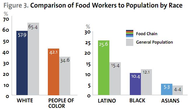
Via Colorlines I discovered an Applied Research Center report titled The Color of Food.  The report found that Blacks, Latinos, and Asians were overrepresented in food service work:

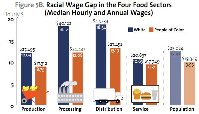
The report also discovered a wage gap between White workers and non-White workers at every level of food production:

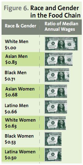
Race intersected with gender, such that women earned less than men of their same race for each group studied:

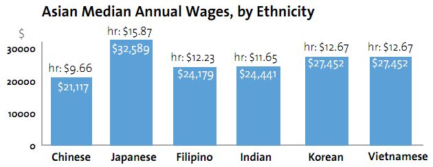
The authors go on to break down the data further by each part of the commodity food chain — production, processing, distribution and service — and by racial group.  For example, they show that the average wage of Latinos and Asians differs by ethnic background (always a good reminder that racial categories obscure variability):

Lots more at The Color of Food.

Lisa Wade, PhD is an Associate Professor at Tulane University. She is the author of American Hookup, a book about college sexual culture; a textbook about gender; and a forthcoming introductory text: Terrible Magnificent Sociology. You can follow her on Twitter and Instagram.

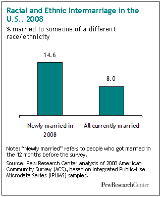
New-ish data from the Pew Research Center suggests that inter-racial and -ethnic marriages are on the rise due to cohort changes.  First, the report shows that people who were newly married in 2008 were more likely to be married to someone of a different racial or ethnic group:

This trend is likely facilitated by greater acceptance of intermarriage.  According to the report, in 1987 less than half of Americans said it was okay for White and Black people to date each other, by 2009 that number had risen to 83%.  Among 18- to 32-year-olds, 93% approve.

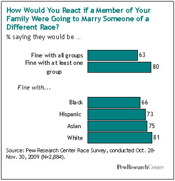
Among Pew’s respondents, 63% said that they approved of inter-racial and -ethnic marriages without reservation and another 17% said that they approved of at least one type of intermarriage, but not others.  Still, overall acceptance of intermarriage still aligns with the familiar racial hierarchy in that Americans are more comfortable with outmarriages to Whites, than to Asians, Hispanics, and especially Blacks.

Acceptance of inter-racial and -ethnic marriage is on the rise, then, in part because younger people are more accepting of it than older people.  Acceptance, however, still reflects a color-based racial hierarchy.

Lisa Wade, PhD is an Associate Professor at Tulane University. She is the author of American Hookup, a book about college sexual culture; a textbook about gender; and a forthcoming introductory text: Terrible Magnificent Sociology. You can follow her on Twitter and Instagram.
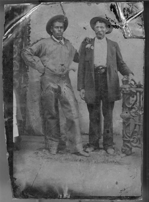
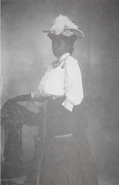
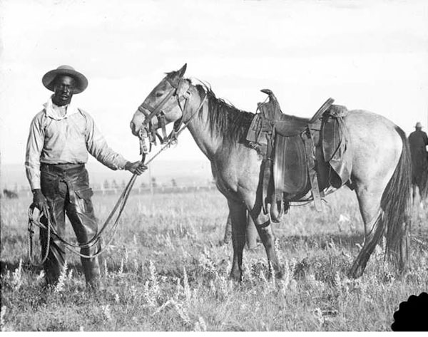
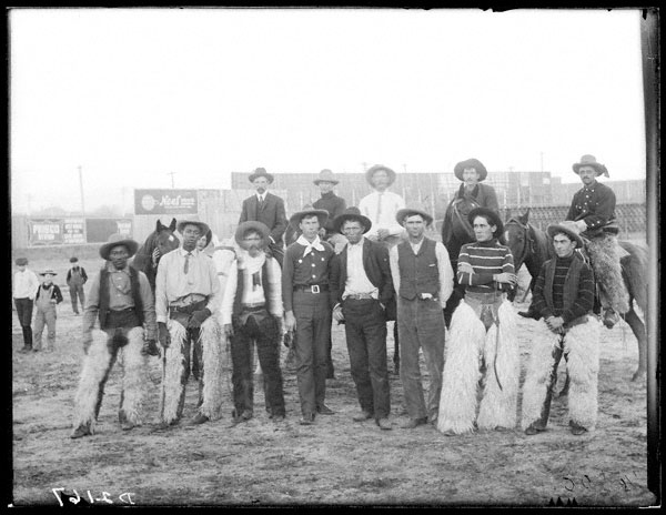
While the quintessential Old West “cowboy” is White in most imaginations, in fact there were Black pioneers in the west during the wild days (usually dated mid-1800s till the end of the century).  According to wikipedia, thousands of Black men and women lived in mostly segregated communities in the West, but participated in all parts of Western society.  They were traders, gold miners, soldiers, cowboys and farm hands, bartenders, cooks, and, of course, outlaws.   I enjoy how these photographs color American history:

Identity unknown, around 1865, Kansas (source):

Nona Marshall, late 1800s, Arizona territory (source):

Black cowboys (1890-1920):

Lisa Wade, PhD is an Associate Professor at Tulane University. She is the author of American Hookup, a book about college sexual culture; a textbook about gender; and a forthcoming introductory text: Terrible Magnificent Sociology. You can follow her on Twitter and Instagram.
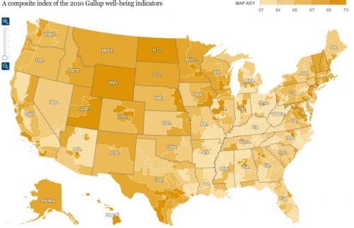
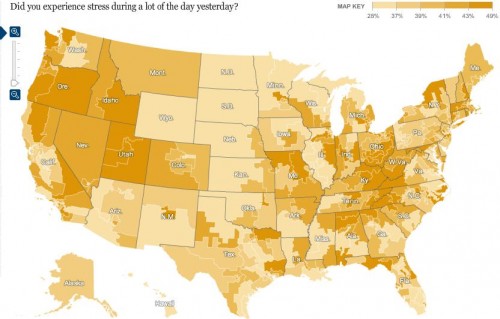
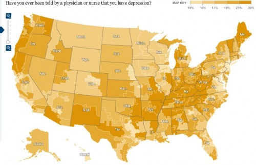
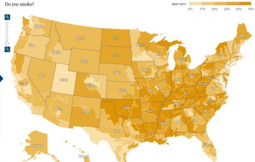
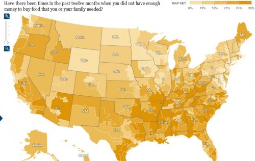
Kristina K. sent in a link to an interactive map at the New York Times that shows the results of Gallup’s 2010 polls of well-being. [UPDATE: Reader Danielle pointed out I forgot to provide a link to the map. Sorry! You can find it here.] Gallup surveys 1,000 people per day about a variety of indicators of well-being, including questions about physical, mental, and emotional health, various health-related behaviors, ability to access health care, access to adequate food and housing, and perceptions of their communities. Here are the overall composite scores, by congressional district (a higher score is better):


The general geographic pattern indicates a swath of relatively low well-being curving from Louisiana up through Michigan, while those in the upper Great Plains and the inter-mountain West are doing better than average.

Percent reporting experiencing a lot of stress:

Percent who have ever been told they have depression:

Of course, this may reflect differences in rates of depression, but it could also reflect differences in medical professionals’ likelihood of identifying a set of symptoms as depression and bringing it up with a patient. For example, we see significant differences by state in the frequency of Caesarean sections among pregnant women.

Percent of people who smoke:

Percent reporting an inability to buy sufficient food:

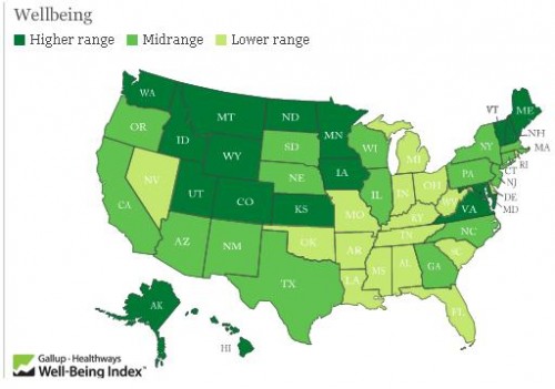
The Gallup page on well-being presents more data. Here is a map of 2009 overall well-being that is a bit easier to read since it’s presented by state rather than congressional district:

Hawaii had the highest overall score, at 70.2; West Virginia had the lowest, 60.5. If you go to their site and click on a state, you can get a breakdown of scores in each area (emotional well-being, physical health, healthy behaviors, and so on).

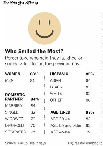
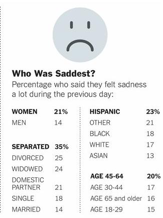
Finally, the NYT provides some demographic information on who was most likely to have said they spent a lot of the previous day laughing or smiling vs. being sad:

Jamal Spencer, a student in Naomi Glogower’s sociology class at Michigan State University, sent in the following promotion for Black History Month, courtesy of the Los Angeles Clippers (source):

Spencer makes two interesting points. First, Black History Month is in February. Oops. Second, and more importantly, notice that the promotion includes admitting “1,000 underprivileged children free.” It is assuming that “Black” is coterminous with “underprivileged,” erasing middle and upper class Blacks and poor Whites. In fact, about half of poor people are White and about 75% of Black people are not poor. This promotion, however, strengthens the conception that the poor are Black, a conception that contributes to the (racist) maligning of and restriction of benefits for the poor. Happy Black History Month indeed.

Lisa Wade, PhD is an Associate Professor at Tulane University. She is the author of American Hookup, a book about college sexual culture; a textbook about gender; and a forthcoming introductory text: Terrible Magnificent Sociology. You can follow her on Twitter and Instagram.
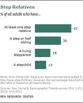
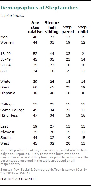
The Pew Research Center recently released data on stepfamilies in the U.S. Of the 2,691 respondents, over 40% had at least one step relative in the immediate family:

Note that they include both step- and half-siblings. For readers who might not be familiar with that language, a step-sibling is related to you only through marriage; you don’t share a biological parent. A half-sibling shares one parent with you, but not both. I can see the point of including both categories if you’re interested in seeing the degree to which American family life varies from the culturally-accepted “ideal” nuclear family, but I would think putting both in a single category might hide meaningful differences (such as for the question about obligation, below).

The chances of having a step-relative in the immediate family vary quite a bit based on demographics, reflecting differences in marriage, divorce, and non-marital childbearing rates:

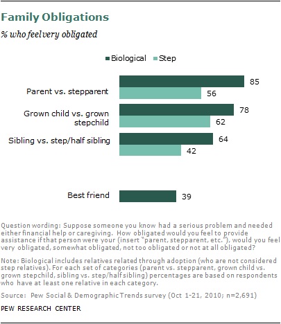
The vast majority (70%) of people with step-relatives said they were very satisfied with their family lives, undermining some of the cultural stereotypes of stepfamilies as inherently filled with conflict. However, the survey also asked participants if they would feel “obligated” to help a family member who was facing serious problems and needed either financial help or caregiving. The results show more feelings of obligation to biological family members than to step-relatives:

I presume perceptions of obligation vary widely based on how old a person was when their parent married their stepparent, the quality of the relationship, and perhaps even whether the stepparent has biological children. The data would seem to have important implications for our ability to draw on family networks for resources. Who is responsible for caring for elderly parents, for instance? Only their biological children? Should someone feel obligated to help a person who they’re related to only because of a parent’s marital choice? Unclear cultural norms about obligations to step-relatives bring up a number of complex issues that many Americans will be forced to grapple with in the future.

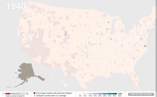
One of my colleagues, Kate Hahn, sent me a link to an interactive map at The Chronicle of Higher Education website that presents data on the proportion of U.S. adults with a bachelor’s degree over time. In 1940, in the vast majority of counties no more than 10% of the population had graduated from college (the national average was 4.6%):

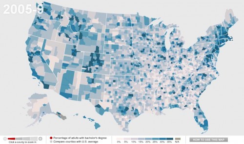
Now the national average is 27.5%:

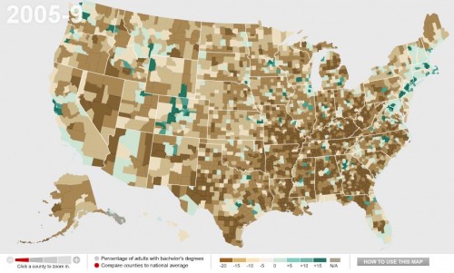
You can also compare counties to the national average. Green counties are above the national average, brown ones are below and, not surprisingly, we see clear regional variations in rates of college education, with Colorado and the Northeast doing particularly well and the South and Appalachian regions lagging:

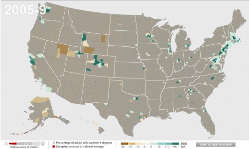
Wealthy counties (those with a median income of $60,000+) in general have higher than average rates of bachelor’s degrees, with the exception of a few counties in the Mountain West, Alaska, and a few scattered areas:

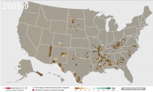
We see the opposite with poor counties (median income under $30,000):

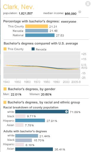
You can break down any of the comparisons by sex or race/ethnicity, and/or look only at  counties with 20% or more Hispanic or Black residents.  You can also select a particular county for more detailed information. For instance, here’s the info on Clark County, Nevada, where I live:

By comparing the maps over time, you can easily track a number of changes: the increase in college degrees overall, of course, but also changes in education such as the dramatic gains women have made in earning college degrees in the past few decades — the gender gap in college degrees was over 7 percentage points in 1980 but only about 1.5 points today.

You know how sometimes you see something and you just cringe and wonder how, how, something made it into the public sphere? Paul Fidalgo, of Near Earth Object, took a photo of this display illustrating the career ladder at McDonald’s. The display provides a rather unintended commentary on race and corporate hierarchies in general:

I suppose I should be happy, as the sky appears to be the limit for White women like me on the Ladder of Whiteness.

I was doing some googling, looking for data on the racial diversity of McDonald’s employees, since the company has touted itself as a leader in providing career opportunities to women and underrepresented minorities. I’m always surprised how corporations that carefully guard their brand in other ways, and talk about diversity issues, often seem to drop the ball when it comes to thinking about the cultural politics of representations of race and ethnicity in their materials.

[UPDATE: A number of commenters argue that McDonald’s has a better record on promoting women and minorities than most corporations. I’m not trying to argue there that they don’t — I was trying to find some data on their employees because I’ve also heard they stand out, as far as corporate America goes. That’s why I found the display surprising, as opposed to perhaps predictable.]

So anyway, my online search led me to 365Black, the website McDonald’s set up to appeal to African Americans:

Ok…uh, sure. Just exactly like the baobab tree.

I’d seen 365Black before — readers have sent it in, and we just couldn’t think of much to say so we’ve never posted about it. But then my googling took me to MeEncanta, the McDonald’s page for the Latino community. They offer this sticker (i.e., instruct you to download the image and print it on sticky-backed paper) to show off your Latin pride:

Alrighty…

And finally I arrived at Myinspirasian, which targets Asian Americans. On the page about Asian Pacific American Heritage Month they include information about contributions by Asian Pacific Americans, such as this:

Multimedia creations inspired by Asian Pacific Americans are the latest rage among kids, teens and young adults of all ages. The multimedia creations offer a variety of the trendiest ways to receive news, information, entertainment and services using the worldwide web.

No specifics are given, so you’ll have to figure out what these mysterious “multimedia creations” are. Also, “they have become household names in a host of sporting activities,” though apparently not the type of household names where McDonald’s could actually name one. The entire section is similarly vapid, completely lacking in anything other than non-specific statements that Asian Pacific Americans have, like, done stuff, and things. It reminded me of some of the very superficial celebrations of Black History Month we’ve seen.

But if you want, you can take the Asian Phrases Challenge, where you can hear various phrases spoken in either Mandarin or Cantonese, Filipino/Taglish, Indian/Hinglish, or Korean:

I’m not sure what the “challenge” aspect is, since it doesn’t do anything but play the phrases.

I just…I don’t know. You decide to make webpages entirely devoted to a particular demographic and this is the best you can do? And do these types of marketing projects actually work?

———————–

For more, see our previous post showing how people of color are subordinated visually in advertising materials.