race/ethnicity: Blacks/Africans

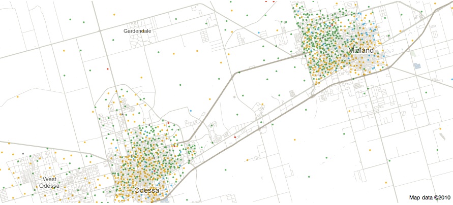
Back in September, I posted about some maps put together by Eric Fischer, using 2000 Census data, showing the racial/ethnic makeup of selected cities. As Jeff H., Eluned J., and Dmitriy T.M. pointed out, the NYT now has up an interactive map where you can see the racial/ethnic composition of any Census tract, using more updated Census Bureau data from 2005 to 2009. For instance, here’s a map of the neighboring cities of Midland and Odessa, Texas, which I picked for no reason other than that I just watched an episode of Friday Night Lights, which is set in a fictionalized version:

Color key:

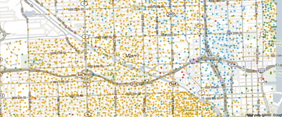
You can zoom in to get quite detailed information about individual neighborhoods. I zoomed in as far as I could on Miami (each dot now represents 50 people):

There’s also a tab that says “View More Maps.” It allows you to select to see just the distribution of Whites, Blacks, Hispanics, Asians, or the foreign-born population. Here’s the map of the Hispanic population of Las Vegas:

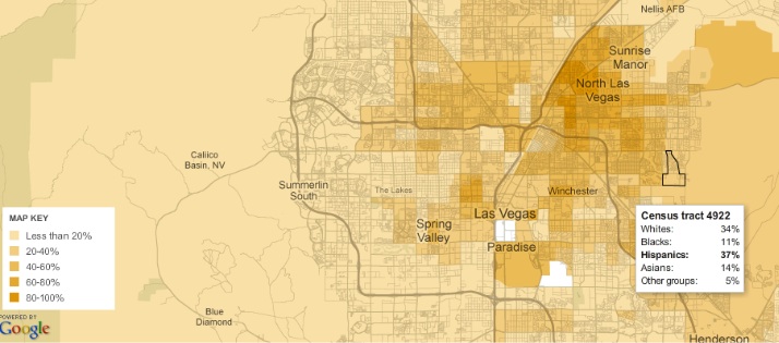
As you can see, if you hover over a Census tract, you can get specific data on its racial/ethnic makeup.

The foreign-born population of Seattle (if you hover over a tract, it will tell you the % foreign-born, as well as the % increase in the foreign-born population since 2000):

A great resource. Although I tried to look up my home town, and even zooming in to the smallest scale, it’s too small to have any data available.

The NYT has posted an interesting interactive map showing the results of the last slave Census taken in the U.S., in 1860, which I discovered via Jessica Brown and Jim Yocom. The map, which shows county-level data, illustrates how slave ownership varied throughout the South

The shading (a new technique at the time, according to the NYT article) indicates what percent of the entire county’s population was enslaved:

You can see the percentage for each county, which is listed on the map, more easily if you zoom in on the pdf version. The cotton-belt area along the Mississippi River clearly stands out, as does Beaufort County, South Carolina, all with over 80% of the population enslaved. The highest rate I could pick out (the map got a little blurry as I zoomed) is in Issaquena County, Mississippi, where slaves appear to have made up 92.5% of the population.

The map also included information on the overall population and % enslaved at the state level; in South Carolina and Mississippi, over half of the total state population was made up of slaves:

Also check out Lisa’s post on geology, the economy, and the concentration of slavery in the U.S.

As the NYT post points out, the map doesn’t show the dramatic increases in slavery in some areas. For instance, while Texas ranked fairly low in terms of the overall slave population, the number of slaves in the state had tripled between 1850 and 1860. The number had doubled in Mississippi between 1840 and 1860. Those growth rates make it rather hard to swallow the argument sometimes presented by those romanticizing the Confederacy that slavery was actually on the wane and would have soon been ended in the South anyway, without any need for federal interference, and wasn’t why the South seceded at all.

Jon Stewart and Larry Wilmore discussed this effort to frame discourses about the Civil War to erase the issue of slavery on The Daily Show:

Last month, Lisa posted a video of Devah Pager discussing her research on the effects of race and a criminal background, and the likelihood of being offered a job. Her experiment indicated that White men with a non-violent drug offense on their record were more likely to get a call back for a job interview than African American men with no criminal background at all.

A post at Discover magazine indicates a similar situation for Muslims in France. Researcher Claire Adida looked at the effects of having a name identified as Muslim on job prospects:

Adida did it by focusing on France’s Senegalese community, which includes a mix of both Muslims and Christians…Adida created three imaginary CVs. All were single, 24-year-old women, with two years of higher education and three years of experience in secretarial or accounting jobs. Only their names, and small details about past employers, differed.

The three chosen names were Khadija Diouf (an easily-recognizable Muslim first name, while Diouf is well-known as a common last name in France’s Senegalese community), Marie Diouf (to represent a Christian Senegalese name), and Aurélie Ménard (a common French name with no particular religious associations). To highlight the religious differences, “Khadija” had worked at Secours Islamique, a non-profit, “Marie” had worked for Secours Catholique, another religious non-profit, and “Aurélie” hadn’t worked for any religious-affiliated employers.

The fictional CVs were then sent out to employers who listed secretarial and accounting jobs with a national employment agency in the spring of 2009; the jobs were matched in pairs based on industry characteristics, size of the employing company, and the specific position. Every position was sent a copy of the CV for Aurélie; for each matched pair of jobs, one got Khadija’s CV while one got Marie’s.

The results are striking. Aurélie got the most responses of all three. However, Marie Diouf also got responses from 21% of the employers the CV was sent to. The nearly identical CV, however, when used with the name Khadija Diouf, got responses from only 8% of potential jobs:

The Discover post adds, “Even after Adida included a photo on the applications (the same one, showing a woman who was clearly not North African), she found the same bias.”

Aurélie’s chances of getting a call back were basically identical for each employer in the matched pairs, which would seem to indicate there weren’t glaring differences between the positions themselves that would account for the variation in responses. Adida’s research also helps control for the possibility that employers might be discriminating based on race/ethnicity, immigrant status, concerns about language, or other factors, by focusing on religious-associated names within a particularly recognizable ethnic group.

A recent survey of Senegalese households in France further indicates that religion affects life chances independent of ethnic background. The survey looked at the income of two Senegalese groups, one Muslim, one Christian:

Both groups arrived in France in the 1970s, so neither enjoyed an economic headstart, although the Christians were slightly better educated. The survey’s data revealed that the Muslim households were significantly poorer than their Christian counterparts, even after adjusting for their initial educational advantage. They’re more likely to fall into poorer income groups and they make around 400 Euros less per month, around 15% of the average monthly salary in France.

Here’s the income distribution, clearly showing Muslim households concentrated at lower incomes than Christian households:

Interestingly, the Discover post suggests this might, if anything, underestimate anti-Muslim bias in the job market, because the Senegalese community is relatively assimilated (particularly in terms of language) and not highly identified with Islam. Muslims from ethnic groups more strongly linked to Islam by the general public may face even higher levels of discrimination.

Gwen Sharp is an associate professor of sociology at Nevada State College. You can follow her on Twitter at @gwensharpnv.

Hope and Kristi P. sent in another example of the way the idea of a “curvy” shape is associated with non-White bodies. This Levi’s ad for their Curve ID jeans shows models whose skin color gets progressively darker as they move from less to more curvy styles:

Notice also that curvy here means primarily having a larger butt. All three models are show in size 27 jeans, which generally are equivalent to about a size 4 (though of course, sizes vary greatly) — certainly larger than the average runway model, but still very small.

Question: does anyone have examples of non-White men depicted as uniquely or systematically “curvy,” or is this applied only to women?

The Centers for Disease Control report that pregnancy rates for U.S. girls age 15-19 vary quite significantly by state: from 66/1,000 in Mississippi to 20/1,000 in New Hampshire (dark and light green represent states with teen pregnancy rates lower than the U.S. average; dark and light purple represent states in which it is higher):

The map shows that, on average, southern states tend to have higher teen pregnancy rates than others.

The Centers for Disease Control reports that the disparity can be explained, in part, by the fact that Blacks and Latinos tend to have higher rates of teen pregnancy than other racial groups such that states with higher proportions of Blacks and Latinos would have higher rates.  However, rates among different racial/ethnic populations also vary quite tremendously by state.  Among white teenagers the teen pregnancy rate ranged from 4/1,000 (in the District of Columbia) to 55/1,000 (in Mississippi), among Black teenagers, it ranged from 17/1,000 (in Hawaii) to 95/1,000 (in Wisconsin), and among Latinas it ranged from 31/1,000 (in Maine) to 188/1,000 (in Alabama).

Race, then, doesn’t predict differences in rates of teen pregnancy all by itself.  In fact, White teenagers are more likely to get pregnant in some states than Black and Latina teenagers in others.  There must be something region- or state-specific driving teen pregnancy rates.

The CDC doesn’t mention sex education, but Mike Lillis at The Hill compared teen pregnancy rates to a sex education policy report by the Guttmacher Institute.  He writes:

All five states with the highest teen birth rates have adopted policies requiring that abstinence be stressed when taught as part of sex education, HIV education or both, the group found. Only one of the five states (New Mexico) mandates that sex education be a part of students’ curriculum.

Of the four states with the lowest teen birth rates, none requires that abstinence be stressed to students, according to Guttmacher.

For your perusal, the CDC data, by state and race (# of pregnancies/1,000 girls 15-19):

Hat tip to Annie Shields at Ms. magazine.

Lisa Wade, PhD is an Associate Professor at Tulane University. She is the author of American Hookup, a book about college sexual culture; a textbook about gender; and a forthcoming introductory text: Terrible Magnificent Sociology. You can follow her on Twitter and Instagram.

Black women and Latinas are more likely to die from breast cancer than white women.  This is, in part, because white women are more likely to have health insurance.  New research, however, illustrated by Philip Cohen at Family Inequality, suggests that even we control for types of insurance and whether women are insured, black women and especially Latinas wait longer than white women for a diagnosis of cancer after the discovery of a breast abnormality:

The authors of the study, Heather Hoffman and colleagues, did not attempt to explain the cause of the disparity.

See also our posts on racial disparities in life expectancy for people with Down’s Syndrome, rates of asthma, and kidney failure.

Lisa Wade, PhD is an Associate Professor at Tulane University. She is the author of American Hookup, a book about college sexual culture; a textbook about gender; and a forthcoming introductory text: Terrible Magnificent Sociology. You can follow her on Twitter and Instagram.


In this seven-minute video, Economist Jeffrey Sachs explains why economic development in Africa remains elusive. He summarizes the geographical, technological, social, and political conditions that held Africa back but propelled parts of Asia forward (he compares to India). Development, he notes, is not simply a matter of wishful thinking and hard work on the part of Africans (as many like to claim), nor is it a matter of just doing what worked elsewhere (as others like to say), but instead requires institutional commitments, economic resources, and global political will.

Lisa Wade, PhD is an Associate Professor at Tulane University. She is the author of American Hookup, a book about college sexual culture; a textbook about gender; and a forthcoming introductory text: Terrible Magnificent Sociology. You can follow her on Twitter and Instagram.

Dmitriy T.M. and Jeff H. sent in a link to Mapping the Measure of America, a website by the Social Science Research Council that provides an amazing amount of information about various measures of economic/human development in the U.S. Here’s a map showing median personal (not household) earnings in 2009:

The District of Columbia has the highest, at $40,342; the lowest is Arkansas, at $23,470 (if you go to their website, you can scroll over the bars on the left and it will list each state and its median income, or you can hover over a state).

You can break the data down by race and sex as well. Here’s median personal income for Native American women, specifically (apparently there is only sufficient data to report for a few states):

Native American women’s highest median income, in Washington ($22,181), is  lower than the overall median income in Arkansas, which is the lowest in the U.S. as we saw above.

Here is the percent of children under age 6 who live below the poverty line (for all races):

Life expectancy at birth differs by nearly 7 years between the lowest — 74.81 years in Mississippi — to the highest — 81.48 years in Hawaii:

It’s significantly lower for African American men, however, with a life expectancy of only 66.22 years in D.C. (again, several states had insufficient data):

The site has more information than I could ever fully discuss here (including crime rates, various health indicators, all types of educational attainment measures, commuting time, political participation, sex of elected officials, environmental pollutants, and on and on), and it’s fairly addictive searching different topics, looking data up by zip code to get an overview of a particular area, and so on. Have fun!