media

In this ten-minute video, Feminist Frequency‘s Anita Sarkeesian does a great job of discussing the problem with “straw feminists,” overtly feminist characters who are made to look bitchy, ridiculous, or just plain wrong… even when they’re describing forms of gender inequality that really exist.  More, they’re used to suggest that feminism places men and women in opposition when, in fact, gendered expectations and institutions are oppressive to men as well.

By demonizing these characters, Sarkeesian concludes, the straw feminist leads real women to disassociate from feminism, even when they believe in the equal rights of men and women.

Transcript after the jump:

more...

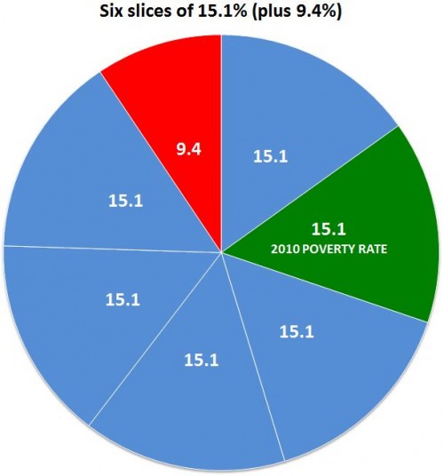
The U.S. Census Bureau reported last week that there were 46.2 million people in poverty in 2010, out of a population of 305.7 million. That is 15.1%, or if you prefer whole numbers, call it 151 out of every 1,000.

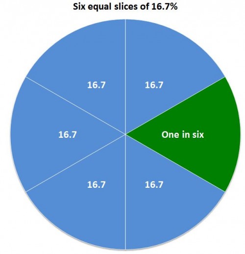
Most news reports seem to prefer reducing the rate to a numerator of one — which makes sense since it uses the smallest whole number possible, for your mental image. In that case, you could accurately call it one out of every 6.6, but no one did. Like the Washington Post and NPR, most called it some version of “nearly one in six.” That’s OK, if you’re willing to call 15.1 “nearly 16.7.”

Using percentages, here’s the difference:

A substantial minority of reports on the poverty report took the low road of rounding the fraction in the direction of their slant on the story. Some reports just went with “one in six,” including people on the political left who may be inclined to enlarge the problem, such as Democracy Now and the labor site American Rights at Work.

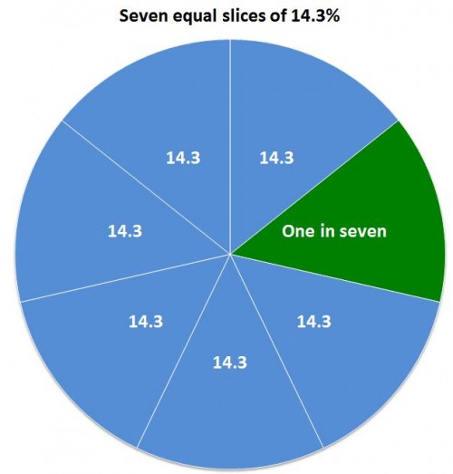
On the right, the Heritage Foundation’s Robert Rector and Rachel Sheffield called it “one in seven” in a column carried by the Boston Herald and others. (Their point, repeated here when the new numbers came out, is that the poor aren’t really poor anymore since they have many more amenities than they used to.) That’s cutting 15.1% down to 14.3%, which is actually closer to the truth than 16.7%:

It’s not that far off, but if your story is about the increase in poverty rates, it’s unfortunate to round down exactly to last year’s rate: 14.3%.

Then there are the people who may have just gotten stuck on the math and couldn’t decide which way to go, like the columnist who called it “essentially one in six” (which was ironic, because the point of his post was, “That’s the nice thing about most statistics, handled deftly, they can say just about anything you want them to.”) In some cases headline writers seem to have been the culprits, shortening the writer’s “almost one in six” to just “one in six.”

The worst exaggeration was from Guardian correspondent Paul Harris, who wrote, “the US Census Bureau has released a survey showing that one in six Americans now live in poverty: the highest number ever reported by the organisation.” The number — 46.2 million — is the highest ever reported, but the percentage was higher as recently as 1993.

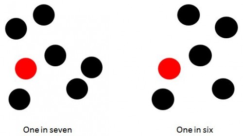
If the point is to conjure an image that helps make the number seem real to people, it probably doesn’t matter — you may as well just go for accuracy and say “fifteen percent.” (You definitely shouldn’t use pie charts, which are hard for viewers to judge.) That’s because most people can’t immediately make an accurate mental image of either six or seven — after four they count. But I could be wrong about that. Consider these images — would the choice of one over the other change your opinion about the poverty problem?

They both create a reasonable image. But the choices people made are revealing about their biases  — and the unfortunate state of numeracy in America. Because it does matter that the number of people in poverty rose by 2,611,000.

Maybe more important is who and where these poor people are. Here’s two other ways of representing it, with very different implications.

Fifteen percent over there:

Fifteen percent spread according to a random number generator:

Note that those are just abstractions for visualizing the overall percentage of poverty. But there is a real geographic distribution of rich and poor, described in recent research by Sean Reardon and Kendra Bischoff (free version here). They found that, not surprisingly, as income inequality has grown, so has income segregation — the tendency of rich and poor to live in different parts of town. And that probably makes reality even more abstract — and more subject to media construction — for people who aren’t poor.

Media depictions of trans people (almost entirely produced by non-trans individuals) tend to be fascinated by bodies. Since the (presumed) inappropriately gendered body is automatically monstrous, weird — or at the very least, available to be gawked at — the accessibility of trans bodies becomes a feature of their depiction.

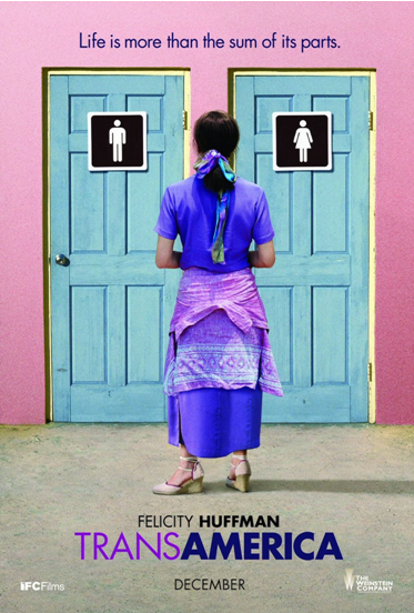
A big thread that runs through most visual media depictions is a fixation on stripping trans people naked, implying the naked body as “true.” The Crying Game’s big reveal comes when Del undresses, while the penultimate moment of self-fulfillment for Bree in Transamerica is represented by her naked in the tub, touching her vagina. Pre-op Bree’s “parts” trap her in-between, as the movie poster so helpfully informs prospective audiences—without surgery, she’s “really” just a man in a dress.

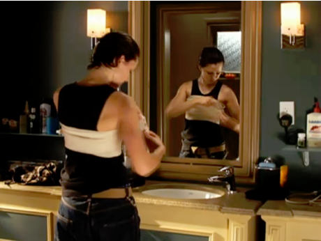
Chest surgery fills much the same function for images of trans men. The body-centrism was so prevalent in the recently released Becoming Chaz, the documentary following Chaz Bono’s transition, one critic titled his review: “About a Boy or About a Body?”  We see a similar interest in trans-bodies in Boys Don’t Cry and the teen soap Degrassi:

(Still shot from film Boys Don’t Cry. Courtesy of Fox Searchlight Films)

(Still shot from Degrassi. Courtesy of Alliance Atlantis)

In all of these cases, the trans person’s emotional and social existence is tied to the state of their body. Bree can’t possibly be fulfilled until she’s had surgery and can strip naked in front of an audience. Bono can “really” be a man only after top surgery and he can go shirtless. Most importantly, trans people appear to have no life outside of their body, and their transition sometimes forms a narrative arc of beginning (bad body), middle (fixing the body), and end (good body).  They are allowed to be a part of the story only as a person transitioning, their trans-status overwhelming everything about them that makes them unique individuals with complex personal stories.

——————————

Avery Dame is currently a master’s candidate in American Studies at the University of Kansas, where he studies media depictions of trans folks and trans vloggers on YouTube. He also blogs at the improbably named Ping Your Spaceman.

If you would like to write a post for Sociological Images, please see our Guidelines for Guest Bloggers.

In a recent interview at The Consensual Project, I was asked if I’d ever seen any “…videos, images, or sound bites that have provided [me] with valuable sexual health information.” I recounted this experience:

There is one video I saw, when I was about 21, that stands out in my mind even today…  The filmmaker asked about 40 women to stand naked, side-by-side, on the edge of a stage.  The camera captured the appearance of their bodies from about the neck to the knees, no faces, just bodies. (I don’t know if it was ever publicly available, but if anyone can send it to me, I’d be thrilled.)

Think about how rarely you actually see a new (near-)naked body that is not a model or the equivalent (actress etc).  With new sexual partners, perhaps.  And if you’re straight, this is (probably mostly) going to be the body of the other sex.  At the gym perhaps?  But you’re not supposed to look, so you probably don’t look closely.  I realized when I saw this video (it probably lasted all of two minutes), that I had never really seen women’s bodies outside of the mass media. I didn’t know what women’s bodies looked like.  And I had been comparing my body to that of actresses and models.  I realized that day that things about my body that I thought were horrible deformities were completely normal.  Even though the bodies in that video were all different, they were also very similar, and my body looked just like theirs in some cumulative way.  From that point on, I knew I wasn’t gross.  A simple lesson.  And so important, but a really hard one to encounter in a powerful way.

I was reminded of this story when I saw a photograph by Spencer Tunick.  Tunick specializes is getting large numbers of naked people together, arranging them, and taking pictures.  Most of them seem more polished than raw, but this one, featured at BoingBoing, seems to reveal bodies in some of their variety and similarity simultaneously.  It’s worth a good long look at each body; each is a precious point of push back against mass media’s representation of the female form.

Lisa Wade, PhD is an Associate Professor at Tulane University. She is the author of American Hookup, a book about college sexual culture; a textbook about gender; and a forthcoming introductory text: Terrible Magnificent Sociology. You can follow her on Twitter and Instagram.

Geographer Derek Watkins put together an interesting visualization of the expansion of the U.S. by showing the distribution of post offices between 1700 and 1900. The distribution of post offices reflects a number of important social and political events — the sudden emergence of post offices on the West Coast in the late 1840s, around the time of the gold rush and California becoming a state, patterns in Kansas and Nebraska in the 1870s clearly showing how population growth followed railroad lines, and so on:

Posted: Visualizing US expansion through post offices. from Derek Watkins on Vimeo.

You can read Watkins’s caveats about the data (it doesn’t include closures of some post offices during that time, and he was unable to determine the location of about 10% of post office branches) here. Thanks to Jeremy Freese, at Scatterplot, for posting it!

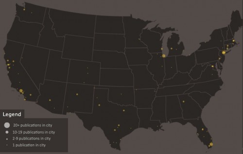
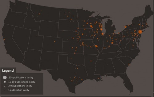
Dmitrity T.M. and Larry Harnisch (of The Daily Mirror) let us know that Stanford University’s Rural West Initiative put together a map showing the spread of newspapers across the U.S. between 1690 and 2011, based on Library of Congress listings. The results illustrate many of the same major social and political changes and trends as the post office map:

The Growth of US Newspapers, 1690-2011 from Geoff McGhee on Vimeo.

The website allows you to see the map for any individual year, and awesomely, you can filter by language, illustrating a number of periods of high immigration and common destination locations. Here’s the map of German-language newspapers in 1900:

And Spanish today:

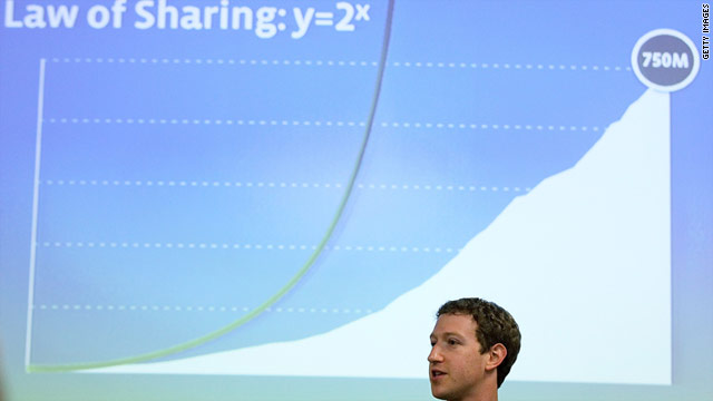
That’s Facebook founder Mark Zuckerberg and, behind him, his “law of information sharing.” The equation and graph illustrate, in his own words:

…that next year, people will share twice as much information as they share this year, and next year, they will be sharing twice as much as they did the year before.

The norms surrounding privacy are changing and new apps and services for us to display ourselves are being invented. Because of this, Zuckerberg predicts that we will share more and new types of information as time passes.

Facebook and the rest of social media (Twitter, Tumblr, Google+ and so on) need us to share more and more information. Facebook, for instance, uses our personal information to attract advertisers who want to better “target” their advertisements to us. Change your relationship status to “engaged” and you may be quickly targeted with wedding ads.

So what? 

Karl Marx said that we are “exploited” when we are not paid in wages the full value of our labor (our bosses, instead, skim some off the top).  Since our sharing makes Facebook valuable, it is our work that makes it the digital goldmine that it is (valued at around $84 billion). We, in turn, are paid no wages at all.

Should the average Facebook user feel exploited? 

Facebook users get non-monetary rewards from using the site, such as self-expression and socializing with others.  Perhaps personal connection or social attention is just another type of currency, one that Marx didn’t fully account for.  Then again, Marx never argued that workers weren’t compensated at all, only that their compensation was not equal to the value they brought to the employer.

So, what do you think? Is Facebook exploitative? Are monetary and social currencies fundamentally different?

Does a Marxist analysis work on Facebook? Or do we need a different theory to make sense of it all?

——————————

Nathan Jurgenson is a graduate student in sociology at the University of Maryland and co-edits the Cyborgology blog.

If you would like to write a post for Sociological Images, please see our Guidelines for Guest Bloggers.

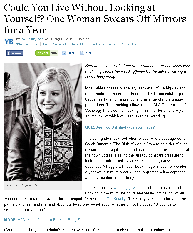
Sociology PhD candidate Kjerstin Gruys recently guest posted about her effort to shun mirrors for one year in the hopes of improving her body image.  As any really interesting and challenging project should, it’s begun to get some major media coverage, including a story at Yahoo News.  When a political project starts getting mass media attention, though, it risks being contextualized and even co-opted by the status quo.  This is a case in point.

Interspersed among the article about Gruys’ project are links, an effort on the part of the website to get readers to spend more time on its pages and the pages of its advertisers.  These are probably randomly generated according to the content of the article.  So, since Gruys’ project is about her feelings about her body and avoiding mirrors for six months before and after her wedding day, the links center around beauty and weddings.  The first two links nestled in among the first few paragraphs read “Are you Satisfied with Your Face?” and “A Wedding Dress to Fit Your Body Shape.”

By publicizing her project, Kjerstin is trying to make the personal political.  But one of the only means of drawing awareness to her work includes losing control of how it’s talked about and delivered.  While she wants women to feel better about themselves, and some may be inspired by her project, in some ways this is also another instance of the mass media reminding women to think about the appearance of their face and body. The inserted links, further, can be read as upholding the very standards that Gruys is trying to combat.  And in at least some cases, they do. The “Are you Satisfied with Your Face?” link, in this vein, goes to a site sponsored by super-beauty project corporation L’Oreal.

Thanks to my student, Kirsten Easton, for sending along this link!

Lisa Wade, PhD is an Associate Professor at Tulane University. She is the author of American Hookup, a book about college sexual culture; a textbook about gender; and a forthcoming introductory text: Terrible Magnificent Sociology. You can follow her on Twitter and Instagram.

Cross-posted, in Portuguese, at Petiscos de Sociologia.

Noam sent in a link to a website with a post featuring “beautiful” Chinese women who have been executed.  These women are apparently important not because of their sacrifice, or because of what they say about Chinese politics, but because they’re beautiful.  Non-beautiful women who have been executed apparently draw no interest.

Noam’s submission gave me a fantastic excuse to post a video of our very own Gwen Sharp giving a 4-1/2 minute lecture about a similar phenomenon, the Missing White Woman Syndrome (originally posted at the NSC School of Liberal Arts and Sciences; transcript after the jump).


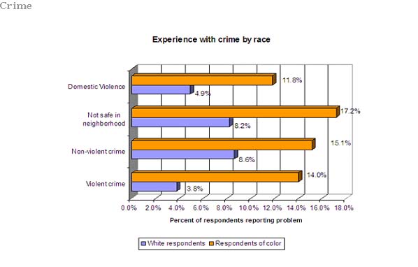
She covers quite a bit of ground.  After introducing the concept, she discusses data on the disproportionate coverage of crimes against white women, and how this shapes perceptions of risk.  In fact, white women are among the least likely type of person to be victimized.  This graph, coincidentally sent in by Grace S., doesn’t break down the data by gender, but it shows a clear pattern by race.

The constant attention to white women’s vulnerability, even though it’s disproportionate, makes it seem as if they are especially likely to be a victim of violent crime.  The risk that women of color will be victimized, then, is underestimated and not taken as seriously as it should be.  Meanwhile, white women may confine themselves to safer-seeming leisure activities and occupational pursuits.

These patterns affirm the role of racism in news making — with violence against women of color apparently less newsworthy — and also shows that white women, though valorized, may self-curtail their lives out of fear that they are, accordingly, the most likely target of violence.

Follow Gwen on Twitter!

References:

Chiricos, T., S. Eschholz, & M. Gertz. (1997). Crime, news and fear of crime: toward an identification of audience effects. Social Problems 44(3), 342-357.

Lundman, R.J. (2003). The newsworthiness and selection bias in news about murder: comparative and relative effects of novelty and race and gender typifications on newspaper coverage of homicide. Sociological Forum, 18(3), 357-386.

Transcript after the jump:
more...