media

Larry Harnisch, of L.A.’s The Daily Mirror, let us know that 4th Estate analyzed the racial and ethnic breakdown of reporters covering the presidential election for 38 major print media outlets. The analysis included front-page articles published between January 1st and October 12th of this year.

Here’s the key for all of the following images:

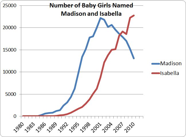
For every major topic, the overwhelming majority of front-page articles were written by non-Hispanic Whites, while racial/ethnic minorities were underrepresented compared to the overall U.S. population:

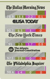
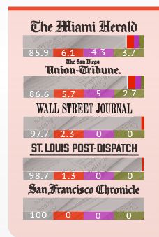
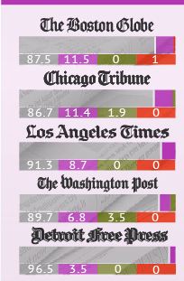
Major newspapers varied in the diversity of those writing their feature articles. The Dallas Morning News was the most diverse, with a particularly large percentage (18.8) of front-page stories written by African American reporters. The San Francisco Chronicle had the least diversity; 100% of its feature political stories were written by White non-Hispanics:

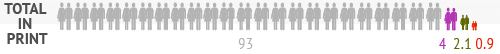
Overall, 93% of the feature articles analyzed in the database were written by White non-Hispanics, 4% by Asian Americans, about 2% by African Americans, and less than 1% by Hispanics. Compare that with each group’s proportion of the overall U.S. population:

These numbers clearly matter in terms of career opportunities and exposure for minorities within the industry. But they also should concern us readers. What does the lack of diversity mean in terms of the issues covered, the political contacts and average-Joe-voters spoken to, the topics seen as important enough to cover?

Also see our earlier post on the gender of those quoted in news stories about the election.

Gwen Sharp is an associate professor of sociology at Nevada State College. You can follow her on Twitter at @gwensharpnv.

The political humor of Saturday Night Live (SNL) has become a mainstay of modern elections in the United States. The show is especially well known for its impersonations of candidates. However, so far this season SNL’s spoof political advertisement from a fictitious group called Low Information Voters of America is generating the greatest amount of political discussion.

The mock advertisement depicts undecided voters as lacking basic civic knowledge as they ask questions about when the election is held, who is running and whether or not they are an incumbent, how long the president serves, who succeeds the president, and whether or not both sexes can legally vote. SNL presents these few remaining swing voters in a way that implies they might have a problematic amount of influence in a close election.

However, is low information an issue only with just late deciding swing voters, or are they much more prevalent in the United States? A little known Zogby poll conducted in 2006 on a representative sample of adults (+/- 2.9%) in the United States provides some insight about how uniformed voters are by comparing political knowledge to awareness of popular culture.

Whereas 73.8% of respondents correctly named the three stooges; only 42.3% of knew the three branches of the U.S. government. Fifty-six percent knew the name of J.K. Rowling’s Fictional boy wizard; yet only 49.5% correctly identified the Prime Minister of England—and this was during the fallout of Iraq war and Downing Street Memo. Sixty-three percent of those polled could not name one Supreme Court justice; 85% were able to identify at least two of the seven dwarfs. Twice as many respondents (22.6%) knew the last American Idol than the last justice confirmed to the Supreme Court (11.3%).

Democracy needs an informed electorate, although the level of information necessary to maintain an effective republic is open for debate. This poll (which does need to be redone because it is becoming quite dated) finds that many adults in the United States — both the decided and undecided — are more informed about popular culture than politics. Thus, while voters may be “informed enough,” it is still difficult to subjectively claim it is healthy for a democracy to have a populace more knowledgeable about reality television, children’s books and fairy tales than civics.

—————————

Jason Eastman is an Assistant Professor of Sociology at Coastal Carolina University who researches how culture and identity influence social inequalities.

In 2010 we posted about a Boston.com slide show celebrating Oktoberfest.  We argued that, while many different types of men were included, the women pictured were overwhelmingly young and often had visible cleavage.  That is, the slideshow was an example of the sexual objectification of women.  In response, the slide show editor, Alan Taylor, sent us a note saying that, while he didn’t disagree and was sympathetic to our concern, he was limited by what photographs were available as well as their quality.

This year’s photos, I noted pleasantly, had exactly zero gratuitous cleavage shots.  I thought I’d highlight it as an example of how not to sexually objectify women in an Oktoberfest slide show.

In other words, look! It’s possible to take pictures of young women in dirndls without showing tons of cleavage!

MSNBC does a pretty good job too.  See also, Oktoberfest and Tradition.

Lisa Wade, PhD is an Associate Professor at Tulane University. She is the author of American Hookup, a book about college sexual culture; a textbook about gender; and a forthcoming introductory text: Terrible Magnificent Sociology. You can follow her on Twitter and Instagram.

Cross-posted at Family Inequality.

In 2010, 28% of wives were earning more than their husbands. And wives were 8-times as likely as their husbands to have no earnings.

I still don’t have my copies of The End of Men, by Hanna Rosin, or The Richer Sex, by Liza Mundy. But I’ve read enough of their excerpts to plan out some quick data checks.

Both Rosin and Mundy say women are rapidly becoming primary earners, breadwinners, pants-wearers, etc., in their families. It is absolutely true that the trend is in that direction. Similarly, the Earth is heading toward being devoured by the Sun, but the details are still to be worked out. As Rosin wrote in her Atlantic article:

In feminist circles, these social, political, and economic changes are always cast as a slow, arduous form of catch-up in a continuing struggle for female equality.

Which is right. So, where are we now, really, and what is the pace of change?

For the question of relative income within married-couple families, which is only one part of this picture — and an increasingly selective one — I got some Census data for 1970 to 2010 from IPUMS.

I selected married couples (called “heterogamous” throughout this post) in which the wife was in the age range 25-54, with couple income greater than $0. I added husbands’ and wives’ incomes, and calculated the percentage of the total coming from the wife. The results show and increase from 7% to 28% of couples in which the wife earns more than the husband (defined as 51% or more of the total income):

(Thanks to the NYTimes Magazine for the triumphant wife image)

Please note this is not the percentage of working wives who earn more. That would be higher — Mundy calls it 38% in 2009 — but it wouldn’t describe the state of all women, which is what you need for a global gender trend claim. This is the percentage of all wives who earn more, which is what you need to describe the state of married couples.

But this 51% cutoff is frustratingly arbitrary. No serious study of power and inequality would rest everything on one such point. Earning 51% of the couple’s earnings doesn’t make one “the breadwinner,” and doesn’t determine who “wears the pants.”

Looking at the whole distribution gives much more information. Here it is, at 10-year intervals:

These are the points that jump out at me from this graph:

  • Couples in which the wife earns 0% of the income have fallen from 46% to 19%, but they are still 8-times as common as the reverse — couples where the wife earns 100%.
  • There have been very big proportionate increases in the frequency of wives earning more — such as a tripling among those who earn 50-59% of the total, and a quadrupling among those in which the wife earns it all.
  • But the most common wife-earning-more scenario is the one in which she earns just over half the total. Looking more closely (details in a later post) shows that these are mostly in the middle-income ranges. The poorest and the richest families are most often the ones in which the wife earns 0%.

Maybe it’s just the feminist in me that brings out the stickler in these posts, but I don’t think this shows us to be very far along on the road to female-dominance.

Previous posts in this series…

  • #1 Discussed The Richer Sex excerpt in Time (finding that, in fact, the richer sex is still men).
  • #2 Discussed that statistical meme about young women earning more than young men (finding it a misleading data manipulation), and showed that the pattern is stable and 20 years old.
  • #3 Debunked the common claim that “40% of American women” are “the breadwinners” in their families.
  • #4 Debunked the description of stay-at-home dads as the “new normal,” including correcting a few errors from Rosin’s TED Talk.
  • #5 Showed how rare the families are that Rosin profiled in her excerpt from The End of Men

In 1956 sociologist C. Wright Mills published a book titled The Power Elite.  In it, he argued that our democracy was corrupt because the same people exercised power in business, the military, and politics.  This small group, with so many important roles and connections, had an influence on our society that was far out-of-proportion with their numbers.  This, he concluded, was a dire situation.

Fast forward to 2012 and Lambert Strether posted a series of Venn diagrams at Naked Capitalism.  Strether writes:

[This] nifty visualization… shows how many, many people, through the operations of Washington’s revolving door, have held high-level positions both in the Federal government and in major corporations. To take but one example, the set of all Treasury Secretaries includes Hank Paulson and Bob Rubin, which overlaps with the set of all Goldman Sachs COOs. The overlapping is pervasive. Political scientists and the rest of us have names for such cozy arrangements — oligarchy, corporatism, fascism, “crony capitalism” — but one name that doesn’t apply is democracy.

UPDATE: I’ve included a criticism of the methodology after the diagrams; the overlap portrayed here is almost exclusively among Democratic politicians and the diagrams were explicitly intended to point out connections among progressives.

See for yourself:

On the methods for putting together these diagrams, Strether writes about the person who’s behind the diagrams:

Herman’s honest: Her goal is to “expose progressive corporatism,” and — assuming for the sake of the argument that D[emocrat]s are progressive, and that “progressives” are progressive — her chart does exactly that, and very effectively, too.

But what her data does not do is expose corporatism as such; there are very, very few Rs listed; it strains credulity that Hank Paulson was the only high-level GS operative in the Bush administration, for example, and if GS isn’t the R[epublican]s’ favorite bank, there’s surely another.

Hence, Herman’s chart, if divorced from context[2], might lead somebody — say, a child of six — to conclude that the only corporatists in Washington DC are D[emocrat]s.

Thanks to Carolyn Taylor for pointing out the methods bias.

Lisa Wade, PhD is an Associate Professor at Tulane University. She is the author of American Hookup, a book about college sexual culture; a textbook about gender; and a forthcoming introductory text: Terrible Magnificent Sociology. You can follow her on Twitter and Instagram.

Cross-posted at Family Inequality.

It is great to acknowledge and celebrate the increase in father involvement in parenting. But it is not helpful to exaggerate the trend and link it to the myth-making about looming female dominance. Yesterday’s feature in the Sunday New York Times does just that, and reminds me that I meant to offer a quick debunking of Hanna Rosin’s TED talk.

The story is headlined “Just Wait Till Your Mother Gets Home.” The picture shows a group of dads with their kids, as if representing what one calls “the new normal.” Careful inspection of the caption reveals it is a “daddy and me” music class, so we should not be surprised to see a lot of dads with their kids.

The article also makes use of a New Yorker cover, which captures a certain gestalt — it’s a funny exaggeration — but should not be confused with an empirical description of the gender distribution of parents and playgrounds:

Naturally, the story is in the Style section, so close reading of the empirical support is perhaps a fool’s errand. However, I could not help noticing that the only two statistics in the story were either misleading or simply inaccurate. In the category of misleading, was this:

In the last decade, though, the number of men who have left the work force entirely to raise children has more than doubled, to 176,000, according to recent United States census data. Expanding that to include men who maintain freelance or part-time jobs but serve as the primary caretaker of children under 15 while their wife works, the number is around 626,000, according to calculations the census bureau compiled for this article.

The Census Bureau has for years employed a very rigid definition of stay-at-home dads, which only counts those who are out of the labor force for an entire year for reasons of “taking care of home and family.” This may seem an overly strict definition and an undercount, but if you simply counted any man with no job but with children as a stay-at-home dad, you risk counting any father who lost a job as stay-at-home. (A former student of mine, Beth Latshaw, now at Appalachian State University, has explored this issue and published her results here in the journal Fathering.)

In any event, those look like big numbers, but one should always be wary of raw numbers in the news. In fact, when you look at the trend as published by the Census Bureau, you see that the proportion of married couple families in which the father meets the stay-at-home criteria has doubled: from 0.4% in 2000 to 0.8% today. The larger estimate which includes fathers working part-time comes out to 2.8% of married couple families with children under 15. The father who used the phrase “the new normal” in the story was presumably not speaking statistically.

(Source: My calculations from Census Bureau numbers [.xls file]. Includes only married-couple families with children under age 15.)


That’s the misleading number. The inaccurate number is here:

About 40 percent of women now make more than their husbands, the bureau’s statistics show, and that may be only the beginning of a seismic power shift, if new books like “The Richer Sex: How the New Majority of Female Breadwinners Is Transforming Sex, Love, And Family,” by Liza Mundy, and “The End of Men: And the Rise of Women,” by Hanna Rosin, are to be believed.

I guess in these troubled times for the newspaper business it might be acceptable to report X and Y statistic “if so-and-so is to be believed.” But it is a shame to do so when the public is paying the salary of people who have already debunked the numbers in question. Just the other day, I wrote about that very statistic: “Really? No. I don’t know why this keeps going around.” Using freely available tables (see the post), I calculated that a reasonable estimate of the higher-earning-wife share is 21%. In fact, on this point Liza Mundy and Hanna Rosin and are not to be believed.

(Source: My graph from Census Bureau numbers.)


TED: Misinformation Frequently Spread

There is a TED talk featuring Hanna Rosin from the end of 2010, and I finally got around to watching it. Without doing a formal calculation, I would say that “most” of the statistics she uses in this talk are either wrong or misinterpreted to exaggerate the looming approach of female dominance. For example, she says that the majority of “managers” are now women, but the image on the slide which flashes by briefly refers to “managers and professionals.” Professionals includes nurses and elementary school teachers. Among managers themselves, women do represent a growing share (although not a majority, and the growth has slowed considerably), but they remain heavily segregated as I have shown here.

Rosin further reports that “young women” are earning more than “young men.” This statistic, which has been going around for a few years now, in fact refers to single, child-free women under age 30 and living in metropolitan areas. That is an interesting statistic, but used in this way is simply a distortion. (See this post for a more thorough discussion, with links.)

Rosin also claims that “70% of fertility clinic patients” prefer to have a female birth. In her own article in the Atlantic, Rosin reports a similar number for one (expensive, rare) method of sex selection only (with no source offered) — but of course the vast majority of fertility clinic patients are not using sex selection techniques. In fact, in her own article she writes, “Polling data on American sex preference is sparse, and does not show a clear preference for girls.”

Finally, I don’t think I need to offer statistics to address such claims as women are “taking control of everything”and “starting to dominate” among “doctors, lawyers, bankers, accountants.” These are just made up. Congress is 17% female.

Philip N. Cohen is a professor of sociology at the University of Maryland, College Park, and writes the blog Family Inequality. You can follow him on Twitter or Facebook.

Cross-posted at Montclair SocioBlog.

Isabella was the second most popular name for baby girls last year.  She had been number one for two years but was edged out by Sohpia.  Twenty-five years ago Isabella was not in the top thousand.

How does popularity happen?  Gabriel Rossman’s new book Climbing the Charts: What Radio Airplay Tells Us about the Diffusion of Innovation offers two models.*   People’s decisions — what to name the baby, what songs to put on your station’s playlist (if you’re a programmer), what movie to go see, what style of pants to buy —  can be affected by others in the same position.  Popularity can spread seemingly on its own, affected only by the consumers themselves communicating with one another person-to-person by word of mouth.  But our decisions can also be influenced by people outside those consumer networks – the corporations or people produce and promote the stuff they want us to pay attention to.

These outside “exogenous” forces tend to exert themselves suddenly, as when a movie studio releases its big movie on a specified date, often after a big advertising campaign.  The film does huge business in its opening week or two but adds much smaller amounts to its total box office receipts in the following weeks.   The graph of this kind of popularity is a concave curve.  Here, for example, is the first  “Twilight” movie.

Most movies are like that, but not all.  A few build their popularity by word of mouth.  The studio may do some advertising, but only after the film shows signs of having legs (“The surprise hit of the year!”).  The flow of information about the film is mostly from viewer to viewer, not from the outside.

This diffusion path is “endogenous”; it branches out among the people who are making the choices.  The rise in popularity starts slowly – person #1 tells a few friends, then each of those people tells a few friends.  As a proportion of the entire population, each person has a relatively small number of friends.  But at some point, the growth can accelerate rapidly.  Suppose each person has five friends.  At the first stage, only six people are involved (1 + 5); stage two adds another 25, and stage three another 125, and so on.  The movie “catches on.”

The endogenous process is like contagion, which is why the term “viral” is so appropriate for what can happen on the Internet with videos or viruses.   The graph of endogenous popularity growth has a different shape, an S-curve, like this one for “My Big Fat Greek Wedding.”

By looking at the shape of a curve, tracing how rapidly an idea or behavior spreads, you can make a much better guess as to whether you’re seeing exogenous or endogenous forces.  (I’ve thought that the title of Gabriel’s book might equally be Charting the Climb: What Graphs of Diffusion Tell Us About Who’s Picking the Hits.)

But what about names, names like Isabella?  With consumer items  – movies, songs, clothing, etc. – the manufacturers and sellers, for reasons of self-interest, try hard to exert their exogenous influence on our decisions.  Nobody makes money from baby names, but even those can be subject to exogenous effects, though the outside influence is usually unintentional and brings no economic benefit.  For example, from 1931 to 1933, the first name Roosevelt jumped more than 100 places in rank.

When the Census Bureau announced that the top names for 2011 were Jacob and Isabella, some people suspected the influence of an exogenous factor — “Twilight.”

I’ve made the same assumption in saying (here) that the popularity of Madison as a girl’s name — almost unknown till the mid-1980s but in the top ten for the last 15 years — has a similar cause: the movie “Splash” (an idea first suggested to me by my brother).  I speculated that the teenage girls who saw the film in 1985 remembered Madison a few years later when they started having babies.

Are these estimates of movie influence correct? We can make a better guess at the impact of the movies (and, in the case of Twilight, books) by looking at the shape of the graphs for the names.

Isabella was on the rise well before Twilight, and the gradual slope of the curve certainly suggests an endogenous contagion.  It’s possible that Isabella’s popularity was about to level off  but then got a boost in 2005 with the first book.  And it’s possible the same thing happened in 2008 with the first movie. I doubt it, but there is no way to tell.

The curve for Madison seems a bit steeper, and it does begin just after “Splash,” which opened in 1984.   Because of the scale of the graph, it’s hard to see the proportionately large changes in the early years.  There were zero Madisons in 1983, fewer than 50 the next year, but nearly 300 in 1985.  And more than double that the next year.  Still, the curve is not concave.  So it seems that while an exogenous force was responsible for Madison first emerging from the depths, her popularity then followed the endogenous pattern.  More and more people heard the name and thought it was cool.  Even so, her rise is slightly steeper than Isabella’s, as you can see in this graph with Madison moved by six years so as to match up with Isabella.

Maybe the droplets of “Splash” were touching new parents even years after the movie had left the theaters.

————————

* Gabriel posted a short version about these processes when he pinch hit for Megan McCardle at the Atlantic (here).

The mass media often enjoys stoking the fires of the “nature/nurture debate,” an argument between those who believe that human behavior is largely inborn (nature) and those who believe it is largely learned (nurture).  In fact, most scholars reject this forced choice in favor of the idea that nature and nurture are forces that shape each other.

In this view, biology is both an independent and a dependent variable.  That is, it acts on us in ways that shape our interactions with others (such that behavior is dependent on biology) and our interactions with others shape our biology (such that our biology is dependent on our behavior).  I’ve published professionally on this topic and we’ve previously posted examples involving the socio-genetic causation of psychopathythe response of testosterone levels to political victories, and the historical shift in the average age of menstruation.

Today’s example comes from an fMRI study of emotion.  They discovered that, when we watch others experience emotions, our brains sync up with theirs.  Our bodies, in other words, strongly react to environmental stimuli.  This, argues one of the researchers, “…facilitates understanding others’ intentions and actions… [as well as] social interaction and group processes.”

It may seem obvious that our neural activity would respond to our environments, but I think it bears emphasizing.  It is too easy for us, in a society that seems eager for a biological explanation for everything, to ignore the ways in which the body is a dependent variable as well as an independent one.  In many ways it makes sense to think of our biologies as the matter through which social interaction occurs.  In other words, while we often think of society as the medium for the transmission of genes, I also like to think of biology as the medium for the transmission of society.

Lisa Wade, PhD is an Associate Professor at Tulane University. She is the author of American Hookup, a book about college sexual culture; a textbook about gender; and a forthcoming introductory text: Terrible Magnificent Sociology. You can follow her on Twitter and Instagram.