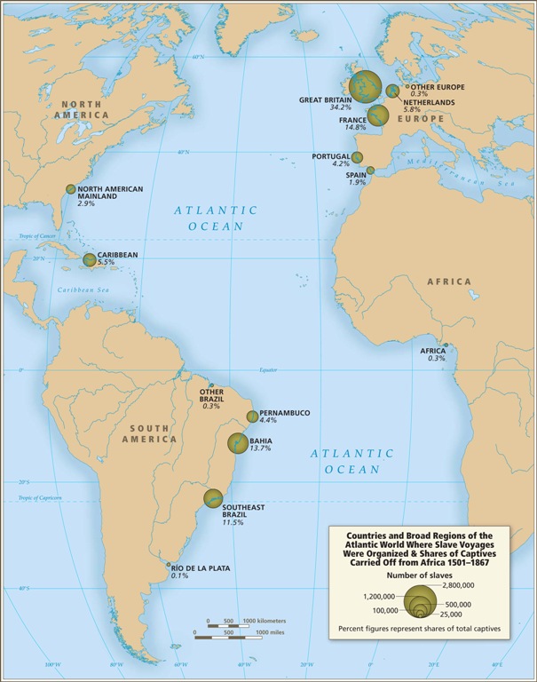
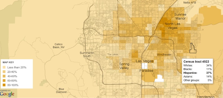
immigration/citizenship

Emory University has a very detailed database about the Atlantic slave trade, titled Voyages: The Trans-Atlantic Slave Trade Database, which I don’t believe we’ve posted before (my apologies if we have). It includes nine maps providing information on major points of departure and destination ports for the trans-Atlantic trade; here’s a general overview:

Initially the vast majority of slave voyages were organized by firms or individuals in Spain and Portugal; however, over time the slave trade was dominated by groups from northern Europe. Great Britain eventually played a major role, and over 1/3 of documented slave voyages were organized there.The description of Map 6 explains, “vessels from the largest seven ports, Rio de Janeiro, Bahia, Liverpool, London, Nantes, Bristol, and Pernambuco carried off almost three-quarters of all captives removed from Africa via the Atlantic Ocean.”

This map shows where voyages were organized, and the % of all documented African slaves that voyages from that country/area transported:

In the U.S., students generally learn about slavery in relation to cotton plantations and, to a lesser extent, tobacco. However, overall those two crops played a relatively minor role in the growth of the global slave trade. It was the growing taste for sugar, and the creation of sugar plantations, particularly in the Caribbean and South American coastal areas, that produced such an enormous demand for African slaves in the Americas. According to the Voyages website, less than 4% of all Africans captured were sold in North America.

The website also has a database of thousands of documented trips in the trans-Atlantic slave trade, including everything from point of origin, destination, number of slaves, % who died during voyage, length of trip, and so on. Some include many more details than others, as you’d expect. You can also create tables to display the variables you’re interested in. Here’s the table showing the slave trade, broken into 25-year intervals and by destination. We can clearly see that the slave trade made one big jump in the late 1500s (going from 4,287 in the 1551-1575 interval to 73,865 between 1576 and the end of the century) and another huge jump in the late 1600s, with the height of the slave trade occuring in the 1700s through the mid-1800s:

You can also create various graphs and charts. Here is a graph of the % of slaves who died during the trip, by year:

I presume the extremely high numbers in the 1550s must be skewed by some ships that sank or met some other disaster that led to the death of everyone aboard.

Over time, ships carried larger numbers of individuals per trip:

The individuals taken as part of the slave trade were predominantly male:

Documented types of resistance from captives or from Africans trying to free them:

You can spend quite a bit of time on this, I warn you — creating timelines, graphs, and so on. It’s taken me an hour to write this post because I keep getting distracted creating charts and tables. Overall, the site is a fantastic resource for both specific information and for helping illuminate the enormity of the Atlantic slave trade. Thanks to Shamus Khan for the tip.

Back in September, I posted about some maps put together by Eric Fischer, using 2000 Census data, showing the racial/ethnic makeup of selected cities. As Jeff H., Eluned J., and Dmitriy T.M. pointed out, the NYT now has up an interactive map where you can see the racial/ethnic composition of any Census tract, using more updated Census Bureau data from 2005 to 2009. For instance, here’s a map of the neighboring cities of Midland and Odessa, Texas, which I picked for no reason other than that I just watched an episode of Friday Night Lights, which is set in a fictionalized version:

Color key:

You can zoom in to get quite detailed information about individual neighborhoods. I zoomed in as far as I could on Miami (each dot now represents 50 people):

There’s also a tab that says “View More Maps.” It allows you to select to see just the distribution of Whites, Blacks, Hispanics, Asians, or the foreign-born population. Here’s the map of the Hispanic population of Las Vegas:

As you can see, if you hover over a Census tract, you can get specific data on its racial/ethnic makeup.

The foreign-born population of Seattle (if you hover over a tract, it will tell you the % foreign-born, as well as the % increase in the foreign-born population since 2000):

A great resource. Although I tried to look up my home town, and even zooming in to the smallest scale, it’s too small to have any data available.

Back in October, NPR presented the results of their investigation into the writing of Arizona’s notorious anti-immigrant law, SB 1070. I was listening to NPR when the story first aired, and I was stunned. The discussion of the law, which allows Arizona law enforcement officers to ask people they stop for proof of citizenship/legal immigration (and to arrest them if they don’t have it), has generally left out one important part of the story: the role of the private prison industry (the above link has an audio file of the story; you can get a complete transcript here):

NPR spent the past several months analyzing hundreds of pages of campaign finance reports, lobbying documents and corporate records. What they show is a quiet, behind-the-scenes effort to help draft and pass Arizona Senate Bill 1070 by an industry that stands to benefit from it…

Corrections Corporation of America, a for-profit prison company, used its membership in the American Legislative Exchange Council (ALEC), a group that brings government officials and corporate representatives together, to lobby for and shape the wording of the bill, which they see as being in their direct interest:

According to Corrections Corporation of America reports reviewed by NPR, executives believe immigrant detention is their next big market. Last year, they wrote that they expect to bring in “a significant portion of our revenues” from Immigration and Customs Enforcement, the agency that detains illegal immigrants.

Once the bill was introduced, CCA began lobbying the broader Arizona legislature. This graphic illustrates the interconnections between ALEC, private prison companies, and final sponsorship of the bill. Of the co-sponsors of the bill, only 6 didn’t receive campaign contributions from the private prison industry (represented by the dollar signs), and the vast majority had either been at the ALEC meeting or were at least members:

In a foll0w-up story (transcript here), NPR explains how ALEC’s “conferences” allow legislators to meet with corporations but get around regulations that normally require disclosure of corporate gifts:

Videos and photos from one recent ALEC conference show banquets, open bar parties and baseball games — all hosted by corporations. Tax records show the group spent $138,000 to keep legislators’ children entertained for the week. But the legislators don’t have to declare these as corporate gifts…legislators can just say they went to ALEC’s conference. They don’t have to declare which corporations sponsored these events.

I know that corporations regularly lobby legislators. That in and of itself shouldn’t be surprising — or even inherently problematic if done in a transparent manner. But I have to say, thinking about the fact that private prison industries are actively lobbying to get elected officials to create new categories of crime so they’ll have to lock up more people, and that this connection was ignored for over 6 months after the bill was implemented, struck me as particularly disturbing — as did the fact that once this came out, we haven’t seen any widespread backlash or citizen outcry at the idea that there are companies that directly stand to benefit from putting people in jail helping to write and pass criminal codes.

The United States is a nation of immigrants… in that the majority of its citizens are not part of the native population of North America.  In other words, because it was and remains a colonized land.

That aside, is the United States unique in receiving an extremely large number of new immigrants relative to its size?  It turns out, No.

Lane Kenworthy, at Consider the Evidence, posted this figure, showing that the U.S. population does indeed include a substantial proportion of first generation immigrants (both legal and illegal), but it is not unique in that regard, nor does it carry the highest percentage:

It also fails to be true, as many anti-immigration people claim, that the U.S. accepts a uniquely large number of immigrants who need help once they arrive:

Lisa Wade, PhD is an Associate Professor at Tulane University. She is the author of American Hookup, a book about college sexual culture; a textbook about gender; and a forthcoming introductory text: Terrible Magnificent Sociology. You can follow her on Twitter and Instagram.

George H.W. Bush’s 1988 “Willie Horton” campaign ad is infamous for racializing fears of crime, encouraging stereotypes of African American men as violent and threatening. The ad is widely believed to have destroyed Michael Dukakis’s chances for winning the presidency, presenting him as soft on crime. It’s a classic example of race-baiting in political campaigns — ads that present racial/ethnic minorities as threatening. Jesse Helms took a different approach with his affirmative action ad, which draws on some Whites’ fears that they are losing out on jobs because of affirmative action.

This election cycle, a number of candidates have produced ads that clearly attempt to stoke and benefit from anti-Hispanic immigrant sentiment. Talking Points Memo posted a mailer sent out by the Yuma County, Arizona, Republican Party as part of its campaign against Democratic state Representative Rae Waters. One side shows a stop sign full of bullet holes and makes a link between immigrants and neighborhood crime:

SB 1070 is the controversial Arizona law that allows law enforcement officials to check the immigration status of people they have stopped for other violations if there is a “reasonable suspicion” they might be undocumented or not carrying the appropriate papers.

To drive the message home, the other side of the mailer contains an image of a blond child, looking a little disturbed, and again links opposition to SB 1070 to “drugs and violence”:

Here in Nevada, Senate candidate Sharon Angle is currently running this commercial that calls Harry Reid the best friend of “illegals,” who are “putting Americans’ safety and jobs at risk.”

The commercial ends with this image:

She has a second commercial that plays on the same themes:

In West Virginia, this ad against Nick Rahall, a Christian Lebanese-American, prominently displays the phrase “Arab Americans” (he chaired Arab Americans for Obama) while scary music plays in the background:

If you have other examples of racialized or anti-immigrant imagery in current campaign ads, let us know.

UPDATE: S. Elle let us know about this ad by Senator David Vitter, of Louisiana, which is very similar to the Angle commercials:

And kantmakm provided a link to this billboard outside Grand Junction, Colorado:


In this video, suggested by Dmitriy T.M., photographer Aaron Huey powerfully illustrates the history of the relationship between the U.S. and the Lakota of the Sioux Nation.   It includes the making and breaking of treaties, the use of the idea of private property to strip the Lakota of their land, the Battle of Wounded Knee, the stealing of the Black Hills, and the socio-economic (and related) disadvantages faced by the Lakota today.

Lisa Wade, PhD is an Associate Professor at Tulane University. She is the author of American Hookup, a book about college sexual culture; a textbook about gender; and a forthcoming introductory text: Terrible Magnificent Sociology. You can follow her on Twitter and Instagram.

This 23-minute documentary, The Colony, explores Chinese immigration to Senegal. The immigrants are drawn to Africa by the promise of lucrative entrepreneurship and they are changing the economic landscape, to the pleasure and displeasure of locals.

At Al Jazeera.

Lisa Wade, PhD is an Associate Professor at Tulane University. She is the author of American Hookup, a book about college sexual culture; a textbook about gender; and a forthcoming introductory text: Terrible Magnificent Sociology. You can follow her on Twitter and Instagram.

During the 19th the United States received many new residents from China.  Sometimes they came voluntarily; sometimes they were imported forcibly.  The term “Shanghaied” originally described the forced stealing of Chinese men to come work in America.  Many of them worked on the transcontinental railroad, built between 1863 and 1869.  Ninety percent of the workers on the central Pacific track, for example, were Chinese.

After the railroad was completed, however, many Chinese went to work in industries in which they competed with white American workers, especially mining, and they became scapegoats for white unemployment.  For some examples of anti-Asian propaganda, see our collection of “yellow peril” posters and cartoons.

Animosity towards the Chinese culminated in the Chinese Exclusion Act of 1882.  The Act meant that Chinese in America, most of whom were adult men, had little hope of reuniting with their families if they stayed in the U.S.; it also allowed the U.S. to deny re-entry if a Chinese person already in the U.S. left the country; and it excluded the Chinese in America from getting U.S. citizenship.

The Chinese Exclusion Act is an ugly moment in U.S. history that was supported by many Americans.  But this support wasn’t universal.  The political cartoon below attacks the Act.  “No admittance to Chinamen,” it reads.  But “communist nihilist-socialist fenian & hoodlum [are] welcome.”  The punchline reads, sarcastically, “We must draw the line somewhere, you know.”

(Image from Time.)

The Fenian, by the way, were Irish political groups, suggesting that the embrace of one minority group did not necessarily translate into the embrace of others.   Or maybe the cartoon was meant to go the other way: “If we’re going to exclude the Chinese, let’s exclude others as well.”

UPDATE: Loki offered the following helpful correction to my description of the word “Shanghaid”:

A bit of disagreement: The verb to Shanghai someone was more often used with respect to the practice of crimps or other people to use force, intimidation or outright kidnapping to man merchant ships during the 18th century.

I’m not about to claim that there weren’t cases of people from Shanghai being forcibly relocated to the US to work on the railroad – but the term refers to one of the abuses of common sailors that was considered usual practice in the age of sail.

Wikipedia article here, for some background of the maritime history of the term: http://en.wikipedia.org/wiki/Shanghaiing

Lisa Wade, PhD is an Associate Professor at Tulane University. She is the author of American Hookup, a book about college sexual culture; a textbook about gender; and a forthcoming introductory text: Terrible Magnificent Sociology. You can follow her on Twitter and Instagram.