immigration/citizenship

A couple of years ago I posted a segment from the PBS series Faces of America focusing on the legal efforts by Syrian immigrants in the late 1800s and early 1900s to be officially recognized as White (and thus eligible for naturalized citizenship). It nicely illustrates the social construction of race and ethnicity, and the way  power struggles are embedded in the categories we recognize and who is assigned to each one.

In Not Quite White: Arabs, Slavs, and the Contours of Contested Whiteness, directors Jamil Khoury and Stephen Combs integrated scenes from Khoury’s play WASP: White Arab Slovak Pole and interviews with scholars from the Arab American and Polish American communities to “reflect upon contested and probationary categories of whiteness and the use of anti-Black racism as a ‘whitening’ dye.”

Thanks to Katrin for the link!

Cross-posted at Thick Culture.

As of the 2010 Census, Latinos represent 17 percent of the US population, but are woefully underrepresented in traditional forms of political participation like voting and making campaign contributions. The Pew Hispanic center reports that while Latinos represented 21% of all eleigible voters in 2010, they accounted for only 6.6% of midterm election voters.

One area where Latinos are more likely to participate when compared to non-Latino whites is in outsider forms of participation like protest activity. This form of activity became synonymous with Latino political participation during the 2006 Grand Marcha where 500,000 protesters packed streets to protest immigration bills. A 2006 CIRCLE study finds that Latino youth, while not engaged in formal types of participation were much more likely to report having engaged in a protest:

Although young Latinos are generally not as engaged as other racial/ethnic
groups, 25% said that they had participated in a protest—more than twice the
proportion of any other racial/ethnic group.

By comparison, only 11% of all youth surveyed had reported taking part in a protest. The accounts for why Latinos protest more than other groups vary but a main causal fator is the lack of access to formal political channels, particularly for non-citizens and undocumented immigrants. Lisa Martinez (2008) points out that Latinos are less likely to engage in protest activity when they live in places with high numbers of elected officials. Is the increase in Latino political engagement via protest simply the result of demographic realities (e.g. residents can’t vote) or is it a leading indicator of an overall dissatisfaction with politics?

——————————

Jose Marichal, PhD, is an assistant professor of political science at California Lutheran University. He teaches and writes about: public policy, race and politics, civic engagement, the Internet and politics, and community development.  He is founder of the blog ThickCulture.

Cross-posted at Jezebel.

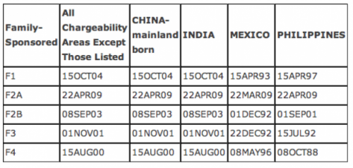
Yesterday I posted about U.S. immigration trends, updated through 2010. Following up on that, Dolores R. found another immigration-related post by KPCC…this time, a look at the wait time to get a family-sponsored immigration visa. With the removal of strict, racialized quotas in 1965, the U.S. turned to a policy based on a set of priorities for deciding who would be granted a visa; among the various categories was a preference for those who had sponsoring relatives already living in the U.S., with different visas and priorities based on family relationship:

  • F1 = unmarried adult children of U.S. citizens
  • F2A = spouses and children (under age 21) of permanent residents
  • F2B = unmarried adult children of permanent residents
  • F3 = married adult children of U.S. citizens
  • F4 = siblings of adult U.S. citizens

According to the U.S. State Department, the annual minimum family-reunification visa target is 226,000 (note that this excludes spouses, parents, and minor children of U.S. citizens, who are highest priority for immigration and are exempt from immigration caps). The Immigration and Naturalization Act requires that family-sponsorsed (as well as employer-sponsored) visas be granted in the order that eligible potential immigrants applied. Unsurprisingly, many years there are more eligible applicants than there are available visas, leading to a backlog of individuals who qualify to immigrate but are waiting for a visa to become available. In particular, China, Mexico, India, and the Philippines are “oversubscribed,” meaning there is a significant backlog.

How long? The table below shows the cut-0ff date for visa applicants in each category as of January 2012. That is, the dates given here are the date by which a person had to apply to finally have a visa available this month; the 2nd column shows for all areas excluding the four countries singled out because of their particularly long wait times:

The least oversubscribed visa category is the F2A, where those now receiving visas will have waited a bit under 3 years. But look at some of the other dates listed. For F1, F2B, and F3 visas from Mexico, the people now at the head of the line have been waiting nearly two decades, having applied in 1992 or early 1993. F4 applicants from the Philippines have been waiting almost a quarter century, since 1988.

This is part of the reason why undocumented immigration continues, and arguments about fairness and waiting their turn in line may not be particularly compelling to individuals who want to reunite with family members in the U.S. Waiting a year, or two, or five, may seem reasonable. If you learn there’s a 20-year wait, the cost/benefit analysis of whether to wait for the visa to come through or to find other means may shift significantly, regardless of how otherwise law-abiding a person might be.

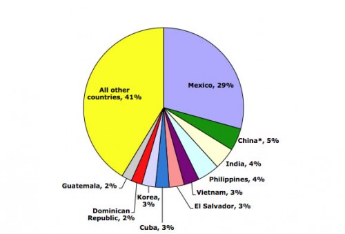
Dolores R. let us know that the Migration Policy Institute has a bunch of updated data and charts/graphs illustrating immigration trends in the U.S. through 2010 (via the KPCC website). So, in 2010, where did immigrants to the U.S. come from? As you may expect, the single largest source of immigrants was Mexico:

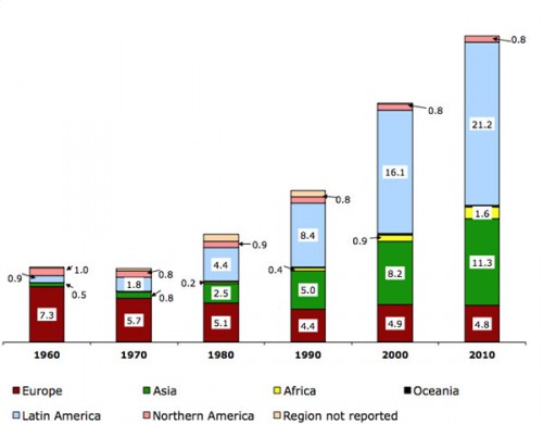
Looking at the region of birth of immigrants in the U.S. (in millions) over time reveals clear patterns:

Notice the shift over time, with fewer immigrants coming from Europe (red) but a major increase in the number of immigrants from Asian and Latin America (green and light blue), noticeable already by 1980. This reflects changes to U.S. immigration policy in 1965 that got rid of the old quota system that openly favored northern and western Europeans. The result was a major change in the demographics of U.S. immigrants.

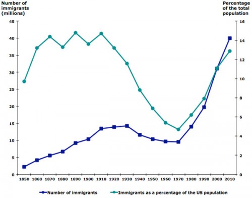
As of 2010, immigrants made up about 13% of the total U.S. population — the highest level in decades, but still not at the all-time high levels seen at several points in the late 1800s/early 1900s:

Lots more data at the MPI website, including a map where you can get very detailed information about the foreign-born population for each state. You might also want to check out our posts on U.S. immigration and geographic names, an interactive map of immigrant settlement patterns, English acquisition among U.S. immigrants, and a map of concentrations of speakers of various languages in the U.S.

Sonita M. sent in a report from the Movement Advancement Project about the state of lesbian, gay, bisexual, and transgender (LGBT) families.

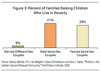
LGBT families are more likely to be poor than non-LGBT families.  Nine percent of married cis-gender different-sex couples live in poverty, compared to 21% of gay male couples and 20% of lesbian couples:

LGBT couples may be more likely to be in poverty in part because of wage differentials between gays, lesbians, and their heterosexual counterparts.  Research shows that gay and bisexual men earn significantly less money than heterosexual men, whereas lesbians make somewhat more money than straight women.  Gay men would be more likely than heterosexual men to be in poverty, then.  But what about women? Women in same-sex couples face the same wage disadvantage that all women face, but also are not married to the heterosexual men that are making so much money (making it so that heterosexual women can make less money than gay women, but still be less likely to live in poverty). Make sense?  I hope so.

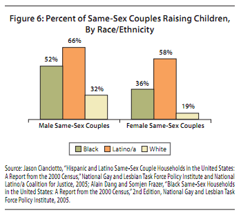
The second reason that LGBT couples with children are more likely than cis-gendered different-sex couples with children to live in poverty is that Black and Latino LGBT people are more likely than White LGBT people to be parents, and Blacks and Latinos are disproportionately poor to begin with:

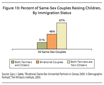
Among same-sex couples, being a parent is also correlated with immigration status, which also correlates with class.  Non-citizens are more likely to be parents than citizens:


The two million children in America being raised by LGBT parents, then, are more likely to suffer from class disadvantage.  The authors of the report go on to discuss the ways in which formal policy and informal discrimination contribute to this state of affairs.

Via Andrew Sullivan.

Lisa Wade, PhD is an Associate Professor at Tulane University. She is the author of American Hookup, a book about college sexual culture; a textbook about gender; and a forthcoming introductory text: Terrible Magnificent Sociology. You can follow her on Twitter and Instagram.

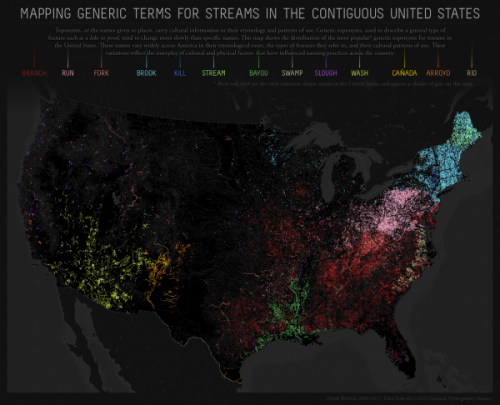
Dolores R. sent a link to a map created by Derek Watkins to show how the names given to geographic features reflect cultural patterns. Using a database of names officially accepted by the U.S. Board of Geographic Names, Watkins mapped generic terms used in the names of streams (excluding “creek” and “river,” which are commonly used throughout the U.S and were plotted in a gray that fades into the background):

The generic terms reflect historical immigration patterns. “Kill” appears in areas of New York originally settled by the Dutch; “cañada,” “arroyo,” and “río” indicate areas of Spanish exploration and settlement in the Southwest; of course, Louisiana and the surrounding area still reflects its French heritage through the term “bayou.”

The map reflects internal migration and cultural diffusion within the U.S., as well. For instance, Watkins suggests that the patch of red in southwest Wisconsin, indicating the use of “branch,” may be due to the lead mining boom in the early 1800s. Lead mining attracted Appalachian miners to the area, and they may have influenced local naming practices, bringing along terms common in Appalachia.

For more on the interconnections between geographic names or terms and larger cultural patterns, Watkins suggests reading Names on the Land: A Historical Account of Place-Naming in the United States, by George Stewart (2008). Another excellent source is Wisdom Sits in Places: Landscape and Language among the Western Apache, by Keith Basso (1996).

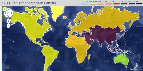
With all the emphasis on Halloween, you may or may not have heard that this year, October 31st was noteworthy for another reason: according to the United Nations, that’s the day the global population hit 7 billion. The UN has set up a website to provide information about population trends and estimates for the future. Here’s the current world population, by region:

The map is interactive, so you can click on a region to find out its population, as well as its percentage of the total world population.

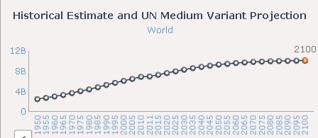
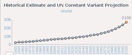
You can also estimate the population through 2100 based on various fertility scenarios. In the default medium scenario, fertility is expected to follow past trends, leveling out at a little over 10 billion by 2100:

On the other hand, if we saw no further reductions in global fertility, the 2100 population would be over 26.8 billion:

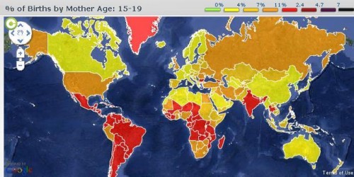
There’s an enormous amount of data available at the site. For instance, if you select the Births tab, you can click on either a region or a specific country and find out what percent of births are to women in different age groups. Here’s the % of all births to women aged 15-19, by country:

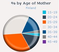
And the chart showing the total age breakdown for Finland (at the site you can hover over the graph to get the actual %):

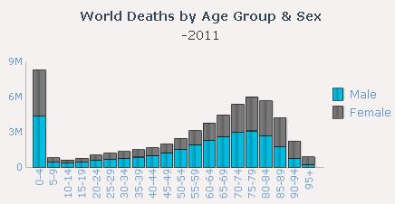
A chart of deaths by age and sex, illustrating the continued high mortality in infancy and early childhood:

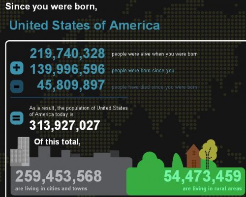
There’s also a section of the site where you can enter information about your own date and place of birth and then get a snapshot of what the global population was when you were born. Since I entered the world:

Overall, it’s a pretty great resource, and another one of those websites that can easily eat up a significant amount of your time without you realizing it.

Geographer Derek Watkins put together an interesting visualization of the expansion of the U.S. by showing the distribution of post offices between 1700 and 1900. The distribution of post offices reflects a number of important social and political events — the sudden emergence of post offices on the West Coast in the late 1840s, around the time of the gold rush and California becoming a state, patterns in Kansas and Nebraska in the 1870s clearly showing how population growth followed railroad lines, and so on:

Posted: Visualizing US expansion through post offices. from Derek Watkins on Vimeo.

You can read Watkins’s caveats about the data (it doesn’t include closures of some post offices during that time, and he was unable to determine the location of about 10% of post office branches) here. Thanks to Jeremy Freese, at Scatterplot, for posting it!

Dmitrity T.M. and Larry Harnisch (of The Daily Mirror) let us know that Stanford University’s Rural West Initiative put together a map showing the spread of newspapers across the U.S. between 1690 and 2011, based on Library of Congress listings. The results illustrate many of the same major social and political changes and trends as the post office map:

The Growth of US Newspapers, 1690-2011 from Geoff McGhee on Vimeo.

The website allows you to see the map for any individual year, and awesomely, you can filter by language, illustrating a number of periods of high immigration and common destination locations. Here’s the map of German-language newspapers in 1900:

And Spanish today: