history

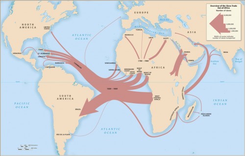
Emory University has a very detailed database about the Atlantic slave trade, titled Voyages: The Trans-Atlantic Slave Trade Database, which I don’t believe we’ve posted before (my apologies if we have). It includes nine maps providing information on major points of departure and destination ports for the trans-Atlantic trade; here’s a general overview:

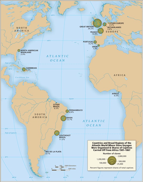
Initially the vast majority of slave voyages were organized by firms or individuals in Spain and Portugal; however, over time the slave trade was dominated by groups from northern Europe. Great Britain eventually played a major role, and over 1/3 of documented slave voyages were organized there.The description of Map 6 explains, “vessels from the largest seven ports, Rio de Janeiro, Bahia, Liverpool, London, Nantes, Bristol, and Pernambuco carried off almost three-quarters of all captives removed from Africa via the Atlantic Ocean.”

This map shows where voyages were organized, and the % of all documented African slaves that voyages from that country/area transported:

In the U.S., students generally learn about slavery in relation to cotton plantations and, to a lesser extent, tobacco. However, overall those two crops played a relatively minor role in the growth of the global slave trade. It was the growing taste for sugar, and the creation of sugar plantations, particularly in the Caribbean and South American coastal areas, that produced such an enormous demand for African slaves in the Americas. According to the Voyages website, less than 4% of all Africans captured were sold in North America.

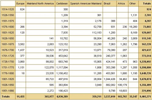
The website also has a database of thousands of documented trips in the trans-Atlantic slave trade, including everything from point of origin, destination, number of slaves, % who died during voyage, length of trip, and so on. Some include many more details than others, as you’d expect. You can also create tables to display the variables you’re interested in. Here’s the table showing the slave trade, broken into 25-year intervals and by destination. We can clearly see that the slave trade made one big jump in the late 1500s (going from 4,287 in the 1551-1575 interval to 73,865 between 1576 and the end of the century) and another huge jump in the late 1600s, with the height of the slave trade occuring in the 1700s through the mid-1800s:

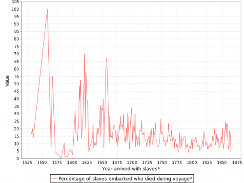
You can also create various graphs and charts. Here is a graph of the % of slaves who died during the trip, by year:

I presume the extremely high numbers in the 1550s must be skewed by some ships that sank or met some other disaster that led to the death of everyone aboard.

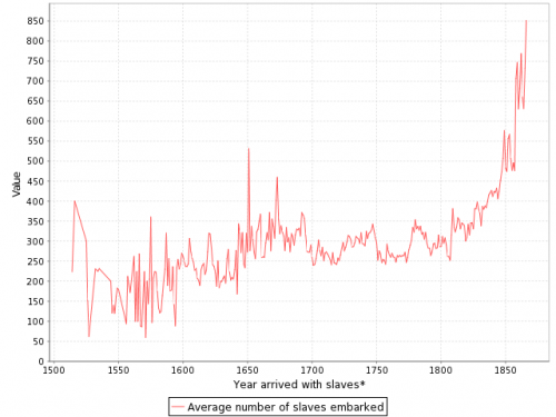
Over time, ships carried larger numbers of individuals per trip:

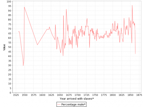
The individuals taken as part of the slave trade were predominantly male:

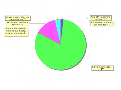
Documented types of resistance from captives or from Africans trying to free them:

You can spend quite a bit of time on this, I warn you — creating timelines, graphs, and so on. It’s taken me an hour to write this post because I keep getting distracted creating charts and tables. Overall, the site is a fantastic resource for both specific information and for helping illuminate the enormity of the Atlantic slave trade. Thanks to Shamus Khan for the tip.

Dr. Grumpy re-tells the fascinating story of the importation of camels to North America for use as beasts of burden.  He begins:

Following the Mexican-American war, the United States found itself in control of a large desert, covering what’s now New Mexico & Arizona, and parts of Texas, California, and several other states. The U.S. Army needed to establish bases and supply lines in the area, both for the border with Mexico and the continuing wars with Indian tribes.

The railroad system was in it’s infancy, and there were no tracks through the area… The only way across was to use horses. But horses, like humans, are heavily dependent on water. This made the area difficult to cross, and vulnerable to attacking Apaches.

And so in 1855 Jefferson Davis, then U.S. Secretary of War (later to become President of the Confederacy during the Civil War), put into action an idea proposed by several officers: buy camels to serve in the desert. Congress appropriated $30,000 for the endeavor, and officials were sent to Turkey to do just that.

The next year they imported somewhere between 62 and 73 camels and, with them, 8 camel drivers all led by a man named Hadji Ali. Enter the U.S. Army Camel Corps.

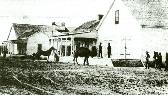
Camels at an Army Fort:

(source)

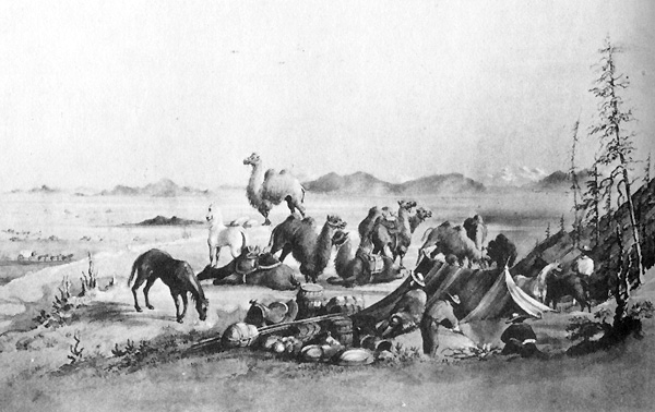
Illustration of camels in camp:

(source)

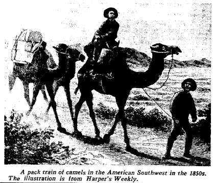
Camels on the go (1850s):

(source)

Says Dr. Grumpy:

They led supply trains all over, from Texas to California…

But there were problems. The Americans had envisioned combined forces of camels and horses, each making up for the deficiencies of the other. But horses and donkeys are frightened of camels, making joint convoys difficult and requiring separate corrals. The army was also unprepared for their intrinsically difficult personalities- camels bite, spit, kick, and are short-tempered. Horses are comparatively easy to handle.

Then came the start of the American Civil War, which focused military attention to the east. With troops pulled out of the American desert, and horses better suited to the eastern terrain, the camels were abandoned.   Though Weird CA suggests that they were used in the war, Dr. Grumpy reports that most simply escaped into the desert.  For a time, there was a wild camel population in the U.S.

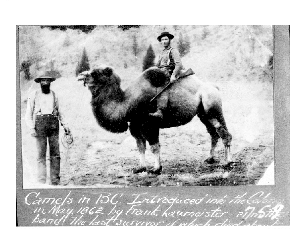
Meanwhile, a former-solider and Canadian gold prospector, Frank Laumeister, figured that camels would be great pack animals for his new line of work. He bought a herd in 1862, but they didn’t work out so well in the rockier terrain. Plus:

The Canadians, like the Americans, discovered they weren’t easy to handle. The same problems of difficult disposition and spooking horses came up. In addition, they found camels would eat anything they found. Hats. Shoes. Clothes that were out drying. Even soap. And so, after a few years, the Canadians gave up on the experiment, too.

Laumeister on one of his camels:

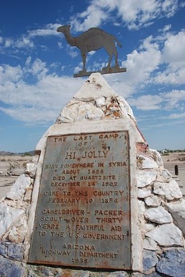
Our original head camel driver, Hadji Ali, eventually got out of the camel business, but he never left America. He became a citizen in 1880, married a woman named Gertrudis Serna and had two children. He died in Arizona in 1902, having spent 51 years of his life in the U.S. You’ll find his tombstone in Quartzsite, Arizona labeled with the name “Hi Jolly,” the Americanized pronunciation of his full name.

(source)

The last sighting of a wild camel in North America was in 1941 near Douglas, Texas (source).

Lisa Wade, PhD is an Associate Professor at Tulane University. She is the author of American Hookup, a book about college sexual culture; a textbook about gender; and a forthcoming introductory text: Terrible Magnificent Sociology. You can follow her on Twitter and Instagram.

Katrin drew our attention to the Christmas character of the Christkind, found in regions as diverse as Austria, Italy, Hungary, Slovakia, the Czech Rebublic, Croatia, Slovenia, Germany, Liechtenstein, Switzerland and, according to Wikipedia, “…parts of Hispanic America, in certain areas of southern Brazil and in the Acadiana region of Louisiana.”

The Christkind was introduced by the German Protestant priest Martin Luther (1483-1546).  At the time, tradition held that gifts were given by St. Nicholas.  Protestants, however, didn’t acknowledge saints, so they needed an alternative mythological gift giver.  The Christkind was originally depicted as baby Jesus, but in many places today is instead an angelic blond child or adult woman.

In Nuremberg, Germany, a Christkind is chosen every two years in a pageant reminiscent of American beauty pageants (source).  This year the Christkind is Rebekka Volland (source):

More photographs of the Christkind:

(source)

(source)

(source)

Lisa Wade, PhD is an Associate Professor at Tulane University. She is the author of American Hookup, a book about college sexual culture; a textbook about gender; and a forthcoming introductory text: Terrible Magnificent Sociology. You can follow her on Twitter and Instagram.

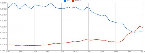
A  number of readers, including Mickey C., Lu Fong (writer and editor at The Good Men Project and Good Feed), Cheryl S., and Kelly V., let us know about Google Ngram. The program includes a database of a little over 5 million books and allows you to graph the frequency with which various words or phrases show up in books published in various languages over time (English can also be broken down into British or American English). Mickey and Lu each graphed the words “men” and “women” (see Lu’s discussion here):

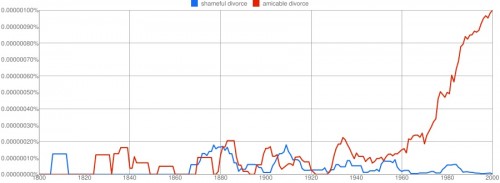
Cheryl S. tried “shameful divorce” vs. “amicable divorce”:

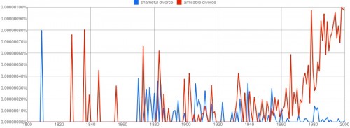
The plateaus are due to smoothing, which presents the data as 3-year averages to reduce huge spikes and valleys from individual data points to make overall trends more apparent. You can change the level of smoothing. Here’s the graph with no smoothing at all:

Overall, the tool provides a way to track changes in language as well as social trends. Google provides some info on their methodology, though not as much as I’d like. Some key points:

1. They “normalize” the results based on the number of books published each year, to account for the fact that many more books are published each year now than in, say, 1800, so 100 occurrences of a phrase today means less than 100 occurrences then — that’s why results are presented as percentages, not as raw numbers.

2. Phrases have to appear in at least 40 books total to be included in the database.

3. Keep in mind, the dataset is not based on all books published, but of a subset of books digitized by Google Books. The database includes about 4% of all published books, according to a journal article just published in Science.

I suspect it will be an amazing time-killer.


In this six-minute video from the New York Times, past residents and developers describe how Times Square was transformed from “the sleaziest block in America” to the corporate palace that it is today.  Thanks to Dmitriy T.M. for the submission!

Lisa Wade, PhD is an Associate Professor at Tulane University. She is the author of American Hookup, a book about college sexual culture; a textbook about gender; and a forthcoming introductory text: Terrible Magnificent Sociology. You can follow her on Twitter and Instagram.

In the late 1800s, one suffering from impotence, addiction to morphine, or belly aches might be prescribed John Pemberton’s French Wine of Coca.   The wine concoction contained caffeine and 8 1/2 milligrams of cocaine (equivalent to snorting about 1/2 line).

(source)

(source)

Prohibition’s arrival in Atlanta in 1886 led Pemberton to re-write his recipe to exclude the alcohol.  Pemberton advertised it as the “great national temperance beverage.”  In 1903, when cocaine was outlawed, Pemberton had to rework his recipe again.  Coca Cola, as we know it, was born.

See The Digital Deli Online for more.

Lisa Wade, PhD is an Associate Professor at Tulane University. She is the author of American Hookup, a book about college sexual culture; a textbook about gender; and a forthcoming introductory text: Terrible Magnificent Sociology. You can follow her on Twitter and Instagram.

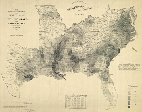
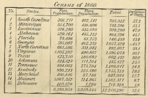
The NYT has posted an interesting interactive map showing the results of the last slave Census taken in the U.S., in 1860, which I discovered via Jessica Brown and Jim Yocom. The map, which shows county-level data, illustrates how slave ownership varied throughout the South

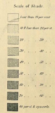
The shading (a new technique at the time, according to the NYT article) indicates what percent of the entire county’s population was enslaved:

You can see the percentage for each county, which is listed on the map, more easily if you zoom in on the pdf version. The cotton-belt area along the Mississippi River clearly stands out, as does Beaufort County, South Carolina, all with over 80% of the population enslaved. The highest rate I could pick out (the map got a little blurry as I zoomed) is in Issaquena County, Mississippi, where slaves appear to have made up 92.5% of the population.

The map also included information on the overall population and % enslaved at the state level; in South Carolina and Mississippi, over half of the total state population was made up of slaves:

Also check out Lisa’s post on geology, the economy, and the concentration of slavery in the U.S.

As the NYT post points out, the map doesn’t show the dramatic increases in slavery in some areas. For instance, while Texas ranked fairly low in terms of the overall slave population, the number of slaves in the state had tripled between 1850 and 1860. The number had doubled in Mississippi between 1840 and 1860. Those growth rates make it rather hard to swallow the argument sometimes presented by those romanticizing the Confederacy that slavery was actually on the wane and would have soon been ended in the South anyway, without any need for federal interference, and wasn’t why the South seceded at all.

Jon Stewart and Larry Wilmore discussed this effort to frame discourses about the Civil War to erase the issue of slavery on The Daily Show:

Cross-posted at Ms.

Previously we’ve posted on the sexy makeovers recently given to Dora the Explorer, Strawberry Shortcake, Holly Hobby, Lisa Frank, Trolls, Cabbage Patch Kids, and the Sun Maid.  Here we have three more.

My Little Pony

The original My Little Pony, chubby and adorable (source):

Today they’re thinner, with an open mouth, more provocative stances, and more responsive positions (source):

Rainbow Brite

Vintage Rainbow Brite:

Rainbow Brite today:

Finally, Monika alerted us to the new look for Candy Land.  First, vintage Candy Land.

1949:


1955:


1962 Candy Land book:

2005:

From the website of Candy Land today:

Lisa Wade, PhD is an Associate Professor at Tulane University. She is the author of American Hookup, a book about college sexual culture; a textbook about gender; and a forthcoming introductory text: Terrible Magnificent Sociology. You can follow her on Twitter and Instagram.