history

Michael Konczal summarizes a depressing story for today’s unemployed and all of us in nations hardest hit by the current recession (via ginandtacos).

Till von Wachter, Jae Song and Joyce Manchester show that unemployment’s negative effect on your pocketbook persists long after re-employment. The figure below shows what happened to the incomes of people who did and did not lose their job during the 1982 recession. It shows that those that lost their jobs (the grey line) saw a decrease in earnings that has yet to recover. Controlling for inflation, on average the unemployed make less now than they did before they lost their jobs 20 years ago.

Quotes Konczal:

…the net loss to a displaced worker with six years of job tenure is approximately $164,000, which exceeds 20 percent of the average lifetime earnings of these workers. These future earnings losses dwarf the losses associated from the period of unemployment itself.

This same pattern can be found at the society level. Michael Greenstone and Adam Looney made the same comparison across countries that were hit the hardest by the recession (purple line) and countries hit less hard (green line). The incomes of individuals in the hardest hit nations were harmed long-term:

Greenstone and Looney show the same pattern for the unemployment rate:

Lisa Wade, PhD is an Associate Professor at Tulane University. She is the author of American Hookup, a book about college sexual culture; a textbook about gender; and a forthcoming introductory text: Terrible Magnificent Sociology. You can follow her on Twitter and Instagram.

Tim Wise answers just this question in this 2 1/2 minute clip featured on his website.  Sneak peak: His answer begins with “No. You should feel angry.”

Laurie J graciously pasted the transcript in the comments; I’ve added it after the jump.

more...

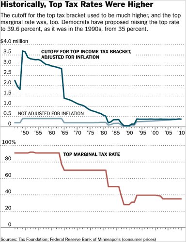
To provide a little context to the current discussion about extending the Bush-era tax cuts, the New York Times has an interesting graph up that shows changes in the level at which the top tax bracket kicked in, as well as the % tax rate in the top bracket:

So on the one hand, in constant dollars, you used to have to be quite a bit richer before you hit the top marginal tax bracket, because we had a wider range of brackets and differentiated incomes more than we do now (taxing an income of $500,000 differently than one of $5 million, whereas now we’ve basically collapsed all those brackets). But now, the highest income tax rate is well under half of what it was in the ’50s.

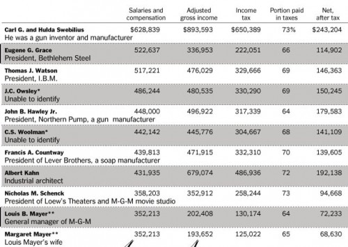
This chart shows the incomes and tax levels of the 10 Americans with the highest salaries (as opposed to wealth from investments, capital gains, etc.) in 1941, data we have because in 1943 President Roosevelt asked for a report on top earners:

I keep hearing news organizations discuss the existing tax cuts, and their possible extension, in a way that seems a bit confusing, by saying it’s a tax cut for people making “up to” $250,000, or $500,000, or however much the cap is for the different plans being thrown around. That seems to imply that, say, everyone making $250,000 or less gets a tax cut, and anyone making $250,001 gets nothing at all. Just to clarify, under all these plans, everyone would receive (or, more accurately, keep the existing) cut on their first $250,000 (or whatever the chosen cutoff would be).

At issue is whether that same tax rate should apply to all income, or whether beyond a chosen cutoff, the Bush tax cuts would expire. In that case, if you made $300,000, say, you would keep the tax cuts on your first $250,000 in income (and thus pay roughly 35% in taxes), but pay a higher rate on that last $50,000 (about 39%). You wouldn’t pay the higher tax rate on your entire income. And I think that’s getting lost a bit in the use of phrases like “middle class tax cuts” or “tax cuts up to X dollars.” That’s separate from whether or not you think extending the tax cuts are a good idea, but I just wanted to take a second to clarify what I think is an easily misunderstood point, made worse by the way it’s being reported on.

One of the things that continually stuns me about the U.S. wars against Iraq and Afghanistan is how little the average American is expected to sacrifice. Yes, many Americans are losing loved ones in this war. Other than those immeasurable sacrifices, however, most Americans are not asked to change a thing about their lives.

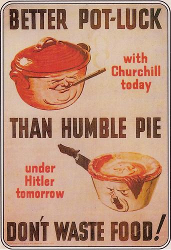
In contrast, during World War II, Americans were asked to make significant sacrifices, changing their daily lives and consumption patterns. Carpooling, for example, to save gas and rubber and staying off the phones.

Vintage Ads posted another great example of government propaganda encouraging the average person to change their lives for the war effort. In this case, the propaganda is British and they implore citizens not to waste food:

U.S. propaganda and advertising similarly encouraged citizens (i.e., women) to save food and stretch their rations (both from 1943):

Images also found at Vintage Ads: here, and here.

Lisa Wade, PhD is an Associate Professor at Tulane University. She is the author of American Hookup, a book about college sexual culture; a textbook about gender; and a forthcoming introductory text: Terrible Magnificent Sociology. You can follow her on Twitter and Instagram.

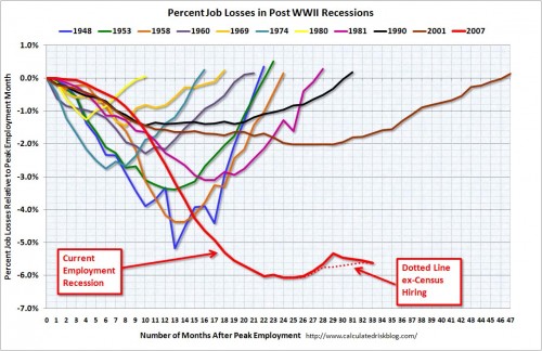
Kelsey C., a master’s student at the University of Colorado-Boulder, sent in this image from Calculated Risk showing the percent of jobs lost in each recession since 1948, relative to the peak of the pre-recession job market. In terms of the percent of jobs lost, the current recession is by far the worst we’ve seen since World War II:

The Bureau of Labor Statistics has a detailed report on employment (or the lack thereof) as of October 2010 available — including information on length of unemployment, numbers working part-time because they can’t find full-time work, labor force participation broken down by race/ethnicity, sex, and educational attainment, Veteran status, disability status, and more!


Dmitriy T.M. sent in a video where Hans Rosling illustrates changes in wealth and life expectancy in 200 countries over the past 200 years, all in four minutes. Pretty neat!


David Sparks created this video that uses blue and red to show shifts in voting patterns (Democratic vs. Republican) in all the presidential elections since 1920:

Sparks points out several interesting patterns that emerge:

1. Voting in urban areas often differs from other parts of their states (for example, Salt Lake City stands out from the rest of Utah, as did San Francisco from the rest of California in 1980).

2. We can see the South swing from solidly Democratic to predictably Republican (as Sparks highlights, the 1924 and 2004 maps are nearly inverted).

3. Despite clear patterns (such as the South going Republican, a coasts vs. interior voting split), we often see fairly drastic shifts between one presidential election and the next, as well as temporary disruptions to the overall trend (for instance, the reliably Republican South went Democratic in 1980).

As Sparks puts,

More broadly, this video is a reminder that what constitutes “politics as usual” is always in flux, shifting sometimes abruptly. The landscape of American politics is constantly evolving,  as members of the two great parties battle for electoral supremacy.

He also has a thorough explanation of his methodology for creating the map, if you’re interested.


A couple of weeks ago I posted a vintage ad referring to Bolsheviks and an interesting discussion ensued about the difficulty of knowing how seriously people would have taken ads at the time they were made and whether the ad would have been seen as a parody at the time. We have a tendency to see ourselves as particularly witty, sophisticated consumers of media and to think people in the past were more straight-forward, credulous, and took things at face value (I’ve certainly been guilty of it), as though sarcasm and parody are recent inventions.

I thought of that when I saw the video Michael M. sent in. It was made as an in-house joke by a producer of commercials in the 1960s and makes fun of cliches used in commercials at the time. It’s slightly NSFW–there are exposed breasts at about 4:10 in, as a reader pointed out.

It also, of course, pulls the curtain back on the advertising industry a bit. As Michael says,

We’ve all seen parodies of the old 50s and 60s style commercials, but I thought it very interesting (and telling) to see it parodied at the time of production, in knowing fashion by the very people who make them. These advertisers were well aware they were selling a fantasy.

Gwen Sharp is an associate professor of sociology at Nevada State College. You can follow her on Twitter at @gwensharpnv.