health/medicine

Tracy J. sent in this ad aimed at encouraging women to get pap smears to check for cervical cancer (originally found here, but the page was taken down, so Ashley in the comments thread found us this cached page):

bccancerbanner_160x600

And along with the ad she offered this great commentary:

The message is essentially that pap tests have the potential to save the lives of women, but rather than pointing out that, you know, this is good cause… women deserve the opportunity to live a long and meaningful life in whatever way they may wish, or whatever… [But this isn’t the message, instead] they use the ad to scare us into thinking, “if all our women were to die, well then who would we objectify? men? gasp! wouldnt that be horrible”…

…it also sends a very clear message that one of the requirements of women in our North American society is to stand as objects for our admiration. Of course this is only certain kinds of women as this ad could easily be used for some sort of diet pill with an ‘overweight’ woman replacing this man with the statement “the world needs skinny women.”

This is very much like the breast cancer awareness efforts that revolve around how hot boobs are (see here, here, here, and the bottom of this post).

—————————

Lisa Wade is a professor of sociology at Occidental College. You can follow her on Twitter and Facebook.

An extended version of this post also appeared at Ms.

I’ve been taking photographs of breast-cancer-research-and-prevention-branded products for a few months now. I was first driven to do so when I saw this at the Million Aire (private plane terminal) at the Burbank airport:

cimg1256

That’s right. You are looking at pink chocolate chips cooked into cookies to signify a commitment to reducing breast cancer-related morbidity and mortality.

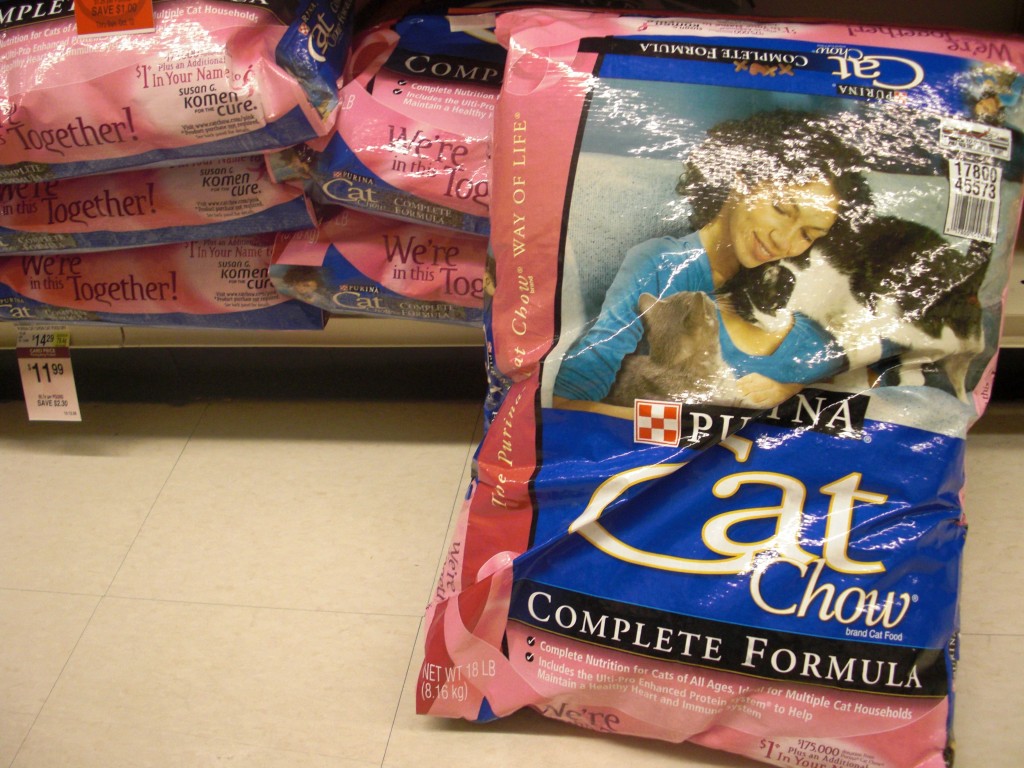
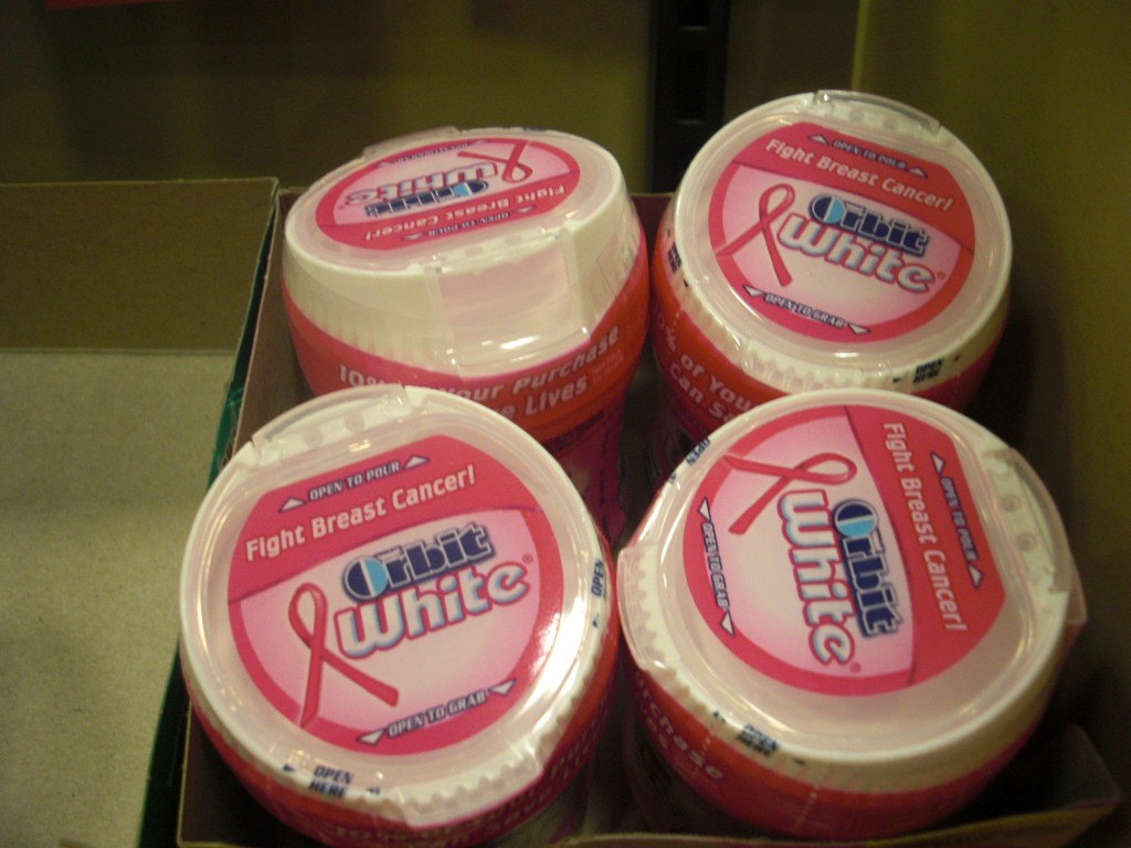
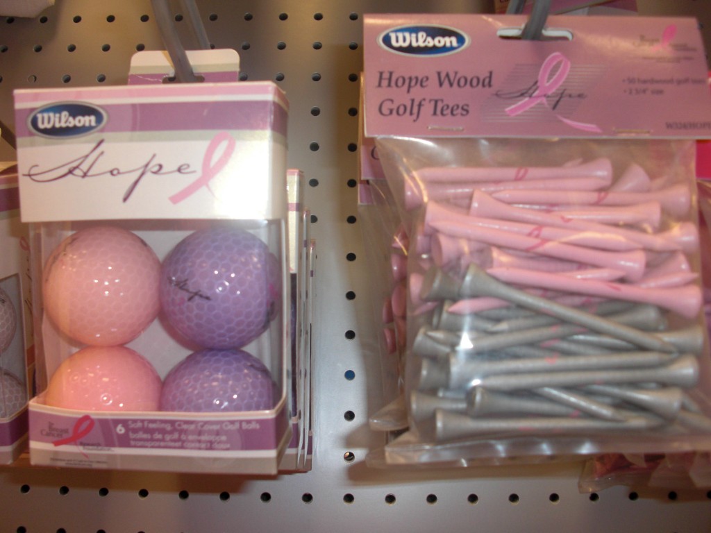
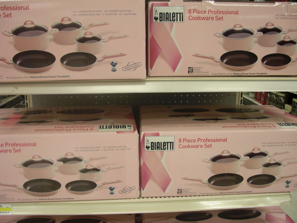
Anti-breast cancer messages are, I think inarguably, the most widely product-linked disease-related message ever.  I am constantly shocked by how many products have a breast cancer version. Here are some pictures I’ve taken over the last few months.

Cream cheese:

lisa-cimg2124

Padlock:

lisa-cimg2186

Cat food:

cimg1637

Gum:

cimg1706

Golf balls and tees:

cimg1953

Pots and pans:

cimg2005

Steve W. sent in this picture of a pink “ladies night out” breast cancer-themed limo (note the pink ribbon hanging from the rear view mirror):

cimg3549

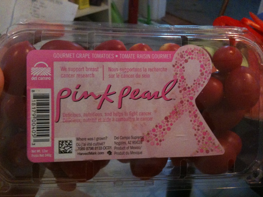
NEW (May ’10)! Renée Y. sent along this photo of breast cancer-awareness-themed grape tomatoes.  I repeat: grape tomatoes.

We’ve discussed the commodification of activism extensively (see here, here, here, here, and here) and so I’m going to skip this point.  Instead, I’d like the ask the following:

What does it mean when awareness of and funding for disease is subject to marketing?  Is this really the most efficient or rational way to set health care priorities?  I did a bit of research.

According to the CDC (2005 seems to be the latest available data), cancer is not the leading cause of death.  Heart disease is the leading cause of death.  Granted, cancer is a close second.  In 2005, 652,091 people died of heart disease and 559,312 died of cancer.  But not breast cancer, all cancers.  In 2005, 49,491 people died of breast cancer.  More than 10 times as many people died of heart disease.

And, if you want to prioritize cancers, more people are diagnosed with prostate cancer than breast cancer (source) and more people die from lung cancer (159,292), colon, rectal, or anal cancer (53,252), and lymphoid/hematopoietic cancers (55,028) (source).

So why such an emphasis on breast cancer?   I’m not sure why.  Certainly there is a massive social movement organization behind this anti-breast cancer marketing and people in charge have made a decision to take this approach.   I think, also, the body parts and the presumed cause of disease matter.   Do we have less sympathy (and would, therefore, a similar marketing campaign be less effective) for lung cancer because we think that lung cancer patients are to blame for their own disease?  Would we find colo-rectal-anal cancer-themed cream cheese somehow less appetizing?  Or prostate cancer-themed gum?  Do lymphoid and hematopoietic cancers affect parts of the body that are simply less iconic?

saveteepink

“Save the lymph nodes” just doesn’t have quite the same ring?

I’m not trying to suggest that raising awareness of and funding research for breast cancer isn’t important, but I am interested in the strategies by which being “against” breast cancer is (literally) sold to us.  And I’m curious about how this affects treatment and research funding, if at all, and the rationality of our resource distribution given the application of a marketing approach to (some) diseases (and not others).  (Also in breast cancer marketing, see here, here, here, here, and here.)

 —————————

Lisa Wade is a professor of sociology at Occidental College. You can follow her on Twitter and Facebook.

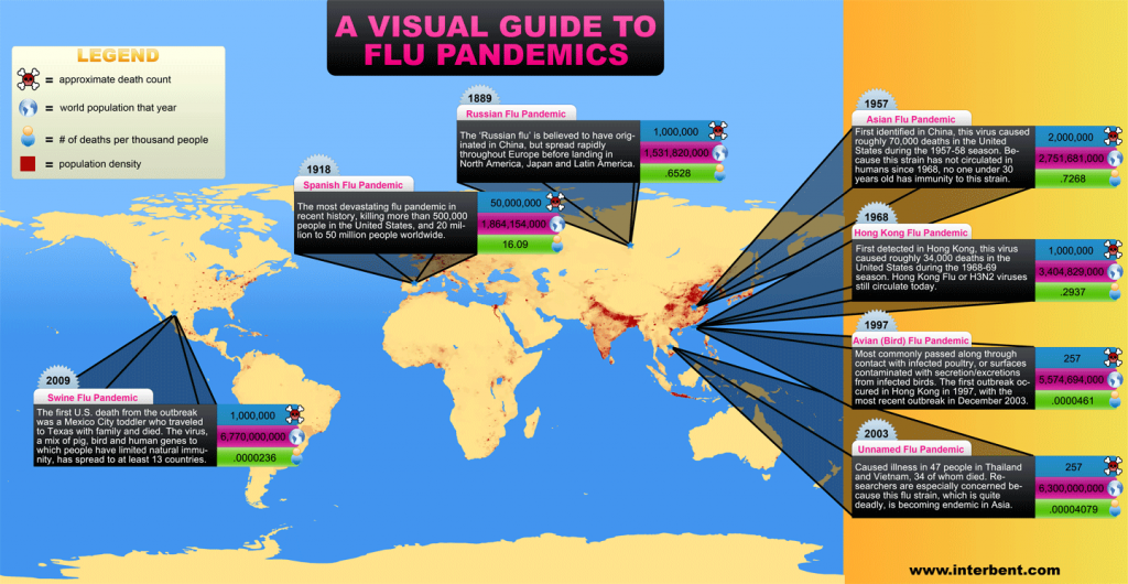
An interesting representation of  flu pandemics (full size found here) throughout history.

flu-pandemics2

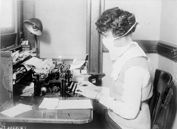
The US National Archives has a wonderful set of images (like the one below) related to The Influenza Epidemic of 1918.

flu-typist

Environmental sociologists have noted that environmental toxicity is most concentrated in communities that include a disproportionate proportion of poor, working class, and non-white people. The map below compares the locations of toxic release facilities (green) with the percentage of people of color in neighborhoods in and near Los Angeles (yellow = 0-40 percent people of color; red = 80-100 percent of color).  The overlap is striking.
2651199629_ab93bd190f_o

Hat tip to Jose at Thick Culture.

Also in race and the environment, check out our post on the anti-immigrant/pro-environment movement, our post on lead poisoning and poor children, and our post on the use of American Indians as environment mascots.

NEW! Katherine O. sent us a link to a Canadian study showing how poverty and pollutants overlap in the city of Toronto. A map of air pollutants released from pollutant inventory facilities in Toronto in 2005, in kilograms:

picture-22

The green dots show where releasing facilities that must take part in the inventory are located; not surprisingly, there are more pollutants in areas with facilities. Of course, the siting of polluting facilities is often fraught with class and race issues, as we saw above.

There are three different measures of air pollution in the report, so you might check the others out too–this one is apparently conservative. While we can see here where there are higher levels of air pollutants, I couldn’t find in the report (which, granted, I didn’t read word-for-word) an absolute level above which pollution is considered harmful to human health, so this graph could be more helpful there.

Poverty rates in Toronto Census tracts, from 2001:

picture-33

From lightest to darkest, the ranges are 0.1 to 4.4%, 4.5 to 12.0%, 12.1 to 21.3%, and 21.4 to 72.8%. The overall Canadian poverty rate at the time was 11.8%.

Finally, neighborhoods defined as high in both poverty and pollutants (in 2005):

picture-41

Again, there are other maps showing overlaps of poverty and pollution when pollution is measured somewhat differently–I chose a more conservative one.

Katherine says,

I would add that these areas are also ones with a high proportion of recent immigrants and racialized individuals/families, although this is not shown.

stimulus_large

(Found here, via Thick Culture.)

Chicho sent in a link to an interesting ad campaign from the Agency for Healthcare Research and Quality and the Ad Council. The campaign’s tagline is Real Men Wear Gowns:

picture-13

According to the website, “Real Men Know the Facts” about heart disease.”

As Chicho points out, it’s one of those rare examples we see of ads trying to undermine stereotypical masculinity rather than play it up: there’s still the idea of being a “real man,” but instead of associating that with rugged individualism or risk-taking (or eating high-fat bacon burgers while drinking a beer as you sit in your Dodge truck), here being a real man means taking care of yourself, going to the doctor regularly, and taking care of your family by staying healthy.

Thanks, Chicho!

Gwen Sharp is an associate professor of sociology at Nevada State College. You can follow her on Twitter at @gwensharpnv.

In the Girl and Boy Scouts, merit badges represent the acquisition of skills and knowledge.  Artist Mary Yaeger tries to draw attention to the skills and knowledge that girls and women in America aquire, whether they be scouts or not, with her own set of embroidered merit badges. They feature things like tolerating menstrual cramps, shaving armpits, taking the birth control pill, suffering through gyn exams, using mascara and lipstick, learning how to walk in high heels, wearing sexy underwear, and more.

The project nicely reminds us that women have to work hard to appear properly feminine, as well as the unique things we experience as women.

Via Jezebel.

Lisa Wade, PhD is an Associate Professor at Tulane University. She is the author of American Hookup, a book about college sexual culture; a textbook about gender; and a forthcoming introductory text: Terrible Magnificent Sociology. You can follow her on Twitter and Instagram.

In this 7 1/2 minute video Hans Rosling maps the relationship between life expectancy, GDP, and sexual health and rights over 300 years of Swedish history:

Found at GapMinder.