gender

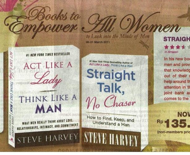
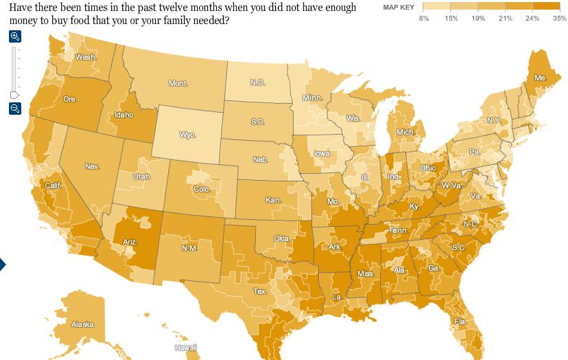
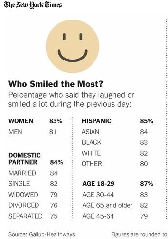
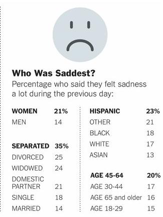
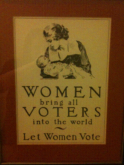
As a number of readers emailed us to point out, yesterday was International Women’s Day, designed to highlight both women’s accomplishments and the persistence of gender inequality worldwide. Ben Buursma noticed an ad in an Indonesian newspaper celebrating International Women’s Day and marketing “Books to empower all women,” though it turns out what they empower women to do is “look into the minds of men” and “find, keep, and understand a man”:

Emma M. H. sent in a link to the the White House Council on Women and Girls report on the status and well-being of U.S. women on a variety of social indicators. Interestingly, while both men and women are waiting longer to get married, the gender gap in age at first marriage has remained relatively constant for decades:

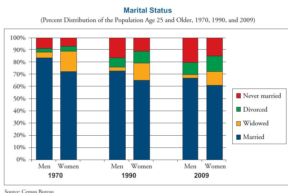
Men are more likely to be either married and never-married, while women currently more likely than men to be divorced or widowed:

Over time, the percent of women who have never given birth has gone up, particularly for the 25-29 age group, though in the last decade there has been a slight downward trend for women aged 30-44:

One note about that graph: the report uses the phrase “had a child” and “childbearing,” so I think this data would include women who have adopted children but never given birth.

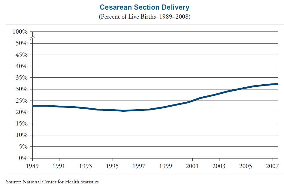
I was surprised to see that rates of Cesarean sections have gone up in the past decade:

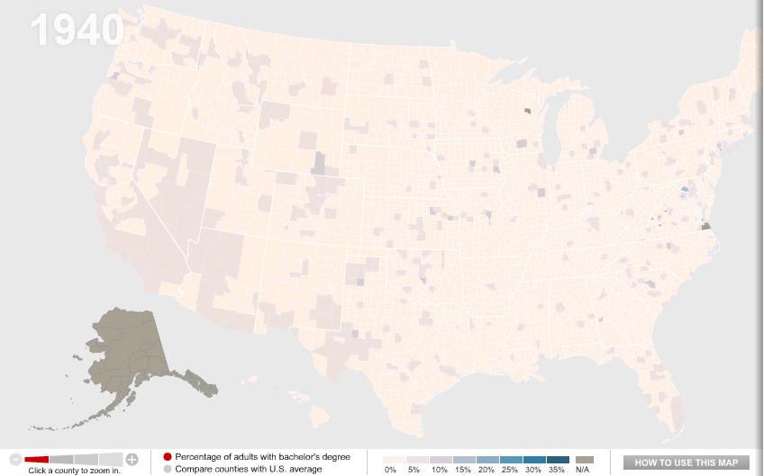
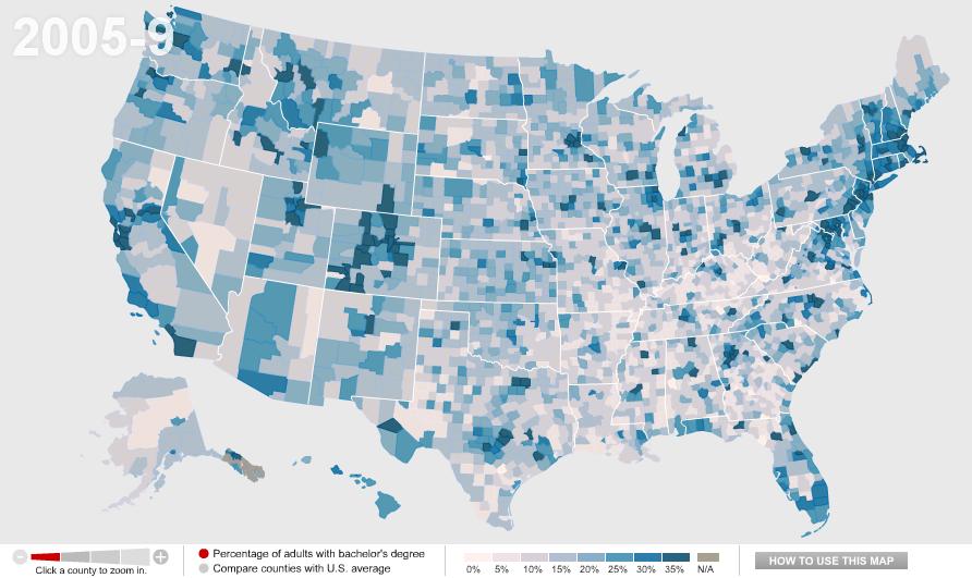
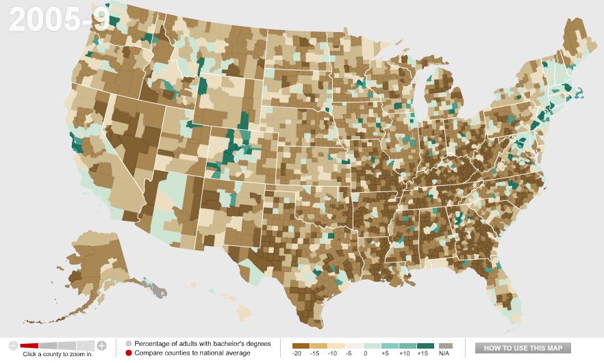
Women are now outperforming men in terms of educational attainment, earning the majority of bachelor’s degrees, though notice the number of degrees in engineering/computer science earned by women hasn’t increased since 1998:

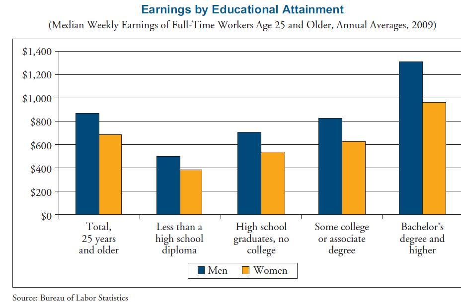
However, women still make less than men at each level of educational attainment:

The report has lots more data on family life, work, education, health, crime, and so on. I’ll post on other topics in the future.

Finally, Ben N., Kay C., Gregory S., and Dave Z. all sent in this video starring Daniel Craig that highlights global gender inequality (though unfortunately I can’t find any reference that provides sources for the statistics in the video, so take it for what it’s worth):

Kristina K. sent in a link to an interactive map at the New York Times that shows the results of Gallup’s 2010 polls of well-being. [UPDATE: Reader Danielle pointed out I forgot to provide a link to the map. Sorry! You can find it here.] Gallup surveys 1,000 people per day about a variety of indicators of well-being, including questions about physical, mental, and emotional health, various health-related behaviors, ability to access health care, access to adequate food and housing, and perceptions of their communities. Here are the overall composite scores, by congressional district (a higher score is better):


The general geographic pattern indicates a swath of relatively low well-being curving from Louisiana up through Michigan, while those in the upper Great Plains and the inter-mountain West are doing better than average.

Percent reporting experiencing a lot of stress:

Percent who have ever been told they have depression:

Of course, this may reflect differences in rates of depression, but it could also reflect differences in medical professionals’ likelihood of identifying a set of symptoms as depression and bringing it up with a patient. For example, we see significant differences by state in the frequency of Caesarean sections among pregnant women.

Percent of people who smoke:

Percent reporting an inability to buy sufficient food:

The Gallup page on well-being presents more data. Here is a map of 2009 overall well-being that is a bit easier to read since it’s presented by state rather than congressional district:

Hawaii had the highest overall score, at 70.2; West Virginia had the lowest, 60.5. If you go to their site and click on a state, you can get a breakdown of scores in each area (emotional well-being, physical health, healthy behaviors, and so on).

Finally, the NYT provides some demographic information on who was most likely to have said they spent a lot of the previous day laughing or smiling vs. being sad:


I submit to you Lady Gaga’s new music video for “Born This Way.” Have at it! Is Lady Gaga breaking new ground? Or is this a strategic ploy to be played more or less constantly in every gay bar in America? Or something else? What do you think?

See also a previous post on Lady Gaga’s disability imagery and my cynical and controversial post critiquing the Gaga-inspired site, Born This Way.  Oh, and that dude with the skeleton face, we totally featured him in a post about the self-fulfilling stereotype.

Lisa Wade, PhD is an Associate Professor at Tulane University. She is the author of American Hookup, a book about college sexual culture; a textbook about gender; and a forthcoming introductory text: Terrible Magnificent Sociology. You can follow her on Twitter and Instagram.

Lindsey V., who recently sent in the excellent film clip in which “scientists” “tested” gendered battle gear, also sent us a link to images showing that the breast size of two video game characters — “Ivy” from “Soul Caliber” and, to a lesser extent, Lara Croft from “Tomb Raider” — have increased over time (source).

Ivy:

Lara Croft:

What might drive their ever-inflating breasts?

Speaking in terms of advertising, Sut Jhally wrote that advertisers must:

…now worry about clutter and noise. That is, how do you make your ads stand out from the [5,000] commercial impressions that people are exposed to [every day].  So if you’re Pepsi, you’re not just competing with Coke anymore. You’re competing with every other advertiser who wants our attention. As advertising takes over more and more space in the culture, the job of the individual advertiser gets harder and harder.

Martin Barron and Michael Kimmel make a similar argument about the rise of “extreme” and violent sexual acts in pornography.  The increase in the sheer amount of porn that emerged with the Internet has created a competitive market in which “sexual victimization of women is a currency” (p. 350).  You have to get noticed somehow.

So, insofar as this boob inflation is a trend, we may be able to explain it, at least in part, with the greater number of cultural products.  Proliferation creates conditions in which each one has to up the ante to “stand out” against the “clutter and noise.”

Sources:

  • Barron, M., & Kimmel, M.S. (2010).  Sexual violence in three pornographic media. Journal of Sex Research, 37, 161-169.
  • Jhally, S. (2000). Advertising at the edge of the apocalypse. In Anderson, R., & Strate, L., Eds. Critical studies in media commercialism. New York: Oxford University Press, 27-39.

Thanks also to Caroline Heldman; I borrowed some of the text in this post from a forthcoming co-authored essay.

Lisa Wade, PhD is an Associate Professor at Tulane University. She is the author of American Hookup, a book about college sexual culture; a textbook about gender; and a forthcoming introductory text: Terrible Magnificent Sociology. You can follow her on Twitter and Instagram.

The décor in my childhood home was unusual. Interspersed with photographs of my sister and me were vintage political posters, inherited from my late grandparents. The most startling of these were the posters promoting women’s right to vote: as I grew up, I realized that the viewpoints they depicted contrasted starkly with the narrative of women’s suffrage that I had learned in my history classes.

This poster supports women’s right to vote not by asserting their equality with men, but by appealing to their ability to bear children:

By contrast, this poster actively highlights woman’s ability to contribute to society beyond stereotypically female roles: women were not only nurses and mothers, but doctors and mayors. Yet at the same time, the image disparages the mentally and physically ill by painting men with these conditions as inherently lesser.

Lastly, a picture that speaks for itself.  Women should have suffrage, says the poster, but they must always remember where they truly belong.

Although the right to vote politically empowered the women of Western society, many of the proponents of the women’s suffrage movement espoused ideologies that would not be considered feminist or politically correct today. My history classes dwelt only briefly on these unpalatable schools of rhetoric, but the images in my home allowed me to glimpse a debate that was just as complex and fragmented as the political disputes we face today.

———————————-

Alison Marqusee is a high school senior from Massachusetts.  In addition to sociology, her interests include linguistics, psychology, and physics.  She looks forward to attending Haverford College.

If you would like to write a post for Sociological Images, please see our Guidelines for Guest Bloggers.


One of my colleagues, Kate Hahn, sent me a link to an interactive map at The Chronicle of Higher Education website that presents data on the proportion of U.S. adults with a bachelor’s degree over time. In 1940, in the vast majority of counties no more than 10% of the population had graduated from college (the national average was 4.6%):

Now the national average is 27.5%:

You can also compare counties to the national average. Green counties are above the national average, brown ones are below and, not surprisingly, we see clear regional variations in rates of college education, with Colorado and the Northeast doing particularly well and the South and Appalachian regions lagging:

Wealthy counties (those with a median income of $60,000+) in general have higher than average rates of bachelor’s degrees, with the exception of a few counties in the Mountain West, Alaska, and a few scattered areas:

We see the opposite with poor counties (median income under $30,000):

You can break down any of the comparisons by sex or race/ethnicity, and/or look only at  counties with 20% or more Hispanic or Black residents.  You can also select a particular county for more detailed information. For instance, here’s the info on Clark County, Nevada, where I live:

By comparing the maps over time, you can easily track a number of changes: the increase in college degrees overall, of course, but also changes in education such as the dramatic gains women have made in earning college degrees in the past few decades — the gender gap in college degrees was over 7 percentage points in 1980 but only about 1.5 points today.

Joanna S. sent us a link to an application designed by Jonathan McIntosh where one can “re-mix” toy commercials aimed at boys versus girls.  You choose the visuals of one and the sounds of another, and have fun watching the wackiness.  We can’t embed the fun results, but you might enjoy visiting and playing a few for fun.

Lisa Wade, PhD is an Associate Professor at Tulane University. She is the author of American Hookup, a book about college sexual culture; a textbook about gender; and a forthcoming introductory text: Terrible Magnificent Sociology. You can follow her on Twitter and Instagram.


Lester Andrist (of The Sociological Cinema) sent in a clip by Feminist Frequency’s Anita Sarkeesian. She looks at the way that the movies that are rewarded with Oscars tend to be highly centered around male characters and male-dominated plots. It seemed appropriate for Oscars day:

(Transcript after the jump below.)

Lester also pointed out The Girls on Film, a group that recreates male-centered scenes from movies with a female cast. They’re fun and also highlight the types of roles we do and don’t expect to see women in. Here’s Lester’s favorite, a recreation of a scene from J. J. Abrams’s Star Trek:


more...