education

Angry Asian Man wrote about two East High Schools–in Rochester, New York and Akron, Ohio–with a peculiar mascot: the Orientals.

East High School merch (Rochester, New York):

Capture

Screen shot of the East High School website (Akron, Ohio):

Capture2

Notice the Asian-y font and the stylistic dragon.

When high schools and sports teams recruit a type of person as a mascot, it objectifies and caricatures them.  It also encourages opposing teams to say things like “Kill the Orientals.”  This can only be okay when we aren’t really thinking about these kinds of people as real humans beings.

This reminded me:  As an undergraduate, I went to the University of California, Santa Barbara.  Our mascot was the Gaucho, which I remember being described as a Mexican cowboy (though South American cowboy may be more descriptive).  I went by the UCSB website and found these two logos.  There is a story about the first identifying it as a brand new logo; the second is for kids:

Capture4

capture5

I am troubled by the Gaucho mascot for the same reasons that I don’t like the Orientals mascot, but at least authentic gauchos are not likely to enroll at UCSB the way that “Orientals” are likely students of the East High Schools.

Then again, this is the image on the front page of the UCSB athlectics website:

Capture3

It does indeed read: “GLORY. HONOR. COURAGE. TORTILLAS.”  This seems to invalidate any argument that the use of the Gaucho mascot is “respectful.”

Thinking about the Orientals and the Gauchos, alongside the many American Indian mascots still found in the U.S., Notre Dame’s Fighting Irish, and the soccer team in the Netherlands who call themselves the Jews, may give us some perspective on this mascot phenomenon that thinking about one at a time doesn’t.  If we feel that one of these mascots is less discriminatory than another, what drives that feeling?  And is it logical?  Or does it stem from a trained sensibility that isn’t applied to all marginalized groups across the board?  Or is it in response to different characteristics of these different groups?  Or different contexts?

Maybe all five mascots are equally offensive and offensive for the same reasons.  But thinking about them together may also be useful for teasing out how, exactly, they are offensive.  What do you think?

—————————

Lisa Wade is a professor of sociology at Occidental College. You can follow her on Twitter and Facebook.

In 2000, at the University of Wisconsin – Madison (UW), Diallo Shabazz was my student.  He was a senior.  At the very beginning of his Frosh year, someone snapped this picture:

Picture5

From that point forward, Diallo was featured in UW promotional materials again and again.  He became accustomed to seeing that smile everywhere.  Because diversity has become such a popular, even trendy thing for a college to have, many students of color find themselves used as representatives of their colleges disproportionately.

But Shabazz’s story takes a fascinating turn.  At the end of his senior year he paged through the next year’s application and didn’t see himself.  Hmmm.  Then, someone asked if he saw himself on the cover.  And he looked and didn’t see it and then he did.  Do you?

Capture1

That’s Diallo behind the excited girl on the left.  Except Diallo had never been to a UW football game.  You might recognize his face, transposed, from the original picture.  Indeed, someone at UW had photoshopped Diallo into the image below in order to give the impression that attendance at the game was more diverse than it was.  No Diallo:

Capture2

In that year 100,000 admission booklets went out with his face.  More insidiously, 100,000 admission booklets went out using his face to give the illusion of diversity at the University of Wisconsin – Madison.

Diallo sued.  He didn’t ask for a settlement.  He said that he wanted a “budgetary apology.”  He asked that, in compensation, the University put aside money for actual recruitment of minority students.  He won.  Ten million dollars was earmarked for diversity initiatives across the UW system.  The irony in the whole thing is that UW requested photos of Shabazz shaking administrators’ hands in reconciliation (i.e., photographic proof that everything was just fine).  Oh, and also, the Governor vetoed part of the earmark and many initiatives wore off with turnover.

What does this teach us?

First, notice that we have a commodification of diversity.  It is considered useful for selling an institution.

Second, if real diversity isn’t possible, cosmetic diversity will do.

Third, Shabazz himself was dismissed even as his image was used over and over.  Not only did they own the rights to his image and include him in many materials without the requirement that they ask or inform him, they literally took his image, cut it up, and used it to create a false picture.  When Shabazz complained, they first tried to blow him off.  So he wasn’t important to them, even as what he represented clearly was.

This suggests, fourth, that there was a real lack of a substantive dialog about and investment in race and diversity on the campus.  Talk: difficult.  Recruitment of minorities to a mostly white campus: tricky.  Addressing the systematic educational underinvestment in minorities prior to arriving at UW: expensive.  Retaining minorities in that environment: challenging.  Photoshop: easy.

Macon D., at Stuff White People Do, featured a similar situation in which Toronto’s Fun Guide (badly) photoshopped a black man onto their cover because their “goal was to depict the diversity of Toronto and its residents” (story here) (images also sent in by fds and Michael G.):

FUNphotoshop2

Original photo:

FUNphotoshop1

All of this puts into some perspective the recent Microsoft scandal that Jon S. and Dmitriy T. M. asked us to blog about.  If you were in the U.S. you would see the first image on the Microsoft webpage (with, as far as we know, real minorities) and, if you were in Poland, you would have seen the second image (with the black man replaced by a white man):

msft_sux_engadget

NEW! (Nov ’09):

Arturo Garcia pointed out that U.S. advertising for Couples Retreat included a black couple, but the advertising in the U.K. did not.

U.S. poster:

4113140933_210b27e6b6

U.K. poster:

4113141007_5a64763a21

The willingness to play with the presence of minorities–both by photoshopping them in and out–suggests that companies are making strategic, not ethical, decisions about what kind of public face (forgive the pun) to put on.  All of this avoids any real engagement with diversity itself.  This is probably largely because diversity is a minefield.  It’s incredibly difficult to even figure out how to define it, let alone how to build it, or how to manage it once you have it (something that my current institution struggles with).  And yet, these are the things that we must do.  Otherwise all of these strategic moves, both towards and away from minorities, are suspect.

NEW! In our comments, Jackie and Jasmine drew our attention to another example.  This is from the University of Texas, Arlington:

utarlington

See also our series on how people of color are included in advertising aimed primarily at white people, starting here.

If you’re really interested in these ideas, you might want to read MultiCultClassics, a blog specializing in how companies try to recruit minorities and present themselves as diverse institutions.

—————————

Lisa Wade is a professor of sociology at Occidental College. You can follow her on Twitter and Facebook.

Lisa Wade, PhD is an Associate Professor at Tulane University. She is the author of American Hookup, a book about college sexual culture; a textbook about gender; and a forthcoming introductory text: Terrible Magnificent Sociology. You can follow her on Twitter and Instagram.

I schedule my posts for mid-morning, but I write most of them between midnight and 5am.  It’s 3:24am right now.

The New York Times developed an interactive graphic, based on data from the Bureau of Labor Statistics, that allows users to see what proportion of Americans are doing what at any given time of the day.

At about 3:24am, 95% of Americans are sleeping:

Capture

The interactive graphic allows you to look at the data by race, gender, parental status, education-level, employment, and age. Below are screen shots of the data for each age group.

People aged 15-24:

15

People aged 25-64:

Capture

People 65 and older:

Capture

Click overto play with the data. It’s oddly fascinating.

—————————

Lisa Wade is a professor of sociology at Occidental College. You can follow her on Twitter and Facebook.

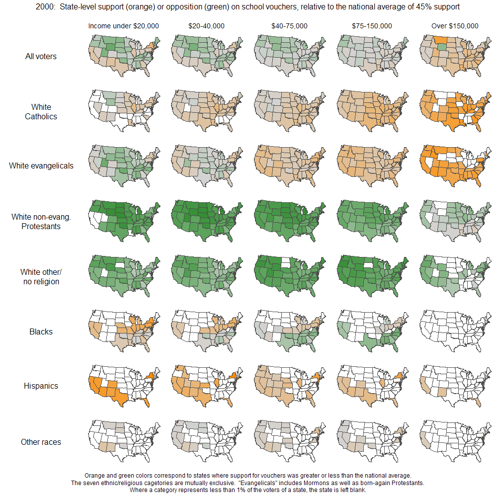
Andrew Gelman over at FiveThirtyEight posted a map (larger version here) that estimates support or opposition of groups with various characteristics to school vouchers, by state and broken down into five income groups. The overall national average is 45% in support of vouchers. Orange indicates that more than 45% of a particular group supports vouchers in that state, while green indicates that less than 45% support them. So, for instance, looking at row 2 (White Catholics), we see that as income goes up, support for vouchers in most states increases, particularly in the $150,000+ income group; on the other hand, row 4 shows much less overall support among White non-evangelical Protestants, even in the highest income group.

vouchermapsBAYES2000

Note that if a particular category (the characterstic for the row at any particular income level) makes up less than 1% of voters in the state, the state is left blank on the map. The data is from 2000, based on about 50,000 respondents. There’s a map of the raw data and a discussion of Bayesian statistical modeling in the original post, if you’re all into that.

As Gelman admits, he needs to add more details about what level of support/non-support the lightness or darkness of the colors indicate–what’s the difference between a very pale green and the darkest green? How many percentage points is that? However, the maps give a general sense of how different racial and religious groups feel about school vouchers, and how income influences that.

One thing I do have a problem with is that the categories are mutually exclusive, meaning Hispanic is treated as a race that does not overlap with Blacks or any of the subcategories of Whites (I also don’t know why all Hispanics and Blacks are put together in one category each). But most people labeled Hispanic in the U.S. see their race as White, with Hispanic as an ethnic, not racial, category–that is also how the U.S. Census defines “of Spanish origin.”

Sociologist Yen Le Espiritu popularized the idea of a pan-ethnic identity.  “Asian American” is a pan-ethnic identity. It is an invented label applied to dozens of different groups with wildly different cultural traditions and languages. Most Americans (Asian and not), over time, came to accept the term as meaningful. American Indian is also a pan-ethnic term, as is African American and most other such labels.

On the one hand, pan-ethnic labels can be empowering. There is power in numbers. A large community identified across ethnic and national identities by race (however fake that racial designation is) can, for example, become a powerful voting bloc to which politicians must attend, or be mobilized to work together to fight for a common cause.

On the other hand, pan-ethnic labels can be disempowering. They tend to ignore the distinctions that make ethnic and national identities meaningful, and the rough categories erase differences among groups, thus making it more difficult to see and, thus, problematize disadvantage.

This latter problem motivated the Asian Pacific American Coalition (APAC) of the University of California campuses to run its “Count Me In” campaign. They notice that, though “Asian Americans” were well represented on University of California campuses (they make up 43% of incoming frosh in 2006), certain groups deemed “Asian” remain underrepresented. These include students of Cambodian, Hmong, and Laotian descent, among others.

The campaign asked the University of California system to disaggregate their “Asian” category.

In response the University of California added 23 new categories to their application.

For a much more extensive discussion of this issue, see Fatemeh Fakhraie’s post at Racialicious(where I stole this video clip).

—————————

Lisa Wade is a professor of sociology at Occidental College. You can follow her on Twitter and Facebook.

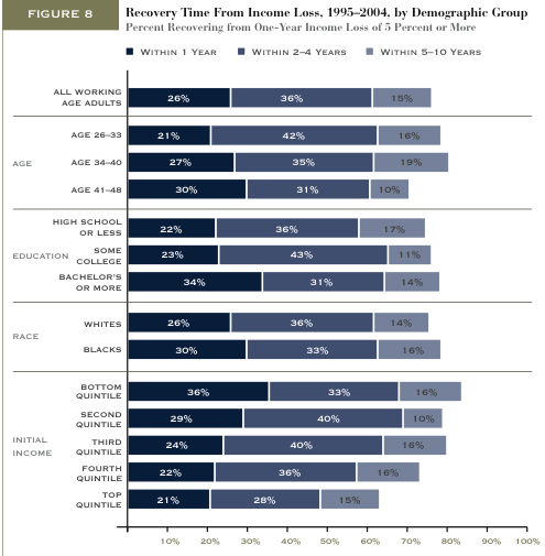
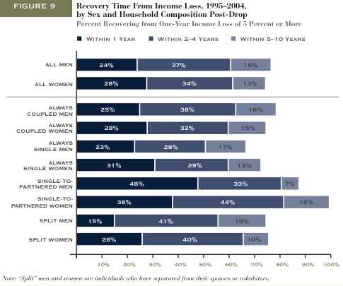
Matthew Yglesias featured two figures from the Pew Economic Mobility project.  They show how long different types of people tend to take to recover from income loss (within 1 year, 2-4 years, or 5-10 years).

This figure shows that people who are older, have more education, or are poor, working, or middle class have a harder time recovering from tough economic times:

recovery

This figure shows how marital status is related to recovery.  Most dramatically, people who get married before recovering financially (especially men), women who split with a partner, and women who are single have a more difficult time recovering.

recoverygender

Something to consider: As several commenters noted, I’m not sure how they defined “recovery” from income loss.  If you never made a lot of money to begin with, does recovery simply mean returning to a state of low income?  Then, does the income for an initially high income person need to return to its high state for it be counted as a “recovery”?

(Just FYI: I revised my interpretation of these figures.  Thanks to the early commenters who noticed I’d misinterpreted.  It was really late at night when I wrote this post!)

—————————

Lisa Wade is a professor of sociology at Occidental College. You can follow her on Twitter and Facebook.

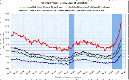
Matthew Ygelsias posted a graph showing that, for those 25 and older, education-level is correlated with rates of unemployment: the more educated you are, the less likely you are to find yourself unemployed. This relationship appears to be uninterrupted by the current recession.

Red = less than a high school diploma
Purple = high school graduate, no college
Green = some college
Blue = bachelors degree or higher

unemploymenteducation-1

—————————

Lisa Wade is a professor of sociology at Occidental College. You can follow her on Twitter and Facebook.

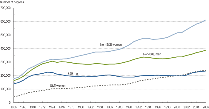
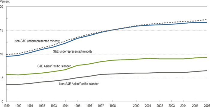
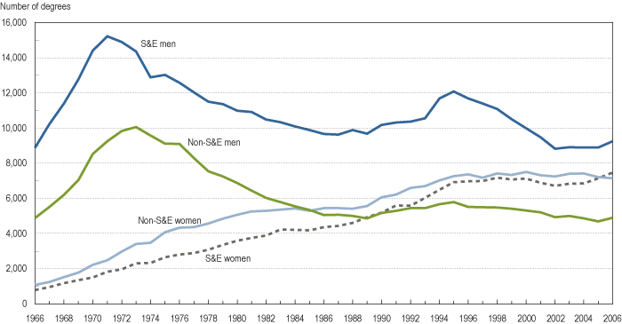
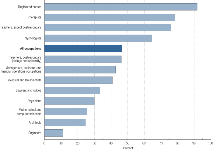
I happened upon a list of figures that display lots of information about who majors in science and engineering (S&E), all available at the NSF page on Women, Minorities, and Persons with Disabilities in Science and Engineering. All are for institutions in the U.S. only, as far as I can tell.

Here we see the number of bachelor’s degrees in S&E and non-S&E fields, by sex:

figc-12

Percent of S&E and non-S&E bachelor’s degrees earned by racial minorities:

figc-21

Number of doctoral degrees earned by sex:

figf-1

Percent of female workers in selected occupations in 2007:

figh-1

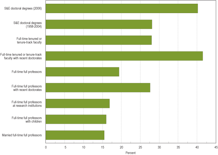
Percent of S&E Ph.D.-holding employees at 4-year colleges and universities that are women:

figh-3

Notice that while women are pretty well represented among “full-time tenured or tenure-track faculty,” they make up barely 15% of “full-time full professors with children,” “married full-time full professors,” and “full-time full professors at research institutions.” Some of this may be a matter of time, in that because being promoted to full professor takes years, an increase in the number of women getting Ph.D.s in a particular field will take a while to show up as a similar increase in number of women as professors in that field, everything else being equal.

But everything else isn’t equal. Women, even highly-educated ones, still do the majority of childcare and housework, and are more likely than men to consider how potential jobs could conflict with future family responsibilities when they are deciding what type of career to choose. So the lower proportion of female full professors at research institutions is likely a combination of some old-school unfriendliness to women in some departments, but also of women opting out of those positions–that is, deciding that the time and energy required to get tenure in a science/engineering department at a research school would conflict too much with family life, so they pursue other career options (for instance, women make up a higher proportion of faculty at community colleges, which are often perceived as being easier to get tenure at, since you don’t necessarily have to do lots of publishing–though anyone who has ever taught 5 courses a semester may question the assumption that it takes less time and work to teach than to publish).

And of course some women try to combine a tenure-track job with their family responsibilities and find it difficult, and either leave academia voluntarily or are turned down for tenure because they have not published enough or are not see as adequately involved and committed. Because of inequalities in the family, men are less likely to face those situations, though certainly some do.

I wish the report had a graph for non-S&E faculty, although it might just depress me.

UPDATE: Commenter Sarah says,

Check out the report “Women in Science: Career Processes and Outcomes” by Yu Xie and Kimberlee A. Shauman.  They find no evidence to support the hypothesis that women are under-represented at the tenure level due to a lag between getting PhDs and acquiring tenure track positions.  In the life sciences, women have been getting PhDs at the same rate as men for many years now, but inequality persists at the tenure-track level.  Xie and Shauman find that a variety of  social factors are responsible for actively hindering women at the highest levels of academia.