education

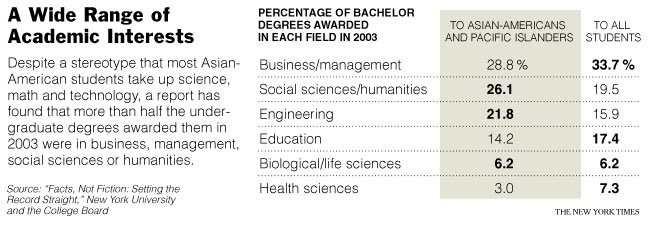
The graph below, from the New York Times, challenges a stereotype about Asian-Americans and their choice of major in college.  The author writes:

The report found that contrary to stereotype, most of the bachelor’s degrees that Asian-Americans and Pacific Islanders received in 2003 were in business, management, social sciences or humanities, not in the STEM fields: science, technology, engineering or math.


The article also discusses the way in which the category “Asian-American/Pacific Islander” makes invisible the dramatic discrepancy between the educational attainments of Asians who’s families immigrated from different places.  For example, they write:

…while most of the nation’s Hmong and Cambodian adults have never finished high school, most Pakistanis and Indians have at least a bachelor’s degree.

The SAT scores of Asian-Americans, it said, like those of other Americans, tend to correlate with the income and educational level of their parents.

And, to a great degree, the success of a given Asian immigrant group in this society is correlated with the wealth of the nation from which they immigrated.

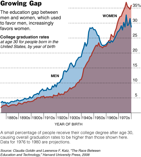


There are other things interesting about this graph too.  (1)  The overall increase in the percentage of the U.S. population who attends and graduates college… and thus changing ideas about who “needs” a college degree.  (2) The fact that the gender difference wasn’t extreme in the late 1800s at all and increased in the early 1900s. (This is in contrast to most students understanding of history, in my experience, as a linear story of progress from backwards to enllightened.)  (3)  The spike in college enrollment and graduation after WWII (GI Bill… but how does that explain the stats on women?).  (4)  The weird dip in 1950s (I don’t know what that’s all about).  And, (5) the period of near parity in the 1960s.  (In the comments, Penny points out that I mis-read the graph in haste.  I apologize.)   (3) The weird dip for people born in the 1950s and coming of age in the 1970s (I don’t know what that’s all about).  And, (4) the period of near parity for people born in the 1960s and coming of age in the 1980s. 

See the accompanying article at the New York Times.

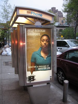
Shieva K. took photos of these two posters, both part of the Boost Up campaign in New York City. Both were posted on the Upper West Side.

The Boost Up campaign is a joint venture between the U.S. Army and the Ad Council to encourage kids to stay in school. The ads feature actual teens who are at risk of dropping out of high school. When you go to the website, you can read a bio about each teen, including the difficulties they face in their home lives, etc. Then you can send a student a “boost,” meaning an email, text message, or post on FaceBook or YouTube, encouraging them to stay in school. You can also watch videos the teens have made about their lives.

The thing I find interesting about this campaign is the lack of any discussion of structural reasons these teens (predominantly racial/ethnic minorities) might be at risk of dropping out of school, or what that might have to do with wealthy people on the Upper West Side. Both the problem and the solution are presented as individual-level issues: teens struggle mostly because they have problems with their parents and unstable home lives, and we can help fix this problem by sending text messages saying “You can do it!” It’s “activism” with no actual need to get involved or think deeply about the problem–we don’t need to change the way schools are funded, wonder whether people who send their kids to private schools still have any responsibility to the public education system, or think about things like poverty, race, crumbling schools, and other structural issues that exist beyond the individual.

I guess any effort is better than nothing, but it seems like we’re basically saying, “Hey, kids! Overcome all your problems by thinking positively and having some strangers who have never met you, and probably can’t even begin to imagine what your life is like, spend 30 seconds writing you a message! That’s all it should really take, so if you still drop out of school, you must not have tried hard enough.” It fits very well into the American cultural ideology that I find so often among my students, the belief that anyone can overcome any disadvantage or hardship if they just try hard enough and “don’t give up”; if they don’t, they’re either lazy, didn’t believe in themselves, or in some other way are to blame. Regardless, there’s not much the rest of us can do about it.

Thanks, Shieva!

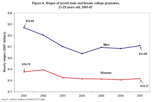
Kay Steiger blogs about the decline in wages since 2001 for college graduates. Figure A shows that both men and women college graduates are earning less than they did in 2001. The wage gap between women and men has decreased, but only because men’s wages have been falling. To top it off, Figure B shows that a lower percentage of college graduates are getting health insurance and pension coverage.

Might this be related to the shrinking middle class?

Via Matthew Yglesias.

Mary McC. of This Book Is for You draws our attention to a link to the full text of a book called “The Stork Didn’t Bring You.”

The book, written for adolescents in 1948 by Lois Pemberton, is surprisingly thorough! But, as Mary said, has plenty of “cringe-worthy” parts, including this tidbit from the chapter Trouble, Trouble, Trouble:

A triple-header of shocks awaits the eager beavers who insist on turning deaf ears to all adult warnings. They’ll awake to one or all three one black morn, in exchange for the few fleeting moments of stolen experiences… You know them already: an illegitimate child; an abortion; or a social disease (p. 158).

Thanks Mary!

Check out PHD Comics’ take on changing ambitions over time.

Thanks, Kelly V.!

Gwen Sharp is an associate professor of sociology at Nevada State College. You can follow her on Twitter at @gwensharpnv.

This interactive chart in the NYT uses shapes to represent how much the average American spends in different categories. Larger shapes make up a larger part of spending; colors show changes in prices from March 2007 to March 2008. Red means an increase in the relative cost, light tan and white relative stability, and blue a decrease.

Note from Gwen: Since it was causing some people with Firefox problems, I’m changing it so you have to click to see it, rather than having it come up automatically when you visit the site. Hope this helps.

more...

One of my students took a picture of this outfit at the mall–I believe she said it’s for sale at Spencer’s. For the sexy Catholic (?) school-dog of your dreams!

Thanks, Blanca M.!