economics: great recession

Cross-posted at Reports from the Economic Front.

Politicians always seem to be talking about the middle class.  They need some new focus groups.  According to the Pew Research Center, over the past four years the percentage of adult Americans that say they are in the lower class has risen significantly, from a quarter to almost one-third (see chart below).

Pew also found that the demographic profile of the self-defined lower class has also changed.  Young people, according to Pew, “are disproportionately swelling the ranks of the self-defined lower classes.”   More specifically some 40% of those between 18 to 29 years of age now identify as being in the lower classs compared to only 25% in 2008.

Strikingly, the percentage of whites and blacks that see themselves in the lower class is now basically equal.  The percentage of whites who consider themselves in the lower class rose from less than a quarter in 2008 to 31% in 2012.  This brought them in line with blacks, whose percentage remained at a third.  The percentage of Latinos describing themselves as lower class rose to 40%, a ten percentage point increase from 2008.

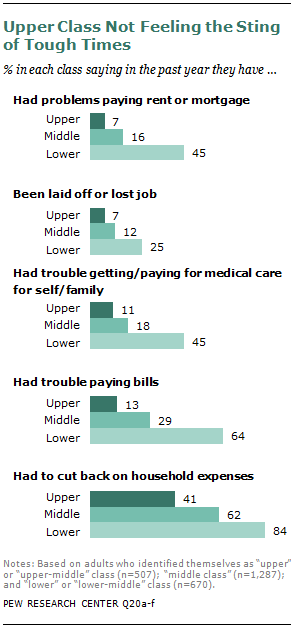
And not surprisingly, as the chart below shows, many who self-identify as being in the lower class are experiencing great hardships.   In fact, 1 in 3 faced four or all five of the problems addressed in the survey.

In short, there is a lot of hurting in our economy.

Cross-posted at Reports from the Economic Front.

The media has focused on the lack of jobs as a major election issue.  But the concern needs to go beyond jobs to the quality of those jobs.

As a report by the National Employment Law Project makes clear, we are experiencing a low wage employment recovery.  This trend, the result of an ongoing restructuring of economic activity, has profound consequences for issues of poverty, inequality, and community stability.

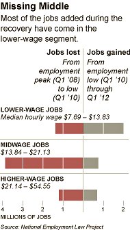
The authors of the report examined 366 occupations and divided them into three equally sized groups by wage.  The lower-wage group included occupations which paid median hourly wages ranging from $7.69 to $13.83.  The mid-wage group range was from $13.84 to $21.13.   The higher-wage group range was from $21.14 to $54.55.

The figure below shows net employment changes in each of these groups during the recession period (2008Q1 to 2010Q1) and the current recovery (2010Q1 to 2012Q1).   Specifically:

  • Lower-wage occupations were 21 percent of recession losses, but 58 percent of recovery growth.
  • Mid-wage occupations were 60 percent of recession losses, but only 22 percent of recovery growth.
  • Higher-wage occupations were 19 percent of recession job losses, and 20 percent of recovery growth.

The next figure shows the lower-wage occupations with the fastest growth and their median hourly wages.  According to the report, three low-wage industries (food services, retail, and employment services) added 1.7 million jobs over the past two years, 43 percent of net employment growth.  According to Bureau of Labor Statistics projections these are precisely the occupations that can be expected to provide the greatest number of new jobs over the next 5-10 years.

 As the final figure shows, the decline in mid-wage occupations predates the recession.  Since the first quarter of 2001, employment has grown by 8.7 percent in lower-wage occupations and by 6.6 percent in higher-wage occupations.  By contrast, employment in mid-wage occupations has fallen by 7.3.


Significantly, as the report also notes, “the wages paid by these occupations has changed. Between the first quarters of 2001 and 2012, median real wages for lower-wage and mid-wage occupations declined (by 2.1 and 0.2 percent, respectively), but increased for higher-wage occupations (by 4.1 percent).”

A New York Times article commenting on this report included the following:

This “polarization” of skills and wages has been documented meticulously… A recent study found that this polarization accelerated in the last three recessions, particularly the last one, as financial pressures forced companies to reorganize more quickly.

“This is not just a nice, smooth process,” said Henry E. Siu, an economics professor at the University of British Columbia… “A lot of these jobs were suddenly wiped out during recession and are not coming back.”

Steady as she goes is just not going to do it and changes in taxes and spending programs, regardless of how significant, cannot compensate for the increasingly negative trends generated by private sector decisions about the organization and location of, as well as compensation for production.

The recession is over in the U.S.. We’re now in the recovery period.

This would be more comforting if the pace of the recovery weren’t glacial. If you pay attention to weekly unemployment numbers or monthly economic reports, you’ve gotten used to the word “disappointing.” Yes, the economy is gaining jobs, but slowly. At this rate, it would take years to climb out of the hole the recession left us in.

But the slow pace of growth isn’t the only concern. The New York Times discusses the types of new jobs being created. While the majority of the jobs lost were midwage jobs, so far most of the new jobs are low-wage:

We’re not gaining new jobs very quickly. And when we do, it’s hard to find a job that provides a solidly middle-class income among those that are being added, continuing the trend of job polarization that economists have shown is reinforced during economic downturns.

The Pew Research Center has released the results of a poll of 2,508 adults about social class and life experiences.

An important caveat to start with: the poll asked people to categorize themselves as upper (2% of respondents), upper-middle (15%), middle (49%), lower-middle (25%), or lower class (7%). We know that there’s a tendency among people in the U.S. to identify as middle class, even when their actual income falls far below or above what could reasonably be considered middle class, and the survey didn’t ask about incomes or assets to compare to individuals’ self-identification. There’s likely to be some overlap between the categories if we actually looked at the income/wealth of participants. The graphs below combine those who defined themselves as upper or upper-middle class together into the “upper class” category, while those who said lower-middle are assigned to the “lower class” group.

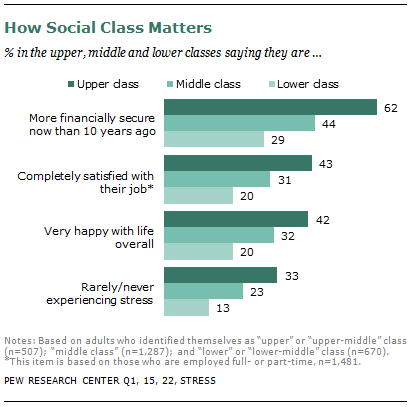
Not surprisingly, there were large differences by social class in a number of quality-of-life areas. The higher one’s class, the more likely they were to say they were better off than they were 10 years ago and were happy with life and rarely experience stress (though apparently we’re generally pretty stressed overall):

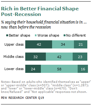
The lower class is much more likely than the other groups to say they are in worse shape than they were before the recession, indicating that they continue to suffer disproportionately from the effects of the economic meltdown and the slow recovery:

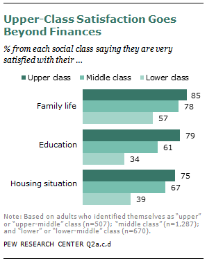
Those defined as lower class were much less satisfied with family life, their level of education, and their housing situation:

They were also much more likely to report specific difficulties in the past year, including trouble paying rent/mortgage and other bills, losing a job, and problems paying for medical care:

The results show a consistent, unsurprising pattern: the rich are weathering the slow recovery relatively well, while the poor suffer disproportionately. Check out the full report for information on participants’ perceptions of the wealthy, the fairness of the tax burden across classes, and which political party best represents each group.

Cross-posted at Reports from the Economic Front.

It’s election season and Republicans and Democrats are working hard to demonstrate that they support dramatically different policies for rejuvenating the economy.

While the Democratic Party’s call for more government spending makes far more sense than the Republican Party’s call for cuts in government spending (see below), the resulting back and forth hides the far more serious reality that our existing economic system no longer appears capable of supporting meaningful social progress for the great majority of Americans.

The chart below helps to highlight our economy’s worsening stagnation tendencies.  Each point shows the 10 year annual average rate of growth and the chart reveals a decade long growth trend that is moving sharply downward.

As David Leonhardt explains:

The economy’s recent struggles arguably began in late 2001, when a relatively mild recession ended and a new expansion began. The problem with this new recovery was that it wasn’t especially strong. From the fourth quarter of 2001 through the fourth quarter of 2007 (when the financial crisis began), the economy grew at an average annual rate of only 2.7 percent. By comparison, the average annual growth rate of both the 1990s and 1980s expansions exceeded 3.5 percent.

This mediocre expansion was followed by the severe recession and weak recovery brought on by the financial crisis. The combined result is that, in recent years, the economy has posted its slowest 10-year average growth rates since the Commerce Department began keeping statistics in 1947.

In fact, the economic growth figures for the period 1995 to 2007 were artificially propped up by a series of bubbles, first stock and then housing.  Once those bubbles popped, average growth rates began steadily falling.

The weakness (and unbalanced nature) of our current weak recovery is well captured in the following chart from Catherine Rampell, which compares the percent change in various indicators in the current recovery (which began in June 2009) with previous post-war recoveries.  The first point to stress is that the current recovery lags the average in all indicators but one: corporate profits.  The second is that government spending has actually been falling during the current recovery, no doubt one reason that the percent increase in so many indictors remains below the average in previous recoveries; the public sector is actually smaller today than it was three years ago.

The relative strength in the performance of corporate profits helps to explain why the two established political parties feel no real pressure to focus on our long term economic problems; corporations just don’t find the current situation problematic despite the economy’s weak overall economic performance.

Even more telling of the growing class divide is the explosion in income inequality over the last thirty years, which is illustrated in the following chart.

In other words, while corporations have succeeded in raising profits at the expense of wages, those in the top income brackets have been even more successful in raising their income at the expense of almost everyone else.  Notice, for example, that median household income in 2010 is roughly where it was in the late 1980s while the median income of the top households racked up impressive gains. Thus, the very wealthy have every reason to do what they are currently doing, which is using their wealth to ensure that candidates restrict their economic proposals to reforms that will do little to change the existing system.

The takeaway: without a mass movement demanding change, election debates are unlikely to seriously address our steady national economic decline.

Cross-posted at Montclair SocioBlog.

What’s familiar isn’t so bad, even if it’s bad.

One of the things I remember from my days in the crim biz is that people’s perceptions of crime don’t have a lot to do with actual crime rates.  This was back in the high-crime decades, and people were more afraid of crime than they are now.  But people felt safer in their own neighborhoods than in other neighborhoods, even when their own neighborhoods had a higher crime rate.

These were the days when I would give someone directions to my building — “Get off the IRT* at 72nd St…” — and they would often ask, “Is it safe?”

“Of course it’s safe.  It’s my neighborhood,” I would say, “I live here. I ought to know.”   Yet when I would go to a party in the East 20s or, God forbid, Brooklyn, I would emerge from the subway and follow the directions with a certain sense of apprehension and caution.

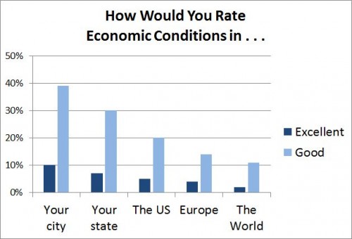
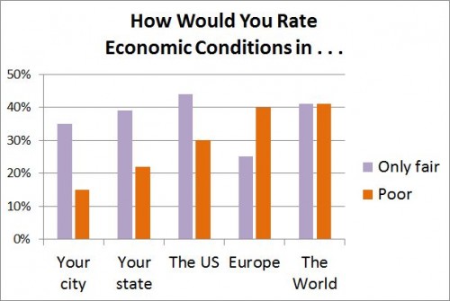
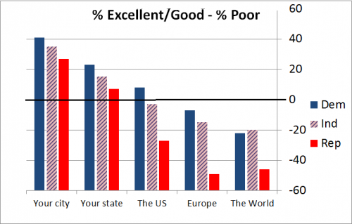
Apparently, the same link between far and fear holds true for people’s perceptions of economic well-being.  A recent Gallup poll asked people how the economy was in places ranging from their own city or area to the world generally.  The closer to home, the better the economy.  The farther from home, the lower the percent of people rating economic conditions as excellent or good.And the farther from home, the higher the percent of people rating economic conditions as “only fair” or poor.Republicans were the most pessimistic about the economy, regardless of location.  Democrats were the most sanguine, with Independents in between. The graph shows the percent who rated the economy positively minus the percent who rated it Poor.This obviously has nothing to do with familiarity but with contempt.  Apparently, for Republicans, a Democrat – especially a Kenyan socialist Democrat – in the White House means that the economy must be bad everywhere.

* These old subway line designations – IRT, BMT, IND – are no longer in official use.  But when did the MTA jettison them?  If you know the answer, please tell me.

———————

UPDATE, June 22 Andrew Gelman has formatted the data as line graphs, making the comparisons and trends clearer.  He has also added his own observations – things I wish I had known or thought of.

This spring the Chronicle of Higher Education offered an in-depth look at the number of highly educated people receiving federal aid.  Though, on average, they are still doing better than people without college degrees, these populations have not been immune to the recession.

While I sensed an undercurrent of classism in the article (e.g., “how could someone like me be on aid”), it offered an interesting profile of the post-graduate degree job outlook, especially for people with a PhD.  Notably, it reminds us just how risky pursuing graduate work can be; 70% of all faculty are now off the tenure-track.  That often means that they teach part-time, have no benefits, and face semester-to-semester job insecurity.

These faculty could probably do something else, but many of them are trying to realize a dream that they’ve spent 10 to 15 years of their lives working towards.  So, they continue to teach part-time for relatively low pay and participate in a job market that, for the most part, opens up only once a year.

For more on the economics and politics of academic labor, read Keith Hoeller’s The Future of the Contingent Faculty Movement.

Lisa Wade, PhD is an Associate Professor at Tulane University. She is the author of American Hookup, a book about college sexual culture; a textbook about gender; and a forthcoming introductory text: Terrible Magnificent Sociology. You can follow her on Twitter and Instagram.

The conventional wisdom seems to be that our biggest economic challenge is runaway government spending. The reality is that government spending is contracting and pulling economic growth down with it.  And worse is yet to come.

Perhaps the best measure of active government intervention in the economy is something called “government consumption expenditure and gross investment.”  It includes total spending by all levels of government (federal, state, and local) on all activities except transfer payments (such as unemployment benefits, social security, and Medicare).  

The chart below shows the yearly percentage change in real government consumption expenditure and gross investment over the period 2000 to 2012 (first quarter).  As you can see, while the rate of growth in real spending began declining after the end of the recession, it took a nose dive beginning in 2011 and turned negative, which means that government spending (adjusted for inflation) is actually contracting.

fredgraph-percente-change-from-a-year-ago.png

The next chart, which shows the ratio of government consumption expenditure and gross investment to GDP, highlights the fact that government spending is also falling as a share of GDP.

dolan-relative-to-gdp.png

Adding transfer payments, which have indeed grown substantially because of the weak economy, does little to change the picture.  As the chart below shows, total government spending in current dollars, which means unadjusted for inflation, has stopped growing.  If we take inflation into account, there can be no doubt that total real government spending, including spending on transfer payments, is also contracting. 

current-total-expenditures.png

The same is true for the federal government, everyone’s favorite villain.  As the next chart shows, total federal spending, unadjusted for inflation, has also stopped growing.

federal-current.png

Not surprisingly, this decline in government spending is having an effect on GDP. Real GDP in the 4th Quarter of 2011 grew at an estimated 3 percent annual rate.  The advanced estimate for 1st Quarter 2012 GDP growth was 2.2 percent.  A just released second estimate for this same quarter revised that figure down to 1.9 percent.  In other words, our economy is rapidly slowing.

What caused the downward revision? 

The answer, says Ed Dolan, is the ever deepening contraction in government spending:  

What is driving the apparent slowdown? It would be comforting to be able to blame a faltering world economy and a strengthening dollar, but judging by the GDP numbers that does not seem to be the case. The following table (see below) shows the contributions of each sector to real GDP growth according to the advance and second estimates from the Bureau of Economic Analysis. Exports, which we would expect to show the effects of a slowing world economy, held up well in the first quarter. In fact, the second estimate showed them even stronger than did the advance estimate. The contribution of private investment also increased from the advance to the second estimate, although not by as much. Exports and investment, then, turn out to be the relatively good news, not the bad, in the latest GDP report.

Instead, the largest share of the decrease in estimated real GDP growth came from an accelerated shrinkage of the government sector. The negative .78 percentage point decrease of the government sector is the main indicator that we are already on the downward slope toward the fiscal cliff.

p120601-1a.png

If current trends aren’t bad enough, we are rapidly approaching, as Ed Dolan noted, the “fiscal cliff.” That is what I was referring to above when I said that worse is yet to come. As Bloomberg Businessweek explains 

Last summer, as part of its agreement to end the debt-ceiling debate (debacle?), Congress strapped a bomb to the economy and set the timer for January 2013. Into it they packed billions of dollars of mandatory discretionary spending cuts, timed to go off at exactly the same time a number of tax cuts [for example, the Bush tax cuts and the Obama payroll-tax holiday] were set to expire  

The congressional deficit supercommittee had a chance to disarm the bomb last fall, but of course it didn’t. And so the timer has kept ticking. The resulting double-whammy explosion of spending cuts and tax increases will likely send the economy careening off a $600 billion “fiscal cliff.”

The fiscal contraction will actually be even worse, since the extended unemployment benefits program is also scheduled to expire at the end of the year.  

So, what does all of this mean?  According to Bloomberg Businessweek:

If Congress does nothing, the U.S. will almost certainly go into recession early next year, as the combo of spending cuts and tax hikes will wipe out nearly 4 percentage points of economic growth in the first half of 2013, according to research by Goldman’s Alec Phillips, a political analyst and economist. Since most estimates project the economy will grow only about 3 percent next year, that puts the U.S. solidly in the red.

One can only wonder how it has come to pass that we think government spending is growing when it is not and that it is the cause of our problems when quite the opposite is true.  Painful lessons lie ahead — if only we are able to learn them.