culture: color

Toban B. wrote in with an observation about Facebook avatars. The default avatar is “white” and appears to be male:

d_silhouette

In contrast to the individual avatar, Facebook’s illustration of global connection uses orange avatars of both sexes:

capture12

“Evidently,” Toban writes, “the orange is supposed to be a sort of compromise skin colour.”

So when Facebook wants to represent global humanity, the avatars are orange and of mixed sex; when Facebook is charged with representing an individual, the avatar is white and male.  This is not random or accidental.  Globally, as Facebook, ironically, reminds us, people are not “white.”  Representing people in this way centers men, Western countries, and whiteness (because there are non-white people in Western countries, too) and marginalizes women, non-Western countries, and non-whites (though one might argue that at least ALL of the avatars aren’t white and male).

UPDATE: I write this update in August of 2010.  Since then it appears that Facebook has added a generic female avatar.  This one was sent in by Amber F. (it’s her mom, Ginger’s, profile):

See our other posts on how whiteness and maleness are the characteristics we attribute to “person,” unless there are reasons to do otherwise, herehere, and here.

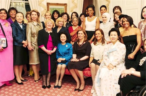
SocProf, from The Global Sociology Blog, has an interesting post about gender in the public sphere. Here is a photo (from Echidne of the Snakes) of the “first spouses” of the G20 nations (that is, the spouses of the political leaders of the G20):

g20_glamour_spouses_expires_1

Except…someone’s missing. Two of the G20 countries (Germany and Argentina) have heterosexual, married female leaders, and their husbands aren’t in the photo. I don’t know why–were they not invited to the event? Did they choose not to come? SocProf asks, “Would the husbands have looked out of place here? Would this have been embarrassing to them?”

But SocProf points out that a different disappearing act recently occurred in Israel:

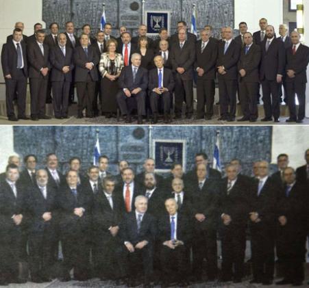
…look what happened in reverse in a group photo of the newly-formed Israeli cabinet. On top is the traditional cabinet group photo, at the bottom is the “touched-up” version that appeared in [the ultra-Orthodox newspaper Yated Neeman]… notice the difference?

30-world_160567s

Indeed, the two female Cabinet members have been photoshopped out.

SocProf says,

[In the G20 photo]…the men are not visibly absent. It is their presence that would be noticeable. And also note the setting in which the women pose, the soft colors, pink carpet and sofa with pastel background. It looks like a somewhat formal yet a little domestic setting.

The bottom photo is formal, no pink or pastel there! Icy grey with flags and orderly pose…It is a perfect illustration of the gendered domains: where men belong and where women belong.

Taken together, the three images, though taken for different purposes in different places, provide a great illustration of how we often make people who don’t fit cultural gender norms invisible…sometimes very literally.

Also see our post on an ultra-Orthodox newspaper that airbrushed girls out of a photo of children.

UPDATE: Commenter Liz says,

I object to the use of the word ‘airbrushing’, because that’s not what happened: those photos were edited, manipulated, or fabricated, but airbrushing is a specific photoshop tool for minor modification. You can’t completely change the reality of a photograph with an airbrush, unless someone would like to tell me that those two male stand-ins are actually just drawings made with photoshop.

If you use the same word (airbrushing) for taking out a model’s cellulite as well as removing heads of state from photographs, you trivialise what’s been done. Digital editing is only going to become more and more common, and it’s important to find the right words to explain how a photo has been altered.

Good point–thanks for pointing the language issue out. I didn’t know what airbrushing referred to, exactly, and had just heard it used to describe altering an image in general.

Below are screenshots of the Degree Men, Degree Women, and Degree Girl websites.

Degree genders their deodorant with color (turquoise and lavender versus blue and yellow), pattern (bold lines versus curving spirals), language (women are “emotional” and men “take risks”).  Really, Degree? We’re still going there? 

Even the scents are gendered and, further, they reveal how we place men and women in a hierarchy (e.g., “Extreme Blast” versus “Summer Rain”).  Men even get a scent called “Power.”

Degree also markets their product differently towards adult and t(w)een girls.  Women are “emotional,” girls are “OMG!” let’s dance!!! 

OMG!  Let’s take a look!


“DEGREE MEN. PROTECTS MEN WHO TAKE RISKS.”

capture7

“Absolute Protection.”
“Responds to increases in adrenaline.”
“Proven at the hottest temperature on earth.”
“Unbeaten in competitive dryness testing.”

Scents include “Cool Rush,” “Extreme Blast,” “Arctic Edge,” “Intense Sport,” “Clean Reaction,” and “Power.”


“DEGREE WOMEN. DARE TO FEEL.”

capture8

“Emotional sweat can cause body odor more than perspiration from physical activity… you need extra odor protection to kick in when you’re stressed or emotional.”

Scents include “Classic Romance,” “Spring Fusion,” and “Fresh Oxygen,” “Pure Satin,” “Delicious Bliss,” and “Sexy Intrigue.”


“DEGREE GIRL. PROTECTION FOR EVERY OMG! MOMENT.”

capture3

“Crazy, exciting or embarrassing, OMG! moments happen to everyone.”

“Sign up 4 Cool Stuff! OMG SIGN UP.”

Scents include “Fun Spirit,” “Tropical Power,” and “Just Dance.”  See also “Pink Crush.”


Also in dumb gendered marketing:  Redken for men, make up for men, Frito Lay targets the ladies, nature versus the beast, it may be pink, but it’s not girly, gendered vitamins, and RISK (for men only).

Also in marketing towards tweens: “My Life” involves getting a boyfriend, teenager+colonialism = weird, and Nair for tweens.

Crazy Vet offers us this rather amazing commercial for BP as an example of “green-washing” or an effort to make a company appear environmentally friendly:

What I think is especially remarkable about this example is how entirely free of any content it manages to be.  The commercial combines pretty colors, animation, babies, cute music, and whistling gas pumps.  That alone, apparently, is effective in convincing us that BP is environmentally benign.  It is pure emotion, completely devoid of an argument.

—————————

Lisa Wade is a professor of sociology at Occidental College. You can follow her on Twitter and Facebook.

Captain Crab sent in a link to this story in the Mail Online about two girls who were kicked out of school for being “two blonde.” Here are the girls:

The girls claim the headmaster said they would be expelled “unless they dyed their hair brown.” He says he simply sent them home until they had it dyed, and that this is in accordance with the school’s dress code, which does not allow “unnatural” hair colors.

It brings up some interesting questions about “naturalness” and how we alter our bodies. Is an “unnatural” hair color any color that a human has never had without help from some type of chemical or other coloring agent? Or is “unnatural” a color other than what your hair would be if you didn’t dye it? Both of these girls dyed their hair colors that many women dye their hair and that some people do have “naturally,” that is, without bleaching it. Does the fact that they chose blonde have anything to do with the reaction? If they had dyed their hair black or auburn, would they have been sent home? I have no idea, I’m just wondering.

You could also use this story to discuss attempts to control kids at school through the use of uniforms, dress/appearance codes, etc., and the way kids always try to get around them, leading to constant renegotiations of what is acceptable and unacceptable between students and school authorities.

Thanks, Captain!

In my post a few weeks back about stuff kids bring to college, I had a photo of a teddy bear lying atop a pile of belongings that included pink bed linens. Obviously, it belonged to a girl. (There was a purse in the picture, but even without it. . . .)

A couple of days later, Lisa at Sociological Images had a post reminding us that pink was once the color for boys. She linked to an article by Ben Goldacre in the Guardian.

The Sunday Sentinel in 1914 told American mothers: “If you like the colour note on the little one’s garments, use pink for the boy and blue for the girl, if you are a follower of convention.”

Goldacre uses this bit of history to debunk the claim recently made by evolutionary psychologists that girls’ preference for pink was an outcome of evolution.

But what about the teddy bear? Isn’t there something feminine, a maternal instinct perhaps, that leads girls to keep these soft, childhood objects? It is only girls, right?

Wait, now I remember seeing NYC sanitation trucks with a teddy bear mounted on the grill like a bowsprit mermaid. And Sebastian Flyte in Brideshead Revisited who takes his bear Aloysius with him to Oxford.

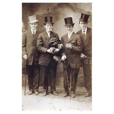
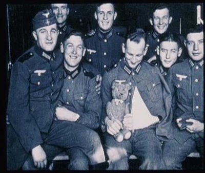
Now there’s a DVD* about a Teddy bear snapshot exhibition by Canadian Ydessa Hendeles – thousands of photos from the early twentieth century of people posing with their bears. And it’s not just girls.

*The DVD is of a documentary film by Agnès Varda, who interviews the visitors to the exhibit.

Hat tip to Magda

Jay Livingston is the chair of the Sociology Department at Montclair State University. You can follow him at Montclair SocioBlog or on Twitter.

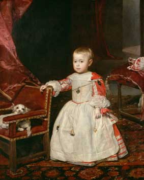
In a comment a while back, Elena pointed out that Diego Velázquez’s painting “Infante Felipe Próspero” (from 1659) provides a good example of how pink was acceptable for males to wear…as were, in some cases, dresses, which the young prince is wearing:

Elena says,

…until the late 1700s little boys would wear dresses or petticoats for as long as they could until they could dress as miniature adults…This was mainly for ease of bodily functions.

Of course, today most parents would be appalled at the idea of dressing toddler boys in dresses–dresses with frills and ribbons, at that.

The painting “Pope Innocent X,” also by Velázquez (1650) shows the Pope in light pink clothing:

Both images found at the National Gallery’s Velázquez page.

You might also check out Kent State University Museum’s Centuries of Childhood exhibit for examples of how children’s clothing has changed over time.

Thanks for the tip, Elena!

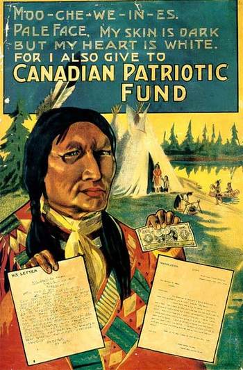
Ben O. sent in this poster (from Found in Mom’s Basement), which uses images of Native Americans (or First Peoples) to encourage Canadians to contribute to the Canadian Patriotic Fund, which was set up during World War I to support wives and children of enlisted men:

It’s a great example of the white/non-white dichotomy, where whiteness implies morality while darkness/blackness is associated with evil or immorality. In this case, his heart is “white” (i.e., he’s a good, moral being) because he does the right thing by caring for war widows. I guess the morality of his act overpowers the misfortune of his skin tone.

Thanks, Ben O.!

On a side note, I’m off to Oklahoma for the next 12 days. I’ll still be posting–Verizon’s internet access program means I can get a weak signal even at the farm–but I won’t be able to check in on comments as often as usual or update posts with information commenters or readers send in.

You will most likely not notice any difference. Just be aware that when you insult me, it’ll take a little longer before I know about it.

Cheers!