clothes/fashion

In this series, I offer a typology reflecting the ways in which people of color are used in advertising aimed primarily at whites (see the first and the second in the series).  In this, the third edition, I suggest that sometimes people of color are included because the idea of “diversity” triggers the related ideas of “cool,” “hip,” “urban,” and “youth,” which also invoke “modernity” and the idea of being “global,” “cosmopolitan,” even “progressive” politics.

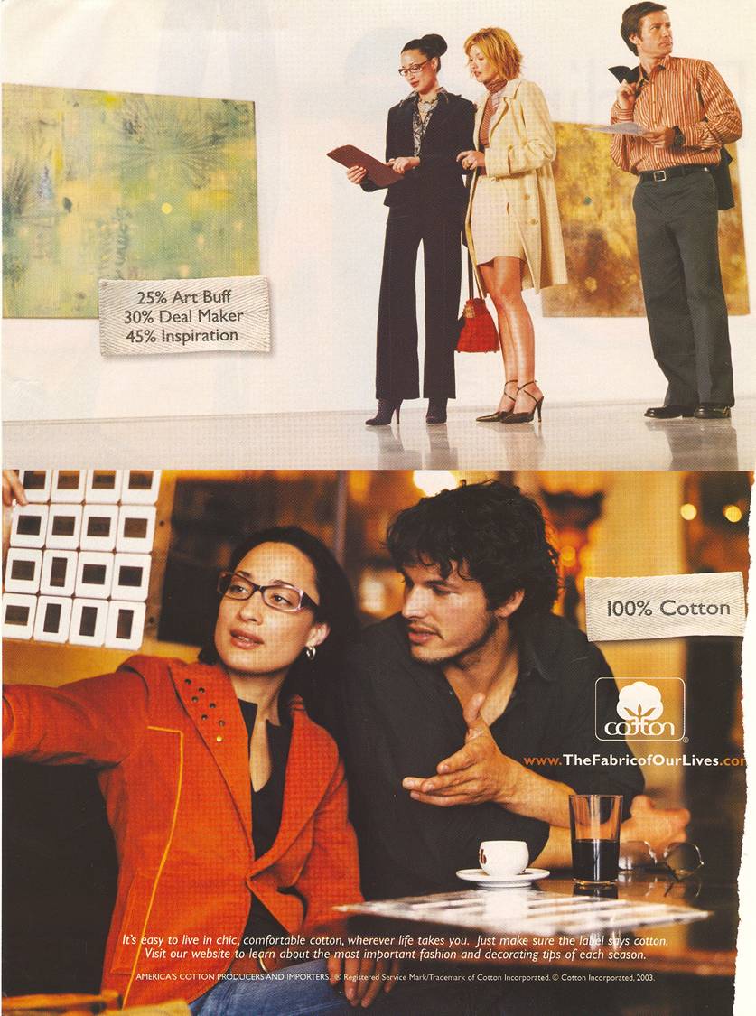
In this ad, a mix of races are used.  Notice that the ad also happens to include, in the bottom image, photography, what looks like a dark beer, and espresso (all “upper class” “sophisticated” interests) and, in the top image, we see that the woman who appears Asian is an art dealer.

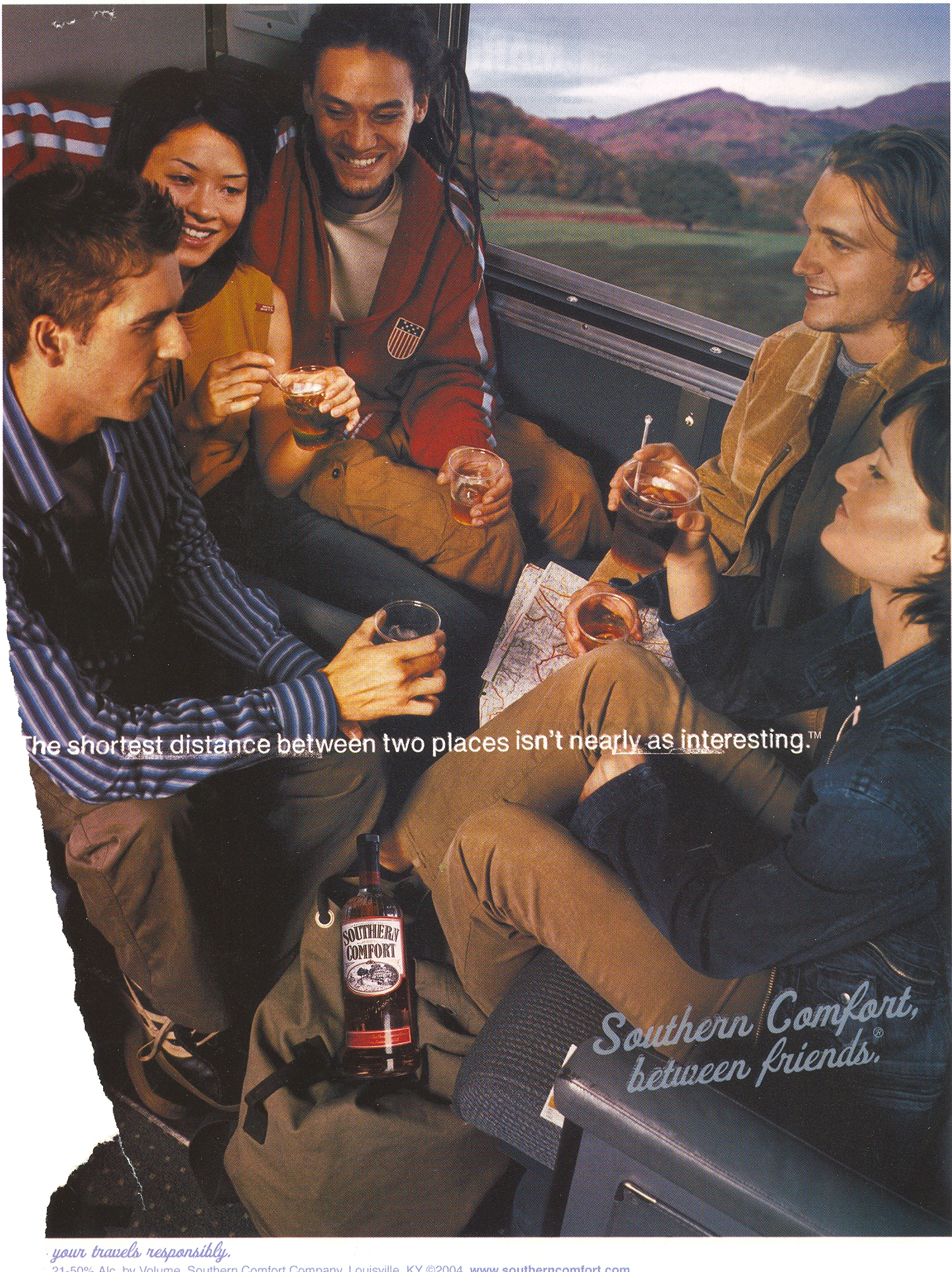
In this next ad, again, we see a mix of races enjoying what looks like a train ride (how European!) with hard liquor.  The text:

The shortest distance between two places isn’t nearly as interesting.

I think it is no accident that “interesting” and racial difference are both present in this ad.

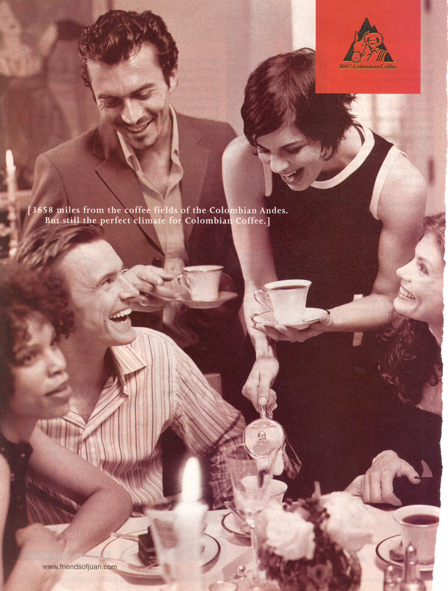
In this next ad we see a racially ambiguous male and a black woman.  Notice the clothes that they are wearing (casually sophisticated) and the delicate nature of their coffee cups.  This is leisure, not some working-class Joe with a cup o’ joe.  Text:

3658 miles from the coffee fields of the Columbian Andes.  But still the perfect climate for Colombian Coffee.

The idea of travel, of course, invokes a certain degree of cosmopolitan-ness and wealth.  And the “perfect” climate refers not just to weather, but to the kind of company Colombian Coffee drinkers keep.

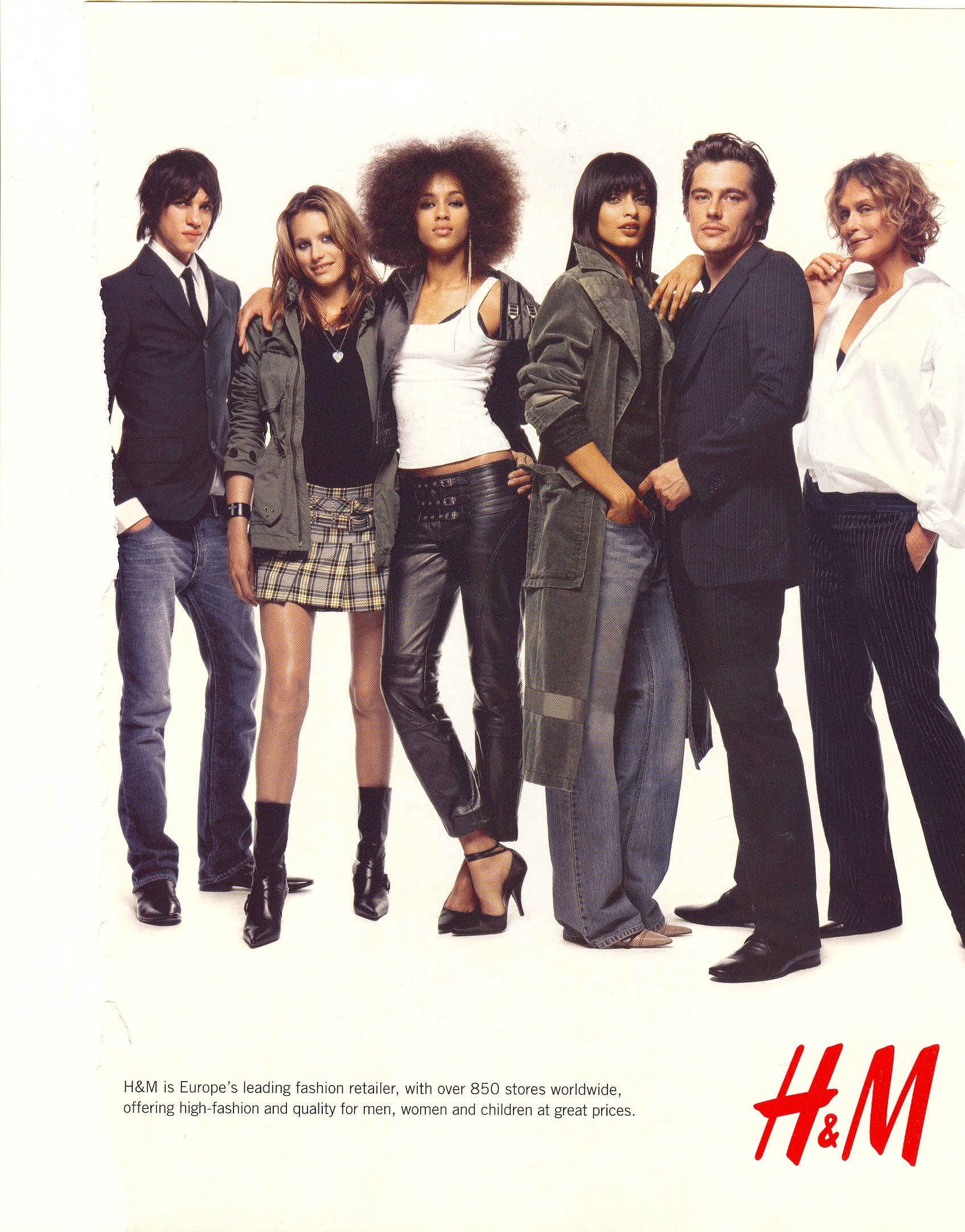
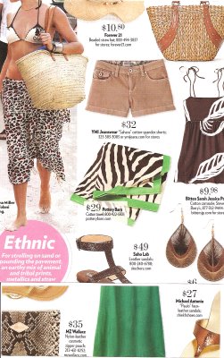
This ad for H&M is a bit different.  Instead of invoking sophistication and cosmopolitan-ness, I think it invokes who and what is “hip” and “cool” and “diversity” is used as a signifier. The text:

H&M is Europe’s leading fashion retailer [Europe again], with over 850 stores worldwide [a reference to being “global”].  Offering high-fashion [i.e., “sophisticated?”] and quality for men, women and children at great prices.

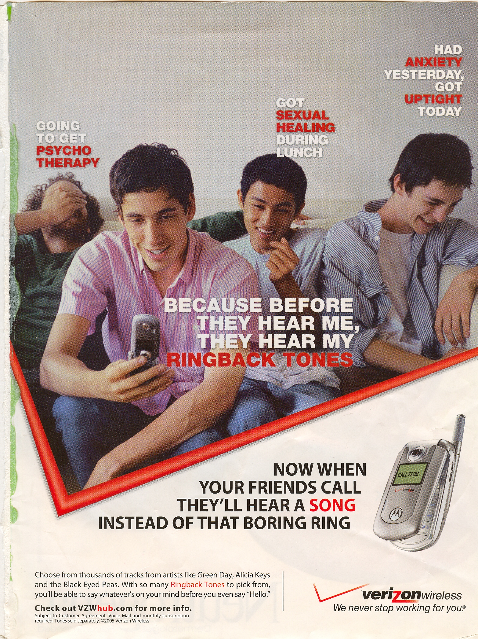
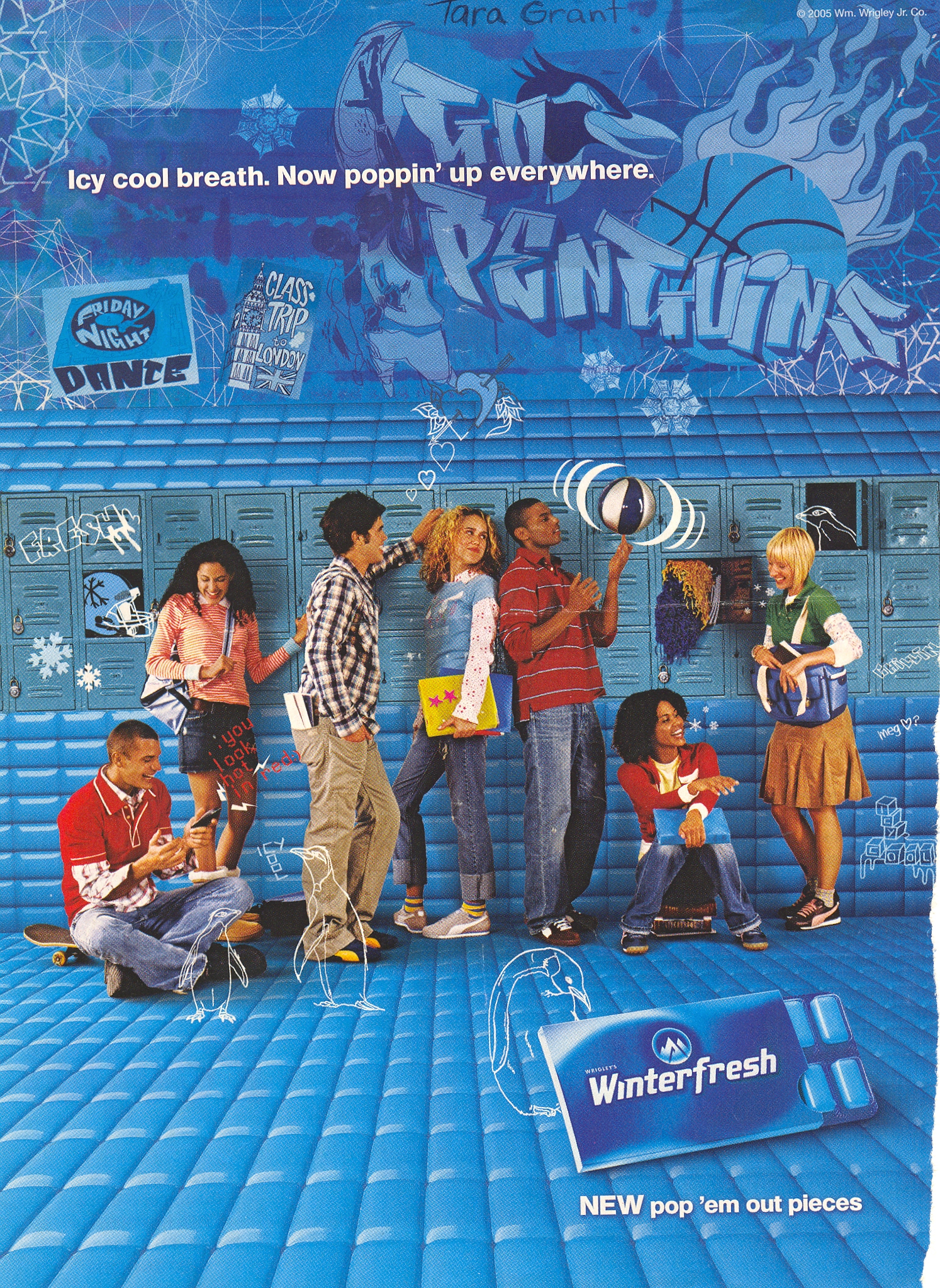
These last two ads, instead of using people of color to emphasize being “hip” or “sophisticated,” use them to signal “youth” and what being young represents.  Young people are on the forefront of “cool,” of course, and also, in some sense, define “progressive” in that they herald a more “diverse” and “tolerant” future (hello, Obama). 


Next up: Including people of color so as to trigger the idea of human diversity.

Don’t miss the others in the series:

(1) Including people of color so as to associate the product with the racial stereotype. 
(2) Including people of color to invoke (literally) the idea of “color” or “flavor.”

Soon after reading my post on “ethnic” fashion, Robin noticed an article in the New York Times about “tribal” elements in fashion. According to the article, “The tribal trend, seen on spring runways awash with ikat, batik, and African wax prints, is hot this summer.” We helpfully learn, “The specimens are rarely authentic, mind you. Rather, designers have appropriated ethnic elements and given them a modern spin.” According to one designer,

“It’s a dialogue between what’s traditional and new, and between East and West,” she said. “Our weavers in Uzbekistan find it really surprising and a real struggle to begin with. At first they don’t like the reworked designs, but over time they acquire appreciation.”

A quote from another designer:

“The enticement of ethnic dress in modern culture is like going on a guided safari,” he said. “We can enjoy the element we are familiar with and attracted to, while not giving up our daily comforts. We can wave to the lion from the safety of our S.U.V.”

So wearing “ethnic” clothing is like going on a sightseeing trip where you can look at savage animals but in a safe way that doesn’t actually bring you in contact with them…interesting. “We” (non-ethnic) people can pick and choose a few things from other cultures but without giving up “daily comforts,” or, like, knowing anything about other people or thinking through thorny issues like who that “we” encompasses and who is doing the defining of “we” and the ethnic “them.” I have to say, the “We can enjoy the element we are…attracted to…” made me think of sex tourism.

Notice here that, first, “ethnic” or “tribal” is applied to an enormous range of cultures spanning the globe that have little in common except not being from Western Europe or the U.S. Also, we see that “ethnic” fashion = traditional = non-modern = wild/animalistic = Eastern, whereas “modern” fashion = Western = non-ethnic. Because there is no ethnicity in the “West.” Except when designers use “traditional” Aztec or Mayan or Mexican or Laplander or etc. etc. prints in their “ethnic” designs.

Here are some pictures from the accompanying slide show:

This purse is $565. The weaving is what the quote from the first designer above was saying she struggled with Uzbeki producers about, since they didn’t like her reworked versions of their “traditional” patterns. I wonder how much of that $565 goes to those weavers?

The caption to the photo of these boots is “cultural gumbo.” They are $350.

These bangles come in cashmere, tweed, and cotton and are $45-125. The article does not tell me if I am being “ethnic” and going on a fashion safari every time I wear my black cashmere cardigan. Maybe it has to be brightly-colored cashmere to be “tribal.”

These shoes are $715. They are ethnic because they are silk and I guess maybe that’s supposed to be a vaguely Asian-y print on the black ones. My years of training in a rigorous sociology Ph.D. program also give me the critical thinking and analytical skills to tell you with certainty that they are hideously ugly.

These clutches are $450. They are ethnic because they use a style of dying called ikat, and also probably because they have a vaguely animal-print design.

Great find, Robin!

NEW: Katie J. sent in a link to Pepperlime (part of the Gap/Banana Republic/Old Navy empire), which features shoes that let the wearer “go tribal”:

pl_w_tribal_rz_picks_02

The other day I came upon this fashion spread in a magazine:

I’m not sure which magazine–I want to say Lucky, but I’m not certain. I just scanned in part of it–I cut out a few things that weren’t that interesting so I could get it in a single scan.

Anyway, I noticed it’s called “Ethnic,” and I started thinking about that label, what makes these “ethnic,” and the choice of that word to describe fashion. The most common element to the collection is animal prints–zebra, leopard, snakeskin, croc, peacock feathers. There were a couple of things that I believe were supposed to be recognizable as “African” prints. I guess those brown shorts are “ethnic” because of the material they’re made from.

But why do we call these fashions “ethnic”? Why not “global”? Or “nature,” since the main themes seem to be animal prints and natural fibers? Or “international”? Why do animal prints, feathers, and grass fibers = ethnic?

It made me think about the way that the things that certain groups do or have go unmarked–so here, there is a category of fashion that is “ethnic,” while apparently all other clothing is ethnicity-less. When I carry a woven bag or wear a shirt with tropical-looking leaves on it, I’m being ethnic, but if I put that purse down and pick up a blue leather one, or change into a shirt with a maple leaf on it, I’d stop being ethnic and go back to being…well, presumably plain-old white, the non-ethnic, non-marked category.

I just thought this might be interesting for a discussion about race and which groups are marked as having a race or ethnicity and which ones (in the U.S., primarily whites) are treated as though they do not have a race/ethnicity and thus aren’t relevant to discussions about racial issues. Or maybe when talking about race/ethnicity as a marketing tool, as something you can put on and take off at will.

This is the iconic photo of Tommie Smith and John Carlos (found here) from the 1968 Olympics in Mexico City. They raised their arms, wearing black gloves, in a symbol of protest against racism in the U.S. Less often noticed is that they were wearing beads to symbolize victims of lynching and went barefoot to protest the fact that the U.S. still had such extreme poverty that some people went without basics, such as sufficient clothing. Peter Norman, the Australian 2nd-place winner, grabbed a button produced by the Olympic Project for Human Rights (see below) when he found out what the other two were going to do and wore it in solidarity (if you look closely you can see that all three are wearing matching white buttons).


The reaction was immediate and negative. Carlos and Smith were stripped of their medals, ejected from the Olympic Village, and returned to the U.S. to widespread anger. In David Zirin’s book What’s My Name, Fool? Sports and Resistance in the United States (2005, Chicago: Haymarket Books), several black athletes discuss the difficulties they faced as a result of their actions. This 2003 interview with Tommie Smith covers some of the same issues.

Below is a button like the ones they were wearing. Much like we often think Rosa Parks spontaneously decided not to give up her seat on the bus (ignoring the fact that she attended training with other African Americans determined to protest inequality in the South), the assumption is often that Smith’s and Carlos’s gesture was something they decided on at the moment. In fact the Olympic Project for Human Rights, organized by Black U.S. athletes, had tried to organize an athletes’ boycott of the 1968 Olympics. When that was unsuccessful, tactics switched to making statements at the Olympics. This was part of an organized plan on the part of a number of Black athletes who were tired of representing the U.S. but being expected to stay silent about racism in the U.S.

Some of these buttons are for sale ($300 each!) on Tommie Smith’s website.

A t-shirt with the cover of the July 15, 1968, issue of Newsweek about “the angry black athlete.”
I looked for a photo of the cover itself but could not find one online. Clearly the nation was anxious about the attitudes of Black athletes even before the Olympics (in October) caused such a stir.

I think these images are useful in a couple of ways. I use them to undermine the idea of the individualistic protester and to bring attention to the ways Civil Rights activists organized and planned their actions. It could also be useful for discussions of politics in sports–the ways in which athletes have at times used their position to bring attention to social inequality, as well as the repercussions they may face for doing so. It might also be interesting to ask why this image caused so much furor, and how the Olympics is constructed as this non-political arena for international cooperation (a topic I cover in my Soc of Sports course). You might compare the image from the 1968 Olympics to this image (found here) from the 1936 Olympics in Germany:

Here we also see the Olympics being used to make a political statement, but in this case the athlete was not thrown out of the Olympic Village or stripped of his medals. What is the difference? Just that time had passed and attitudes toward political statements at the Olympics changed? In the 1936 pose, the athlete was showing pride in and support for his country, whereas Smith and Carlos meant their gesture as a protest of conditions in the U.S.–thus shaming their nation in an international arena (this was a major cause of the anger they faced when they returned to the U.S.–the idea that they were airing the nation’s “dirty laundry,” so to speak, for others to see). Could that be part of the difference in the reaction?

Of course, a cynical person might argue that these seemingly ungrateful, misbehaving black athletes who refused to smile and play along were being publicly punished in the media for getting “uppity” (in a time period where white Americans were also wearying of minorities’ continued demands for equality and social change).

Miguel sent us a link to Galeria: Ellas Mandan, a set of advertisements that reverse the common images of male dominance by showing women in control:

For liquor:

For pantyhose:

Shoes:

Jeans:

Dolce & Gabbana:

A submission from Stumblng Tumblr from the Brylcreem website:

NEW!  A fashion ad from Phillip G.:

lrg-2765-brian_atwood_series2_03_jpg

These images show women in “control” of, or dominating men, but in a very sexualized manner that often references S&M or bondage. So women can have power, but have to be sexualized at the same time. This fits in well with our cultural beliefs that women have power over men because men want sex and will allow themselves to be manipulated by women in order to get it. So women can supposedly control men by threatening to withhold sex until they get what they want.

And is it not possible to just have some images where men and women are equals and no one has to be dominant? Is that out of the question?

Thanks, Miguel!


Lisa and I went to the Atomic Testing Museum in Las Vegas today. We were not allowed to take pictures! However, we were inspired to post about the word “atomic.” Below are some pictures related to the U.S. bombing of Nagasaki during WWII. They are followed by some examples of the way in which the word “atomic” has been taken up in popular culture

The mushroom cloud over Nagasaki, Japan:

Nagasaki before and after the U.S. dropped an atomic bomb (found here):

Together the bombs dropped by the U.S. on Nagasaki and Hiroshima killed between 150,000 and 220,000 people immediately (that is, not considering the long-term morbidity and mortality). For more on the science of atomic bombs and the structural and human casualties of the Hiroshima and Nagasaki bombings, click here. Our point here is to point out that at this point in history, the word “atomic” referred to something incredibly devastating to human life.

Given this, we find it fascinating that the word came to mean something like “cool,” “super extra much,” “hot and spicy” and numerous other vague references to awesomeness. Then, the adjective could be used to describe anything at all. Consider the following examples

Clothes and sporting equipment:

Music-related stuff:

Candy:


So at some time and for some reason, the word “atomic” came to refer not to something very, very serious and instead to something very, very fun. How odd. We did a search for the etymology of the word “atomic” and there was nothing to explain how the word came to be used that way in popular American culture. In fact, there was no reference to its non-scientific use at all.

P.S. – If you’re ever in Las Vegas and want to see something very, very weird (sociologically, we mean), we suggest the Atomic Testing Museum. There, you can learn about America’s proud “atomic testing heritage.”

UPDATE: Commenter Elena pointed out that before the creation of the atomic bomb, people thought radiation promoted health. An ad for a radioactive “solar pad,” basically a radioactive belt people were supposed to wear:

Found here.

A radium water filter:

Found here.

It seems odd to me that after the devastation the atomic bombs caused in Japan, the word “atomic” and atomic materials such as uranium retained any positive connotations in the public realm.

Gwen Sharp is an associate professor of sociology at Nevada State College. You can follow her on Twitter at @gwensharpnv.

Larry brought my attention to Save the Ta-Tas, a breast-cancer awareness company. I can’t quite decide what to make of them–the website says a “portion of gross sales” is contributed to fighting breast cancer, but not how big of a portion. So presumably you are fighting breast cancer by paying $24.95 for t-shirts like this one:

bigtatas.jpg

I assume it’s a for-profit company. And the t-shirts are kind of funny, and they’re bringing attention to a worthy cause. And yet it’s another example of consumption as activism (see here, here, and here; there are other examples if you search under the “activism” tag). I mean, you could just donate $25 straight to a breast cancer awareness organization and know all $25 went there, as opposed to knowing some unspecified “portion” of it did. I guess if you’re going to buy a t-shirt anyway, you might as well buy one that will provide some money to an organization you care about, but if your interest is in actually funding breast cancer research, there seem to be more efficient ways to go about it.

On the other hand, I am fascinated by this product:

booblubebathroom.jpg

Despite what your dirty little mind might be thinking, the website informed me that Boob Lube is to be used for breast self-exams. Why you would need lube for that, I cannot say.

Thanks, Larry!

NEW: 73man pointed out the Irish Women’s Health Care “Two Tits and a Vote” campaign to get people to demand that politicians help provide more access to breast cancer screening. Here’s a photo from the campaign:


Note that the Mona Lisa stamp in the background has huge boobs.

This campaign is unlike the first one because it’s not attached to a corporation, as far as I can tell. But it seems like there would be a way to bring attention to this issue without using the body of a model-thin women with big boobs.

Then again, I guess maybe those are the type of boobs politicians would be most worried about being damaged.

Thanks, 73man!

This is an ad (found here) for House of Dereon’s collection for girls. House of Dereon is the fashion label created by Beyonce Knowles and her mother.

hodgirls.jpg

The girl standing on the right is wearing high heels which seem to actually be her size. They are not, thankfully, for sale on the website. This might be interesting to add to a discussion of the adultification of girls or the Miley Cyrus scandal.

Thanks to Elizabeth for pointing this one out!