clothes/fashion

Jo B. sent us a link to Icebreaker, a New Zealand clothing company. One of their products is wool underwear. As she pointed out, there are some distinct differences in how the men’s and women’s underwear lines are depicted.

The men’s line is called beast. When you go to the site, there’s a little intro part. The following phrase shows up on the banner at the top:
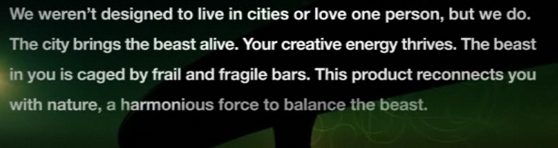
As Jo says,

The overall idea seems to be that men have some kind of innate, primordial aggression (thought I’m not sure how this is supposed to relate to woollen underwear).

Indeed, socialization “cages” men’s true nature, but just barely–its hold is “frail and fragile” and, I presume, could burst forth if you aren’t really careful. I don’t quite follow how the city “brings the beast alive,” or how reconnecting with nature “balances” the beast; since the beast is supposedly men’s real nature, I think reconnecting them with nature would bring out the beast, but whatever. I’m clearly applying too stringent a level of logic. Also, for the record, if all it takes to reconnect with nature is a natural material (made from a domesticated source), then cotton, angora, and mohair would work just as well.


The women’s line is called Nature. When you go to its site there’s also an intro, but without any useful summary of what women are like to compare to the Beast.

Again from Jo:

The female models are slim, delicate, and tend to pose in a way that suggests passivity (static poses, arms held behind body…) and instability (balancing on her toes).  The images in the female range focus more on being attractive, while the men’s range is about being active and aggressive.

The marketing campaign also reinforces the difference in the way we talk about men and women and their association with nature. When we connect men to nature, it’s in an aggressive, predatory sense (the beast). When women are associated with nature, it’s often in a way that implies harmony, an appreciation for the natural world, perhaps some intuitive sense that women have (or, you know, their connection to the moon and stuff because of menstrual cycles). The background is part of this; the grey background of the men’s line doesn’t look nearly as peaceful as the serene white background for the female models.

Thanks, Jo!

FYI:  Jo sent an email to the company complaining and this was their response:

Hi Josephine,

Apologies for the delayed reply. I am writing on behalf of Jeremy Moon to thank you for taking the time to give us your views about Icebreaker’s marketing of its underwear lines for men (Beast) and women (Nature). We understand your concerns, and we really appreciate the level of thought you have put into sharing them with us.

Gender representations are a sensitive issue in marketing, and Icebreaker certainly had no intention of promoting negative or damaging images of men or women in our Winter 08 campaign.

In most of our collections, our marketing approaches to men and women are almost identical. We aim to make Icebreaker garments as stylish as possible, but our clothes are based on performance above all – regardless of the gender of the wearer.

In our Bodyfit, Icebreaker_GT and Superfine collections, for example, women are photographed in exactly the same way as men – pushing their physical boundaries in the outdoors. Our marketing for the garments in these core collections centre on photographs of athletic-looking women skiing, hiking and climbing mountains. None of the images are of women in a passive or decorative role: they’re of women who are confident, independent, adventurous and strong.

We chose a different approach for our underwear ranges. For obvious reasons, we couldn’t adopt our usual approach of showing women taking part in outdoor sports – clearly they wouldn’t play sport in their underwear alone. The other factor we took into consideration is that Nature and Beast, although both underwear collections, are very different ranges.

Men tend to buy underwear for its practical benefits. Our aim was to position Beast as a premium range that has the same performance factors (such as breathability, a critical benefit for underwear) as Icebreaker’s outdoor clothing and yet is sufficiently stylish to be worn at work. Our marketing approach refers not to aggression, but to energy – the same energy (or performance benefits) that works equally well in both outdoor and urban environments. You’ll notice our marketing refers to “creative energy” and also the “harmoniousness” of nature.

The Nature range is our most feminine range by far, and much of our marketing focuses on the way it looks – its styles and its nature-inspired designs. Nature is made from the lightest, most luxurious grade of 100% pure merino, as we understand customers’ concerns against wearing traditional wool (rather than merino) against their skin, so our marketing talks about concepts like “100% pure”. While the photography for the rest of our collections is based around the outdoors, Nature images are designed to show off the styling and softness of the garments.

Our campaigns are designed to be edgy, and we’re very sorry if in this instance you feel our approach conveyed the wrong messages. Please be assured this was not our intention. Thank you for writing, and be assured we will bear your concerns in mind when planning future campaigns. I hope this email helps lesson your disappointment with our brand,

Regards
Alice

Gwen Sharp is an associate professor of sociology at Nevada State College. You can follow her on Twitter at @gwensharpnv.

We were shopping for my 6-year-old stepdaughter in Walmart in the Boston metro area this weekend. I took a picture of a display of T-shirts for sale for girls, available in size 6X-14. Clockwise, these 4 say “Peace, love and lipgloss,” “it’s a girls [sic] world! (we just let the boys live in it),” “”Friends are forever / Boys are whatever,” and “My favorite things: 1. My mom, 2. Fridays, 3. Shopping, 4. My best friends, 5. My brother (Just kidding).”

Here’s another one from the same display that says “My dad’s awesome…when he buys me stuff!” Presumably a dad is therefore not awesome when he is trying to raise a happy, healthy kid with techniques that do not include purchasing sparkly pink shirts with pro-capitalism messages.

This archive of cigarette commericals, sent in by Kay W., makes some interesting comparisons of vintage and contemporary cigarette ads.

First, they compare vintage ads that try to sell cigarettes by pointing to the fact that they suppress your appetite with contemporary-ish Virginia Slims ads which seem to suggest so indirectly.

Second, they compare vintage advertisements that argue that some brands are smooth and good for your voice with the contemporary “Find Your Voice” campaign:

Third, this set of ads nicely shows how the association of glamour with cigarette smoking has transcended history:

Breck C. sent us this link to a collection of photographs of Harajuku Girls.  Harajuku is a style for teenagers in a region of Japan (here is the wikipedia entry).  I can’t think of a way to describe them that does them justice, so here are some pictures (found here, here, here and here):

In 2004, Gwen Stefani began touring with four women posing as Japanese Harajuku girls.  Stefani’s Harajuku Girls serve as her entourage and back-up dancers. Here she is with four (Japanese?) women that she hires to be her Harajuku Girls (found here and here):

In the comments, Inky points out that Stefani says this about them in her song, Rich Girl:

I’d get me four Harajuku girls to
Inspire me and they’d come to my rescue
I’d dress them wicked, I’d give them names
Love, Angel, Music, Baby
Hurry up and come and save me

Stefani also has a Harajuku Lovers clothing line and a series of perfumes, one for her, and one for each Harajuku Girl:

I think that Stefani’s use of Asian women as props (they may or may not be Japanese) fetishizes Asian women and reinforces white privilege.  The Harajuku Girls serve as contrast to Stefani’s performance of ideal white femininity.  It makes me think of both this poster on colonial-era travel and this fashion spread.

Yet, Stefani’s been at this for four years and I can’t remember hearing any objections to her Harajuku Girls, even in feminist and anti-racist alternative media.  Further, if her fashion line, perfume, and continued employment of the Harajuku Girls are any indication, people seem to think the whole thing is awesome.  In the meantime, I bet she’s making bank on her clothing line and perfume.  Where’s that money going?

Do you think my reading is fair?

And, if so, why do you think there’s been so little outcry?

For good measure, here she is performing with her “Girls”:

In our comments, SG asks that we include the following clarification:

This article is really misrepresenting a whole fashion scene and I would like to ask that you correct it- It is just perpetuating the idiocy and ignorance surrounding these styles. “Harajuku is a style for teenagers in a region of Japan”. “Harajuku style” Is a term coined by western media because they are too ignorant to actually research the names of these actual styles. Harajuku is not a style. It is a location. The females you have pictured are in Decora (and two in Visual Kei). The only “harajuku style” that exists is the fictional one made up by Gwen Stefani and the western media.

Thanks SG.

See also our post featuring other examples of ads and artists using Asians as props.

Elizabeth recently posted about an ad for Motrin that suggested that you should take pain medicine so as to keep walking in pain-inducing high heels.  The message was, essentially, “Suffer for fashion, ladies!  Motrin will help!”  I wanted to discuss, also, this second ad in their series (found here) and an anonymous commenter egged me on:

[youtube]https://www.youtube.com/watch?v=XO6SlTUBA38[/youtube]

They start off saying that how mothers make decisions about how to carry their infants according to what is in style (“Wearing your baby seems to be in fashion”).  They then point out that what is currently in fashion is painful for mothers.  But, of course, moms are going to do it anyway, because the sacrifice is for the child (“It’s a good kind of pain, it’s for my kid”).  But also about fashion!  And about how in-fashion it is to be a mom!  (“Plus it totally makes me look like an official mom”).

The ad trivializes motherhood (threatening to reduce it to fashion), equating it, in a sense, to the high heels in the other ad.  At the same time, it legitimizes suffering in the service of your child, which reinforces the ideology of intensive mothering that has ramped up the must-haves and must-dos of mothering like never before in human history.

The good news is that Motrin pulled this ad campaign and has apologized after bloggers took them to task.

Lisa Wade, PhD is an Associate Professor at Tulane University. She is the author of American Hookup, a book about college sexual culture; a textbook about gender; and a forthcoming introductory text: Terrible Magnificent Sociology. You can follow her on Twitter and Instagram.

Motrin shows ads on the sides of bus shelters in the Boston metro area. Here’s one, which says, “High heels…when you strut, we feel your pain.”

"When you strut, we feel your pain."

Another ad in the series says, “30-pound stroller…when you lift, we feel your pain.” I can only find these 2 examples so far, and it seems they are both gendered feminine, associated with a shoe style worn almost exclusively by women and with an activity [stroller use = child care] connoted as feminine.

Even though I can’t read the text, I thought this ad was worth putting up.  I think I get the gist of it just fine.

Via Vintage Ads.

Vintage Ads put up another example of an ad, this one from 1931, using the idea of the “savage.”  In this one, her “impossible” behavior is compared to an Electrolux refridgerator.

 NEW!  Vintage Ads offered us another on this theme.  The text reads: “make like a medicine man in Voodoo Shorts.”  Don’t miss the spear.

voodoo_shorts

Prompted by Gwen’s recent post on adoption announcement cards, Carmen from the excellent blog Racialicious sent us this link to a post about onesies for transnationally adopted infants by iBastard.  As iBastard says

…when people go out of their way to say something, there’s usually more to it than the literal message. There’s a metamessage (the message behind the message itself) or subtext of some kind.

These first two onesies (found at Racialicious and here respectively) are from children adopted from Guatemala:

And this one, also found at Racialicious, is for babies adopted from China:

The first and last one associate babies with goods (“special delivery” and “imported”) that can be bought.  Those with superior resources (i.e., Americans?) can buy these goods. 

The middle one de-humanizes Guatamalans.  As Resistance notes: What is a Guatling?  “Is it like an earthling? A foundling? An underling? A gosling? A yearling?” 

All advertise for others that these children are adopted transnationally.  And why might an adoptive parent want to advertise such things?  Without trivializing how much such parents love their children, we do seem to have a phenomenon in which a transnational adoption is considered a humanitarian good that proves you are not racist, into multiculturalism, and a card-carrying liberal good person (the discourse around Angelina Jolie’s adopted children is part of this).

What do you think the meta-messages are here?  iBastard offers a translation over at Racialicious

Oh and, in the spirit of resistance, check out this parody t-shirt made by iBastard:

Also in dressing your kids and meta-messages: leftish t-shirts for kids, “future M.I.L.F.” t-shirts and the like, “God Hates Fags” t-shirts, sexist t-shirts for kids, trucker girl booties, and more.

Other posts on advertising your politics on your metaphorical sleeve: “I’m Saving The Planet – What Are You Doing?”, “Tough Guys Wear Pink”, “Real Girls Eat Meat”, “True Love Waits”, “I Love My Big Tatas”, and “Use Your Period For Good”.