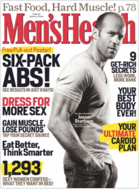
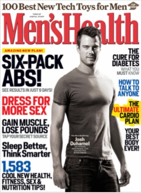
Sabriel let us know about a story at Gawker about the repeated use of nearly identical covers for Men’s Health. For instance, here are the “Six-Pack Abs!” covers from December 2006, April 2007, March 2006, and April 2008 (it was used a couple of other times, too):
They used the “Lose Your Gut!” template repeatedly, including in May 2009, October 2008, and March 2005, among others:
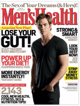
The editor responded by saying that the reused covers are only on the newsstand editions; subscribers get different versions, though even then, there’s quite a bit of repeating.

But regardless, I’m not interested in the fact that a magazine was recycling covers per se. I was struck by two things. First, the repeated covers make clear how much men’s midsections have become objects of scrutiny, the area to work on and obsess about, and by which your physique is judged. From Gawker:

Since 2007, Men’s Health has led with “Flat-Belly Foods,” “Get Back Into Shape,” and “Lose Your Gut” at least twice a year, and a “Six-Pack Abs” at least once a year since 2005.

Second, the degree to which cover lines can be reused, and content is interchangeable, underscores the degree to which these types of magazines — whether aimed at men or women — are selling us the same story, month after month. That story is: you aren’t good enough, your body isn’t good enough, but we have the secret to fixing it (lose weight, gain muscle), getting great sex (or, in the case of women, pleasing your guy), and improving your life in other ways (men = make more money, women = deal with a difficult coworker). The magazines are selling you slightly modified versions of that story because that story is what advertisers want you to get.

This might be a particularly literal repackaging of that theme, but other fashion/health/exercise/gossip magazines are doing the same thing in a somewhat more subtle form.

Oh my. Inés V. just let us know about a contest on WTVN, a conservative talk radio station in Ohio (reader Scapino clarifies that the conservative tone is mostly due to syndication of Glenn Beck and Rush Limbaugh, not really the local DJs). Just…see for yourself:

Inés says,

This campaign is a response to Columbus mayor Michael Coleman who boycotted AZ by banning all city-funded travel after SB1070, and the mayor is depicted as a holder of a green card [that’s him shown on the ID card].

It’s an astounding example of dehumanizing undocumented immigrants — being a proud American is linked to “illegals” (a term that somehow seems more stigmatizing than terms like “illegal immigrants” or “illegal aliens,” even — a linguistic erasure of personhood altogether) being scared, presumably of all the proud Americans they encounter, and the lucky winner gets to go “spend a weekend chasing aliens”. It’s like you’re getting to go on a safari.

Groups in Columbus have organized a response and will be delivering letters to the station this afternoon, before the contest ends, in protest.

I’d add more commentary, but what can you really say?

This being the opening weekend for Sex and the City 2, it seems like a perfect time for this video of sociologist Tracy Scott, from Emory University, discussing the cultural impact and contradictions of the SATC franchise. Enjoy!

Thanks to Nicole J. for sending it in!

At BoingBoing, German professor Michael Shaughnessy offered his insights regarding how Americans and Germans see and talk about color differently.  Among other things, he noted how few foods in the U.S. are described as blue.  Blueberries, of course.  And blue cheese, I suppose.  (Or “bleu” cheese, as TheophileEscargot points out.)  But little or nothing else.

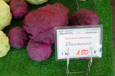
In contrast, Shaughnessy suggested that many more foods are described as blue in southern Germany.  Notably, blue onions, blue grapes, and blue cabbage (pictured):

In northern Germany, however, “Blaukraut” is “Rotkohl.”  That is, the same color (“blau”) is described as red “(“rot”).  He ponders whether “red onions [in the U.S.] are truly red.” In fact, their better described as purple.

He continues, “Words, impacted by the visual, often vary at the crossroads between colors.”  In other words, perception may be influenced by language and culture.  Where does blue end and red begin?

UPDATE: In the comments Alissa notes:

German wikipedia tells me that the south/north naming difference results from the difference in prepararation of the food. in northern germany it is usually prepared with acidic substances like vinegar giving it a more reddisch color, thus “Rotkraut” (very good with apples), in southern germany sugar or natron is the ingredient of choice, which enhances the blue of the original purple color, hence “Blaukraut”.

Interesting!

Lisa Wade, PhD is an Associate Professor at Tulane University. She is the author of American Hookup, a book about college sexual culture; a textbook about gender; and a forthcoming introductory text: Terrible Magnificent Sociology. You can follow her on Twitter and Instagram.

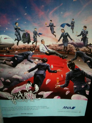
Lukas B.sent in an advertisement from the February 2010 Hemisphere magazine (the in-flight United Airlines mag). The ad is for ANA airlines’ flights to Japan. The target of the ad appears to be business travelers, represented by a White man. And how to show what a great job the airline will do of taking care of you? Surround said male business traveler with ten Japanese women, there to serve and pamper him:

The ad seems to rely to some degree on the stereotype of the submissive Asian woman, or more specifically, the geisha — a Japanese woman trained in the art of serving and pleasing men. There are many ways ANA could advertise, and even lots of ways they could represent good service.The fact that this ad deals with flights to Japan makes a particular racialized idea of service and comfort useful to the company.

At the same time, I’m fascinated by the fact that there are presumably potential customers to whom the idea of being waited on hand and foot while flying would be a major selling point (as opposed to, say, more comfortable seats or tastier food or something).

And, as Lukas points out, they also make sure to throw in the obligatory blossoms that are required in advertising/images related to China or Japan.

Gwen Sharp is an associate professor of sociology at Nevada State College. You can follow her on Twitter at @gwensharpnv.

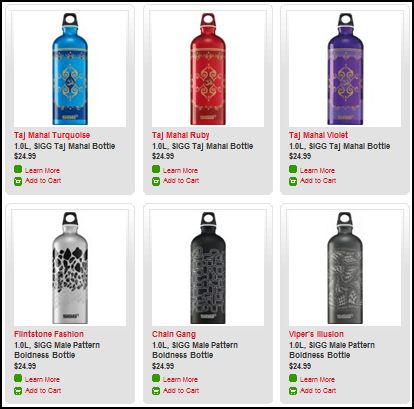
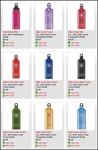
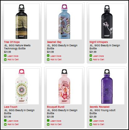
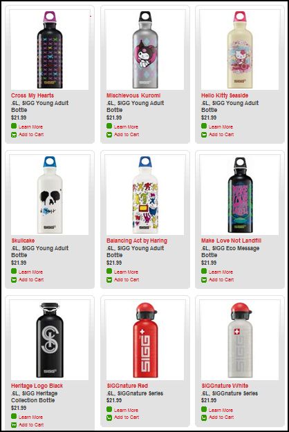
Stella P. sent in a link to the SIGG water bottle website, pointing to the fact that there are “women’s” and “men’s” collections. What’s interesting about the two collections isn’t just the reproduction of the gender binary and the gendering of water bottles, but the fact that the outcome of this bifurcation is actually less choice for men. There are 77 total water bottles in the women’s collection, but only 58 in the men’s. If you scroll through the options, you’ll see that women basically get to choose among ALL of the bottles, but men are not presented with any that (apparently) appear TOO feminine. This is a great example, then, of the way that patriarchy constrains men by pushing them away from items deemed girly.

Here are some screen shots of the men’s and women’s collections.

Men’s:

Women’s:

Lisa Wade, PhD is an Associate Professor at Tulane University. She is the author of American Hookup, a book about college sexual culture; a textbook about gender; and a forthcoming introductory text: Terrible Magnificent Sociology. You can follow her on Twitter and Instagram.

K. sent in a trailer for a new comedy called Outsourced.  In it, a white call center manager is sent to India to  manage a company full of Indian workers who take orders for gag items (including jingle jugs).  I think the it is both troubling and promising at the same time.  My thoughts after the trailer:

On the one hand, a lot of prior experience and several aspects of this trailer make me worry that this show is going to capitalize on negative stereotypes of Indians, especially ones that suggest that they are goofy and nerdy and are hilariously unfamiliar (e.g., “stupid” names and “scary” food)… with a handful of stereotypes about Americans thrown in for good measure.  The show threatens to reaffirm a binary where the U.S. and India are completely different in every way.

On the other hand, I am encouraged by the fact that the show includes a wide range of Indian characters.  In some cases, our stereotypes are upset by traits that Americans are conditioned not to expect in Indians (such as the guy who likes to dance); in other cases, characteristics are clearly attributed to individuals instead of “Indians” (such as the girl who is afraid to talk).  Further, it becomes clear in the trailer that the employees in the manager’s office are misfits because they’re misfits, not because they’re Indian.  The competitor call center employees are not misfits at all.  They are clearly super-effective and excellently-trained (though, perhaps, also Westernized).  The ridiculousness of the main ensemble cast, then, isn’t attributed to their Indianness per se.

So, yes, I fear that this is going to be a show that makes (white) Americans laugh by suggesting that Indians are dorky and weird.  At the same time, I see promise in a show that actually casts Indians as individuals instead of representatives of their nation/race.

Lisa Wade, PhD is an Associate Professor at Tulane University. She is the author of American Hookup, a book about college sexual culture; a textbook about gender; and a forthcoming introductory text: Terrible Magnificent Sociology. You can follow her on Twitter and Instagram.

Dan S. alerted us to an image, purportedly of an article from the May 13, 1955, episode of Housekeeping Monthly. In it there is a photo of a woman bending over an oven with a list of tips for being a good wife, such as “a good wife always knows her place.” We’ve gotten this image before and never posted on it, much like the list on “How to Be a Good Wife,” attributed around the web to a “1950s home economics textbook.”

So why haven’t we posted the image before? Because it’s a fake. According to Snopes, the list was circulating widely on its own long before it suddenly appeared with the damning image…which is a completely unrelated image from a cover of John Bull magazine (not Housekeeping Monthly) that appeared in 1957, not 1955. Notice the text along the upper right corner of the image–it says “Advertising Archives.” According to Snopes, no one has ever turned up the economics textbook the “How to Be a Good Wife” list supposedly comes from, either.

So what gives? Why do these hoax 1950s-era images/lists keep appearing? I think Snopes makes an interesting case:

It has become fashionable to portray outdated societal behaviors and attitudes — ones we now consider desperately wrongheaded — to be worse than they really were as a way of making a point about how much we’ve improved. When we despair over the human condition and feel the need for a little pat on the back, a few startling comparisons between us modern enlightened folks and those terrible neanderthals of yesteryear give us that. We go away from such readings a bit proud of how we’ve pulled ourselves up by our bootstraps and with our halos a bit more brightly burnished.

The juxtaposition of wonderful modernity with a tawdry past also serves to reinforce the ‘rightness’ of current societal stances by  making any other positions appear ludicrous. It reminds folks of the importance of holding on to these newer ways of thinking and to caution them against falling back into older patterns which may be more comfortable but less socially desirable. Such reinforcement works on the principle that if you won’t do a good thing just for its own sake, you’ll surely do it to avoid being laughed at and looked down upon by your peers.

A typical vessel for this sort of comparison is the fabricated or misrepresented bit of text from the “olden days,” some document that purportedly demonstrates how our ancestors endured difficult lives amidst people who once held truly despicable beliefs.

Of course, as the Snopes article goes on to discuss, all kinds of very sexist stuff existed in the ’50s, and there were home-ec textbooks, magazines, etc., that included suggestions along the lines of those listed above.

Given that, it’s not shocking that when we see images of this sort, they immediately seem authentic, and get re-posted around the web despite the sketchy aspects of their origin stories. It’s not like we’ve never posted anything on Soc Images that we later figured out was a hoax (we also get things that we hope, desperately, are hoaxes but turn out to be real).

So there’s a truth behind the general gist of these types of lists, but many of the images themselves are fakes, created to make fun of our hopelessly, and hilariously, sexist past. And given how many real examples of sexist propaganda you could find from the 1950s, it’s worth pondering we find so many fake ones, and how, for some people, they may function to delegitimate concerns about gender inequality or sexism today, because come on, ladies — look how much better we have it than our grandmas did!

Gwen Sharp is an associate professor of sociology at Nevada State College. You can follow her on Twitter at @gwensharpnv.