In an interesting example of cultural borrowing/appropriation sent in by Catherine H., the Korean all-girl pop band T-ara imitates stereotypes of American Indians in their music video for their (strangely catchy) song, YaYaYa.

It’s difficult (for me) to know how these stereotypes of native North Americans “work” in Korea. It appears to mean something to Koreans, otherwise why use the imagery and narratives, but what? And how should Americans who oppose the stereotyping (and erasing of modern) Native Americans talk about this “borrowing”?

To get some perspective, I turned to James Turnbull.  Turnbull is behind the blog, The Grand Narrative, where he writes about Korean Sociology through the prism of pop culture.  This is what he had to say:

First, please note that T-Ara’s Yayaya is actually just one of several recent Korean music videos that have used Native-American imagery, and by no means the most offensive at that. For a list, see here, which points out that Indian Boy by MC Mong is much more problematic.

Second, so many Korean groups are being formed these days – over 30 new girl-groups in 2011 alone – that their management companies (most well-known Korean groups are completely “manufactured”) are in a constant battle to gain media attention for them. One way to do so is to regularly come up with new “concepts” for the group, of which a “cute” one incorporating Native-American imagery is just one possibility of many.

But thirdly and most importantly, it is no exaggeration to say that Korea is one of the least politically-correct societies out there, particularly in the ways in which non-Koreans are represented in popular-culture.

Often, this is completely innocent, most Koreans being ignorant of the connotations of Blackface for instance, or the passions Nazi imagery arouses in Western countries, to the extent that both are regularly found in popular culture and advertising. Indeed, I was especially struck once by reading of university students performing in Blackface at a festival because they thought Black audiences would like it, and would appreciate the interest in “their culture”. As the person who saw this wrote, this was not “offensive” per se, but it was certainly shocking.

Alternatively however, the ignorance can be willing. For example, last year the the Korean Overseas Information Service (KOIS) part of the Ministry of Culture, Sports and Tourism, produced an expensive “Visit Korea” ad which played on the likes of CNN and BBC World and so on, but which relied so heavily on patronizing stereotypes of non-Koreans that it would likely have put off more potential tourists than attracted them. Non-Koreans in the KOIS were consulted in the making however, and did warn the producers of this, but unfortunately their advice was rejected, either because a) Korean advertisers are notorious for producing things that would appeal primarily to Koreans, despite the actual target audience, and/or b) it didn’t jibe with the advertisers’ perceptions of non-Koreans and their wants or needs. (Both are persistent problems with Korean tourism advertisements.)

Finally, for the source of those perceptions, consider Korea’s extremely exclusionary “bloodline”-based nationalism andextremely homogenous population (less than 3% of Korea’s population are “foreign residents”, a third of which are ethnic Koreans from China). Consequently, Korean society is really only just beginning to grapple with the concept of multiculturalism, albeit with much urgency because of the sudden huge influx of brides from Southeast Asia in the last decade or so, with the populations of many rural communities close to becoming a third or even half non-ethnic Korean. Certainly, a great deal of progress has been made in integrating them and acknowledging what their cultures have to offer, but when Korean school textbooks extolled the virtues of being an ethnically homogenous society until as recently as 2006 (and see here for how Blacks and native-Americans were portrayed in school picture dictionaries at that time), then I’m sure you can appreciate that much still remains to be done to prevent prejudice against them, especially in how non-Koreans and cultures are portrayed in the media.

Which to be fair, nobody outside of Korea was at all concerned with until K-pop became popular!

Thank you, James!

We’re happy to hear your thoughts in the comment threads. The video:

Lisa Wade, PhD is an Associate Professor at Tulane University. She is the author of American Hookup, a book about college sexual culture; a textbook about gender; and a forthcoming introductory text: Terrible Magnificent Sociology. You can follow her on Twitter and Instagram.

Duane Reade (a drugstore chain) is welcoming weary New York City travelers on their subway ride with an advertisement playing into one of the most tired stereotypes – the emotional female eater. Take a look:

Don’t worry, the picture proclaims – by the fourth spoonful of our ice cream, you’ll begin to forget him! The gendered notions of this ad are clear, as it makes sure to emphasize that these issues of emotional eating are befalling women. ‘Him,’ we are supposed to assume, is the man who left/dumped/broke the heart of ‘you,’ the woman. And ‘you’ are coping with this tragedy, of course, by eating copious amounts of delicious ice cream – that’s how women deal with stress and disappointment, right?

Nothing here mentions taste or ingredients. This is an ad for a sugary stand-in to negate whatever distress a woman may be feeling, drawing on the idea that women use high-fat and/or sugary foods to fill an emotional void.

Emotional eating is a learned behavior. Like all learned behaviors, it is reinforced with supportive messages that can be both direct and subliminal. This ad isn’t trying anything new – media critics, most notably Jean Kilbourne, have for years been pointing out the tactic of equating a food item to an object of affection or even love, one that can stand in for a partner that a woman sees as falling short or who has deserted her. Movies and TV shows so often portray  women nursing broken hearts being offered a pint of ice cream or other food by their friends (see: the entire Bridget Jones franchise) that The Big Bang Theory mocked the trope.

The association in the Duane Reade ad implies that a woman’s desire for intimacy isn’t something dynamic and fulfilling, based on a real connection with a human being, but rather a desire that can be filled with anything that won’t desert her, or that can be easily replenished, drawing on larger cultural message and stereotype of men being unable to emotionally connect and of women being too needy.

—————

Larkin Callaghan is a doctoral student at Columbia University studying health behavior and education, with a focus on female adolescent health. She is currently working on her dissertation which explores the relationship between sub-clinical disordered eating behaviors and high-risk sex behavior, substance use, violence, and suicide. You can follow her on Twitter, Tumblr, and at her blog.

If you would like to write a post for Sociological Images, please see our Guidelines for Guest Bloggers.

Bo  Novak snapped this photograph of a Bosch ad in a storefront in Bath, U.K.  “125 years of evolution,” but apparently men still haven’t figured out how to use the washing machine.

See also Laundry: Women Have Always Done It.  At our Pinterest page, you can browse all of our examples of gendered housework and childcare.

Lisa Wade, PhD is an Associate Professor at Tulane University. She is the author of American Hookup, a book about college sexual culture; a textbook about gender; and a forthcoming introductory text: Terrible Magnificent Sociology. You can follow her on Twitter and Instagram.

The Federal Reserve Bank recently released 1,197 pages of transcripts of its 2006 closed door meetings.  As the Wall Street Journal comments: “The transcripts paint the most detailed picture yet of how top officials at the central bank didn’t anticipate the storm about to hit the U.S. economy and the global financial system.”  

Federal Reserve officials suspected that housing prices were peaking (see chart below).  But since they didn’t believe that prices had been driven up by a well entrenched bubble, they were not very concerned that they were coming down. 

p1-be338_fed_ns_20120112181819.jpg 

The Financial Times described the general Federal Reserve stance as follows:

Almost every Fed policymaker concluded that weaker housing would cause a slowdown in consumption and investment but expected that to offset strength elsewhere in the economy, leading to continued growth overall.

“Housing is the crucial issue. To get a soft landing, we need some cooling in housing,” said Ben Bernanke, Fed chairman, in his summing up of the economic situation in March 2006. “I think we are unlikely to see growth being derailed by the housing market.”

Indeed, a number of Fed officials saw the housing slowdown as welcome news that would help resolve a potential threat to the economy. “As to housing, we are in fact, as all have noted, squeezing out of that sector the speculative excesses that developed with the low interest rates of recent years — and doing so is unavoidable if we want to correct the sector,” said Thomas Hoenig, then president of the Kansas City Fed, at the September 2006 meeting of the FOMC. 

The transcripts show that the Federal Reserve was so confident that the economy was on solid footing that many officials were, according to the Wall Street Journal:   

…offering praise for outgoing Fed Chairman Alan Greenspan, who attended his final Fed meeting in January 2006. Timothy Geithner, then president of the Federal Reserve Bank of New York and now Treasury Secretary, playfully offered this forecast about Mr. Greenspan’s legacy: “I think the risk that we decide in the future that you’re even better than we think is higher than the alternative.”

The transcripts also suggest that Fed officials misgauged the potential for housing problems to spill over into the broader economy.

“Our recent financial-market data don’t, in my view, provide a convincing case for a substantial increase in the probability of a much weaker path for growth going forward,” Mr. Geithner said at a meeting in December 2006.  

So how did the best and the brightest get it so wrong?

Perhaps the major reason is because it served their interests to pretend there was no housing bubble.  The recovery from our 2001 recession was driven by consumption and that consumption was supported directly and indirectly by the housing bubble.  In other words stopping the bubble would have revealed the weakness in our economy and the need for serious structural change.  It was far easier and more lucrative for those at the top to just let the bubble go on expanding and pretend that it didn’t exist.

The following chart from the New York Times puts the movement in housing prices highlighted above into a longer term perspective, revealing just how strong speculative pressures were in the housing market.

shiller-housing-bubble-graph.jpg

As Dean Baker, one of the very few economists to warn about the dangers of the bubble, explains 

First, what happened is very straightforward: we had a huge run-up in house prices that had no basis in the fundamentals of the housing market. After 100 years in which nationwide house prices just kept even with the overall rate of inflation, house prices began to sharply outpace inflation, beginning in the late 1990s.

By 2002, when some of us first noticed the bubble, house prices had already risen by more than 30 per cent in excess of inflation. By the peak of the bubble in 2006, the increase in house prices was more than 70 per cent above the rate of inflation.

This was a huge problem because this bubble was driving the economy. It drove the economy directly by creating a boom in residential housing construction. We were building housing at a near record pace in the years 2002-2006. This was in spite of the fact that we had an ageing population and record levels of vacancies at the start of that period.

The other way in which the bubble was driving the economy was through its effect on consumption. The bubble created more than US $8tn [trillion] in ephemeral wealth in housing. Homeowners thought this wealth was real and spent accordingly. The result was a massive consumption boom that sent the saving rate down to zero in the years from 2004-2006.

In reality, a lot of the consumer spending driving growth was financed by home refinancing, which helped many housholds compensate for stagnant wages and weak job creation at the cost of a sharp rise in debt.  As a Wall Street Journal blog post pointed out, “From 2000 to 2007, household debt doubled from $7 trillion to $14 trillion, with debt related to housing responsible for 80% of the increase. By 2007, the household debt to GDP ratio reached its highest level since 1929.”

As we now know only too well, the collapse of the housing bubble reverberated through the economy, including the financial sector, triggering the Great Recession.  Tragically, many of the “best and brightest” remain in leadership positions today, still arguing for the soundness of economic fundamentals. 

I’ve posted in the past about differences I’ve noticed in the language used in signs in the girls’ and boys’ clothing sections at Target, which seemed to reinforce the idea that boys are rough and rowdy while girls are sweet. Eric B. sent in another example that he recently saw in Target’s infants’ department. The store he went to had five aisles; each aisle had a set of large signs along the top. Three of the five were focused on boys, and they all emphasize activities:

So boys actively do things (they play, they learn to feed themselves, they discover) that merit adult attention and admiration. What about girls?

Oh, they sleep:

For other examples of how we reinforce the boys are active/girls are passive binary, see our posts on the binary in Lego City, in kids’ meal toys, and in magazines.

Another example, forwarded by Aaron P., of the trivialization of holidays meant to celebrate the triumphs of the marginalized:

Lisa Wade, PhD is an Associate Professor at Tulane University. She is the author of American Hookup, a book about college sexual culture; a textbook about gender; and a forthcoming introductory text: Terrible Magnificent Sociology. You can follow her on Twitter and Instagram.

The NYT posted an interesting interactive graphic showing the occupations of the wealthiest 1% of U.S. households, broken down further by industry. You can hover over a rectangle to see how many people in a particular type of job in each industry are in the top 1%, as well as what percent of people in that job/industry are in the top 1%. For instance, 27.2% of physicians in offices or clinics (not hospitals) are in the top 1%:

The relative size of the rectangle tells you how many people in that category are in the top 1% (so overall, the single largest occupational group of the top 1% is management), while the color indicates the % of people in each occupation/industry who are in the top 1% (lightest = less than 1%, darkest = over 20%). Definitely worth going over to the NYT post and playing around for a little while.


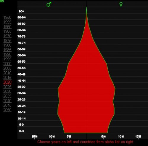
If you’re looking for basic global demographic information, World Health Rankings provides a great overview, using World Health Organization, World Bank, UNESCO, and other data. The website allows you to select a country, then provides a detailed breakdown of many demographic details, such as population pyramids (you can select different years in the past, or look at predictions for the future), leading causes of death, etc. Here’s the 2010 population pyramid for the U.S.:

You can also easily access all the age pyramids here. The 2020 projections for Brazil show the changing demographics due to the dramatic decrease in the fertility rate, which Lisa posted about this weekend:

There’s an interactive map of the top 15 causes of death in the U.S., allowing you to look at variations by county. Here’s the map of deaths due to heart disease, with Clark County, Nevada, highlighted:

You can also look at life expectancy for different nations for every decade between 1960 and 20101, a “real-time” clock that tracks global deaths (you can look at how many have died in the last year or month, or you can click “now” and reset the clock and watch as the clock estimate how many people die of various causes of death worldwide), and maps showing the prevalence of various causes of death around the world. Lots of neat representations of rather depressing information.

Also, as I wrote this post I realized that now every time I see a population pyramid of the U.S., Community‘s song “Baby Boomer Santa” is going to play through my head.