In an earlier post we reviewed research by epidemiologists Richard Wilkinson and Kate Pickett showing that income inequality contributes to a whole host of negative outcomes, including higher rates of mental illness, drug use, obesity, infant death, imprisonment, and interpersonal trust.

In the six-minute video below, Kate Pickett talks about how more equal societies are kinder to each other, give more in foreign aid, are less status-conscious, consume less, and even recycle more.  Based on this, she argues that reducing inequality within societies is a good strategy towards addressing climate change.

How to increase equality? It turns out there are lots of options.

See Dr. Pickett making similar arguments as to why raising the average national income in developed countries doesn’t make people happier or enable them to live longerwhy unequal societies are more violent, and how status inequality increases stress.

And see more about income inequality and national well-being at Equality Trust.

Lisa Wade, PhD is an Associate Professor at Tulane University. She is the author of American Hookup, a book about college sexual culture; a textbook about gender; and a forthcoming introductory text: Terrible Magnificent Sociology. You can follow her on Twitter and Instagram.

This morning NPR had a segment on the history of the U.S. income tax. A federal income tax was first introduced during the Civil War to make up for lost tariffs due to blocked ports and sunk ships. However, in 1895 the Supreme Court declared the income tax unconstitutional. In 1913, the states ratified the Sixteenth Amendment to the Constitution:

The Congress shall have power to lay and collect taxes on incomes, from whatever source derived, without apportionment among the several States, and without regard to any census or enumeration.

For a couple of decades, only the wealthy paid income tax. However, war — in this case, World War II — once again increased the need for taxes. The government had to convince a larger portion of the population to pay income tax. The Treasuring Department and Disney produced “The New Spirit,” a short film featuring Donald Duck. The film presented paying taxes as patriotic and essential to the war effort, and helped normalize the income tax for all workers:

For another example of World War II-era Disney propaganda in support of particular government policies, see our earlier post on Victory through Air Power, which justified bombing civilian targets.

Gwen Sharp is an associate professor of sociology at Nevada State College. You can follow her on Twitter at @gwensharpnv.

Time‘s cover story this week is adapted from The Richer Sex, a forthcoming book by Liza Mundy. I provided a few numbers for the story (see below). The content is behind a pay wall here, but the cover gives a taste:
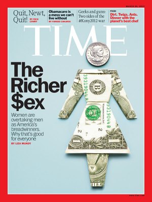
My only beef with the story is that it misidentifies the richer sex, which I’ll return to below. Otherwise, it’s an interesting piece on the (very partial) convergence in roles among married couples. Despite the current stall in progress toward equality, I’m glad to see an article with a positive take on the idea of equality (for middle class straight couples, at least) without focusing on the demise of men.

They only used two of the numbers I sent, so consider the other 9 numbers here a Family Inequality blog exclusive!

First, I showed them the trend in the gender composition of managers from 1980 to 2010. I used the 1990 occupational categories for this (from IPUMS), in the vain hope of maintaining consistency over time*:
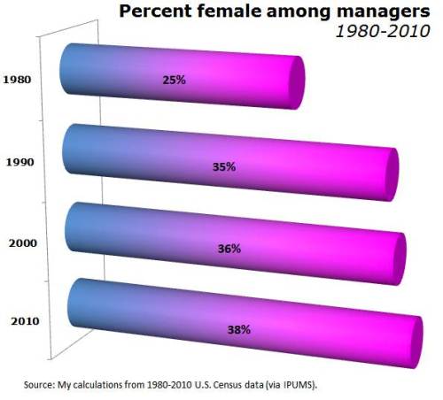
My emphasis was on the stall in progress since 1990, so I ended up in the “on the other hand” paragraph of the story.

The other piece of “other hand” I pitched to them was the segregation among managers — with women concentrated in some corners of the managerial world — which I mentioned here, and which Matt Huffman and I studied here. For 2010, that segregation, in broad strokes, looks like this:
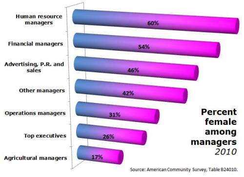
This didn’t make it into the story. There was to be only one “on the other hand” paragraph. It’s all about how women are pulling ahead of men and becoming the primary breadwinners, and what that means for gender and relationships.

Of course, women are not yet the richer sex, so the evidence in the article is about trends in that direction. The text says, for example:

Assuming present trends continue, by the next generation, more families will be supported by women than by men.

By the time the graphics department got to it, the “assuming…” part was gone, and this was the header:

The numbers that support this are the trend from 24% of wives out-earning their husbands in 1987 to 38% in 2009 (helped considerably by the mancession’s crimp on men’s jobs in 2008 and 2009). Here’s their graph:

Going from 24% to 38% in 22 years doesn’t mean we’ll pass 50% in another generation. It might be OK for rhetorical purposes to say something like, “at this rate it’ll take 300 years for the U.S. to catch Sweden’s welfare state” — but not OK to say it will happen in that time. If that were true, I could show you this graph and say, “the Earth will be a ball of human flesh expanding at the speed of light in less than 1,000 years!”

Besides projecting from the trend, the other reasonable way to make guesses about the future is to look at young people. For that Liza Mundy reuses a statistic that Time first used in 2010, showing that among those who are single, child free, under 30 and living in metro areas, women have higher earnings than men.
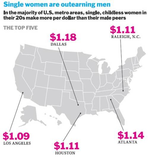
Great, you’re thinking, stay young and single, and don’t have children, and equality is yours!

I do believe our children are the future, but predicting the future from this subset is not a safe bet. The original Time piece is critiqued here and here, although the New York Times hit on this formula for gender equality in 2007 (critiqued here). The basic manipulation here is limiting the comparison to men versus women within a group where women are more likely to have completed college but not yet experienced the wage-diminishing events that now largely begin in the late 20s (marriage, children, and slower earnings growth). It’s an interesting comparison, but shouldn’t be used for projecting the future — or even characterizing the whole present.

Anyway, interesting story.

*There can be no perfectly matching set of occupational categories over long periods of time, because the type of work being done has changed. For example, there were no computer programmers or “customer service representatives” to speak of in 1980, and there are millions now.

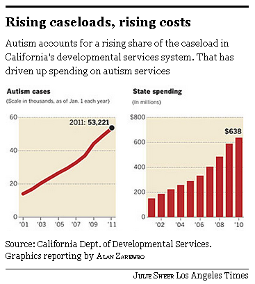
Autism appears to be on the rise. The U.S. Centers for Disease Control and Prevention reports that there are 20 times more cases of autism today than there were in the 1980s.  This figure, from the Los Angeles Times, shows a 200% increase in California:

The rise in cases of autism led scientists to ask whether there was an actual increase in incidence or if we were just getting better at identifying it.  The evidence seems to suggest that it’s (at least mostly) the latter.  Said anthropologist Roy Richard Grinker: “Once we are primed to see something, we see it and wonder how we could have never seen it before.”

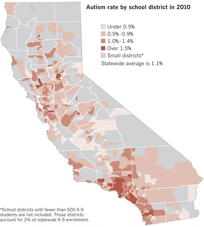
But how to explain disparities like this?

Often regional differences in health and mental health can be traced to heavier environmental toxin loads.   In most of those cases, though, clusters of illness occur in poor and often disproportionately non-white neighborhoods.  Autism clusters were happening in class-privileged places.

Sociologist Peter Bearman discovered that these clusters were the result of conversation.  Class-privileged parents had the resources to get their child diagnosed, then they talked to other parents.  Some of these parents would recognize the symptoms and take their child to the doctor and… voila… a cluster.  “Living within 250 meters [of a child diagnosed with autism], reports the Los Angeles Times, boosted the chances by 42%, compared to living between 500 and 1,000 meters away.”

Lisa Wade, PhD is an Associate Professor at Tulane University. She is the author of American Hookup, a book about college sexual culture; a textbook about gender; and a forthcoming introductory text: Terrible Magnificent Sociology. You can follow her on Twitter and Instagram.

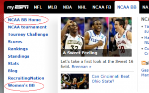
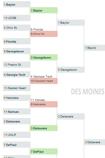
Over at Bloomer Girls Blog, a site devoted to sports and gender, Lydia posted about ESPN’s online resources for the NCAA March Madness basketball tournaments. The layout of the site, and the format of the brackets, makes the women’s basketball tournament relatively invisible.

As we often see in sports, the men’s version is taken as the default. The apparently neutral “NCAA BB Home” link goes to the men’s tournament, specifically. To get information on the women’s tournament, you have to choose the “Women’s BB link” lower on the page:

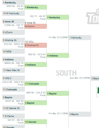
Lydia also found differences in the features available on the brackets you can fill out. The men’s bracket provides a range of features that encourage ongoing participation. While a game is occurring, the bracket is updated with the current score and how much time is left in the game, cluing potential viewers in to particularly close (and exciting) games. After a game, the final score is posted; you can also see the scheduled time of upcoming games:

None of these features that add to the value of the bracket were integrated into the women’s brackets — no updates of the scores of games that are in progress (so no chance of drawing in viewers to a particularly exciting or intense game), no schedule to tell you when the next game is, not even the final scores of past games:

Lydia argues that by making the men’s tournament resources more engaging and informative, it reinforces the sense that the women’s tournament is a side event, not worth the same level of attention as the men’s. As she points out, ESPN probably devoted less time and energy to the women’s tournament website because they assume fewer people will sign up and use it. But by creating less engaging resources, they provide less incentive for fans to bother signing up, creating a self-fulfilling prophecy.

How does a scientist measure your unconscious mind?  It turns out, it can be done.  With a technique called the Implicit Association Test, psychologists can measure your unconscious beliefs about anything: whether, deep down, you associate Black men with weapons, Asians with foreigners, fat people with laziness, men with science, and more.  You can test yourself on all manner of implicit beliefs here.

It works by putting a pair of words on each side of a computer screen. Sometimes the pair matches your unconscious mind; like (for most of us, unfortunately) young and good.  Sometimes the pair challenges your unconscious mind; like (for most of us, unfortunately) old and good.  You’re asked to do a timed test focusing on just one of the pair; we’re all quicker when the terms match than when they don’t.  For more, read up about it here.

In any case, it turns out the phenomenon has a name — the Stroop effect — and the best illustration of it I’ve ever seen was featured on BoingBoing.  It involves colors and color names. For a lifetime, we’ve been taught to associate certain colors with certain names. Accordingly, our brain fires faster and more confidently when we see the name in the color, compared to when we see the name in an opposing color.  See for yourself: can you read both lists of colors equally comfortably, un-self-consciously, and quickly?Probably not.  So, for better or worse, scientists see this same effect when they try to get our brains to process paired words like Asian/American and men/science.  The results of these experiments are depressing (both abstractly and often personally when we take the tests ourselves), but it’s pretty amazing that we’re able to delve that deeply into the mind with such a simple task.

Lisa Wade, PhD is an Associate Professor at Tulane University. She is the author of American Hookup, a book about college sexual culture; a textbook about gender; and a forthcoming introductory text: Terrible Magnificent Sociology. You can follow her on Twitter and Instagram.

A couple of years ago I posted a segment from the PBS series Faces of America focusing on the legal efforts by Syrian immigrants in the late 1800s and early 1900s to be officially recognized as White (and thus eligible for naturalized citizenship). It nicely illustrates the social construction of race and ethnicity, and the way  power struggles are embedded in the categories we recognize and who is assigned to each one.

In Not Quite White: Arabs, Slavs, and the Contours of Contested Whiteness, directors Jamil Khoury and Stephen Combs integrated scenes from Khoury’s play WASP: White Arab Slovak Pole and interviews with scholars from the Arab American and Polish American communities to “reflect upon contested and probationary categories of whiteness and the use of anti-Black racism as a ‘whitening’ dye.”

Thanks to Katrin for the link!

Flickr Creative Commons, Lau

Stephanie Medley-Rath sent in a new example of urinals shaped like women’s mouths (source).

Liz B. sent in a slide show of “innovative” urinals that included this example.

Urinals at the Rosenmeer restaurant in Moenchengladbach, Germany, are shaped like women’s bodies (source).

Others are shaped like nuns urinals (more nun or maybe the Virgin Mary urinals here).


Emma B. sent in this image of sinks:

fail-owned-sink-design-fail

Gwen Sharp is an associate professor of sociology at Nevada State College. You can follow her on Twitter at @gwensharpnv.