Search results for inequality

Originally posted at Inequality by (Interior) Design.

One of my favorite sociologists is Bill Watterson. He’s not read in most sociology classrooms, but he has a sociological eye and a great talent for laying bare the structure of the world around us and the ways that we as individuals must navigate that structure—some with fewer obstacles than others. Unlike most sociologists, Watterson does this without inventing new jargon (or much new jargon), or relying on overly dense theoretical claims. He doesn’t call our attention to demographic trends (often) or seek to find and explain low p values.

Rather, Watterson presents the world from the perspective of a young boy who is both tremendously influenced by–and desires to have a tremendous influence on–the world around him. The boy’s name is Calvin, and I put a picture of him (often in the company of his stuffed tiger, Hobbes) on almost every syllabus I write. Watterson is the artist behind the iconic comic strip, “Calvin and Hobbes,” and he firmly believed in his art form. I’m convinced that if you can’t find a Calvin and Hobbes cartoon to put on your syllabus for a sociology course, there’s a good chance you’re not teaching sociology.

The questions and perspectives of children are significant to sociologists because children offer us an amazing presentation of how much is learned, and how we come to take what we’ve learned for granted. In many ways, this is at the heart of the ethnographic project: to uncover both what is taken for granted and why this might matter. Using the charm and wit of a megalomaniacal young boy, Watterson challenges us on issues of gender inequality, sexual socialization, religious identity and ideology, racism, classism, ageism, deviance, the logic of capitalism, globalization, education, academic inquiry, philosophy, postmodernism, family forms and functions, the social construction of childhood, environmentalism, and more.

Watterson depicts the world from Calvin’s perspective. He manages to illustrate both how odd this perspective appears to others around him (his parents, teachers, peers, even Hobbes) as well as the tenacity with which Calvin clings to his unique view of the world despite the fact that it often fails to accord with reality. Indeed, Calvin ritualistically comes into conflict with his social obligations as a child (school, chores, social etiquette, and norms of deference and respect, etc.) and the diverse roles he plays as a social actor (both real and imaginary). Calvin is a wonderful example of the human capacity to play with social “roles” and within the social institutions that frame and structure our lives.

Quite simply, Calvin often simply refuses to play the social roles assigned to him, or, somewhat more mildly, he refuses to play those roles in precisely the way they were designed to be played. And in that way, Calvin helps to illustrate just how social our behavior is.  Social behavior is based on a series of structured negotiations with the world around us. This doesn’t have to mean that we can act however we please—Calvin is continually bumping into social sanctions for his antics. But neither does it mean that we only act in ways that were structurally predetermined. The world around us is a collective project, one in which we have a stake. We play a role in both social reproduction and change.

Understanding the ways in which our experiences, identities, opportunities, and more are structured by the world around us is a central feature of sociological learning. Calvin is one way I ask students to consider these ideas. Kai Erikson put it this way in an essay on sociological writing:

Most sociologists think of their discipline as an approach as well as a subject matter, a perspective as well as a body of knowledge. What distinguishes us from other observers of the human scene is the manner in which we look out at the world—the way our eyes are focused, the way our minds are tuned, the way our intellectual reflexes are set. Sociologists peer out at the same landscapes as historians or poets or philosophers, but we select different details out of those scenes to attend closely, and we sort those details in different ways. So it is not only what sociologists see but the way they look that gives the field its special distinction. (here)

Calvin is a great example of the significance of “breaching” social norms. Breaches tell us something important about what we take for granted, and if your sociological imagination is well-oiled, you can often learn something about the “how” and the “why” as well. A great deal of the social organization goes into the production of our experiences, identities, and opportunities is subtly disguised by these “whys” (or what are sometimes called “accounts”). Calvin’s incessant questioning of authority and social norms illuminates the social forces that guide our accounts surrounding a great deal of social life–subtly, but unmistakably, asking us to consider what we taken for granted, how we manage to do so, as well as why. This is a feature of some of the best sociological work—a feature that is dramatized in childhood.

In Erikson’s treatise on sociological writing, he concludes with a wonderful description of an interaction between Mark Twain and a “wily old riverboat pilot.” Researching life on the Mississippi, Twain noticed that the riverboat pilot deftly swerves and changes course down the river, dodging unseen objects below the water’s surface in an attempt to move smoothly down the river. Twain asks the pilot what he’s noticing on the water’s surface to make these decisions and adjustments. The riverboat pilot is unable to explain, offering a sort of “I know it when I see it” explanation (interviewers know this explanation well). The pilot’s eyes had become so skilled in this navigation that he didn’t need to concern himself with how he knew what he knew. But both he and Twain were confident that he knew it. Over the course of their interactions, Twain gradually comes to learn more about what exactly the riverboat pilot is able to see and how he uses it to move through the water unhindered. This, explains Erikson, is the project of good sociology—“to combine the eyes of a river pilot with the voice of Mark Twain.”

Through Calvin, Watterson accomplishes just this. Calvin offers us a glimpse of wonderful array of sociological ideas and perspectives in an accessible way. Watterson has a way of seamlessly calling our attention to the taken for granted throughout social life and his images and ideas are a great introduction to sociological thinking. I like to think that Calvin’s life, perspectives, antics, and waywardness help students call the systems of social inequality and the world around them into question, learning to see sociologically. Calvin is a great tool to help students recognize that they can question the unquestionable, to learn to problematize issues that might lack the formal status of “problems” in the first place. Watterson used Calvin to help all of us learn to see the ordinary as extraordinary–a worthy task for any sociology course.

Tristan Bridges, PhD is a professor at the University of California, Santa Barbara. He is the co-editor of Exploring Masculinities: Identity, Inequality, Inequality, and Change with C.J. Pascoe and studies gender and sexual identity and inequality. You can follow him on Twitter here. Tristan also blogs regularly at Inequality by (Interior) Design.

Where you grow up is consequential. It plays a critical role in shaping who you are likely to become. Where you live affects your future earnings, how much education you’re likely to receive, how long you live, and much more.

Sociologists who study this are interested in the concentrated accumulations of specific types and qualities of capital (economic, cultural, social) found in abundance in certain locations, less in more, and virtually absent in some. And, as inequalities intersect with one another, marginalization tends to pile up. For instance, those areas of the U.S. that are disproportionately Black and Latino are also areas struggling economically (see Dustin A. Cable’s racial dot map of the U.S.). Similarly, those areas of the country with the least upward mobility are also areas with some of the highest proportions of households of people of color. And, perhaps not shockingly (although it should be), schools in these areas receive fewer resources and have lower outcomes for students.

How much education you receive is, in part, a result of where you grow up. Think about it: you’re be more likely to end up with at least a bachelor’s degree if you grow up in an area where almost everyone is at least college educated. It’s not a requirement, but it’s more likely. And, if you do and go on to live in a similar community and have children, your kids will benefit from you carrying on that cycle as well. Of course, this system of advantages works in reverse for communities with lower levels of educational attainment.

Recently, a geography professor, Kyle Walker, mapped educational attainment in the U.S. Inspired by Cable’s map of racial segregation, Walker visualizes educational inequality in the U.S. from a bird’s eye view. And when we compare Walker’s map of educational attainment to Cable’s map of racial segregation, you can see how inequalities tend to accumulate.

Below, I’ve displayed paired images of a selection of U.S. cities using both maps. In each image, the top map illustrates educational attainment and the bottom visualizes race.

  • On Walker’s map of educational attainment (top images in each pair), the colors indicate: less than high schoolhigh schoolsome collegebachelor’s degree, and graduate degree.
  • On Cable’s map of racial segregation (bottom images in each pair), the colors indicate: White, Black, Hispanic, Asian, and Other Race/Native American/Multi-Racial

So, one way of comparing the images below is to look at how the blue areas compare on each map of the same region.  

Below, you can see San Francisco, Berkeley, and San Jose, California in the same frame using Walker’s map of educational attainment (top) over Cable’s racial dot map (bottom).See how people are segregated by educational attainment (top image) and race (bottom image) in Chicago, Illinois:
Los Angeles, California:
New York City:
Detroit, Michigan:
Houston, Texas:
Compare regions of the U.S. examining Walker’s map with Cable’s racial dot map, you can see how racial and educational inequality intersect. While I only visualized cities above for comparison on both maps, if you examine Walker’s map of educational attainment, two broad trends with respect to segregation by educational attainment are easily visible:

  • Urban/rural divide–people with bachelors and graduate degrees tend to be clustered in cities and metropolitan areas.
  • Racial and economic inequalities–within metropolitan areas, you can see educational achievement segregation that both reflects and reinforces racial and economic segregation within the area (this is what you see above).

And, as research has shown, the levels of parents’ educational attainment within an area impacts the educational performances of the children living in that area as well. That’s how social reproduction happens. Sociologists are interested in how inequalities are passed on to subsequent generations. And it is sometimes hard to notice in your daily life because, as you can see above, we’re segregated from one another (by race, education, class, and more). And this segregation is one way interlocking inequalities persist.

Tristan Bridges, PhD is a professor at the University of California, Santa Barbara. He is the co-editor of Exploring Masculinities: Identity, Inequality, Inequality, and Change with C.J. Pascoe and studies gender and sexual identity and inequality. You can follow him on Twitter here. Tristan also blogs regularly at Inequality by (Interior) Design.

Flashback Friday.

Add to the list of new books to read Delusions of Gender: How Our Minds, Society, and Neurosexism Create Difference, by Cordelia Fine. Feeding my interest in the issue of sexual dimorphism in humans — which we work so hard to teach to children — the book is described like this:

Drawing on the latest research in neuroscience and psychology, Cordelia Fine debunks the myth of hardwired differences between men’s and women’s brains, unraveling the evidence behind such claims as men’s brains aren’t wired for empathy and women’s brains aren’t made to fix cars.

Good reviews here and here report that Fine tackles an often-cited study of newborn infants’ sex difference in preferences for staring at things, by Jennifer Connellan and colleagues in 2000. They reported:

…we have demonstrated that at 1 day old, human neonates demonstrate sexual dimorphism in both social and mechanical perception. Male infants show a stronger interest in mechanical objects, while female infants show a stronger interest in the face.

And this led to the conclusion: “The results of this research clearly demonstrate that sex differences are in part biological in origin.” They reached this conclusion by alternately placing Connellan herself or a dangling mobile in front of tiny babies, and timing how long they stared. There is a very nice summary of problems with the study here, which seriously undermine its conclusion.

However, even if the methods were good, this is a powerful example of how a tendency toward difference between males and females is turned into a categorical opposition between the sexes — as in, the “real differences between boys and girls.”

To illustrate this, here’s a graphic look at the results in the article, which were reported in this table:

They didn’t report the whole distribution of boys’ and girls’ gaze-times, but it’s obvious that there is a huge overlap in the distributions, despite a difference in the means. In the mobile-gaze-time, for example, the difference in averages is 9.7 seconds, while the standard deviations are more than 20 seconds. If I turn to my handy normal curve spreadsheet template, and fit it with these numbers, you can see what the pattern might look like (I truncate these at 0 seconds and 70 seconds, as they did in the study):

Source: My simulation assuming normal distributions from the data in the table above.

All I’m trying to say is that the sexes aren’t opposites, even if they have some differences that precede socialization.

If you could show me that the 1-day-olds who stare at the mobiles for 52 seconds are more likely to be engineers when they grow up than the ones who stare at them for 41 seconds (regardless of their gender) then I would be impressed. But absent that, if you just want to use such amorphous differences at birth to explain actual segregation among real adults, then I would not be impressed.

Originally posted in September, 2010.

Philip N. Cohen is a professor of sociology at the University of Maryland, College Park. He writes the blog Family Inequality and is the author of The Family: Diversity, Inequality, and Social Change. You can follow him on Twitter or Facebook.

Originally posted at Feminist Reflections.

Screen Shot 2016-06-01 at 3.40.39 PMIn 2014, a story in The New York Times by Seth Stephens-Davidowitz went viral using Google Trend data to address gender bias in parental assessments of their children—“Google, Tell Me. Is My Son a Genius?”  People ask Google whether sons are “gifted” at a rate 2.5x higher than they do for daughters.  When asking about sons on Google, people are also more likely to inquire about genius, intelligence, stupidity, happiness, and leadership than they are about daughters.  When asking about daughters on Google, people are much more likely to inquire about beauty, ugliness, body weight, and just marginally more likely to ask about depression.  It’s a pretty powerful way of showing that we judge girls based on appearance and boys based on abilities.  It doesn’t mean that parents are necessarily consciously attempting to reproduce gender inequality.  But it might mean that they are simply much more likely to take note of and celebrate different elements of who their children are depending on whether those children are girls or boys.

To get the figures, Stephens-Davidowitz relied on data from Google Trends. The tool does not give you a sense of the total number of searches utilizing specific search terms; it presents the relative popularity of search terms compared with one another on a scale from 0 to 100, and over time (since 2004).  For instance, it allows people selling used car parts to see whether people searching for used car parts are more likely to search for “used car parts,” “used auto parts,” or something else entirely before they decide how to list their merchandise online.  I recently looked over the data the author relied on for the piece.  Stephens-Davidowitz charted searches for “is my son gifted” against searches for “is my daughter gifted” and then replaced that last word in the search with: smart, beautiful, overweight, etc.

And while people are more likely to turn to Google to ask about their son’s intelligence than whether or not their daughters are overweight, people are much more likely to ask Google about children’s sexualities than any other quality mentioned in the article.  And to be even more precise, parents on Google are primarily concerned with boys’ sexuality.  Below, I’ve charted the relative popularity of searches for “is my son gay” alongside searches for “is my daughter gay,” “is my child gay,” and “is my son gifted.”  I included “child” to illustrate that Google searches here are more commonly gender-specific.  And I include “gifted” to illustrate how much more common searches for son’s sexuality is compared with searches for son’s giftedness (which was among the more common searches in Stephens-Davidowitz’s article).

Picture1

The general trend of the graph is toward increasing popularity.  People are more likely to ask Google about their children’s sexuality since 2004 (and slightly less likely to ask Google about their children’s “giftedness” over that same time period).  But they are much more likely to inquire about son’s sexuality.  At two points, the graph hits the ceiling.  The first, in November of 2010, corresponds with the release of the movie “Oy Vey! My Son is Gay” about a Jewish family coming to terms with a son coming out as gay and dating a non-Jewish young man.  The second high point, in September of 2011, occurred during a great deal of press surrounding Apple’s recently released “Is my son gay?” app, which was later taken off the market after a great deal of protest.  And certainly, some residual popularity in searches may be associated with increased relative search volume since.  But, the increase in relative searches for “is my son gay” happens earlier than either of these events.

Relative Search Popularity
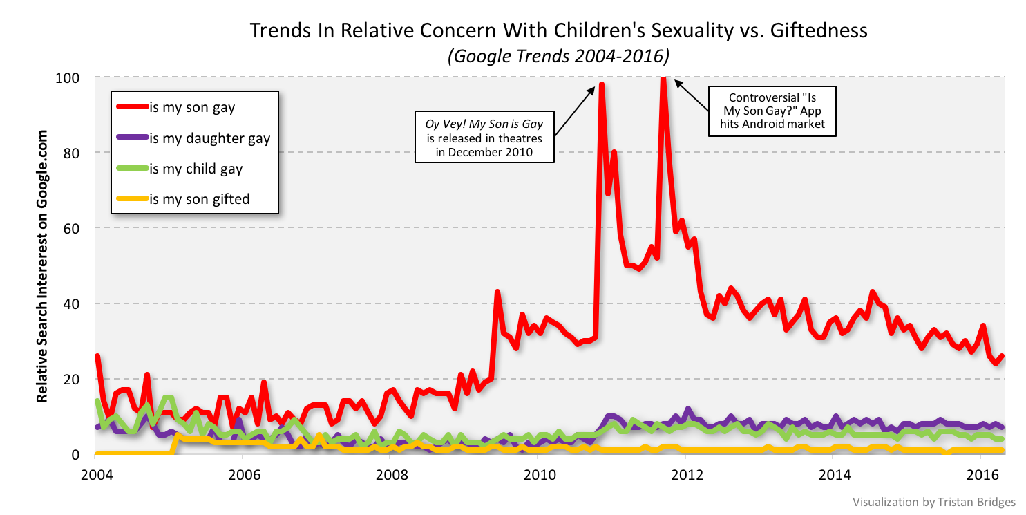
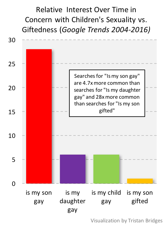
Indeed, over the period of time illustrated here, people were 28x more likely to search for “is my son gay” than they were for “is my son gifted.”  And searches for “is my son gay” were 4.7x more common than searches for “is my daughter gay.”

Reading Google Trends is a bit like reading tea leaves in that it’s certainly open to interpretation.  For instance, this could mean that parents are increasingly open to sexual diversity and are increasingly attempting to help their children navigate coming to terms with their sexual identities (whatever those identities happen to be).  Though, were this the case, it’s interesting that parents are apparently more interested in helping their sons navigate any presumed challenges than their daughters.  It could mean that as performances of masculinity shift and take on new forms, sons are simply much more likely to engage with gender in ways that cause their parents to question their (hetero)sexuality than they used to.  Or it could mean that parents are more scared that their sons might be gay.  It is likely all of these things.

I’m not necessarily sold on the idea that the trend can only be seen as a sign of the endurance of gender and sexual inequality.  But one measure of that might be to check back in with Google Trends to see if people start asking Google whether their sons and daughters are straight.  At present, both searches are uncommon enough that Google Trends won’t even display their relative popularity.

Tristan Bridges, PhD is a professor at the University of California, Santa Barbara. He is the co-editor of Exploring Masculinities: Identity, Inequality, Inequality, and Change with C.J. Pascoe and studies gender and sexual identity and inequality. You can follow him on Twitter here. Tristan also blogs regularly at Inequality by (Interior) Design.

Originally posted at the Gender & Society blog.

Two songs that seemed like they were on the radio every time I tuned into a pop station last summer were Omi’s single, “Cheerleader” (originally released in 2015) and Andy Grammar’s song, “Honey, I’m good” (originally released in 2014). They’re both songs written for mass consumption. Between 2014 and 2015, “Cheerleader” topped the charts in over 20 countries around the world. And, while “Honey, I’m Good” had less mass appeal, it similarly found its way onto top hit lists around the world.

They’re different genres of music. But they both fall under the increasingly meaningless category of “pop.”  And, because they both gained popularity around the same time, it was possible to hear them back to back on radio stations across the U.S.  Both songs are about the same issue: each are ballads sung by men celebrating themselves for being faithful in their heterosexual relationships.  Below is Omi’s “Cheerleader.” Here is the chorus:

“All these other girls are tempting / But I’m empty when you’re gone / And they say / Do you need me? / Do you think I’m pretty? / Do I make you feel like cheating? / And I’m like no, not really cause / Oh I think that I found myself a cheerleader / She is always right there when I need her / Oh I think that I found myself a cheerleader / She is always right there when I need her”

In Omi’s song, he situates himself as uninterested in cheating because he’s found a woman who believes in him more than he does. And this, he suggests, is worth his fidelity. Though, he does admit to being tempted, which also works to situate him as laudable because he “has options.”

Andy Grammar’s song is a different genre. And like Omi’s song, it’s catchy (though, apparently less catchy if pop charts are a good measure). Grammar’s video is dramatically different as well. It’s full of couples lip syncing his song while claiming amounts of time they’ve been faithful to one another. Again, and for comparison, below is the chorus:

“Nah nah, honey I’m good / I could have another but I probably should not / I’ve got somebody at home, and if I stay I might not leave alone / No, honey I’m good, I could have another but I probably should not / I’ve gotta bid you adieu and to another I will stay true”

Unlike Omi’s song, Grammar’s single is a song about a man at a bar without his significant other. He’s turning down drinks from a woman (or women), claiming that he doesn’t trust himself to be faithful if he gives into the drink. Instead, he opts to leave the bar to ensure he doesn’t give in to this temptation.

Both songs are written in the same spirit. They’re songs that appear to be about women, but are actually anthems about what amazing men these guys are because… well, because they don’t cheat, but could.

I was struck by the common message, a message at least partially to blame for why we all heard them so much. And the message is that, for men in heterosexual relationships, resisting the temptation to be unfaithful is hard work. And this message helps to highlight key ingredients of contemporary hegemonic masculinities: heterosexuality and promiscuity. Both men are identifying as heterosexual throughout each song. But, you might think, they’re not identifying as promiscuous. So, how are they supporting this cultural ideal if they appear to be challenging it? The answer to that is all in the delivery.

Amy C. Wilkins studied the ways that a group of college Christian men navigated what she terms the “masculinity dilemma” of demonstrating themselves to be heterosexual and heterosexually active when they were in a group committed to abstinence. Wilkins discovered that they navigated this dilemma by enacting what she refers to as “collective processes of temptation” whereby they crafted a discourse about just how masculine they were by resisting the temptation to be heterosexually active. They ritualistically discussed the problem of heterosexual temptation. And, in so doing, Wilkins argues that the men she studied, “perform their heterosexuality collectively, aligning themselves with conventional assumptions about masculinity through the ritual invocation of temptation” (here: 353). It’s hard to craft an identity based on not doing something. But if you’re going to, Wilkins argues that temptation is key.

Similarly, Sarah Diefendorf found that young evangelical Christian men navigate their gender identities alongside pledges of sexual abstinence until marriage. Men in Diefendorf’s study used one another as “accountability partners” to make sure they didn’t cheat on their pledges if they were in relationships, but even with things like pornography or masturbation. As Diefendorf writes, “These confessions… enable these men to demonstrate a connection with hegemonic masculinity through claims of desire for future heterosexual practices” (here: 658-659). In C.J. Pascoe’s study of high school boys navigating tenuous gender and sexual identities, she refers to this process more generally as “compulsive heterosexuality.”

Both songs are meant to situate the two singers as great men, men to be admired. But, being able to listen to this message and “get it” means that you can take for granted the premise on which the songs are based—in this case, that men are hard-wired to be sexual scoundrels and that heterosexual women should count themselves lucky if they are fortunate enough to have landed a man committed to not living up to his wiring. Without understanding men as having a natural and apparently insatiable sexual wanderlust, these songs don’t make sense.

Both Omi and Grammar need the discourse of temptation to frame themselves as noble. If we want to challenge men to not cheat, we should be challenge the idea that they’re working against biologically deterministic inclinations to do so. I’m not sure it would make a top 20 hit, but neither would it recuperate forms of gendered inequality through the guise of dismantling them.

________________

*Thanks to Sarah Diefendorf for her edits and smart feedback on this post.

Tristan Bridges, PhD is a professor at the University of California, Santa Barbara. He is the co-editor of Exploring Masculinities: Identity, Inequality, Inequality, and Change with C.J. Pascoe and studies gender and sexual identity and inequality. You can follow him on Twitter here. Tristan also blogs regularly at Inequality by (Interior) Design.

Democrats and Republicans are deeply divided. By definition, political parties have differences of opinion. But these divisions have widened. Twenty years ago, your opinions on political issues did not line up the way we have come to expect them. Today, when you find you share an opinion with someone about systemic racism, you’re more likely to have like minds about environmental policies, welfare reform, and how they feel about the poor, gay and lesbian people, immigrants and immigration, and much more. In other words, Democrats and Republicans have become more ideologically consistent in recent history.

A recent Pew Report reported that in 1994, 64% of Republicans were more conservative than the median Democrat on a political values scale. By 2014, 92% of Republicans were more conservative than the median Democrat. Democrats have become more consistently liberal in their political values and Republicans have become more consistently conservative. And this has led to increasing political polarization (see HERE and HERE for smart posts on this process by Lisa Wade and Gwen Sharpe). You can see political polarization happening below.

You might think ideological commitments naturally come in groupings. But there are lots of illogical pairings without natural connections. Why, for instance, should how you feel about school vouchers be related to how you feel about global warming, whether police officers use excessive force against Black Americans, or whether displays of military strength are the best method of ensuring peace?  The four issues are completely separate. But, if your Facebook feed looks anything like mine, knowing someone’s opinion about any one of these issues gives you enough information to feel reasonably confident predicting their opinions about the other three. That’s what ideological consistency looks like.

Consider how this process affects understandings of important systems of social inequality that structure American society. Discrimination is an issue that sociologists have studied in great detail. We know that discrimination exists and plays a fundamental role in the reproduction of all manner of social inequalities. But, people have opinions about various forms of discrimination as well—even if they’re unsupported by research or data. And while you might guess that many Americans’ opinions about one form of discrimination will be predictive of their opinions about other forms, there’s not necessarily a logical reason for that to be true. But it is.

The following chart visualizes the proportions of Americans who say there is “a lot of discrimination” against Black people, gay and lesbian people, immigrants, transgender people, as well as the proportions of Americans who oppose laws requiring transgender people to use bathrooms that correspond to their sex at birth. And you can see how Americans identifying as Democrat and Republican compare.

The majority of Americans understand that social inequalities exist and that discrimination against socially marginalized groups is still a serious problem. By that, I mean that more than half of Americans believe these things to be true. And data support their beliefs. But look at the differences between Democrats’ and Republicans’ opinions about important forms of discrimination in U.S. society. The gap is huge. While just less than 1 in 3 Republicans feels that there is a lot of discrimination against Black people in the U.S., almost 8 in 10 Democrats support that statement. That’s what political polarization looks like. And Pew found that the trend is even more exaggerated among voters.

Republicans and Democrats are not just divided about whether and what to do about forms of social inequality. They’re divided about whether these inequalities exist. And that is an enormous problem.

Tristan Bridges, PhD is a professor at the University of California, Santa Barbara. He is the co-editor of Exploring Masculinities: Identity, Inequality, Inequality, and Change with C.J. Pascoe and studies gender and sexual identity and inequality. You can follow him on Twitter here. Tristan also blogs regularly at Inequality by (Interior) Design.

I love gender and sexual demography.  It’s incredibly important work.  Understanding the size and movements of gender and sexual minority populations can help assess what kinds of resources different groups might require and where those resources would be best spent, among others things.  Gary J. Gates and Frank Newport initially published results from a then-new Gallup question on gender/sexual identity in 2012-2013 (here).  At the time, 3.4% of Americans identified as either lesbian, gay, bisexual, or transgender.  It’s a big deal – particularly as “identity” is likely a conservative measure when it comes to assessing the size of the population of LGBT persons.  After I read the report, I was critical of one element of the reporting: Gates and Newport reported proportions of LGBT persons by state.  As data visualizations go, I felt the decision concealed more than it revealed.

From 2015-2016, Gallup collected a second round of data. These new data allowed Gates to make some really amazing observations about shifts in the proportion of the U.S. population identifying themselves as LGBT.  It’s a population that is, quite literally on the move.  I posted on this latter report here.  The shifts are astonishing – particularly given the short period of time between waves of data collection.  But, again, data on where LGBT people are living was reported by state.  I suspect that much of this has to do with sample size or perhaps an inability to tie respondents to counties or anything beyond state and time zone.  But, I still think displaying the information in this way is misleading.  Here’s the map Gallup produced associated with the most recent report:

During the 2012-2013 data collection, Hawaii led U.S. states with the highest proportions of LGBT identifying persons (with 5.1% identifying as LGBT)–if we exclude Washington D.C. (with 10% identifying as LGBT).  By 2016, Vermont led U.S. states with 5.3%; Hawaii dropped to 3.8%.  Regardless of state rank, however, in both reports, the states are all neatly arranged with small incremental increases in the proportions of LGBT identifying persons, with one anomaly–Washington D.C.  Of course, D.C. is not an anomaly; it’s just not a state. And comparing Washington D.C. with other states is about as meaningful as examining crime rate by European nation and including Vatican City.  In both examples, one of these things is not like the others in a meaningful sense.

In my initial post, I suggested that the data would be much more meaningfully displayed in a different way.  The reason D.C. is an outlier is that a good deal of research suggests that gender and sexual minorities are more populous in cities; they’re more likely to live in urban areas.  Look at the 2015-2016 state-level data on proportion of LGBT people by the percentage of the state population living in urban areas (using 2010 Census data).  The color coding reflects Census regions (click to enlarge).

Vermont is still a state worth mentioning in the report as it bucks the trend in an impressive way (as do Maine and New Hampshire).  But I’d bet you a pint of Cherry Garcia and a Magic Hat #9 that this has more to do with Burlington than with thriving communities of LGBT folks in the towns like Middlesex, Maidstone, or Sutton.

I recognize that the survey might not have a sufficient sample to enable them to say anything more specific (the 2015-2016 sample is just shy of 500,000).  But, sometimes data visualizations obscure more than they reveal.  And this feels like a case of that to me.  In my initial post, I compared using state-level data here with maps of the U.S. after a presidential election.  While the maps clearly delineate which candidate walked away with the electoral votes, they tell us nothing of the how close it was in each state, nor do they provide information about whether all parts of the state voted for the same candidates or were regionally divided.  In most recent elections traditional electoral maps might leave you wondering how a Democrat ever gets elected with the sea of red blanketing much of the nation’s interior.  But, if you’ve ever seen a map showing you data by county, you realize there’s a lot of blue in that red as well–those are the cities, the urban areas of the nation.  Look at the results of the 2016 election by county (produced by physicist Mark Newman – here).  On the left, you see county level voting data, rather that simply seeing whether a state “went red” or “went blue.”  On the right, Newman uses a cartogram to alter the size of each county relative to its population density.  It paints a bit of a different picture, and to some, it probably makes that state-level data seem a whole lot less meaningful.

Maps from Mark Newman’s website: http://www-personal.umich.edu/~mejn/election/2016/

The more recent report also uses that state-level data to examine shifts in LGBT identification within Census regions as well.  Perhaps not surprisingly, there are more people identifying as LGBT everywhere in the U.S. today than there were 5 years ago (at least when we ask them on surveys).  But rates of identification are growing faster in some regions (like the Pacific, Middle Atlantic, and West Central) than others (like New England).  Gates suggests that while this might cause some to suggest that LGBT people are migrating to different regions, data don’t suggest that LGBT people are necessarily doing that at higher rates than other groups.

The recent shifts are largely produced by young people, Millennials in the Gallup sample.  And those shifts are more pronounced in those same states most likely to go blue in elections.  As Gates put it, “State-level rankings by the portion of adults identifying as LGBT clearly relate to the regional differences in LGBT social acceptance, which tend to be higher in the East and West and lower in the South and Midwest. Nevada is the only state in the top 10 that doesn’t have a coastal border. States ranked in the bottom 10 are dominated by those in the Midwest and South” (here).

When we compare waves of data collection, we can see lots of shifts in the LGBT-identifying population by state (see below; click to enlarge).  While the general trend was for states to have increasing proportions of people claiming LGBT identities in 2015-2016, a collection of states do not follow that trend.  And this struck me as an issue that ought to provoke some level of concern.  Look at Hawaii, Rhode Island, and South Dakota, for example.  These are among the biggest shifts among any of the states and they are all against the liberalizing trend Gates describes.

Presentation of data is important.  And while the report might help you realize, if you’re LGBT, that you might enjoy living in Vermont or Hawaii more than Idaho or Alabama if living around others who share your gender or sexual identity is important to you, that’s a fact that probably wouldn’t surprise many.  I’d rather see maps illustrating proportions of LGBT persons by population density rather than by state.  I don’t think we’d be shocked by those results either.  But it seems like it would be provide a much better picture of the shifts documented by the report than state-level data allow.

Tristan Bridges, PhD is a professor at the University of California, Santa Barbara. He is the co-editor of Exploring Masculinities: Identity, Inequality, Inequality, and Change with C.J. Pascoe and studies gender and sexual identity and inequality. You can follow him on Twitter here. Tristan also blogs regularly at Inequality by (Interior) Design.

A different version of this post was originally published at Timeline.

To get some perspective on the long term trend in divorce, we need to check some common assumptions. Most importantly, we have to shake the idea that the trend is just moving in one direction, tracking a predictable course from “olden days” to “nowadays.”

It’s so common to think of society developing in on direction over time that people rarely realize they are doing it. Regardless of political persuasion, people tend to collapse history into then versus now whether they’re using specific dates and facts or just imagining the sweep of history.

In reality, sometimes it’s true and sometimes it’s not true that society has a direction of change over a long time period. Some social trends are pretty clear, such as population growth, longevity, wealth, or the expansion of education. But when you look more closely, and narrow the focus to the last century or so, it turns out that even the trends that are following some path of progress aren’t moving linearly, and the fluctuations can be the big story.

Demography provides many such examples. For example, although it’s certainly true that Americans have fewer children now than they did a century ago, the Baby Boom – that huge spike in birth rates from 1946 to 1964 – was such a massive disruption that in some ways it is the big story of the century. Divorce is another.

The most popular false assumption about divorce – sort of like crime or child abuse – is that it’s always getting worse (which isn’t true of crime or child abuse, either). In the broadest sense, yes, there is more divorce nowadays than there was in the olden days, but the trend is complicated and has probably reversed.

It turns out, however, that the story of divorce rates is ridiculously complicated. For one thing, there is no central data source that simply counts all divorces. The National Center for Health Statistics used to divorces from states, but now six states don’t feel like cooperating anymore, including, unbelievably, California. Even where divorces are counted, key information may not be available, such as the people’s age or how long they were married (or, now that there is gay divorce, their genders). Fortunately, the Census Bureau (for now) does a giant sample survey, the American Community Survey, which gives us great data on divorce patterns, but they only started collecting that information in 2008.

The way demographers ask the question is also different from what the public wants to know. The typical concerned citizen (or honeymooner) wants to know: what are the odds that I (or someone else getting married today) will end up divorced? Science can guess, but it’s impossible to give a definitive answer, because we can’t actually predict human behavior. Still, we can help.

The short answer is that divorce is more common than it was a 75 years ago, but less common than it was at the peak in 1979. Here’s the trend in what we call the “refined” divorce rate – the number of divorces each year for every thousand married women in the country:

The figure uses the federal tally from states from 1940 to 1997, leaves out the period when there was no national collection, and then picks up again when the American Community Survey started asking about divorce.

So the long term upward trend is complicated by a huge spike from soldiers returning home at the end of World War II (a divorce boom, to go with the Baby Boom), a steep increase in the sixties and seventies, and then a downward glide to the present.

How is it possible that divorce has been declining for more than three decades? Part of it is a function of the aging population. As demographers Sheela Kennedy and Steven Ruggles have argued, old people divorce less, and the married population is older now than it was in 1979, because the giant Baby Boom is now mostly in its sixties and people are getting married at older ages. This is tricky, though, because although older people still divorce less, the divorce rates for older people (50+) have doubled in the last two decades. Baby Boomers especially like to get divorced and remarried once their kids are out of the house.

But there is a real divorce decline, too, and this is promising about the future, because it’s concentrated among young people – their chances of divorcing have fallen over the last decade. So, although in my own research I’ve estimated that estimated that 53% of couples marrying today will get divorced, that is probably skewed by all the older people still pulling up the rates. Typical Americans getting married in their late 20s today probably have a less than even chance of getting divorced. The divorce will probably keep falling.

Rather than a conservative turn toward family values, I think this represents an improving quality of marriages. When marriage is voluntary – when people really choose to get married instead of simply marching into it under pressure to conform – one hopes they would be making better choices, and the data support that. Further, as marriage has become more rare, it has also become more select. Despite more than a decade of futile marriage promotion efforts by the federal government, marriage is still moving up the income scale. The people getting married today are more privileged than they used to be: more highly educated (both partners), and more stably situated. All that bodes well for the survival of their marriages, but doesn’t help the people left out of the institution. If less divorce just means only perfect couples are getting married, that’s merely another indicator of rising inequality.

Putting this trend back in that long term context, we should also ask whether falling divorce rates – which run counter to the common assumption that everything modern in family life is about the destruction of the nuclear family – are always a good thing. Most people getting married would like to think they’ll stay together for the long haul. But what is the right amount of divorce for a society to have? It seems like an odd question, but divorce really isn’t like crime or child abuse. You want some divorces, because otherwise it means people are stuck in bad marriages. If you have no divorce that means even abusive marriages can’t break up. If you have a moderate amount, it means pretty bad marriages can break up but people don’t treat it lightly. And if you have tons of divorce it means people are just dropping each other willy-nilly. When you put it that way, moderate sounds best. No one has been able to put numbers to those levels, but it’s still good to ask. Even as we shouldn’t assume families are always falling apart more than they used to, we should consider the pros and cons of divorce, rather than insisting more is always worse.

Philip N. Cohen is a professor of sociology at the University of Maryland, College Park. He writes the blog Family Inequality and is the author of The Family: Diversity, Inequality, and Social Change. You can follow him on Twitter or Facebook.