
The Simon Wiesenthal Center just released “iReport: Online Terror + Hate: The First Decade” (pdf) analyzing cyberhate and extremist websites from the last decade. In addition to analysis and pictures of the websites analyzed (I posted some below), the report contains discussions of “cyberhate” and online terrorism, and includes an action plan. See also the NYTimes coverage of the report.
While I would argue that the Internet is no different in terms of composition than the peoples and organizations that make up the Internet (i.e. the Internet reflects and re-creates the racial, ethnic, gender and class divisions found elsewhere), what I think is particularly interesting about this report is how newer Internet technologies (Web 2.0 technologies like social networking sites, collective gaming, blogs, folksonomies) are shaping how these kinds of web content are created and distributed. Just as Web 2.0 technology tailors the information you see about your friends on social networking sites like Facebook, Web 2.0 technology is also making it possible for extremist groups to bring tailored content to targeted groups of interested individuals.
This report has a lot of content that would be perfect for class discussions on the Internet, online activism, how Web 2.0 technology shapes this kind of content, the visibility/invisibility of race, class, gender and other inequalities online, as well as issues of web freedom and monitoring online content. How could this content be regulated and/or censored? Should it be?
Some highlights from the report (p. 3):
• The Internet’s unprecedented global reach and scope combined with the difficulty in monitoring and tracing communications make the Internet a prime tool for extremists and terrorists.
• The Simon Wiesenthal Center has been monitoring these developments for nearly two decades through our Digital Terrorism and Hate Project. Our findings reveal that as the Internet has grown, the escalation of extremist sites has kept pace in number and in technological sophistication.
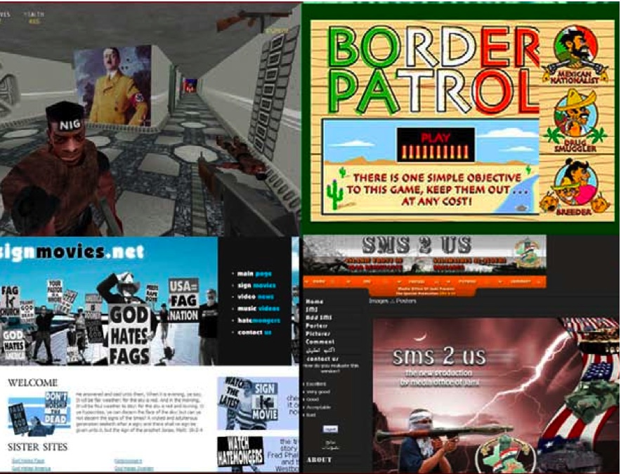
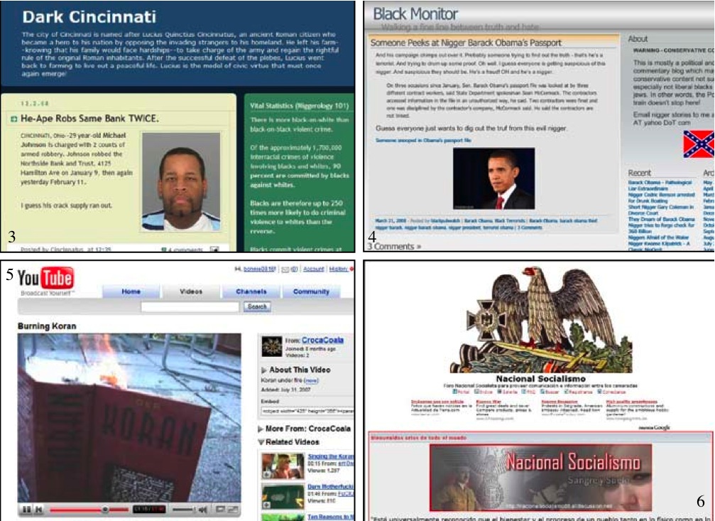
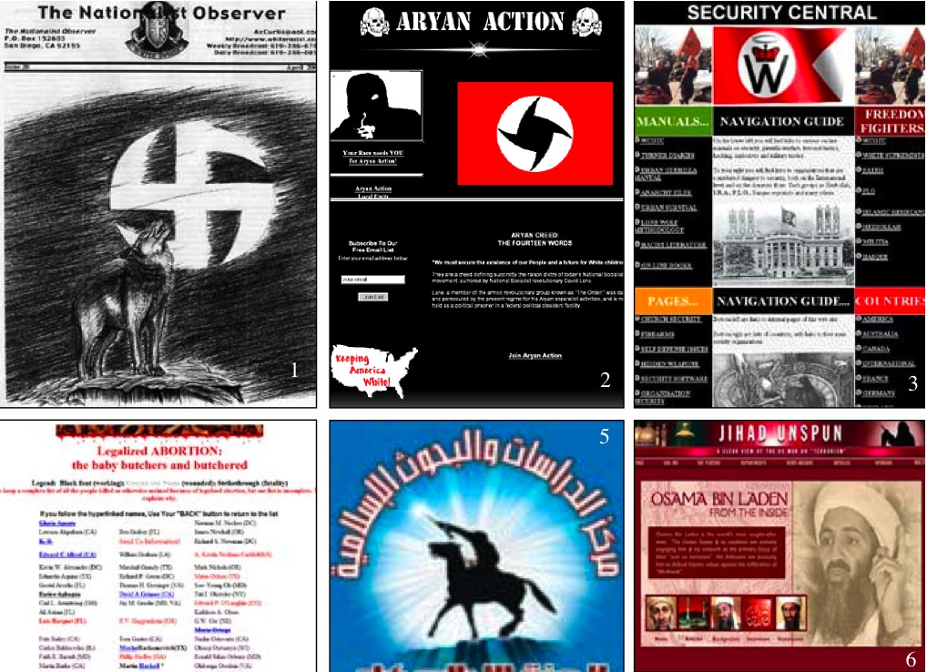
• In April 1995, the first extremist website went online: Today, the Wiesenthal Center’s Digital Terror and Hate 2.0 identifies some 8,000 problematic hate and terrorist websites and other internet postings. This represents a 30% increase over last year.
• Every aspect of the Internet is being used by extremists of every ilk to repackage old hatred, demean the ‘Enemy’, to raise funds, and since 9/11, recruit and train Jihadist terrorists. Of special concern is the use of the Internet used by the Iranian regime to justify terrorism and spread its influence throughout South America.
• Internet-based hate has inspired some of the most violent hate crimes in America. In this election year, the Internet continues to be used to demean and threaten African Americans, Jews, immigrants, gays and virtually every religious denomination.
• Extremists are leveraging 2.0 technologies to dynamically target young people through digital games, Second Life scenarios, blogs, and even Youtube and Facebook style videos depicting racist violence and terrorism.
And some images of sites included in the report (they are described within the report):


