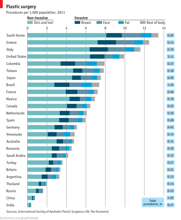
Cross-posted at AlterNet, Jezebel, and VitaminW.
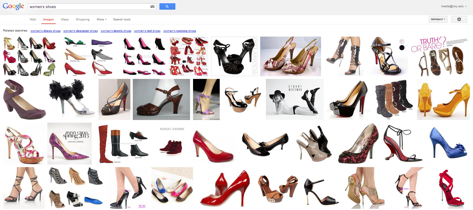
I don’t know about you, but whenever I go shopping for shoes, I’m always stunned by the incredible disproportion of high heels. I’m just gonna guestimate here, but I’ll bet 85% of the shoes at the average store are high heels so impractical that most women only wear them on special occasions that involve a lot of sitting down. These shoes, moreover, seem to be pushed to the front of the display. Women’s shoe stores beckon shoppers by putting their most outrageous shoes out front. You have to go digging for a practical pump. A quick Google image search for “women’s shoes” reveals the same bias in favor of the four-inch or higher, spindly heeled shoe:
How is it that a shoe that gets 1% of feet time takes up 85% of retail space? I’m gonna take a shot at offering an answer.
In a previous post I reviewed the history of the high heel. Originally a shoe for high-status men, it was adopted by the lower classes. Elites responded by heightening the heel. The higher the heel, the more impractical the shoe. Eventually the working classes couldn’t keep up with the escalation because they had to, you know, work. Sociologically, this is an example of what Pierre Bourdieu famously called “distinction.” The rich work to preserve certain cultural arenas and products for themselves. This allows them to signify their status; you know, keep them from getting confused with the masses.
I think something similar is going on today among women. Certain class advantages make it easier for upper middle class and wealthy women to don high heels. High heels can really only be worn routinely by women who don’t work on their feet all day (I’ll grant there are dedicated exceptions). Valet parking makes it a whole lot easier to wear shoes that hurt to walk in, so does not having to take the bus.* Having money, in itself, means that nothing stands between you and buying things that are impractical. So, high heels function to differentiate women who can afford to be impractical with their footwear — both monetarily and in practice — from women who can’t. This, I think, is why the highest, spikiest heels are are the front of the shoe store. In a certain way, they signify status. Wearing those shoes promises to differentiate you from other “lesser” women, women who can’t invest in their appearance and get lots of practice looking elegant on their tip toes.
Women of all classes desire such shoes because of the signals they send and they often buy them aspirationally, hoping to be the type of woman who wears them. It’s primarily women at the top of the class hierarchy that will be able wear them routinely, though, feeding the supply of barely worn spike heels that populate every thrift store in America. So, that’s my theory.
But let’s complicate it just a bit more. Since working class people do, ultimately, have access to high-heeled shoes, the upper classes have to go to extra lengths to effectively use high heels as a marker of distinction. This can be accomplished by sub-dividing high heels into “classy” and “trashy”: 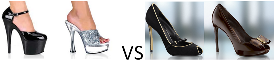 I got the ones on the left by Googling “stripper shoes” and the ones on the right are courtesy of Louis Vuitton, $890 and $1,450 respectively. Now I know that you can get “classy” heels for much cheaper, but the point is to identify this as an arms race. The rich have the power to control the discourse and can always access the high-status objects. The poor can copy, but they are often playing catch up because the rich are always changing the rules. So, as soon as the poor are doing it right, the rules change, otherwise the activity doesn’t function to distinguish the rich from the poor. And so on.
* Men, if you’re reading, high heels really do hurt to walk in. Yes, pretty much all the time. Most women are used to it and mild pain may not even register consciously. Sometimes the pain is quite significant, but women wear them anyway. You’ve probably seen women in your life kicking off their high heels as soon as they walk in the door, or rubbing their feet and wincing; there’s a reason for that.
Lisa Wade, PhD is an Associate Professor at Tulane University. She is the author of American Hookup, a book about college sexual culture; a textbook about gender; and a forthcoming introductory text: Terrible Magnificent Sociology. You can follow her on Twitter and Instagram.