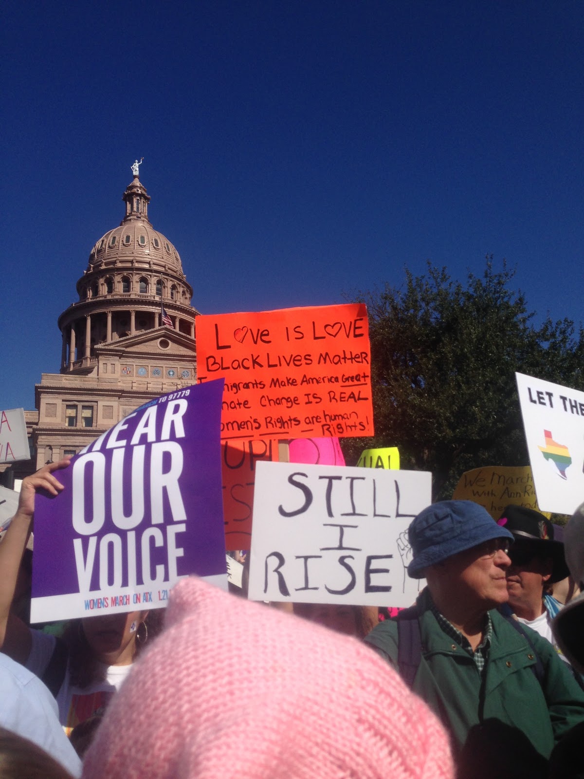
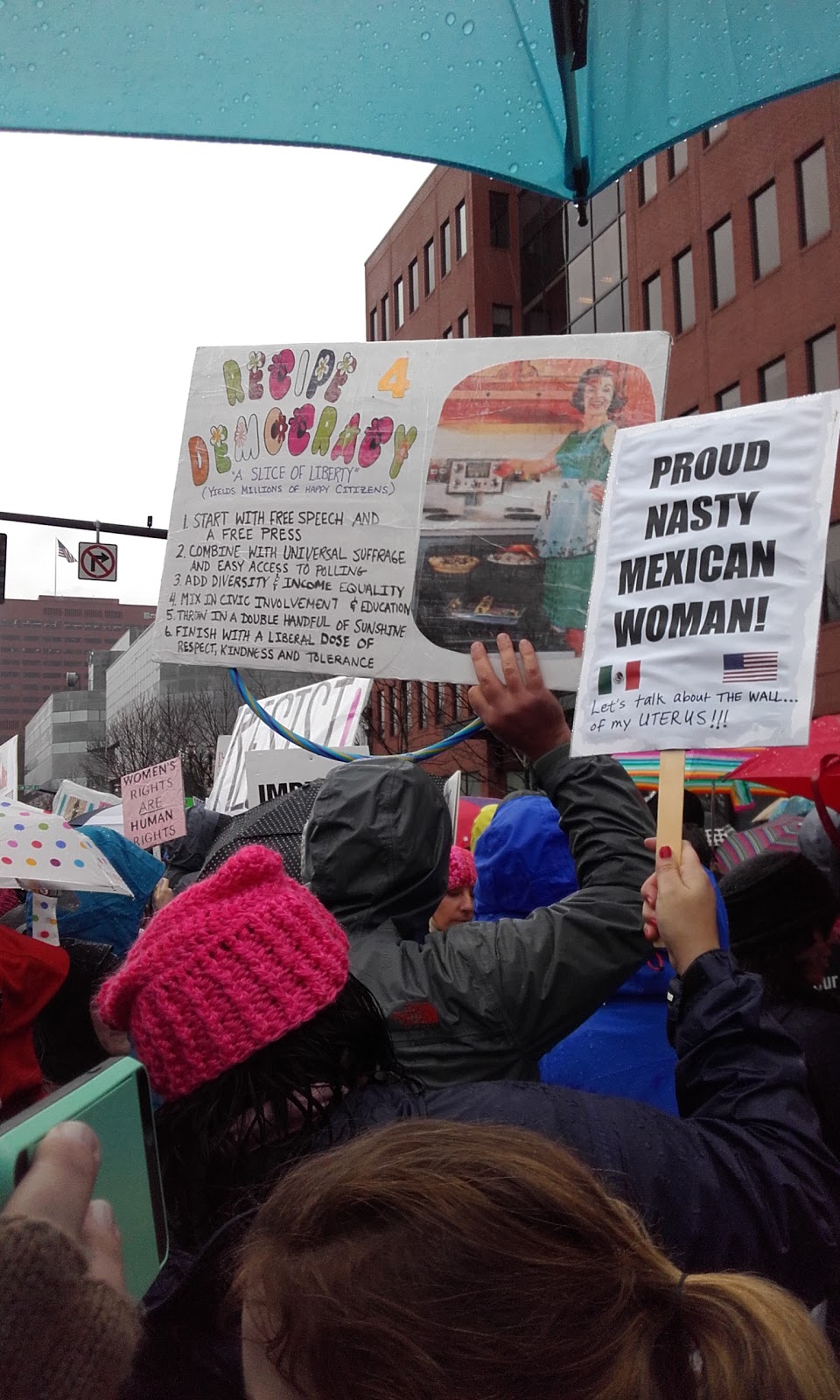
Democrats and Republicans are deeply divided. By definition, political parties have differences of opinion. But these divisions have widened. Twenty years ago, your opinions on political issues did not line up the way we have come to expect them. Today, when you find you share an opinion with someone about systemic racism, you’re more likely to have like minds about environmental policies, welfare reform, and how they feel about the poor, gay and lesbian people, immigrants and immigration, and much more. In other words, Democrats and Republicans have become more ideologically consistent in recent history.

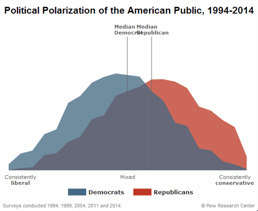
A recent Pew Report reported that in 1994, 64% of Republicans were more conservative than the median Democrat on a political values scale. By 2014, 92% of Republicans were more conservative than the median Democrat. Democrats have become more consistently liberal in their political values and Republicans have become more consistently conservative. And this has led to increasing political polarization (see HERE and HERE for smart posts on this process by Lisa Wade and Gwen Sharpe). You can see political polarization happening below.

You might think ideological commitments naturally come in groupings. But there are lots of illogical pairings without natural connections. Why, for instance, should how you feel about school vouchers be related to how you feel about global warming, whether police officers use excessive force against Black Americans, or whether displays of military strength are the best method of ensuring peace?  The four issues are completely separate. But, if your Facebook feed looks anything like mine, knowing someone’s opinion about any one of these issues gives you enough information to feel reasonably confident predicting their opinions about the other three. That’s what ideological consistency looks like.

Consider how this process affects understandings of important systems of social inequality that structure American society. Discrimination is an issue that sociologists have studied in great detail. We know that discrimination exists and plays a fundamental role in the reproduction of all manner of social inequalities. But, people have opinions about various forms of discrimination as well—even if they’re unsupported by research or data. And while you might guess that many Americans’ opinions about one form of discrimination will be predictive of their opinions about other forms, there’s not necessarily a logical reason for that to be true. But it is.

The following chart visualizes the proportions of Americans who say there is “a lot of discrimination” against Black people, gay and lesbian people, immigrants, transgender people, as well as the proportions of Americans who oppose laws requiring transgender people to use bathrooms that correspond to their sex at birth. And you can see how Americans identifying as Democrat and Republican compare.

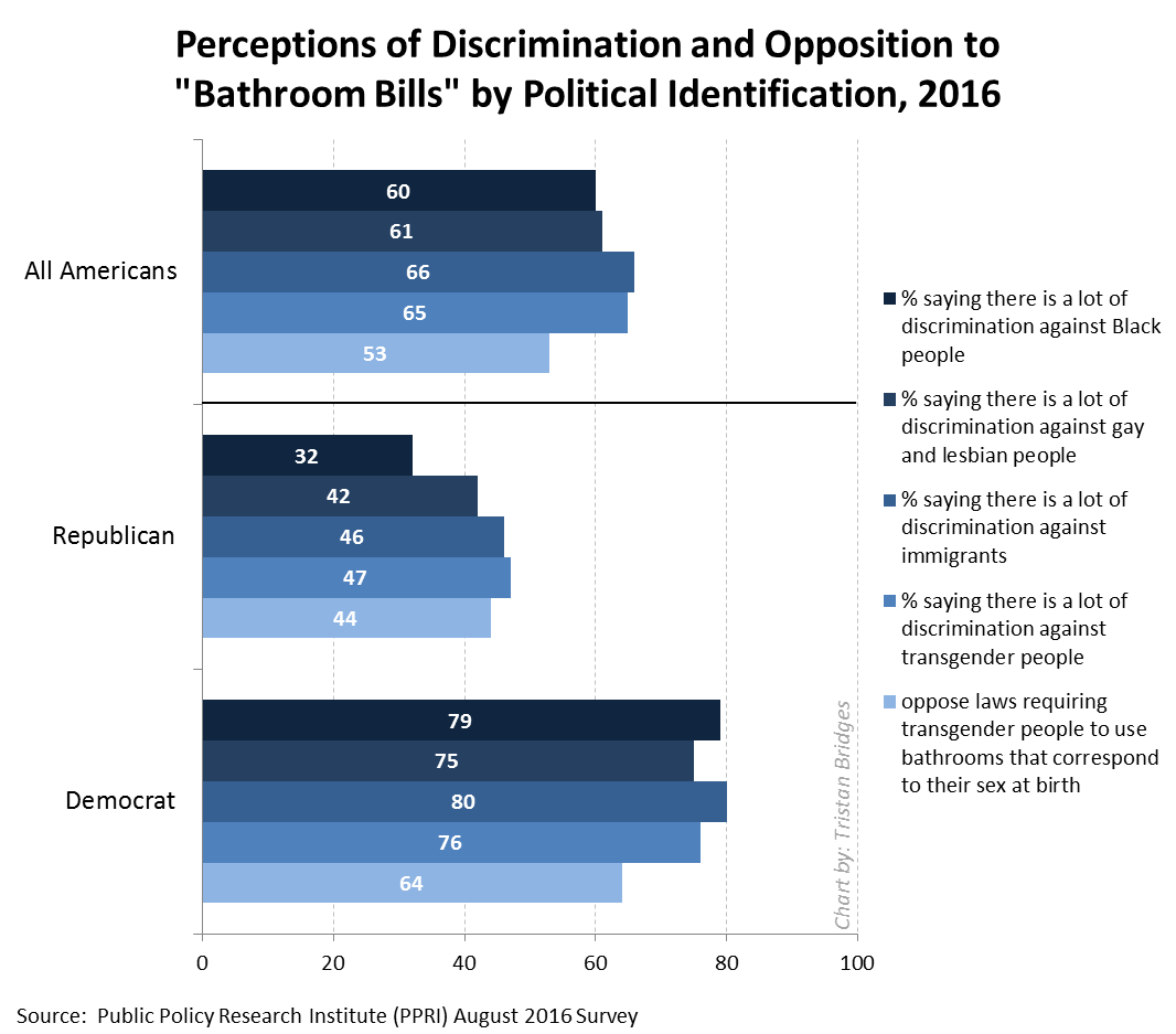
The majority of Americans understand that social inequalities exist and that discrimination against socially marginalized groups is still a serious problem. By that, I mean that more than half of Americans believe these things to be true. And data support their beliefs. But look at the differences between Democrats’ and Republicans’ opinions about important forms of discrimination in U.S. society. The gap is huge. While just less than 1 in 3 Republicans feels that there is a lot of discrimination against Black people in the U.S., almost 8 in 10 Democrats support that statement. That’s what political polarization looks like. And Pew found that the trend is even more exaggerated among voters.

Republicans and Democrats are not just divided about whether and what to do about forms of social inequality. They’re divided about whether these inequalities exist. And that is an enormous problem.

Tristan Bridges, PhD is a professor at the University of California, Santa Barbara. He is the co-editor of Exploring Masculinities: Identity, Inequality, Inequality, and Change with C.J. Pascoe and studies gender and sexual identity and inequality. You can follow him on Twitter here. Tristan also blogs regularly at Inequality by (Interior) Design.

Facts about all manner of things have made headlines recently as the Trump administration continues to make statements, reports, and policies at odds with things we know to be true. Whether it’s about the size of his inauguration crowd, patently false and fear-mongering inaccuracies about transgender persons in bathrooms, rates of violent crime in the U.S., or anything else, lately it feels like the facts don’t seem to matter. The inaccuracies and misinformation continue despite the earnest attempts of so many to correct each falsehood after it is made.  It’s exhausting. But why is it happening?

Many of the inaccuracies seem like they ought to be easy enough to challenge as data simply don’t support the statements made. Consider the following charts documenting the violent crime rate and property crime rate in the U.S. over the last quarter century (measured by the Bureau of Justice Statistics). The overall trends are unmistakable: crime in the U.S. has been declining for a quarter of a century.

Now compare the crime rate with public perceptions of the crime rate collected by Gallup (below). While the crime rate is going down, the majority of the American public seems to think that crime has been getting worse every year. If crime is going down, why do so many people seem to feel that there is more crime today than there was a year ago?  It’s simply not true.

There is more than one reason this is happening. But, one reason I think the alternative facts industry has been so effective has to do with a concept social scientists call the “backfire effect.” As a rule, misinformed people do not change their minds once they have been presented with facts that challenge their beliefs. But, beyond simply not changing their minds when they should, research shows that they are likely to become more attached to their mistaken beliefs. The factual information “backfires.” When people don’t agree with you, research suggests that bringing in facts to support your case might actually make them believe you less. In other words, fighting the ill-informed with facts is like fighting a grease fire with water. It seems like it should work, but it’s actually going to make things worse.

To study this, Brendan Nyhan and Jason Reifler (2010) conducted a series of experiments. They had groups of participants read newspaper articles that included statements from politicians that supported some widespread piece of misinformation. Some of the participants read articles that included corrective information that immediately followed the inaccurate statement from the political figure, while others did not read articles containing corrective information at all.

Afterward, they were asked a series of questions about the article and their personal opinions about the issue. Nyhan and Reifler found that how people responded to the factual corrections in the articles they read varied systematically by how ideologically committed they already were to the beliefs that such facts supported. Among those who believed the popular misinformation in the first place, more information and actual facts challenging those beliefs did not cause a change of opinion—in fact, it often had the effect of strengthening those ideologically grounded beliefs.

It’s a sociological issue we ought to care about a great deal right now. How are we to correct misinformation if the very act of informing some people causes them to redouble their dedication to believing things that are not true?

Tristan Bridges, PhD is a professor at the University of California, Santa Barbara. He is the co-editor of Exploring Masculinities: Identity, Inequality, Inequality, and Change with C.J. Pascoe and studies gender and sexual identity and inequality. You can follow him on Twitter here. Tristan also blogs regularly at Inequality by (Interior) Design.

I love gender and sexual demography.  It’s incredibly important work.  Understanding the size and movements of gender and sexual minority populations can help assess what kinds of resources different groups might require and where those resources would be best spent, among others things.  Gary J. Gates and Frank Newport initially published results from a then-new Gallup question on gender/sexual identity in 2012-2013 (here).  At the time, 3.4% of Americans identified as either lesbian, gay, bisexual, or transgender.  It’s a big deal – particularly as “identity” is likely a conservative measure when it comes to assessing the size of the population of LGBT persons.  After I read the report, I was critical of one element of the reporting: Gates and Newport reported proportions of LGBT persons by state.  As data visualizations go, I felt the decision concealed more than it revealed.

From 2015-2016, Gallup collected a second round of data. These new data allowed Gates to make some really amazing observations about shifts in the proportion of the U.S. population identifying themselves as LGBT.  It’s a population that is, quite literally on the move.  I posted on this latter report here.  The shifts are astonishing – particularly given the short period of time between waves of data collection.  But, again, data on where LGBT people are living was reported by state.  I suspect that much of this has to do with sample size or perhaps an inability to tie respondents to counties or anything beyond state and time zone.  But, I still think displaying the information in this way is misleading.  Here’s the map Gallup produced associated with the most recent report:

During the 2012-2013 data collection, Hawaii led U.S. states with the highest proportions of LGBT identifying persons (with 5.1% identifying as LGBT)–if we exclude Washington D.C. (with 10% identifying as LGBT).  By 2016, Vermont led U.S. states with 5.3%; Hawaii dropped to 3.8%.  Regardless of state rank, however, in both reports, the states are all neatly arranged with small incremental increases in the proportions of LGBT identifying persons, with one anomaly–Washington D.C.  Of course, D.C. is not an anomaly; it’s just not a state. And comparing Washington D.C. with other states is about as meaningful as examining crime rate by European nation and including Vatican City.  In both examples, one of these things is not like the others in a meaningful sense.

In my initial post, I suggested that the data would be much more meaningfully displayed in a different way.  The reason D.C. is an outlier is that a good deal of research suggests that gender and sexual minorities are more populous in cities; they’re more likely to live in urban areas.  Look at the 2015-2016 state-level data on proportion of LGBT people by the percentage of the state population living in urban areas (using 2010 Census data).  The color coding reflects Census regions (click to enlarge).

Vermont is still a state worth mentioning in the report as it bucks the trend in an impressive way (as do Maine and New Hampshire).  But I’d bet you a pint of Cherry Garcia and a Magic Hat #9 that this has more to do with Burlington than with thriving communities of LGBT folks in the towns like Middlesex, Maidstone, or Sutton.

I recognize that the survey might not have a sufficient sample to enable them to say anything more specific (the 2015-2016 sample is just shy of 500,000).  But, sometimes data visualizations obscure more than they reveal.  And this feels like a case of that to me.  In my initial post, I compared using state-level data here with maps of the U.S. after a presidential election.  While the maps clearly delineate which candidate walked away with the electoral votes, they tell us nothing of the how close it was in each state, nor do they provide information about whether all parts of the state voted for the same candidates or were regionally divided.  In most recent elections traditional electoral maps might leave you wondering how a Democrat ever gets elected with the sea of red blanketing much of the nation’s interior.  But, if you’ve ever seen a map showing you data by county, you realize there’s a lot of blue in that red as well–those are the cities, the urban areas of the nation.  Look at the results of the 2016 election by county (produced by physicist Mark Newman – here).  On the left, you see county level voting data, rather that simply seeing whether a state “went red” or “went blue.”  On the right, Newman uses a cartogram to alter the size of each county relative to its population density.  It paints a bit of a different picture, and to some, it probably makes that state-level data seem a whole lot less meaningful.

Maps from Mark Newman’s website: http://www-personal.umich.edu/~mejn/election/2016/

The more recent report also uses that state-level data to examine shifts in LGBT identification within Census regions as well.  Perhaps not surprisingly, there are more people identifying as LGBT everywhere in the U.S. today than there were 5 years ago (at least when we ask them on surveys).  But rates of identification are growing faster in some regions (like the Pacific, Middle Atlantic, and West Central) than others (like New England).  Gates suggests that while this might cause some to suggest that LGBT people are migrating to different regions, data don’t suggest that LGBT people are necessarily doing that at higher rates than other groups.

The recent shifts are largely produced by young people, Millennials in the Gallup sample.  And those shifts are more pronounced in those same states most likely to go blue in elections.  As Gates put it, “State-level rankings by the portion of adults identifying as LGBT clearly relate to the regional differences in LGBT social acceptance, which tend to be higher in the East and West and lower in the South and Midwest. Nevada is the only state in the top 10 that doesn’t have a coastal border. States ranked in the bottom 10 are dominated by those in the Midwest and South” (here).

When we compare waves of data collection, we can see lots of shifts in the LGBT-identifying population by state (see below; click to enlarge).  While the general trend was for states to have increasing proportions of people claiming LGBT identities in 2015-2016, a collection of states do not follow that trend.  And this struck me as an issue that ought to provoke some level of concern.  Look at Hawaii, Rhode Island, and South Dakota, for example.  These are among the biggest shifts among any of the states and they are all against the liberalizing trend Gates describes.

Presentation of data is important.  And while the report might help you realize, if you’re LGBT, that you might enjoy living in Vermont or Hawaii more than Idaho or Alabama if living around others who share your gender or sexual identity is important to you, that’s a fact that probably wouldn’t surprise many.  I’d rather see maps illustrating proportions of LGBT persons by population density rather than by state.  I don’t think we’d be shocked by those results either.  But it seems like it would be provide a much better picture of the shifts documented by the report than state-level data allow.

Tristan Bridges, PhD is a professor at the University of California, Santa Barbara. He is the co-editor of Exploring Masculinities: Identity, Inequality, Inequality, and Change with C.J. Pascoe and studies gender and sexual identity and inequality. You can follow him on Twitter here. Tristan also blogs regularly at Inequality by (Interior) Design.

Why did people march on January 21, 2017? As a team of sociologists interested in social movements, we know there are many possible answers to this seemingly simple question.

As a team of sociologists we have developed a multi-method, multi-site research project, Mobilizing Millions: Engendering Protest Across the Globe.* We want to understand why people participate in a march of this scale, at a critical historical juncture in our political landscape. Within weeks of discussion of the first march, there were already “sister” march pages national and internationally. While it is beyond the scope of this post to discuss all of the project findings thus far, the predictability of the racial tensions visible in social media or the role of men, local opportunities and challenges we do offer some early findings.

In the project’s first phase, we had team members on the ground in Washington D.C.; Austin, TX; Boston, MA; Los Angeles, CA; New York, NY; Philadelphia, PA;  Portland, OR; Santa Barbara, CA and St. Louis, MO. We are currently conducting a survey about the motivations and experiences that brought millions of people to the marches worldwide. We recruited respondents from marches in the aforementioned cities, and online. This has resulted in responses from around the world. Our preliminary findings from the observations and survey highlight that 1) there were a range of reasons people attended marches and 2) across and within sites, there were varying experiences of “the” march in any location.

One striking similarity we observed across sites was the limited visible presence of social movement organizations (SMOs). For sure, SMOs became visible in social media leading up to the event (particularly for the DC march). Unlike at social movement gatherings such as the US Social Forum or conservative equivalents, the sheer number of unaffiliated people dwarfed any delegations or representatives from SMOs. Of our almost 60-member nation-wide team across sites only a handful had encountered anyone handing out organizational material, as we would see at other protest. This is perhaps what brought many people to the march—an opportunity to be an individual connecting with other individuals. However, this is an empirical question as is what this means for the future of social movement organizing. We hope others join us in answering.

Second, while the energy was palpable at all of the marches so was the confusion. As various media sources reported, attendance at all sites far exceeded projections, sometimes by 10 times. Consequently, the physical presence of the expanded beyond organizers’ expectations, which in many places required a schedule shifted. At all marches there were points where participants in central areas could not move and most people could not hear scheduled speakers even if they were physically close to a stage.  Across the sites, we also observed how this challenge stimulated different responses. In multiple locations, people gathering spontaneously created their own sub-marches out of excitement as happened in DC when a band started playing on Madison street and people followed. Or, while waiting, waiting participants chanted “march, march.” Still, in many locations, once the official march started, people created sub-marches out of necessity because the pre-planned march route was impassable. When faced with standing for an hour to wait their “turn” to walk or create an alternative, they chose the latter.

Creativity was visible in artistic forms as well. While there were professionally printed signs (and T-shirts), there was a wealth of handmade signs at the marches. As expected, a slew that referenced phrases the president-elect had said noting, for example, “this pussy grabs back.” Yet there was also a range of other signs ranging from simple text to complicated storyboards (see below).

Across sites, we also saw many differences: including which types of organizations sponsored (or “supported” or “ were affiliated with”) that march.

At the Austin, Texas march, marchers’ signs and chants reflected a wide variety of concerns, including women’s reproductive health care, Black Lives Matter, and environmental justice. The emotional tenor was frequently celebratory, though it varied from one point in the march to another across a crowd reported to be more than 40,000. Many speeches at the rally immediately following the march connected the actions of the Texas state legislature–on whose front steps the march began and ended–to the broader national context.

Photo of Austin, TX by Anna Chatillon-Reed.

The Los Angeles March numbers suggest it exceeded DC participation. There was a noticeable presence of signs about immigration and in Spanish, which is not surprising considering the local and state demographics.

Photo of Los Angeles by Fátima Suarez.
Photo of Los Angeles by Fátima Suarez

The Philadelphia, PA march was close to bigger cities of in New York and DC. Some participants noted that due to the location it was  “competing” for marchers.

Philadelphia photo by Alex Kulick.

The Portland, OR protest also exceeded attendance expectations as marchers withstood hours of pouring rain. Holding the “sister” marches on the same day worldwide emphasized the magnitude and assists in building collective identity. Yet it also meant organizers in different locations faced vastly different challenges. Factors such as weather that might not have existed if organizers had been scheduling based solely on local norms and contexts.

Portland photo by Kelsy Kretschmer.

To help provide a preliminary sense of the motivations and continued engagement of marchers, we examined a sample of the ~40,000 tweets posted over two months. The analysis continues.

In the coming month, we are launching a separate survey to better understand a group social movement scholars are sometimes less inclined to study: people who do not participate in marches on January 21 (there are exceptions to this of course). As social movement scholars know, mobilization is actually a rare occurrence when we consider the range of grievances present in any society at any given moment. For a second phase of the project, we will conduct interviews with select survey participants.

Understanding the range of responses to grievances is critical as we move into this new era. If the first month of Trump’s presidency is any indication of the years to come, scholars and activists across the political spectrum will have many opportunities to engage these questions.

____________________

*The team Faculty collaborators are Zakiya Luna, PhD (Principal Investigator, California, DC, LA,PH and TX coordinator); Kristen Barber, PhD (St. Louis Lead); Selina Gallo-Cruz, PhD (Boston Lead); Kelsy Kretschmer, PhD (Portland Lead). The site leadership was provided by Anna Chatillon (Austin, TX); Fátima Suarez (Los Angeles, CA); Alex Kulick (Philadelphia, PA & social media); Chandra Russo, PhD (DC co-lead). We are also grateful to many volunteer research assistants.

Dr. Zakiya Luna is an Assistant Professor of Sociology at University of California, Santa Barbara. Her research focused on social movements, human rights and reproduction with an emphasis on the effects of intersecting inequalities within and across these sites. She has published multiple articles on activism, feminism and reproductive justice. For more information on her research and teaching, see http://www.zakiyaluna.com.

Alex Kulick, MA, is a doctoral student in sociology at the University of California, Santa Barbara and trainee in the National Science Foundation network science IGERT program. Their research investigates social processes of inequality and resistance with an emphasis on sexuality, gender, and race.

Anna Chatillon-Reed is a doctoral student in sociology at the University of California, Santa Barbara. She is currently completing her MA, which investigates the relationship between the Black Lives Matter movement and feminist organizations.

The 2017 Super Bowl was an intense competition full of unexpected winners and high entertainment value. Alright, I didn’t actually watch the game, nor do I even know what teams were playing. I’m referring to the Super Bowl’s secondary contest, that of advertising. The Super Bowl is when many companies will roll out their most expensive and innovative advertisements. And this year there was a noticeable trend of socially aware advertising. Companies like Budweiser and 84 Lumber made statements on immigration. Airbnb and Coca-Cola celebrated American diversity. This socially conscious advertising is following the current political climate and riding the wave of increasing social movements. However, it also follows the industry’s movement towards social responsibility and activism.

One social activism Super Bowl commercial that created a significant buzz on social media this year was Audi:

The advertisement shows a young girl soapbox racing and a voiceover of her father wondering how to tell her about the difficulties she is bound to face just for being female. This commercial belongs to a form of socially responsible advertising often referred to as femvertising. Femvertising is a term used to describe mainstream commercial advertising that attempts to promote female empowerment or challenge gender stereotypes.

Despite the Internet’s response to this advertisement with a sexist pushback against feminism, this commercial is not exactly feminist. While at its core this advertisement is sending a fundamentally feminist argument of gender equality and fair wages, it feels disempowering to have a man explain sexism. It feels a little like “mansplaining” with moments reminiscent of the male “savior” trope. There is also a very timid relationship between the fight for gender equality and the product being sold. The advertisement is attempting to associate Audi with feminist ideals, but the reality is that with no female board members Audi is not exactly practicing what they preach. There are many reasons why ‘femverstising’ in general is problematic (not including contested relationship between feminism and capitalism). Here I will point out three problems with this new trend of socially ‘responsible’ femvertising.

1. The industry

The advertising industry is not known for its diversity nor is it known for its accurate representation women. So right away the industry doesn’t instill confidence in those hoping for more socially aware and diverse advertising. The way advertising works is to promote a brand identity by drawing on social symbols that make products like Channel perfume a signifier of French sophistication and Marlboro cigarettes an icon of American rugged masculinity. Therefore companies are selling an identity just as much as the product itself, while corporations that employ feminist advertising are instead appropriating feminist ideologies.

They are appropriating not social signifiers of an idealized lifestyle, but rather the whole historical baggage and gendered experiences women. This appropriation at its core is not for social progress and empowerment, but to sell a product. The whole industry functions by using these identities for material gain. As feminism becomes more popular with young women, it then becomes a profitable and desirable identity to implement. The whole concept is against feminist ideology because feminism is not for sale. Using feminist arguments to sell products may be better than perpetuating gender stereotypes but it is still using these ideologies like trying on a new style of dress that can be taken off at night rather than embodying the messages of feminism that they are borrowing. This brings us to the next point.

2. Sometimes it’s the Wrong Solution

Lets consider Dove, the toiletries company that has gained a fair amount of notoriety for their social advertising and small-scale outreach programs for women and girls. Their advertisements are famous for endorsing the body positive movement. But in general the connection between female empowerment and what they actually sell is weak. Which makes it feel insincere and a lot like pandering. Why doesn’t Dove just make products that are more aligned with feminist ideologies in the first place? If feminist consumers are what they want, then make feminist products. Don’t try to just apply feminist concepts as an afterthought in hopes of increasing consumer sales.

Dove is a beauty company that is benefiting from products that are aimed at promoting a very gendered ideal of beauty. The company itself is part of the problem so its femvertising makes me feel like Dove (and their parent company Unileaver) is trying to deny that they are playing a huge role in the creation of these stereotypes that they are claiming to be challenging. If you want to really empower women then don’t just do it in your branding start with the products you are making, examine your business model, and challenge the industry as whole. Feminist concepts should run through the entire core of your business before you try to sell it to your consumers. We don’t need feminist advertising, we need a system that is not actively continuing to increase a gender divide where women are meant to be beautiful and expected to purchase the beauty products that Dove sells. Using feminist inspired advertising doesn’t solve this underlying core problem it just masks it. Femvertising therefore is often the wrong solution, or really not even a solution at all.

3. Femvertising shouldn’t have to be a term

We really shouldn’t be in a situation where all advertising is so un-feminist and so degrading towards women that there is a term for advertising that simply depicts women as powerful. When the bar is set so low we shouldn’t praise companies for doing the minimum required to represent women both accurately and positively. We should be holding our advertising, media, and all other forms of visual representation to much higher standards. Femvertising shouldn’t be a thing because we shouldn’t have to give a term to what responsible advertising agencies should be aiming for when they represent women.

So as to not leave you on a depressing and negative note, here are three advertisements that should be acknowledged for actively challenge the norms:

_____________

Nichole Fernández is a PhD candidate in sociology at the University of Edinburgh specializing in visual sociology. Her PhD research explores the representation of the nation in tourism advertisements and can be found at www.visualizingcroatia.com. Follow Nichole on twitter here.

“Manspreading” is a relatively new term.  According to Google Trends (below), the concept wasn’t really used before the end of 2014.  But the idea it’s describing is not new at all.  The notion that men occupy more space than women is one small piece of what Raewyn Connell refers to as the patriarchal dividend–the collection of accumulated advantages men collectively receive in androcentric patriarchal societies (e.g., wages, respect, authority, safety).  Our bodies are differently disciplined to the systems of inequality in our societies depending upon our status within social hierarchies.  And one seemingly small form of privilege from which many men benefit is the idea that men require (and are allowed) more space.


It’s not uncommon to see advertisements on all manner of public transportation today condemning the practice of occupying “too much” space while other around you “keep to themselves.”  PSA’s like these are aimed at a very specific offender: some guy who’s sitting in a seat with his legs spread wide enough in a kind of V-shaped slump such that he is effectively occupying the seats around him as well.

I recently discovered what has got to be one of the most exhaustive treatments of the practice ever produced.  It’s not the work of a sociologist; it’s the work of a German feminist photographer, Marianne Wex.  In Wex’s treatment of the topic, Let’s Take Back Our Space: Female and Male Body Language as a Result of Patriarchal Structures (1984, translated from the German edition, published in 1979), she examines just shy of 5,000 photographs of men and women exhibiting body language that results from and plays a role in reproducing unequal gender relations.

The collection is organized by an laudable number of features of the various bodily positions.  Interestingly, it was published in precisely the same year that Erving Goffman undertook a similar sociological study of what he referred to as “gender display” in his book, Gender Advertisements–though Goffman’s analysis utilized advertisements as the data under consideration.

Like Goffman, Wex examined the various details that made up bodily postures that seem to exude gender, addressing the ways our bodies are disciplined by society.  Wex paired images according to the position of feet and legs, whether the body was situated to put weight on one or two legs, hand and arm positions, and much much more.  And through this project, Wex also developed an astonishing vocabulary for body positions that she situates as the embodied manifestations of patriarchal social structures.  The whole book organizes this incredible collection of (primarily) photographs she took between 1972 and 1977 by theme.  On every page, men are depicted  above women (as the above image illustrates)–a fact Wex saw as symbolizing the patriarchal structure of the society she sought to catalog so scrupulously.  She even went so far as to examine bodily depiction throughout history as depicted in art to address the ways the patterns she discovered can be understood over time.

If you’re interested, you can watch the Youtube video of the entire book.

Tristan Bridges, PhD is a professor at the University of California, Santa Barbara. He is the co-editor of Exploring Masculinities: Identity, Inequality, Inequality, and Change with C.J. Pascoe and studies gender and sexual identity and inequality. You can follow him on Twitter here. Tristan also blogs regularly at Inequality by (Interior) Design.
Protestors march in the Woman’s March on Washington D.C. Jan. 21, 2017. The Capital Mall area was the starting point of the march, hundreds of thousands of people attended. (National Guard photo by Tech. Sgt. Daniel Gagnon, JTF-DC).

Waves of pink knitted hats and protest signs packed the streets of D.C. on January 21, 2017, just one day after President Trump’s inauguration drew average crowds. The Women’s March of 2017 was the largest protest in recent history, bringing together over 500,000 people in DC- the location of the flagship march, and over 2.9 million people nationwide. Protesters came from near and far to protect a diverse set of rights that are threatened by the incoming administration. Perhaps the Women’s March can be understood as a partial response to President Obama’s declaration in his farewell address that the most important office in a democracy is “citizen,” and, thus, citizens must work to improve our society, not just when there is an election or when their own narrow interests are at stake. The march was an example of what this kind of democracy looks like. Originally proposed on social media, the idea for the march took off and a groundswell of support emerged from independent individuals and those associated with organizations.  Despite this level of support, many have speculated about who attended the march, whether they voted, the goals of protesters and their level of civic engagement. Some have discounted the protesters as only forwarding the perspectives and issues of white women and eschewing those of other groups such as people of color and/or members of the LGBTQ community.

Combatting this new era of “alternative facts,” a research team led by Dr. Dana R. Fisher, Dr. Dawn M. Dow and Dr. Rashawn Ray from the University of Maryland, College Park provides data-supported facts about participants at the Women’s March. Teams of 2 surveyed participants throughout the march (full details of sampling and methodology available upon request) to understand who was protesting and why. In total, 527 people completed the survey (representing a 92.5% response rate).

Far from using protesting as a substitute for voting, as a recent tweet from Trump suggested, initial findings from this project show that the protesters at the Women’s March voted, and overwhelmingly for Secretary Hillary Clinton. Among respondents, 90.1% reporting voting for Hilary Clinton, 2.3% voted for a third-party candidate and .2% (one person) voted for Donald Trump. Among the 1.7% who explicitly said they did not vote, nearly half were non-U.S. citizens who are not eligible to do so.

Our findings also suggest that the Women’s March has potentially lit the political fires of a new generation of activists and reactivated the political activism of others. Indeed, a third of the participants reported that the Women’s March was their first time participating in a protest ever. For over half of the participants (55.9%), the March was their first protest in 5 years (including those who had never participated before).

Respondents were also asked to identify the issues that motivated them to protest.  Our data suggest protesters were unified by a range of distinct and overlapping priorities. Given the name of the march, it is not surprising that 60.6% of respondents cited women’s rights as a motivation for protesting.  However, other social issues were also at the forefront of protesters’ minds. Nearly tied for second place, protesters cited the environment (35.5%), racial justice (35.1%), LGBTQ rights (34.7%), and reproductive rights (32.7%) as motivations to attend. Other political issues were also well represented including equality (25.1%), social welfare (23.1%) and immigration (21.6%).  Indeed, rather than representing a narrow set of interests, protesters identified multiple and diverse motivations for participating.

Historically protests focus on one social issue such as equal pay, climate change, voting rights or same sex marriage. The Women’s March was different in that its protesters were seemingly engaged in intersectional activism–a version of activism that is sensitive to how race, class, gender and sexuality complicate inequality. Perhaps the Women’s March is distinct in this way because protesters were not just motivated by concrete issues, but they were also motivated by a desire to protect and reassert a vision of America that embraces diversity and inclusion as a strength rather than a threat. This vision of America is increasingly under attack by the Trump Administration. It remains to be seen how the energy from the march will translate into change locally across the country but recent protests suggest that citizens stand ready to protect their rights and the rights of others.

Dr. Dawn M. Dow is an Assistant Professor of Sociology at the University of Maryland, College Park.  She received a PhD in sociology from the University of California, Berkeley and also earned a JD from Columbia University, School of Law.  Dow’s research examines intersections of race, class and gender within the context of the family, educational settings, the workplace and the law. Her work has been published in journals including Gender & Society, Journal of Marriage and Family and Sociology of Race & Ethnicity.  Follow her on Twitter here.

Dr. Dana R. Fisher is a Professor of Sociology and the Director of the Program for Society and the Environment at the University of Maryland. Her research focuses on environmental policy, civic participation and activism more broadly. She has written extensively on activism and social protest in articles as well as in her second book Activism, Inc. (Stanford University Press 2006).  Fisher’s work on protest builds on data collected from around 5,000 protesters at thirteen protest events in six countries. For more information, go to www.drfisher.umd.edu.  Follow her on Twitter here.

Dr. Rashawn Ray is an Associate Professor of Sociology at the University of Maryland, College Park. Ray obtained a Ph.D. in Sociology from Indiana University in 2010. From 2010-2012 he was a Robert Wood Johnson Foundation Health Policy Research Scholar at the University of California, Berkeley/UCSF. Ray’s research addresses the mechanisms that manufacture and maintain racial and social inequality. His work also speaks to ways that inequality may be attenuated through racial uplift activism and social policy. Follow him on Twitter here.


The Women’s March in Washington had three times more people in attendance than did President Trump’s inauguration. Many have argued about the reasons for these numbers (see here, here, and here), and used them both individually and together to make claims about activism and political support. But something is missing from these conversations. In order to fully understand the differences in attendance at these events in D.C., and to avoid taking these numbers to mean something they do not, we must account for class and race.

Gender, education and race may have been the biggest rifts in voters this past presidential election, but class is part of this political shift. At least part of why people didn’t show up for President Trump’s inauguration in droves but did show up to the Women’s Marches is a story of class privilege and the cultural capital that comes with it. Upper middle class white women and urban dwellers from all classes had easy access to Women’s Marches, both in D.C. and around the country. Many of Trump’s voters would have had to fly to D.C. Because research shows that only about 50% of the population in the US flies each year, and because that tracks with income and education, Women’s March supporters may have been more likely to fly than Trump voters were. If we look at data from just the five counties with the largest vote share for Trump, we see that, except for Buchanan, Virginia, these locations present great travel distance. Further, President Trump received 4.1% of the vote in Washington, D.C., and lost in surrounding states by large percentages. As CNN points out, a trip to inauguration would be a long one for a critical mass of Trump supporters.

White voters from rural areas and those without a college education represent the largest demographics to turn out for Trump. Many of Trump’s supporters reside in more rural areas that are struggling economically. Cost and familiarity with travel, ease and options in taking time off of work, and geographic proximity to D.C. may have affected participation in Inauguration events. Sociologists talk about cultural capital—or the non-financial goods that help with social mobility beyond economic means. Such capital can include knowledge, skills, and education—things that are both material and symbolic. When Emily lived in rural Arkansas, many people she met had never left the state or in some cases even the county. Indeed, when she told a friend there that she flew home for Christmas and it cost $70, he was surprised that a plane ticket cost less than it did to fill up his truck, because he’d never flown before. Emily’s knowledge of air travel is a form of cultural capital, and one that could put her at an advantage in planning a trip to fly to Washington, D.C. for the March. There is an intimidation that comes from not having done that or been there before—your cultural capital can determine how well versed you are in navigating AirBnB and the slew of cheap flight websites that exist.

Why was the Women’s March so highly attended? Many have analyzed the mass turn-out in D.C., nationally, and internationally. For the first time, the Women’s March brought out highly educated, more affluent white women who have the forms of capital to plan and attend a weekend in D.C. Of course, there were many—millions, in fact—who did not go to D.C., but who showed support in sister marches around the country and globe. For many, their lack of attendance in D.C. could be due to the same barriers that perhaps inhibited many from attending the Inauguration. For others, their participation was possible because demographics likely to participate in Women’s Marches – LGBTQA+ folks and people of color – are more likely to reside in urban communities. But to compare these attendance rates without talking about class, and without talking about the mobilization of white women, muddies the realities of who is ready and willing to act at more local levels.

While the Women’s March may have kicked off a movement that has the tools in place for success, we need to remember that Trump’s path to success was unpredicted. To take his inauguration attendance numbers to mean that his initial supporters have changed their minds or that Trump has lost political support would be a potentially grave mistake. To take what is now the largest protest in U.S. history as evidence of mass, continued mobilization, that may also be inaccurate. White women are just starting to show up—will they continue to do so? In talking about the intersections of class and race, we remember who is able to mobilize and show support when, and we must bring these intersections to the fore in future conversations about mobilization and activism.

Sarah Diefendorf is a PhD candidate in Sociology at the University of Washington. Her research centers on sexuality, gender, and evangelical religious groups. You can follow her on Twitter here.

Emily Kalah Gade is a PhD candidate in Political Science at the University of Washington. Her research centers on political violence, civil resistance and militancy.