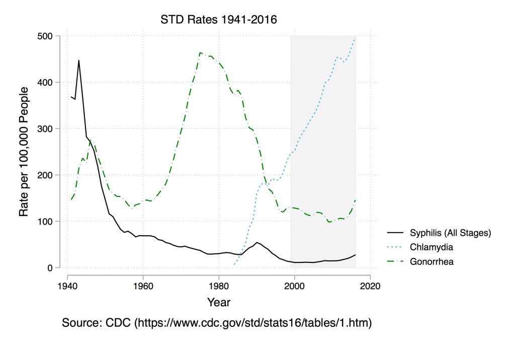
The CDC recently issued a press release announcing that rates of reported cases for sexually transmitted diseases are setting record highs. The new report offers reports of rates going back to 1941 in a table, so I made a quick chart to see the pattern in context and compare the more common conditions over time (HIV wasn’t included in this particular report).

It is important to note that a big part of changes in disease rates is usually detection. Once you start looking for a condition, you’ll probably find more of it until enough diagnoses happen for treatment to bring the rates down. Up until 2000, the U.S. did pretty well in terms of declining rates for cases of gonorrhea and syphilis. Zoom in on the shaded area from 2000 to 2016, however, and you can see a pretty different story. These rates are up over the last 16 years, and chlamydia rates have been steadily increasing since the start of reporting in 1984.

STDs are fundamentally a social phenomenon, especially because they can spread through social networks. However, we have to be very careful not to jump to conclusions about the causes of these trends. It’s tempting to blame dating apps or hookup culture, for example, but early work at the state level only finds a mixed relationship between dating app use and STD rates and young people also have higher rates of sexual inactivity. Rate increases could even be due in part to detection now that more people have access to health coverage and care through the Affordable Care Act. Just don’t wait for peer review to finish before going to get tested!

Inspired by demographic facts you should know cold, “What’s Trending?” is a post series at Sociological Images featuring quick looks at what’s up, what’s down, and what sociologists have to say about it.

Evan Stewart is an assistant professor of sociology at University of Massachusetts Boston. You can follow his work at his website, on Twitter, or on BlueSky.

Where is your nearest garbage dump? Where does the local factory go when it needs to get rid of some particularly toxic chemicals? If there was a disaster, would you have to move? Could you?

Sociologists use shorthand terms like “environmental racism” to draw attention to the fact that poor communities and communities of color are often more likely to be exposed to hazardous materials, and cases like the Flint water crisis drive this point home.

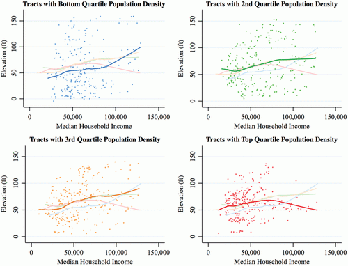
Of course, housing inequality also means that nobody has to dump anything to put poor communities in hazardous positions. One recent example of this is the flooding in Houston after Hurricane Harvey. Over at Socius, Yuqi Lu gathered data on the median household income in neighborhoods across the Houston area from the American Community Survey and matched it with land elevation data from Google Maps.

In general, poorer neighborhoods in Houston sit at lower elevations, and thus are more susceptible to flood risks. This relationship is strongest in less-densely-populated areas, such as rural and suburban neighborhoods, but additional analysis in Lu’s article shows the relationship is robust.

The latest reports are in on human caused climate change. Regardless of whether we can act to turn it around in time, we’ll also have to recognize the fact that not everyone faces the same fallout from environmental hazards and natural disasters.

Evan Stewart is an assistant professor of sociology at University of Massachusetts Boston. You can follow his work at his website, on Twitter, or on BlueSky.

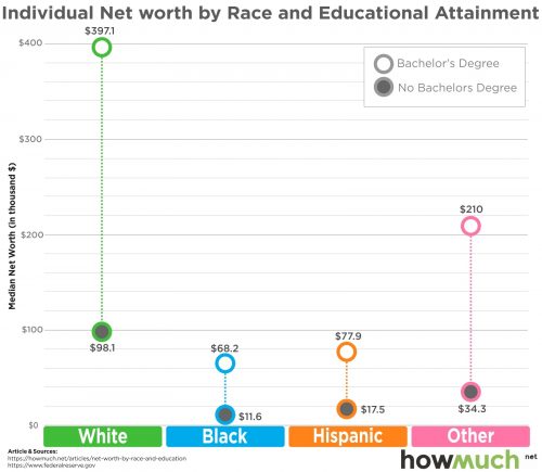
The staff at How Much recently visualized summaries from a Federal Reserve analysis showing how much a college degree can matter for your net worth. It turns out education can really pay…if you’re white.

This illustrates an important sociological point. When we talk about structural inequality, critics often note that we shouldn’t disregard individuals’ efforts to work and earn a better life. Getting a college degree is one of the centerpieces of this argument. These gaps show it’s not that effort doesn’t matter at all, but that inequality in social conditions means those efforts yield wildly different outcomes.

Want to read more on higher education and America’s wealth gap? Check out Tressie McMillan Cottom’s Lower Ed, Thomas Shapiro’s Toxic Inequality, and Dalton Conley’s Being Black, Living in the Red.

Evan Stewart is an assistant professor of sociology at University of Massachusetts Boston. You can follow his work at his website, on Twitter, or on BlueSky.

This weekend I was at the annual conference for the Society for the Scientific Study of Religion, where they held a memorial for sociologist Peter Berger. I thought of Berger and Luckmann’s classic The Social Construction of Reality in the airport on the way home. Whenever people say ritual is dying out, or socially constructed things “aren’t real,” I think of airport lines.

There are always two lines, but rarely any separation other than a sign like this. If you’re lucky, you can catch the gate agent making a big show of opening the “general boarding” lane, but everyone ends up at the same scanner right past the sign (usually only a minute or two after the “elite” passengers). From Berger and Luckmann (the Anchor Books paperback edition):

The developing human being not only interrelates with a particular natural environment, but with a specific cultural and social order which is mediated to him by the significant others who have charge of him (p. 48).

The symbolic universe orders and thereby legitimates everyday roles, priorities, and operating procedures…even the most trivial transactions of everyday life may come to be imbued with profound significance (p. 99).

Evan Stewart is an assistant professor of sociology at University of Massachusetts Boston. You can follow his work at his website, on Twitter, or on BlueSky.

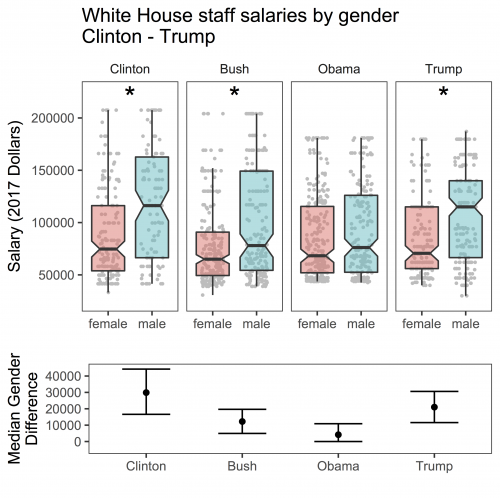
On the Data is Beautiful subreddit, a user going by the name fencelizard recently took a look at gender differences in full-time staff salaries in the last four U.S. Presidential administrations. This is only a quick descriptive picture (notes on the methodology below), but it highlights an important point about organizations: inequality doesn’t always neatly align with ideology.

Both the wide and the narrow median pay gaps are bipartisan. While the Clinton and the early Trump administrations have the widest gaps in median earnings, the George W. Bush and Obama administrations were the closest to gender parity (the gap was not statistically significant in the Obama years).

Of course, these gaps mean different things in different administrations. The parity among Bush staffers looks like it came from pay cuts on both sides, with more men remaining in a higher salary range, while the Obama administration had a much more even distribution across men and women. Part of the pattern for the Trump administration could be due to understaffing in general.

Nevertheless, it is interesting to see how the salary distribution for women staffers has remained relatively consistent and lower than fluctuating salaries for men. Sociologists know that inequality can be embedded in the day-to-day operations of institutions like schools, prisons, and government offices. Bias certainly can and does play a role in this process, but the ideological support that we often associate with such biases—like political preferences—doesn’t always have to be the deciding factor for whether inequality happens.

Some background on the analysis from fencelizard:

Salary data was sourced from white house press releases for Trump (PDF tables; FML) and Obama (UTF-8 csv’s; thanks Obama), and from the Washington Post for Bush (http://www.washingtonpost.com/wp-srv/politics/administration/whbriefing/2004stafflistb.html) and Clinton (https://www.washingtonpost.com/archive/politics/1993/11/01/salaries-at-clintons-white-house/9c96f5b6-02c5-4888-87ee-dc547d8d93f0/?utm_term=.aa70a4af1649). Supposedly full salary data for Bush I exists too, but I couldn’t find it anywhere online.
I cleaned up the data in R, used the ‘gender’ package to guess staffers’ gender from their first names, and made the plots with ggplot2 and gridExtra. I used a Wilcox test to compare the distribution of salaries across genders for each president. Asterisks in the figure above indicate significantly different distributions.

Evan Stewart is an assistant professor of sociology at University of Massachusetts Boston. You can follow his work at his website, on Twitter, or on BlueSky.

The harrowing mass shooting in Las Vegas this week is part of a tragic pattern, and it raises big questions about how we deal with such tragedies in public life. In the face of such horror, many people rightly turn to their deep convictions for comfort and strength, and their leaders are no different. Referencing religion is a common choice for politicians, especially in troubling times. Experimental evidence shows these references draw voters in, but lately it seems like the calls for comfort may have gotten a little…rehearsed.

For a growing number of Americans, calls for “thoughts and prayers” ring especially hollow. About a fifth of the U.S. population has no religious affiliation, and new experimental research shows we may be drastically underestimating the number of atheists in the population as well. Despite these trends, we don’t often seen direct challenges to religious beliefs and practices in policy debates. Healthcare reform advocates don’t usually argue that we should keep people alive and well because “there probably isn’t an afterlife.” While the battle to legalize same sex marriage discussed the separation of church and state, we didn’t see many large advocacy groups arguing for support on the grounds that biblical claims simply weren’t true.

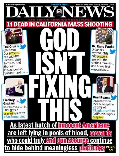
In lieu of prayer, calls for concrete action on gun control in the face of mass shootings are a new challenge to these cultural norms. In the wake of the 2015 San Bernardino shooting,  the New York Daily News ran this cover:

Now, in press conferences and on the floor of Congress, more political leaders are openly saying that thoughts are prayers are not enough to solve this problem. Sociologists know that the ways we frame issues matter, and here we might be seeing a new framing strategy emerging from the gun control debate that could reshape the role of religion in American politics in the long term.


Evan Stewart is an assistant professor of sociology at University of Massachusetts Boston. You can follow his work at his website, on Twitter, or on BlueSky.

Over at Family Inequality, Phil Cohen has a list of demographic facts you should know cold. They include basic figures like the US population (326 million), and how many Americans have a BA or higher (30%). These got me thinking—if we want to have smarter conversations and fight fake news, it is also helpful to know which way things are moving. “What’s Trending?” is a post series at Sociological Images with quick looks at what’s up, what’s down, and what sociologists have to say about it.

The Crime Drop

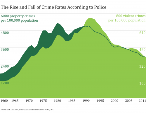
You may have heard about a recent spike in the murder rate across major U.S. cities last year. It was a key talking point for the Trump campaign on policing policy, but it also may be leveling off. Social scientists can also help put this bounce into context, because violent and property crimes in the U.S. have been going down for the past twenty years.

You can read more on the social sources of this drop in a feature post at The Society Pages. Neighborhood safety is a serious issue, but the data on crime rates doesn’t always support the drama.

Evan Stewart is an assistant professor of sociology at University of Massachusetts Boston. You can follow his work at his website, on Twitter, or on BlueSky.

In an era of body positivity, more people are noting the way American culture stigmatizes obesity and discriminates by weight. One challenge for studying this inequality is that a common measure for obesity—Body Mass Index (BMI), a ratio of height to weight—has been criticized for ignoring important variation in healthy bodies. Plus, the basis for weight discrimination is what other people see as “too fat,” and that’s a standard with a lot of variation.

Recent research in Sociological Science from Vida Maralani and Douglas McKee gives us a picture of how the relationship between obesity and inequality changes with social context. Using data from the National Longitudinal Surveys of Youth (NLSY), Maralani and McKee measure BMI in two cohorts, one in 1981 and one in 2003. They then look at social outcomes seven years later, including wages, the probability of a person being married, and total family income.

The figure below shows their findings for BMI and 2010 wages for each group in the study. The dotted lines show the same relationships from 1988 for comparison.

For White and Black men, wages actually go up as their BMI increases from the “Underweight” to “Normal” ranges, then levels off and slowly decline as they cross into the “Obese” range. This pattern is fairly similar to 1988, but check out the “White Women” graph in the lower left quadrant. In 1988, the authors find a sharp “obesity penalty” in which women over a BMI of 30 reported a steady decline in wages. By 2010, this has largely leveled off, but wage inequality didn’t go away. Instead, that spike near the beginning of the graph suggests people perceived as skinny started earning more. The authors write:

The results suggest that perceptions of body size may have changed across cohorts differently by race and gender in ways that are consistent with a normalizing of corpulence for black men and women, a reinforcement of thin beauty ideals for white women, and a status quo of a midrange body size that is neither too thin nor too large for white men (pgs. 305-306).

This research brings back an important lesson about what sociologists mean when they say something is “socially constructed”—patterns in inequality can change and adapt over time as people change the way they interpret the world around them.

Evan Stewart is an assistant professor of sociology at University of Massachusetts Boston. You can follow his work at his website, on Twitter, or on BlueSky.