
On the Data is Beautiful subreddit, a user going by the name fencelizard recently took a look at gender differences in full-time staff salaries in the last four U.S. Presidential administrations. This is only a quick descriptive picture (notes on the methodology below), but it highlights an important point about organizations: inequality doesn’t always neatly align with ideology.
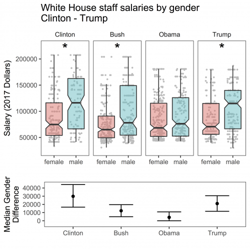
Both the wide and the narrow median pay gaps are bipartisan. While the Clinton and the early Trump administrations have the widest gaps in median earnings, the George W. Bush and Obama administrations were the closest to gender parity (the gap was not statistically significant in the Obama years).
Of course, these gaps mean different things in different administrations. The parity among Bush staffers looks like it came from pay cuts on both sides, with more men remaining in a higher salary range, while the Obama administration had a much more even distribution across men and women. Part of the pattern for the Trump administration could be due to understaffing in general.
Nevertheless, it is interesting to see how the salary distribution for women staffers has remained relatively consistent and lower than fluctuating salaries for men. Sociologists know that inequality can be embedded in the day-to-day operations of institutions like schools, prisons, and government offices. Bias certainly can and does play a role in this process, but the ideological support that we often associate with such biases—like political preferences—doesn’t always have to be the deciding factor for whether inequality happens.
Some background on the analysis from fencelizard:
Evan Stewart is an assistant professor of sociology at University of Massachusetts Boston. You can follow his work at his website, or on BlueSky.Salary data was sourced from white house press releases for Trump (PDF tables; FML) and Obama (UTF-8 csv’s; thanks Obama), and from the Washington Post for Bush (http://www.washingtonpost.com/wp-srv/politics/administration/whbriefing/2004stafflistb.html) and Clinton (https://www.washingtonpost.com/archive/politics/1993/11/01/salaries-at-clintons-white-house/9c96f5b6-02c5-4888-87ee-dc547d8d93f0/?utm_term=.aa70a4af1649). Supposedly full salary data for Bush I exists too, but I couldn’t find it anywhere online.
I cleaned up the data in R, used the ‘gender’ package to guess staffers’ gender from their first names, and made the plots with ggplot2 and gridExtra. I used a Wilcox test to compare the distribution of salaries across genders for each president. Asterisks in the figure above indicate significantly different distributions.
Comments 2
Anittah/Digital — October 13, 2017
I wonder how those gaps compare to gap norms everywhere else in the States during each administration.
constantlyhopeful — April 25, 2022
While the Clinton and early Trump administrations had the greatest disparities in median wages, the George W. Bush and Barack Obama administrations were the most near to play tic tac toe parity in median incomes (the gap was not statistically significant in the Obama years).