In this series I have offered five explanations of why people of color are included in advertising. Start with the first in the series and follow the links to the remaining four here.

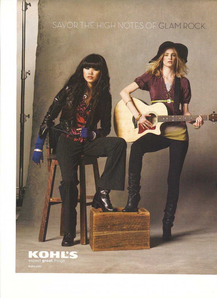
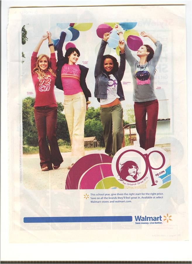
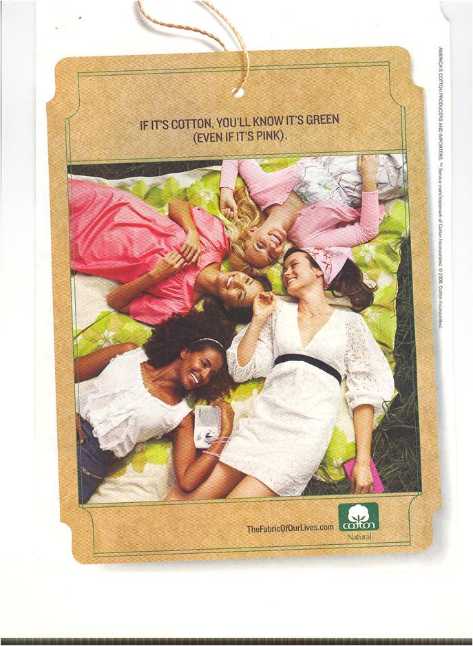
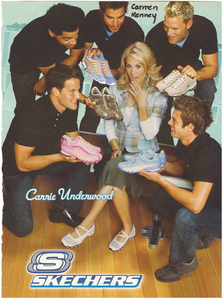
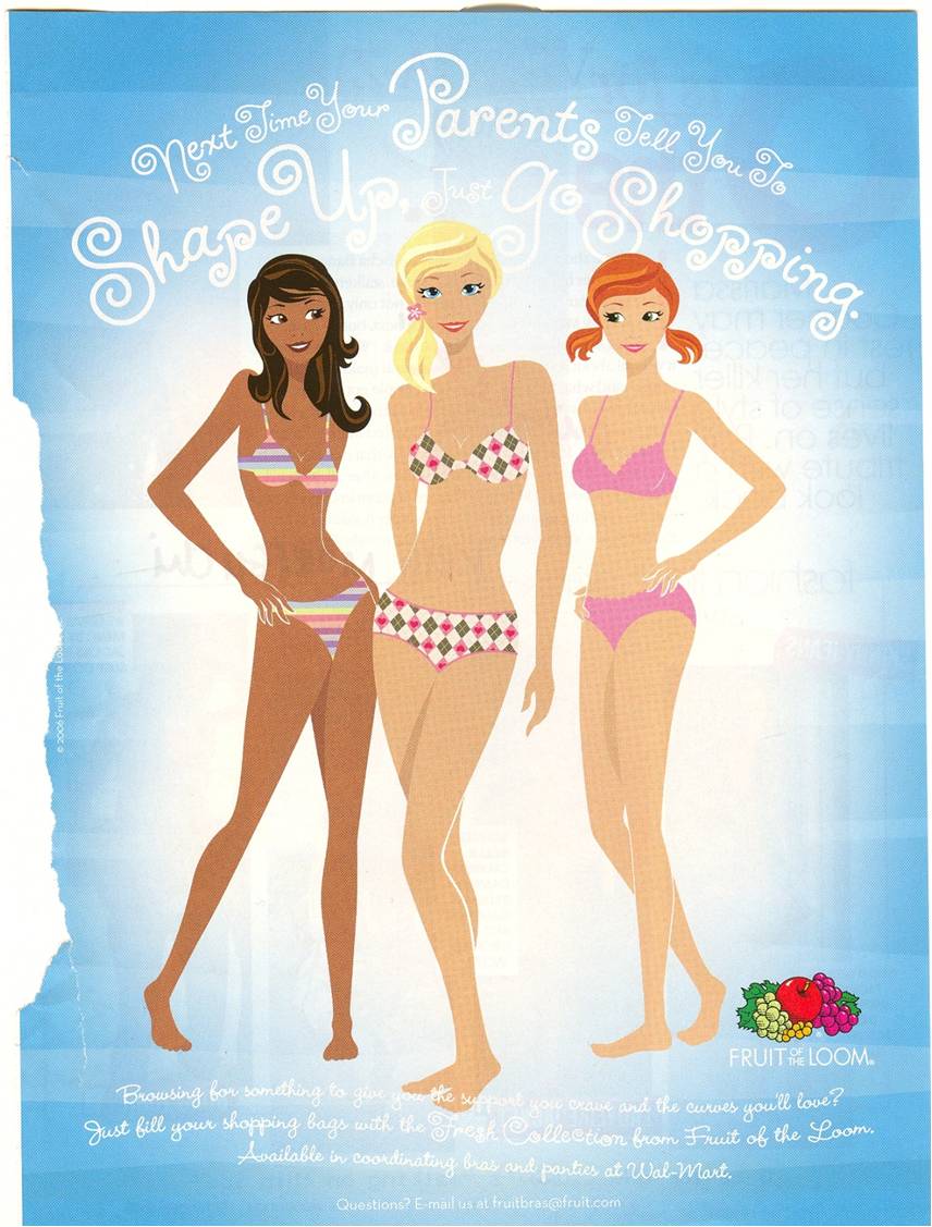
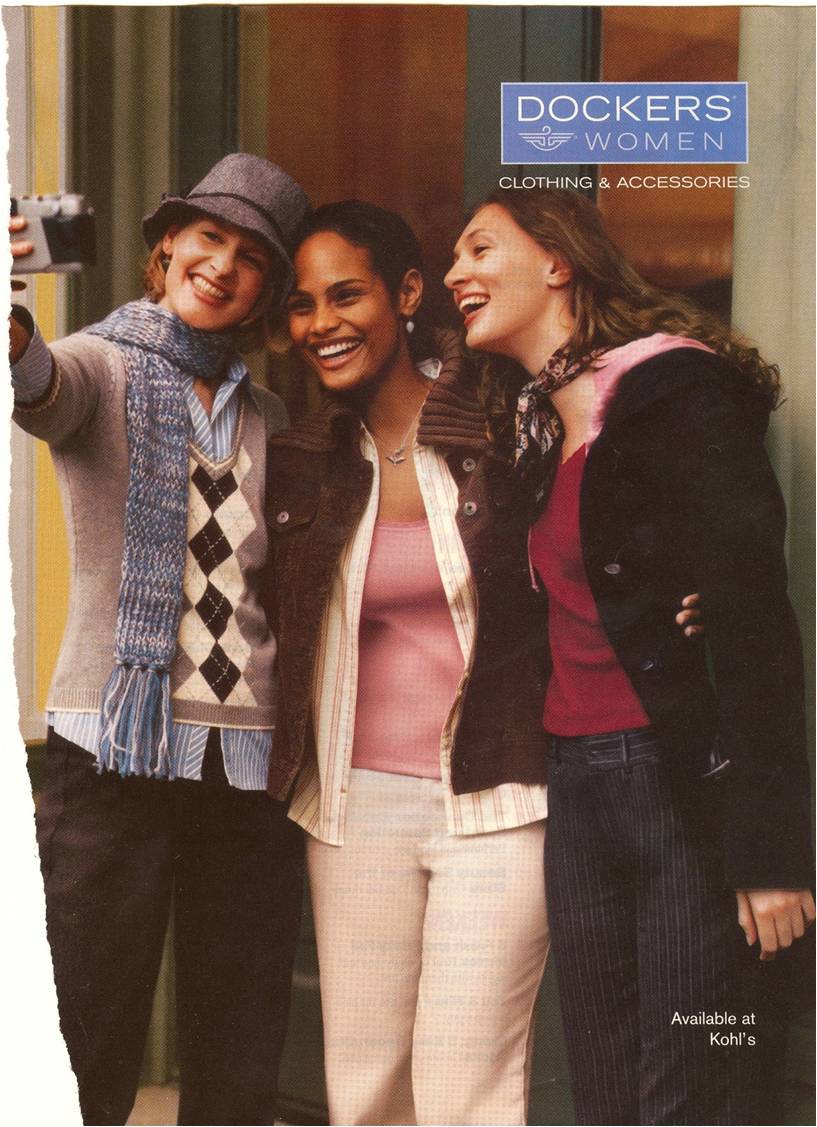
I am now discussing how they are included.  Already I have shown how people of color are whitewashed. Here I show that, when people of color are included, they are often chaperoned. That is, people of color are usually outnumbered by white people. Here are some examples:


NEW!  This is a two-page ad for Kohls:

03-02103-022

I speculate that, if there are more white people than people of color in an advertisement, the inclusion of a non-white person does not threaten the status quo (that whiteness is mainstream and normative) and the product is still clearly marked as mainstream and normative (i.e, white).

Next up: Subordination.

Also in this series:
(1) Including people of color so as to associate the product with the racial stereotype.
(2) Including people of color to invoke (literally) the idea of “color” or “flavor.”
(3) To suggest ideas like “hipness,” “modernity,” and “progress.”
(4) To trigger the idea of human diversity.
(5) To suggest that the company cares about diversity.

How are they included?
(6) They are “white-washed.”

Lisa Wade, PhD is an Associate Professor at Tulane University. She is the author of American Hookup, a book about college sexual culture; a textbook about gender; and a forthcoming introductory text: Terrible Magnificent Sociology. You can follow her on Twitter and Instagram.

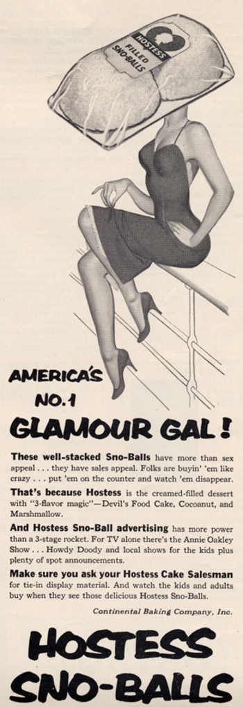
Select text: “These well-stacked Sno-Balls have more than sex appeal… they have sales appeal!”

The 1960s via Found in Mom’s Basement.

More sexualization of food here, herehere, herehere, here, and especially here.

Michael Kimmel argues that, for contemporary Americans, science is a superstition.  Scientific explanations are comforting and often accepted without critical thought.  The word “natural” rolls off our tongue and frequently gets conflated with “good.”  We are obsessed with finding the biological origins of sexual orientation, gender difference, political proclivities, happiness… everything.  Once a biological basis is found, it is considered the whole explanation.  It is as if biology is more fundamental and more true than things like culture or society. 

Our “faith” in science, then, is useful to marketers insofar as they can claim that their product is objectively tested, engineered, or otherwise scientifically sound.  This brings me to this Marquardt Beauty Analysis website, sent in by Kiran D.  The website explains the science behind beauty.  The main page includes a woman’s face overlaid with complex geometric shapes:
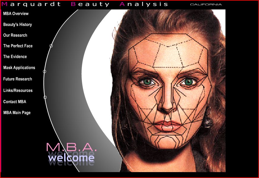

Here is part of the mission statement (emphasis mine):

MBA is dedicated to proactively researching human visual aesthetics, including its biological and mathematical bases, and to utilizing the results of that research to develop and provide information and technology with which to analyze and positively modify (i.e. improve) human visual attractiveness.

MBA further is dedicated to tailoring and formatting this technology to specific uses for direct applications in the fields where human attractivenss is a factor or parameter (i.e. those fields interested in human visual attractiveness) including medicine, dentistry, psychology, anthropology, biology, anthropometry, the arts, cosmetic makeup, and fashion, as well as for direct use by the individual consumer.

Notice how they use scientific buzzwords like “bases,” “formatting,” “applications,” and “parameter.”

Here is a screenshot showing how they have tried to “scientize” beauty and make their endeavor look like legitimate science:


On the page below they claim that their formula works across history (elsewhere they also claim it works across race), so they argue that their science is objective and not culturally or historically contingent:
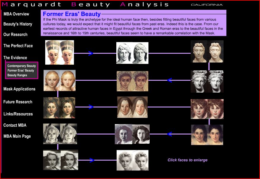
The website, of course, is not really about research on beauty; it’s a mechanism with which to sell make-up, cosmetic surgery, and other products.  Here is a screenshot of the first part of the links page:
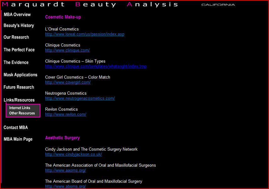
The page includes links to L’Oreal, Clinique, Cover Girl, Neutrogena, and Revlon; five “aesthetic surgery” links; three “aesthetic dentistry” links; and a handful of academic-y sounding links.

Thanks Kiran!

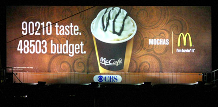
Chelsea C. brought our attention to this billboard for McDonald’s coffee or McCafe:

90210 is the zip code for Beverly Hills, a notoriously rich neighborhood in California. And, Chelsea explains, 48503 is a zip code in Flint, Michigan.

The ad is interesting to me because of the double meaning of taste (hello Bourdieu!). Taste refers to how things taste on your tongue (literally the taste of the coffee), but it also refers to who has good versus bad taste (people with good taste are “high class” and they like things like classical music and caviar). The idea that this ad is capitalizing (pun intended!) on both meanings of the word taste is supported by the use of the term “cafe” in “McCafe” and the portrayal of a fancy coffee drink (“Mochas”).

So the ad is saying that, even if you live in Flint and don’t have the economic resources of someone who lives in Beverly Hills, you can have the taste of expensive coffee because, of course, expensive coffee is to your taste.

There is something interesting here that ties into our consumer culture and wide range of advertising, television programming, and Paris Hilton-watching that encourages us to aspire to be just like the rich. This means buying expensive things that you can’t really afford and/or valuing things that mark you as a high class person with good taste (such as Mochas from McCafe, if that’s the best you can do). There is no questioning as to whether it’s a good idea for everyone to aspire to such heights, whether there is something problematic in the disparity between 90210 and 48503, or even whether it’s true that the rich have better “taste.” So, ultimately, the hierarchy goes unchallenged while we all just jocky for position.

This reminds me of the moment in the Sex and the City movie when Carrie realizes that her assistant, Louise, rents super-expensive purses even though she is too poor to buy them.  Carrie is impressed by Louise’s “taste” and her dedication to having “the best” things even if they are completely inessential and renting them only exacerbates the fact that she doesn’t have oodles of cash.

So, yeah, I think this billboard plays into that.

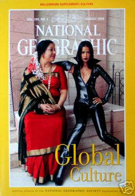
Parameswaran (2002) writes:

The [National] Geographic’s August 1999 cover dramatically deploys women’s bodies as detailed blueprints, maps that busy readers could use to instantly trace the passage of non-Western cultures from tradition to global modernity…

More of her description of this cover after the image (found here):


An older middle-aged Indian woman, with streams of white and orange flowers pinned to her hair at the base of her neck, symbolizes tradition. The deep red silk sari with a gold border, the gold necklaces around her neck, and the thick gold bangles on her wrists clearly mark her as a traditional upper-class woman… The older Indian woman’s body and posture also announce her alignment with tradition. She is heavyset, almost stocky, and her sari demurely covers her large breasts. Her feet are placed moderately close together and her folded hands rest in her lap. Avoiding the direct eye of the camera, her face, with the trademark dot of the Hindu tradition etched between her eyes, is turned sideways as she bestows a tender maternal gaze on the young woman sitting beside her…

In contrast to the gentle passivity and the slack middle-aged body that index tradition, bold assertiveness, feminine youthfulness, and an androgynous firm body register cosmopolitan modernity in the cover of image. These biological and emotional transformations in the modern, non-Western woman’s physical appearance and personal demeanor appear to be wrought by Westernization. The young, slender Indian woman sitting next to the middle-aged woman has short, shoulder length hair framing her face. The marked absence of the dot on her forehead as well as her clothing, instantly herald her identity as a modern woman. She is dressed in a black, shiny PVC catsuit, unzipped down to the middle of her chest to display her small, almost flat breasts, while her feel are encased in sharply pointed black boots. Disdaining the gaze of the older woman directed towards her, she defiantly stares at the camera and claims her personal space with arrogant confidence. Her legs and felt, unlike the older woman’s feet, are splayed wide apart and her knees point in opposite directions. Her left arm is poised akimbo style while her left palm grips her hip in a strong masculine gesture.

In the magazines sharply polarized, binary rendering of the “new and hip” as radically different from the “old and outmoded,” one woman symbolizes ethnic tradition and the other global modernity…

Citation:  Parameswaran, Radhika. 2002. Local Culture in Global Media: Excavating Colonial and Material Discourses in National Geographic. Community Theory 12, 3: 287-315.

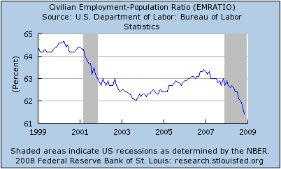
If there are any method-heads out there who want to tell me this isn’t as bad as it looks, I’m ready to listen.

Actually, I just thought of one.  The line looks like it drops to the bottom, but the scale starts at 61 and ends at 65.  Even still… method-heads?

(Found here, via Alas!)

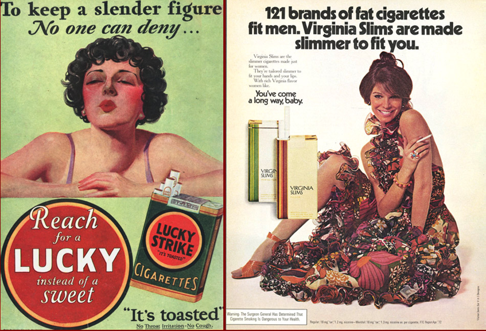
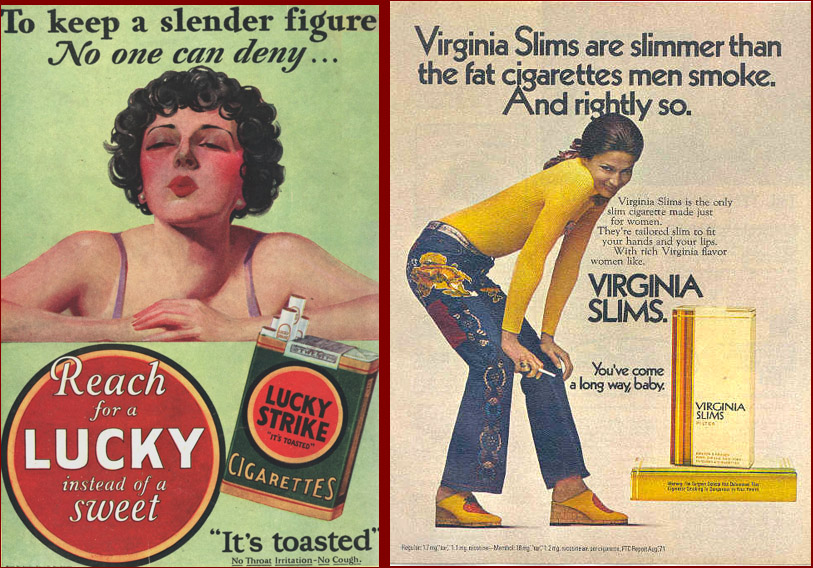
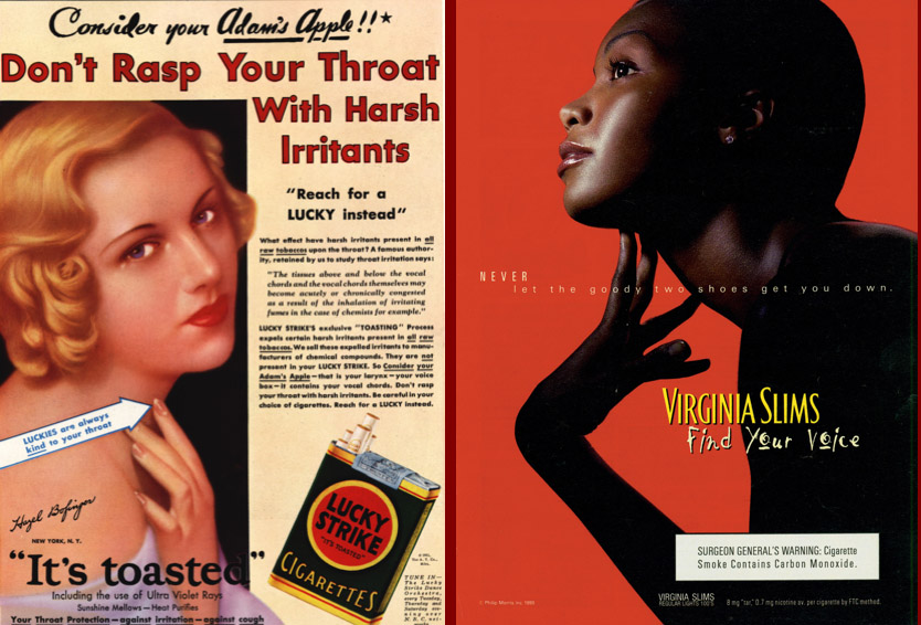
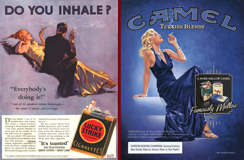
This archive of cigarette commericals, sent in by Kay W., makes some interesting comparisons of vintage and contemporary cigarette ads.

First, they compare vintage ads that try to sell cigarettes by pointing to the fact that they suppress your appetite with contemporary-ish Virginia Slims ads which seem to suggest so indirectly.

Second, they compare vintage advertisements that argue that some brands are smooth and good for your voice with the contemporary “Find Your Voice” campaign:

Third, this set of ads nicely shows how the association of glamour with cigarette smoking has transcended history: