A while back, Lisa drew on work by Ashley Mears to post about different preferred aesthetics in editorial vs. commercial modeling — that is, modeling for fashion magazines and runways as opposed to modeling clothing in catalogs and other venues specifically meant to lead to sales of products. Mears (whose forthcoming book, Pricing Beauty: Value in the Fashion Modeling World I eagerly await) points out that while models earn more prestige doing editorial work, they generally earn significantly more money if they can get commercial jobs (though, since the two types of modeling require different looks, models have little control over which type of modeling they’ll be considered for).

Jezebel posted an article about a lawsuit brought by three models against the modeling agency Next that clearly shows the low compensation models receive for doing some of the most prestigious modeling. This statement of model Anna Jagodzinska’s account (including payments that are still outstanding as well as deductions from her account for agency fees and services) with Next includes both editorial work (the second two items are her pay for a day of shooting with two different versions of Vogue) and commercial work (J. Crew, H&M, and large sums from agencies that put together advertising materials, such as Laird and Partners). The pay for a day’s shoot for French Vogue? $125. For the U.S. version of Vogue, the dominant fashion magazine, it’s $250:

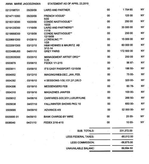
The daily pay rates for catalogs, by contrast, are in the thousands.

It’s a perfect example of Mears’s argument that models often face a situation where prestigious jobs actually pay very little; so many models want to be in Vogue that the magazine doesn’t have to pay much, and the same is true for a lot of editorial work. Also notice that this statement, from April 2010, shows that the French Vogue has owed the $125 daily fee since May of 2009, and one of Vogue‘s payments has been due since October 2009 and another since December 2009. The end result is that in return for the status that comes with these types of editorial modeling jobs, models have to accept low pay compared to the commercial market, and may have to wait a long time to get even that.

The Jezebel article I linked to above includes an excellent explanation of the various charges on the account statement and the reason modeling agencies don’t aggressively pursue overdue accounts. Notice how it says “unavailable balance” at the bottom of the statement? That means the clients haven’t paid the modeling agency, so she has that much coming but hasn’t actually been paid yet, since the agencies treat the models like independent contractors and only pay them when the agency gets the money from the client.

Alex W. sent in a 1972 ad for Weyenberg Massagic shoes (a version of which was reprinted in Ms. magazine in 1974, after appearing in Playboy). The ad uses subtle imagery and text to imply that if men buy the right footwear, women will be so entranced that they will remain in their natural habitat, the floor (more specifically, as reader Jamie points out, at your feet), just for the chance to gaze at the beautiful product:

To provide a little context to the current discussion about extending the Bush-era tax cuts, the New York Times has an interesting graph up that shows changes in the level at which the top tax bracket kicked in, as well as the % tax rate in the top bracket:

So on the one hand, in constant dollars, you used to have to be quite a bit richer before you hit the top marginal tax bracket, because we had a wider range of brackets and differentiated incomes more than we do now (taxing an income of $500,000 differently than one of $5 million, whereas now we’ve basically collapsed all those brackets). But now, the highest income tax rate is well under half of what it was in the ’50s.

This chart shows the incomes and tax levels of the 10 Americans with the highest salaries (as opposed to wealth from investments, capital gains, etc.) in 1941, data we have because in 1943 President Roosevelt asked for a report on top earners:

I keep hearing news organizations discuss the existing tax cuts, and their possible extension, in a way that seems a bit confusing, by saying it’s a tax cut for people making “up to” $250,000, or $500,000, or however much the cap is for the different plans being thrown around. That seems to imply that, say, everyone making $250,000 or less gets a tax cut, and anyone making $250,001 gets nothing at all. Just to clarify, under all these plans, everyone would receive (or, more accurately, keep the existing) cut on their first $250,000 (or whatever the chosen cutoff would be).

At issue is whether that same tax rate should apply to all income, or whether beyond a chosen cutoff, the Bush tax cuts would expire. In that case, if you made $300,000, say, you would keep the tax cuts on your first $250,000 in income (and thus pay roughly 35% in taxes), but pay a higher rate on that last $50,000 (about 39%). You wouldn’t pay the higher tax rate on your entire income. And I think that’s getting lost a bit in the use of phrases like “middle class tax cuts” or “tax cuts up to X dollars.” That’s separate from whether or not you think extending the tax cuts are a good idea, but I just wanted to take a second to clarify what I think is an easily misunderstood point, made worse by the way it’s being reported on.

Abi, a professor of Materials Engineering at the Indian Institute of Science, pointed out an interesting graph posted by Ezra Klein at the Washington Post. The graph, using data from a survey of public opinion about the U.S. budget, shows how much of the U.S. budget respondents believe goes to foreign aid, how much they think should go to foreign aid…and how much actually does:

The actual figure? 0.6% in 2009.

Abby Kinchy, Assistant Professor at Rensselaer Polytechnic Institute, Richard M., and Alana B., who blogs at Pecan Pie, sent us a link to a post by Maya at Feministing about an anti-domestic violence PSA from South Africa. The group that created the ad, People Opposing Women Abuse, set up an experiment of sorts. A man first played drums loudly in his townhouse, quickly leading to multiple complaints by neighbors about the noise and a written warning. On a different night, the group loudly played a tape of what sounded like a violent dispute between a man and a woman.  The reaction? Watch:

Aside from the obviously horrifying implications about domestic violence, I think it’s an interesting illustration of what people feel comfortable intervening or complaining about. As Maya points out in the original post, we all  like to think we would immediately be at the door or on the phone with police, but many of us have, at one point or another, encountered a situation where we didn’t know whether to intervene or not:

…I once sat in a subway station in Manhattan late at night and watched a man try to get a sobbing, drunk woman to leave with him. I hesitated, not sure what to do. A few minutes later the police arrived; someone had acted, but it wasn’t me. Just last week, I saw a man aggressively slap a woman’s butt as she walked past in my neighborhood. I looked the other way, and she didn’t say anything either. I ignore sexual harassment—directed at me or others—pretty much every day.

I suspect what is going on here is a mixture of factors: that we put violence between partners into a different, less serious category than, say, a fist-fight between strangers at a bar, an unwillingness to intervene in what many think of as a private family matter, and fear about our own safety if we get involved or call authorities, among others.

For a thorough discussion of the so-called “bystander effect,” and the complex reasons people may not report behavior they find inappropriate, check out this article (free of charge) from the Journal of the International Ombudsmen Association.

Brian McCabe put up a post at Five Thirty Eight about changes in public attitudes toward letting gays and lesbians serve in the U.S. military, using data from ABC/Washington Post polls that asked whether gays and lesbians should be able to serve and whether they should be allowed to serve while openly disclosing their sexual orientation.

The red line below indicates those who said gays and lesbians who are open about their sexual orientation should be allowed to serve. The blue line indicates responses for those who agreed that gays and lesbians should be able to serve if they didn’t disclose their sexual orientation — a position that basically aligns with the military’s current Don’t Ask, Don’t Tell policy.

When DADT was passed in 1993, less than half of those surveyed thought gays and lesbians should be able to openly serve, though over 60% supported allowing them to serve as long as they didn’t disclose their sexual orientation. But notice the dramatic changes in the last 17 years:

Support among the general public for allowing gays and lesbians to serve in the military, without any restrictions, has increased greatly. In 2008, 75% of respondents supported such a policy. Also notice the gap between the two options has narrowed. In the 1990s, a significant portion of the population was comfortable with gays and lesbians in the military only under a DADT-type situation, where anyone who wasn’t straight had to keep quiet about it. Today the overwhelming majority of respondents support a non-restrictive policy, and the additional support gained by adding the possibility of requiring gays and lesbians to hide their sexual orientation isn’t nearly as large as it used to be.

Whether Congress will repeal DADT is still unclear. But the trend among the general public is pretty clear, from this and other polls: Americans no longer need the reassurance of a policy that promises to restrict gays’ and lesbians’ sexuality in order to support their military service.

Kelsey C., a master’s student at the University of Colorado-Boulder, sent in this image from Calculated Risk showing the percent of jobs lost in each recession since 1948, relative to the peak of the pre-recession job market. In terms of the percent of jobs lost, the current recession is by far the worst we’ve seen since World War II:

The Bureau of Labor Statistics has a detailed report on employment (or the lack thereof) as of October 2010 available — including information on length of unemployment, numbers working part-time because they can’t find full-time work, labor force participation broken down by race/ethnicity, sex, and educational attainment, Veteran status, disability status, and more!

Prolific sender-inner Dmitriy T.M. sent in a link to a story at Slate showing increases in rates of U.S. adults of diabetes between 2004 and 2008, as well as the distinct regional variations. You can look at maps individually or watch a time-lapse slide show.

Percent of adults diagnosed with diabetes in 2004:

2008:

The change is pretty dramatic for such a short time period. I presume differences in poverty rates, access to health care, and nutritional differences all play a part. Any demographers or public health scholars out there with insights?

The CDCP has the data available for download, and you can play around with different maps (# of adults instead of % and so on).

UPDATE: Reader Arielle says,

Please clarify the type of diabetes this graph is discussing (I assume it’s Type 2). As it stands, you’re perpetuating two myths: one, that all types of diabetes are affected by “poverty rates, access to health care, and nutritional differences” (Type 1 is an autoimmune disease and has nothing to do with lifestyle), and two, that only children are diagnosed with (or have) Type 1 diabetes.

Here’s a problem: neither the CDCP nor the Salon Slate article specify. They say “adult diabetes,” meaning individuals over the age of 18 who are diagnosed with diabetes (so not necessarily adult onset diabetes). I think that would mean either Type 1 or Type 2. But I’d take the data with a little caution since the source doesn’t make that absolutely clear.

UPDATE 2: Chris points out an important element of what might be going on here:

More significantly one of the comments on Slate (not Salon) said that the diagnostic standard for diabetes recently dropped from 140 to 124.  That’s going to add a LOT of people to the second map if the transition occurred between 2004 and 2008.

That would make a lot of sense, because quite honestly, I just couldn’t figure out how the overall numbers had increased so rapidly in just 4 years. This is a great example of the social construction of health and disease: we are constantly defining and redefining what does and doesn’t count as unhealthy, which can dramatically affect statistics on the topic without there necessarily being a large change in the overall state of the population.