Emma M.H. sent us a commercial for Cougar Life, a dating site that promotes itself as a place to meet older (but still sexy!) women interested in dating younger men. Despite the name, the site actually welcomes women of all ages. When you go to the website, you specify whether you’re looking for a “cub” (women aged 18-35) or a “cougar” (aged 35-65). Similarly, Emma was struck by how young the women in the ad look:

So though the company brands itself as a site about cougars — which would imply an emphasis on middle-aged and older women — here it markets itself almost entirely with women who would fall into no more than into the “cub” category or the very lowest end of 35-65 age range that defines cougars on the site, while the song declares they’re “all cougars.” It’s possible the company thought that women who look older than 40 would be unacceptable even to potential customers of a dating website specifically promising the ability to meet such women. But it also seems like the term “cougar” is being used to apply to a wider array of women than when it first entered pop culture — not just older women who date younger men, but practically any woman past her early 20s who has a voracious sexual appetite. Cougar Life draws on this, assuring us it was recently voted the “wildest dating service in America.” The defining feature may be less age than the idea that a woman is not just sexually available, but almost predatory in her search for sex — that is, that she seeks sex in a way we generally find acceptable only for men.

UPDATE: Reader Anna caught a mistake I made. The “cub” category was for the men seeking women on the site, not for younger women. She explains,

If you look at the site carefully, the “cubs” category means men the ages of 18-35, not women of these ages. Choose “looking for a cub” and the pictures are all male, and that term is often used for the younger male partner of an older women. The only women “available” on the site are 36 years old and over, so the site in effect bans both middle aged men and young-ish women from participating.

Thanks, Anna!

A year ago we posted a photo of a children’s t-shirt, found at Goodwill, that claimed the wearer is “Too pretty to do math.” We were relieved to know the shirt had been destroyed, in the interests of children and appreciators of the fine field of mathematics.

But sadly, Ingrid P. informs us that a magnet with the same slogan is now for sale at youth-oriented clothing store Forever 21:

So the message to girls is that, first, math is something to be avoided if possible; only girls who aren’t pretty enough to get out of it would bother to take it seriously. And, second, being attractive should get you out of doing things you might find difficult or unpleasant.

There do not appear to be “I’m too handsome to do math” or, say, “I’m too pretty to do English literature” versions, because the magnet relies on two notions that preclude those options: that girls, specifically, either can’t or don’t want to master difficult academic subjects, and that math is inherently, and almost uniquely, difficult to learn — a cultural trope my friends who teach math often find exasperating, as it means they have to battle years of socialization that teaches students to be intimidated and convinced they’re likely to fail before they even start.

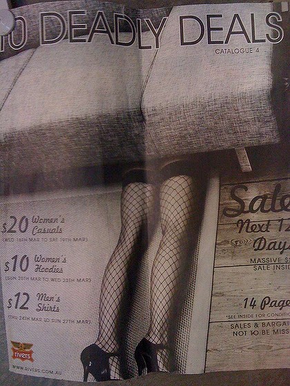
Kelebek and Laurie L. both let us know about a recent example of the use of images of dead or brutalized women in fashion advertising. A recent catalog, titled “Deadly Deals,” from the Australian clothing chain Rivers, included this image (via The Age):

And way back in July of last year, Caroline submitted an article from Amazing Women Rock about an ad for Beymen Blender, an upscale clothing boutique in Istanbul. The ad shows a woman’s dismembered body hanging from meat hooks; it and the rest of the photos below may be triggering for those sensitive to images of violence toward people, so I’m putting it after the jump.

However, Dmitriy T.M., Melissa F., and Noelle S. found an example from the October 2010 issue of Interview magazine that inverts the usual gender pattern by showing a woman with brutalized men. The photo shoot was apparently supposed to evoke the types of torture and murder used by organized crime in Russia.

In this case, Naomi Campbell is shown in positions of dominance over an extremely pale-skinned, and clearly badly injured, man. So those images reverse not just the usual gender dynamic in images of violence and brutality in fashion photos, but also the frequent pattern of seeing naked or partially-naked Black bodies displayed as props around more fully-clothed White bodies (though Campbell is certainly scantily clad and sexualized). I suppose you could see this as undermining or commenting on the images we often see of violence toward women in fashion. Yet we could also argue that it does so by reinforcing the association of Blackness, in particular, with violence and aggression. And the photo shoot includes the same sexualization of violence seen so often in the fashion industry.

Thoughts?

Gwen Sharp is an associate professor of sociology at Nevada State College. You can follow her on Twitter at @gwensharpnv.

Cross-posted at Jezebel.

Way back in September of last year, Baxter sent us this Star Trek promotional poster, which showed the main cast staring straight out at the viewer, with the exception of the one female character, who was turned to the side, glancing sideways at the viewer with her mouth slightly open:

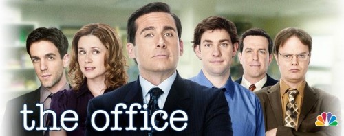
We didn’t get around to posting about it at the time, but I thought of it when I saw the image from the Hulu site for the U.S. version of The Office, sent in by Jessica F. Similarly to the Star Trek poster, all of the male characters are looking straight out at the viewer, mouths closed, while the one female character has her head turned to the side, mouth slightly open; in this case, she’s looking at one of the male characters, not the viewer:

In both these posters, the men meet the viewer head-on, if you will.  Their bodies are aimed straight at the viewer, they make eye contact, and that contact is confident. In contrast, the women avert themselves.  Their body language is less self-assured.  The woman in the Star Trek poster is alluring, a passive sexiness; the woman in the Office poster is referential, using her eyes to draw attention to the show’s star.

After initially posting those, I asked for more examples and readers sent them in. Jessica T. pointed out this banner ad for Thor:

She also found an ad for the TV show Bones, which has the women smiling at the camera much more openly (well, except for Bones):

d

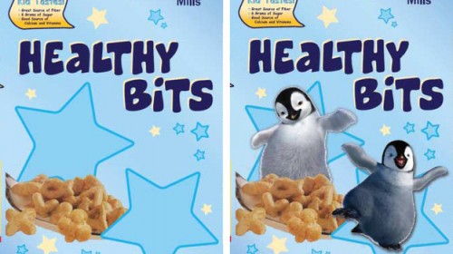
Bryan L. sent us a link to an NPR story about the effects of using cartoon characters to market food to kids. The study, conducted by researchers at Yale University’s Rudd Center for Food Policy and Obesity, had 80 children between the ages of 4 and 6 eat what they were told was a “new” cereal. The cereal was either called Sugar Bits or Healthy Bits, and in each case, half of the boxes included cartoon penguins and half didn’t. Here’s are the two options for Healthy Bits:

Kids were  then asked to rate the taste of the cereal, using a 5-point smiley face scale. Interestingly, kids rated the taste of Healthy Bits more highly than that of Sugar Bits (overall mean rating of 4.65 vs. 4.22). Less surprisingly, the presence of a cartoon character on the box led kids to think the cereal taste better (overall mean rating of 4.70 with a character, vs. 4.16 without).

You can read an overview of the article, “Influence of Licensed Spokescharacters and Health Cues on Children’s Ratings of Cereal Taste, which was published in the Archives of Pediatrics & Adolescent Medicine.

So it appears that kids are getting some of the message about nutrition and healthy eating, and that describing something as having lots of sugar leads them to evaluate it more negatively than they might have otherwise. (I couldn’t help but wonder if there might be a contrast effect, also. Maybe kids expect something  called Healthy Bits to be really gross and, if it doesn’t, evaluate it more positively than they would have, while they expect Sugar Bits to be super awesome and rate it particularly harshly if it doesn’t live up to their hopes. I know that type of comparative priming effect occurs with adults, where our initial expectations influence our later subjective assessment, but I have no idea to what degree that occurs with kids. Anybody know enough about childhood development to comment?)

However, cartoon characters have a strong influence on how kids evaluate the taste of cereal, enough to override their nutritional concerns. Put a cute penguin on Sugar Bits, and it suddenly tastes as good as a box of Healthy Bits without the penguin. Another study from researchers at the Rudd Center found that kids preferred to eat graham crackers, gummy snacks, and even carrots more if they were in a package with a popular cartoon character.

So the good news here is that kids may be willing to make better eating choices than we often give them credit for, and describing something as “healthy” isn’t the kiss of death we might expect. But the use of cartoon characters, such as tie-ins from TV shows and movies, is a powerful form of marketing. If such characters — especially, I assume, highly recognizable and popular ones — appear more often on less healthy options, they undermine efforts to guide children to develop healthy eating habits.

UPDATE: Reader qwirkle was able to get a copy of the entire article, which does make clear that the kids rating Sugar Bits lower than Healthy Bits wasn’t just an “expectations effect”:

Another explanation for the difference in children’s assessments of the cereal involves their expectations of the cereal taste based on the name. Specifically, the cereal used for this study had only a moderately sweet taste. Consequently, children may have been disappointed by the lack of sugary flavor in the cereal named Sugar Bits and pleasantly surprised by the sugary flavor in the cereal named Healthy Bits. At 6 g of sugar per serving, however, the sugar content was comparable to that of other commonly available sweet cereals (eg, 6 g in Honey Kix and 9 g in Honey Nut Cheerios). Nevertheless, whether the children were reacting to their expectations of the cereal’s taste or expressing their skepticism of the merits of sugary products, when the character was present on the box, children reported a more favorable subjective experience with the product.”

M.H. thought we might like to get to post about the sexualization of food again, so she sent us a link to a post at Redbook that is one of the more bizarre and blatant examples I’ve seen in a while. The article, titled “Blow Him Away in Bed: Oral Sex Tips” (an excerpt from Redbook’s 500 Sex Tips), is illustrated with various foods.

Here’s an example of one of their helpful hints:

Other tips are illustrated with images of a pickle, popsicle, mushroom, banana, a baguette, and a butternut squash, among others.

I cannot help but feel that if you write something that requires you to type “keywords: squash, tomato, vegetable, phallic, fellatio, oral sex, blow job, penis,” you may want to reconsider the topic, but that’s just me.

UPDATE: Readers are correctly pointing out that this example differs significantly from most of our other examples of sexualization of food by not being degrading in the way many of the others were. I think this is more just a curious example of the wide array of foods we sexualize, as well as how silly a lot of sex tips in women’s magazines are.

Gwen Sharp is an associate professor of sociology at Nevada State College. You can follow her on Twitter at @gwensharpnv.

I suspect most Soc Images readers will, by now, be familiar with the Bechdel Test — the set of criteria for evaluating whether female characters are included in movies in even minimally non-male-centered ways, made popular by Alison Bechdel of Dykes to Watch Out For. To pass, a movie has to have at least two female characters who have at least one conversation with one another about something other than a man. For a quick overview, see our repost of Anita Sarkeesian discussing the Bechdel Test.

Leah B. let us know that there’s a website, Bechdel Test Movie List, entirely devoted to rating movies based on the criteria (with the stipulation that female characters have to actually be named to count). It consists of a list of movies that have been added and rated by readers; there are currently over 2,000 movies produced between 1900 and 2011 rated on the website. This is, obviously, nowhere near a random sample; as you’d expect, it’s highly weighted toward more recent movies, and of course not everyone agrees on the ratings (you can add a symbol to show you disagree and leave a comment on a movie’s rating page).

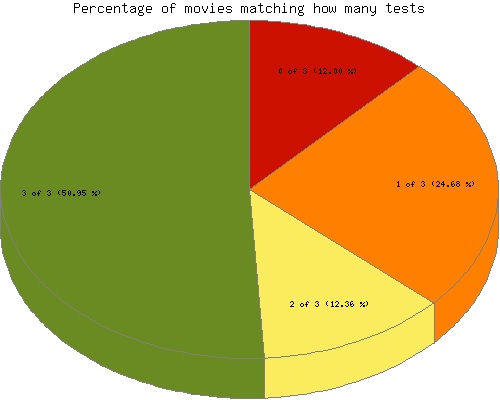
That said, the site includes a stats page that is interesting to look through just for a snapshot of the inclusion of women in these movies. Here’s a breakdown of the entire list; green indicates movies that passed all three tests, yellow passed 2, orange passed 1, and red didn’t pass any of the three:

It’s fun to browse through, for entertainment value and a starting place for thinking about the Bechdel Test and pop culture.

We have posted in the past about the controversy surrounding the casting of the movie The Last Airbender. Many fans of the original series were upset that Asian characters were recast as White, with the main cast initially containing no non-White characters at all. This fits in with a more general lack of Asian main characters in Hollywood.

More recently, a different controversy about race and casting emerged when African American British actor Idris Elba was cast as the Norse god Heimdall in Thor, though this character was always White in the comic book series.

Anthony N. sent in a video by MovieBob at The Escapist that discusses concerns over race in casting Thor and why recasting a White character with a non-White actor doesn’t have the same implications as recasting a non-White character with a White actor does:

,/p>