Bob K. sent in this image of Liquid Virgin Tightening Lubricant (found here):

According to the website,

This product is called a Vaginal Contracting Lubricant. It is Similar to the age-old China Shrink cream. These drops work to temporarily tighten the walls of the vagina. I have never tried it but our sales representative says they work. I didn’t ask how she knew.

This could be used in a discussion of how women’s bodies are perceived, and particularly stereotypes of sexually active women’s bodies. After all, the word “loose” implies that a woman is slutty and therefore her vagina is all, you know, stretched out and stuff. Because that’s totally how that works.
The implication is that sex with such women will be less pleasurable for men than sex with women who have had less sex…such as virgins. You might also want to talk about vaginal rejuvenation surgery as part of this topic.

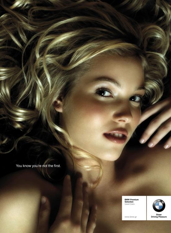
Since we’re on the topic of images of sexually experienced women, Jenelle and Marcello both sent in this ad for BMW used cars (found here):

“You know you’re not the first.”

Here’s an example of another ad (found here) from the Polish used BMW campaign that doesn’t use a woman to sell cars. So apparently it can be done.

Thanks, Bob, Marcello, and Jenelle!

As we’re sure you’ve noticed, one thing we’re really interested in is the social construction of gender and the way the world is divided into things that are ok for men to do and things that are ok for women to do. This dividing of the world by gender includes everything from food (salad vs. steak), pets (cats vs. dogs), and even colors (pink vs. blue). Generally, people are punished for not following these rules, though men are often punished more harshly for crossing into “feminine” or “girly” territory. At the same time, because these rules are socially constructed, they get fiddled with and sometimes people can get away with crossing the gender line–or even make it cool to do so.

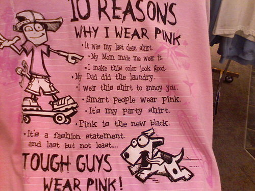
Abby sent in this photo of a t-shirt (found here) similar to one she saw a boy wearing at a school picnic recently. Another boy was also wearing a pink shirt, though without the explanation for why.

Abby says,

I think it is interesting the way the shirt challenges some dominant ideas about gender (pink = smart) while reinforcing others (e.g. men don’t know how to do laundry).

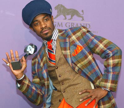
Another example of pink being redefined as an appropriate color for men to wear (other than Don Johnson in the 1980s) is Andre 3000 from Outcast (image found here):

In fact, Andre 3000 was one of several hip-hop stars in the last few years who have clearly cared about fashion and re-popularized what has been described as a “dandy” fashion sense (see next photo, found here). So something that we generally associated with women (caring intensely about fashion) has become an acceptable, or even hip, part of a masculine image.

Here’s Kanye West in pink (found here):

Here is a picture (found here) of the character Chuck Bass from the TV show “Gossip Girl”:

Huh. While looking for other examples for this post I came upon The Charming Dandy, which has the tagline “a feminine eye for every guy.” It gives advice about fashion, manners, decorating, and tips for grooms (I did not previously know the names for shawl, peak, and notch lapels). The things you discover.

Anyway, these pics could be useful for showing how our gender dichotomy (pink = girls, blue = boys) is actually a lot more contradictory, that there is nothing “natural” about associating pink with girls, and that we often change gender rules while failing to acknowledge this has any bigger implications for our entire system of dividing the world by gender.

Thanks to Abby for the image and post title!

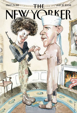
Breck sent in a link to this post about the controversial New Yorker front cover depicting Barack and Michelle Obama as Muslim extremists (I found the full-size image here):

As you may guess, there have been some quite negative reactions to this cartoon. The Obama campaign did not particularly like having him portrayed as an American flag-burning Muslim, oddly enough. And apparently this has gotten wide enough press coverage that even my mom had heard about it and was distressed, and my mom doesn’t follow politics too closely.

I’m kind of fascinated by this entire situation. When I went to Oklahoma last month to visit my family, my uncle informed me that Obama is a Muslim with some secret evil motive for wanting to be president that the rest of us can’t even imagine because we aren’t diabolical enough to think of it. When I pointed out that Obama is not a Muslim, my uncle said he used to be, which is the same thing, and that if Obama really loved America he would change his middle name from Hussein. I gave up on the conversation at that point and returned to pulling ticks off the dog, since that was a lot more pleasant.

What I’m saying is, I have first-hand knowledge of the people out there who honestly believe Obama is some type of Muslim extremist with an evil plot for when he gets into office. Fox News reported on the “fist bump” as a possible terrorist gesture. This distrust of Obama is out there. So this cartoon could spark a really interesting discussion of political humor/satire and the boundaries between “appropriate” and “inappropriate.” I assume–and I’m just assuming here–that this cover was supposed to be a commentary on the fact that some people (and Fox News) are convinced Obama has a connection to Muslims and/or terrorists and, as a result, has evil plans for the future of America. But the cover could also simply reinforce those ideas–I really hope my uncle doesn’t suddenly take up reading and pass by a magazine rack in the near future, because this cover will prove to him that he’s been right all along. So what’s the line between social commentary that points out and/or ridicules issues such as these and just reinforcing the misconceptions or stereotypes that you claim to be undermining?

It could also be used for a discussion of how we read things into images based on our own assumptions. I mean, I have no evidence this cover is supposed to be a commentary (however misguided, dumb, or inappropriate it might be) on misconceptions about Obama; I’m just presuming based on what I know about The New Yorker, its liberal slant, and my recent experience with my uncle. If you showed me the exact same image and told me it came from Fox News, I am certain my reaction would be different because of my assumptions about what Fox News would be trying to say with the image. I can check that tendency to make assumptions about the intention of the creators of an image, and I try to, but I think it’s always good to point out to students that we don’t just passively see an image; our own experiences, assumptions, and so on influence how we interpret them. This is part of the reason that, once an image is put out there, the intention of the creator doesn’t necessarily have much to do with how people interpret or use it.

Thanks, Breck!

On an unrelated note: If you’ve noticed my absence from posting the last few days, I can only say that the first 2 seasons of “Buffy the Vampire Slayer” turned out to be way more compelling than I was expecting and watching them can be quite the time sucker.

Ben O. sent in the video for “Take You There,” by Sean Kingston. Ben said, “The premise of Sean Kingston’s song ‘Take You There’ is that driving through slums is a great idea for a romantic date.”

[youtube]https://www.youtube.com/watch?v=axq1jQTk84w[/youtube]

My original thought, before I watched the video, was that maybe Kingston (who, according to Wikipedia, was born in Miami but mostly raised in Kingston, Jamaica) was trying to humanize the kinds of low-income neighborhoods that non-residents often believe are uniformly terrifying and that anyone who would venture there is going to their certain death. Or, if not that, maybe to show some of the horrid realities of living in economically devastated areas.

Then I watched the video. What struck me is how every resident is portrayed as glowering, threatening, and angry; they’re all the stereotype of the aggressive Angry Black Man.

The other thing that’s interesting is the gender elements. First, here are some of the lyrics:

We can go to the tropics
Sip piña coladas
Shorty I could take you there
Or we can go to the slums
Where killas get hung
Shorty I could take you there
You know I could take ya (I could take ya…)
I could take ya (I could take ya…)
Shorty I could take you there
You know I could take ya (I could take ya…)
I could take ya (I could take ya…)
Shorty I could take you there

Baby girl I know it’s rough but come wit me
We can take a trip to the hood
It’s no problem girl it’s my city
I could take you there
Little kid wit guns only 15
Roamin’ the streets up to no good
When gun shots just watch us, run quickly
I could show you where

As long you’re wit me
Baby you’ll be alright
I’m known in the ghetto
Girl just stay by my side
Or we can leave the slums go to paradise
Babe it’s up to you,
It’s whatever you like

So rather than having any real commentary on slums, the slums become a site to reinforce the idea that women should align with a man to protect them. The slums are just a backdrop for Kingston to impress a hot woman by being able to take her into an exotic world and keep her safe…from all the aggressive, mean Black men they encounter.

Ben continued,

My friend is traveling in Uganda and was reminded of this song when staying in Atiak, site of a gruesome massacre…His comment was: “I thought of Lam, who has dedicated his life to improving this place, to giving his people a future, and finally, of [Sean Kingston], whose highest ambition is to impress girls by taking them on a tour of places like Atiak. What a stupid song.”

Thanks, Ben!

Gwen Sharp is an associate professor of sociology at Nevada State College. You can follow her on Twitter at @gwensharpnv.

Muriel Minnie Mae sent in this video, a cartoon that presents a lot of the “men are like THIS, but women are like THIS!” stereotypes. The “female” is a circle and the “male” is a square (a very common type of imagery–things depicting masculinity are often angular, while those evoking femininity are often round or curvy).

Notice that the woman can’t go on a business trip because she’s (literally) tied to the house. Also, both men and women have the same image of the “ideal partner”–someone who cooks, cleans, and cares for the kids, though of course the man who wants this is a jerk and the woman who wants this is, presumably, dreaming.

At the very end of the video it says “stereotypes?” I don’t know what the intention of the makers of the video is–to parody stereotypes, or if they actually accept them, but it doesn’t really matter, as far as I can tell, because the video is useful either way.

Good for providing a quick, funny overview of lots of stereotypes and the way our gender myths lead us to believe that men and women literally do everything differently. Also, you can pick up a little Italian.

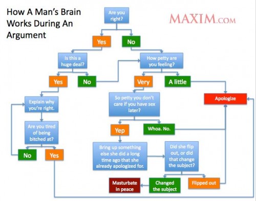
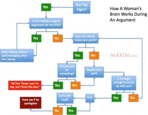
NEW! In an example of the “men and women are totally different!” trope, Rachael H. let us know about Maxim’s helpful flow charts showing how men and women argue:

manbrain

womensbrain

Oh, crazy illogical women and their poor put-upon male partners!

NEW! (May ’10): Juniper, Corina C., and Dana G. sent in another example of this genre, this time videos by members of Harvard’s sailing teams:

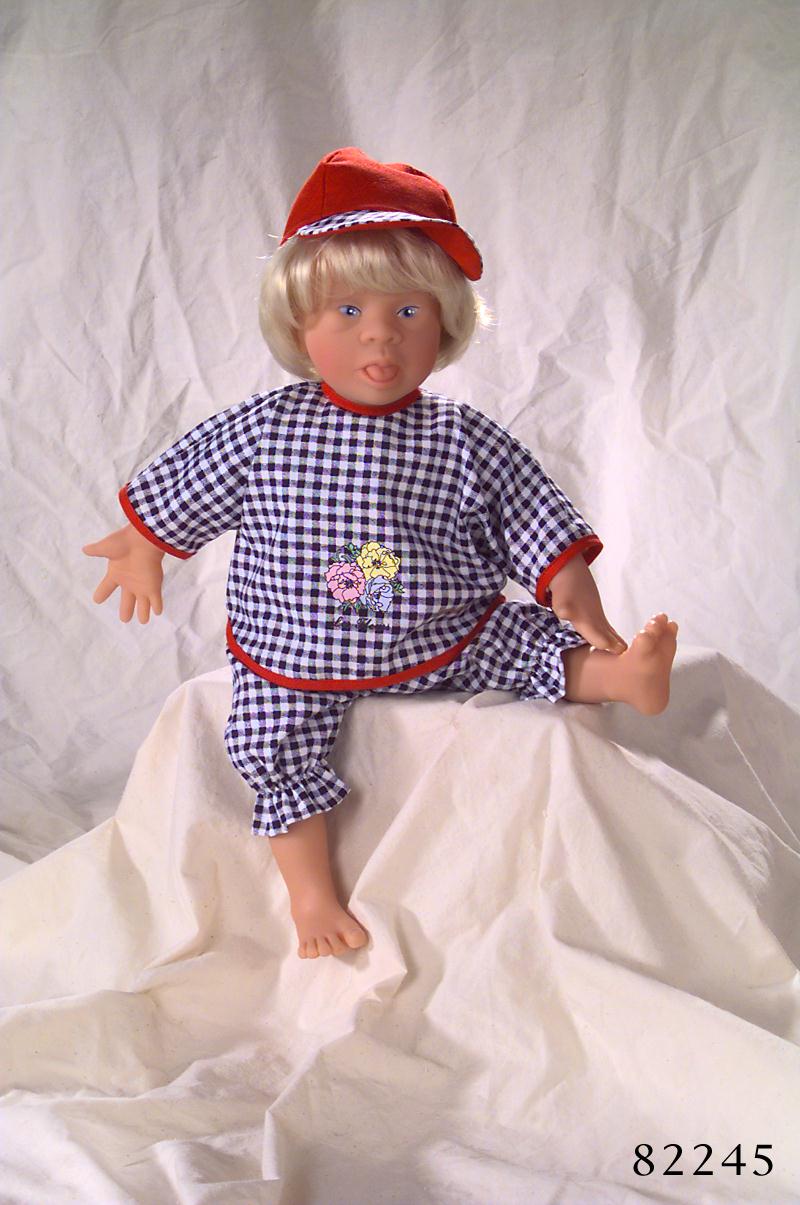
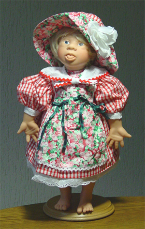
Elizabeth (from Blog of Stench) sent us a link to a story in The Times Online about “disability dolls,” such as these dolls that depict Down’s Syndrome:


Here is a passage from the Times Online article:

Carol Boys, chief executive of the Down’s Syndrome Association in the UK, says: “Anything that helps to ‘normalise’ Down’s syndrome and promote inclusivity has to be a good thing. If the Down’s syndrome dolls give joy to those with the condition and their siblings, we fully support them. However, there is a range of products on the market of varying quality and accuracy, so we would advise people to purchase with care.” Boys adds that it is difficult to know with any certainty what Down’s children generally think of such toys: “We have no idea what they think of such dolls, because there has never been any research done to find out.”

However, some professionals have their reservations. Jenni Smith, a chartered educational psychologist in London, says: “I feel that children who have disabilities, including children with Down’s syndrome, tend to see themselves as ‘like everyone else’ and to offer a toy that ‘looks like them’ may only emphasise the difference.”

There are a lot of issues these images–and the article–might be useful for, most obviously depictions of people with disabilities and arguments about whether they “should” (or “want” to) be shown as “normal” (?). I thought it was fascinating that an opponent of the dolls used this analogy:

“In early research into race stereotypes, in which black children were asked to choose from three dolls – one black, one brown and one white – and say which doll they would be most like, almost all chose the white doll,” Smith says.

The use of that example to argue that kids like to associate themselves with “a positive, generally accepted image,” as she goes on to say, might not be all that comforting to a lot of people.

The other thing that hit me when reading the article is the way adults were discussing whether or not children with Down’s Syndrome would like the dolls…but (as Boys says in the quote above), apparently no one has bothered to just go out and ask some kids with Down’s Syndrome if they like the dolls or to watch and see if, given the option, they actually play with them. Wouldn’t that be more effective and respectful of the children under discussion? In general adults often discuss children as though they would be incapable of providing input or expressing desires, and I wouldn’t be surprised if this tendency is exacerbated when the children have a disability or are otherwise considered “extra sensitive.”

Gwen Sharp is an associate professor of sociology at Nevada State College. You can follow her on Twitter at @gwensharpnv.

I recently came upon these two ads in magazines and noticed how they both evoke old-money wealth and luxury.

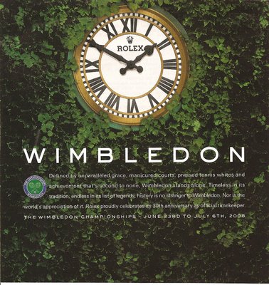
I found this Rolex ad in The New Yorker. Notice the ivy-colored background and the connection to Wimbledon, an event (for a sport) often associated with the upper class.

The text says,

Defined by unparalleled grace, manicured courts, pressed tennis whites and achievement that’s second to none, Wimbledon stands alone. Timeless in its tradition, endless in its list of legends, history is no stranger to Wimbledon. Nor is the world’s appreciation of it. Rolex proudly celebrates its 30th anniversary as official timekeeper.

“Manicured courts” and “pressed tennis whites” bring up images of aristocratic lifestyles, and the ad connects Wimbledon (and, therefore, Rolex) to “tradition” and “history.”

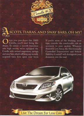
I can’t remember for sure where I found this ad for the Toyota Corolla, but I think in Glamour (don’t ask).

The text, which is clearly to be taken less seriously than the Rolex ad:

Ascots, tiaras, and sway bars, oh my! Once you purchase the 2009 Corolla, you’ll start living the dream. To ensure a smooth transition into high society, we’ve equipped the Corolla with revised suspension, springs, and sway bars, which will keep any recently acquired tiara firm upon your brow. If you’re more of the fetching ascot type, consider the comfortable ride an accessory to your necktie. Whatever flourishes you fancy, the Electronically Controlled Transmission and Vehicle Stability Control will distinguish your dominion over the road. Live the dream for less coin.

I thought it was interesting that the second ad (for a car not generally associated with the upper class) is trying to evoke the idea of luxury, but in a joking wink-wink way, whereas the Rolex ad clearly has no element of parody about it–the connection to “tradition” and “pressed tennis whites” is completely serious.

Ed L. sent us this British ad for McCoys crisps (chips, here in the U.S.), which reinforces gender boundaries. Not only are men not supposed to like (or perform) ballet, but even knowing a small fact about it makes a man so unmasculine that he’s no longer worthy to hang out with other men. Also, at the end we learn they’re “Man Crisps.”


Thanks, Ed!

Also, Rick T. and Penny R. sent in this Snickers ad, which features Mr. T mocking and shooting at an effeminate male speedwalker:

[youtube]https://www.youtube.com/watch?v=OkT_d2OTgv0[/youtube]

According to Mr. T, the speedwalker is “a disgrace to the man race” and “it’s time to run like a real man.” After having Snickers shot at him, the speedwalker does, indeed, run. And then the tagline: “Snickers: Get Some Nuts.”

The A.V. Club reports that the ad was pulled from the air in Britain after complaints that it was homophobic. The A.V. Club article has three other Snickers commercials starring Mr. T, including this one:

Here we learn that “It’s time to teach you fools some basic man rules,” which consist of the following:

Men like sports, girls in cars.
Men don’t go to fancy cocktail bars.
Real men have fun when they out.
They don’t go to wine bars to pose and pout.
So fools, you better change,
or you face is somethin’ I’ll rearrange.

Apparently real men do like poetry, anyway.

This would be good for a discussion of gender and the policing of masculinity, as well as the way that men who cross those boundaries–or even stray near them–risk ridicule or even outright abuse (if they’re lucky, Mr. T might advocate just pitying them, not actually rearranging their faces). It’s also useful for a discussion of what type of man is defined as a “real” man–apparently only men who like sports and girls, don’t drink wine, and know better than to pose. While this clearly excludes gay men, it also excludes many straight men. There’s a certain class element here–presumably “real” men drink beer, not wine, a drink generally more popular among those with higher incomes. All those men–gays, wine-drinkers, and pouters–just need to get some freakin’ nuts.

Thanks, Rick and Penny, for sending it along!

Gwen Sharp is an associate professor of sociology at Nevada State College. You can follow her on Twitter at @gwensharpnv.