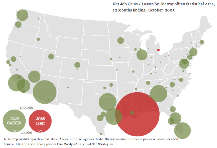
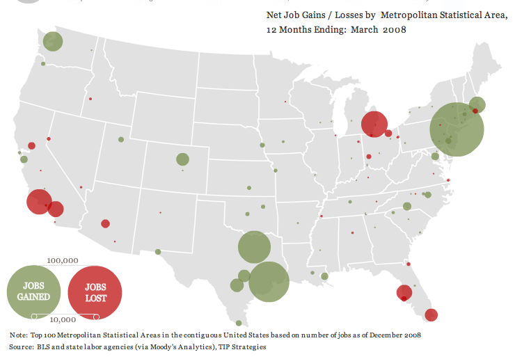
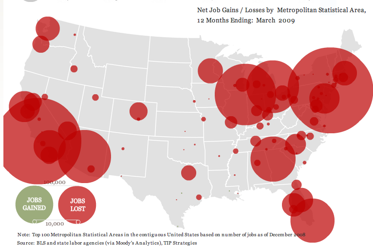
thewhatifgirl let us know about a really interesting interactive website that shows job gains and losses for the 100 largest metropolitan areas in the U.S. from the beginning of 2004 until March 2009, based on Bureau of Labor Statistics data. I took a few screenshots.
Right after Hurricane Katrina:

From April 2006 to March 2007, the economy’s looking good for everybody but beleaguered Detroit:

We start seeing a few more problem areas and a lot less job growth from April 2007 to March 2008:

And then things go really badly. Notice the job loss circle in L.A. is so big that it got cut off on the website, and there’s not a single job growth circle [Note: eagle-eyed commenter Ali points out there are a few teensy job-gain circles, one in Louisiana, one around Austin, TX, and one way down at the tip of Texas along the border, and it’s possible there are some other small ones covered by the red]:

UPDATE: Commenter Miss Prism cautions,
The maps could be straight out of “How to Lie with Statistics”, though. The diameter (rather than the area) of the circles increases linearly with jobs lost, so a ten times bigger job loss gives the visual impression of being 100 times worse.
So just be aware that it’s how wide the circles are that indicates job loss.
Other posts on the economic meltdown: a county-level map, duplexes and home foreclosures, state budget shortfalls, who feels the recession?, Michigan’s economy, where stimulus money is going, U.S. household income and debt, defending private jet travel, all kinds of data from The Guardian, average stimulus dollars per person by state, unemployment rates by county, video on the credit crisis, framing the stimulus package, beer consumption, the New York Post monkey cartoon, a graph of job losses, gender and job loss, unsold cars, Hyundai’s job-loss insurance program, the economic downturn at the mall, employment/population ratio, home equity as a percent of net worth, advice to the rich: be discreet during a recession, different measures of joblessness, and changes in wages.

Comments 9
MissPrism — June 17, 2009
Interesting!
The maps could be straight out of "How to Lie with Statistics", though. The diameter (rather than the area) of the circles increases linearly with jobs lost, so a ten times bigger job loss gives the visual impression of being 100 times worse.
Ali — June 17, 2009
Just a point on that last graph, I can actually see 3 tiny job gain circles in Austin, TX, New Orleans, LA, and a TX border town (Del Rio maybe?) And there might be a few others that are covered up by the red.
Ali — June 17, 2009
oops, shoud correct myself: it's Austin, TX, McCallen, TX, and Baton Rouge (not New Orleans which has a tiny red dot), LA.
waxghost — June 17, 2009
I find it fascinating that the circles are all centered on fairly large cities, and that there are at least 8 states that I can identify that have no circles at all. Obviously it is used superficially as a way to make us see immediately the kinds of job losses and gains that have happened but what does it say about the way we view urban and rural areas? And what about suburbs?
thewhatifgirl — June 17, 2009
Oops, I didn't realize that I was still posting under my other username. "waxghost" is me.
Gwen Sharp, PhD — June 17, 2009
thewhatifgirl--
Rural areas are definitely ignored. However, "Metropolitan Statistical Areas" often include quite a few of the suburbs surrounding a city--they're often larger than the political boundaries of a specific municipality--so at least some suburbs around the biggest cities are certainly included.
thewhatifgirl — June 17, 2009
Thanks, gwen. I didn't realize that.
Tabitha — June 19, 2009
Also problematic that we're going with net job losses with no accounting for the size of the job market/population. For the most part, the biggest cities have the largest circles, and lots of demographic maps of all sorts of factors would look like the last one.
Race and the Economic Downturn » Sociological Images — November 4, 2009
[...] also: images of the downturn, job loss by region, unemployment by education level, another map of job loss by region, the dilemma of the duplex, not [...]