According to Vox, the U.S. has 4.43% of the world’s population and almost 42% of the world’s population of civilian-owned guns.
This is your image of the week:
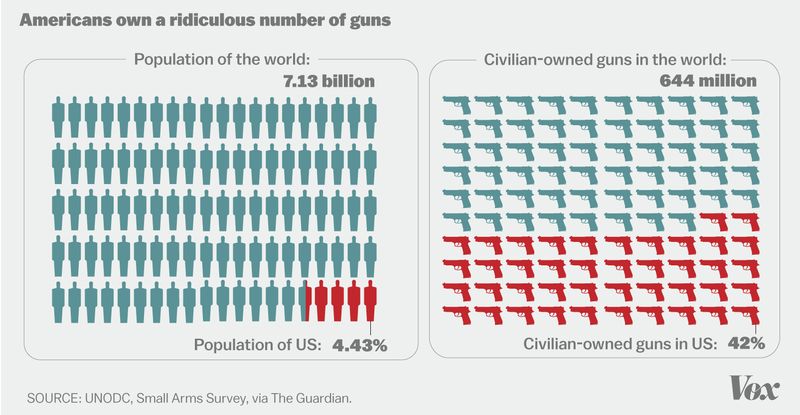
It’s hard to say exactly, but there may be as many guns as there are people in the U.S., or even more guns than people. Since not everyone is a gun owner, that means that the typical gun owner owns more than one. In fact, they own, on average, 6.6 guns each. Two-thirds of the guns in the U.S. are in the hands of 20% of the population. Gun manufacturers know this and market accordingly.
Gun ownership is correlated with both gun homicide and suicide. Accordingly, we also have the highest rate of gun violence of any developed country. In 2013, there were 21,175 gun suicides and 11,208 gun homicides.
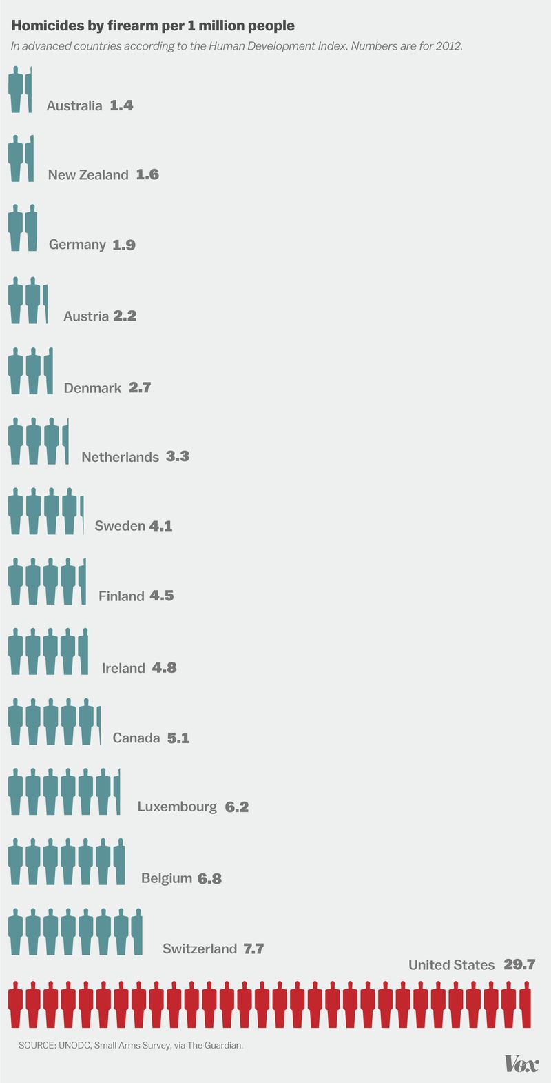
This data was collected by the UNODC and compiled by the Guardian.
Lisa Wade, PhD is an Associate Professor at Tulane University. She is the author of American Hookup, a book about college sexual culture; a textbook about gender; and a forthcoming introductory text: Terrible Magnificent Sociology. You can follow her on Twitter and Instagram.