politics: election 2008

Are conservatives happier than liberals. Arthur Brooks thinks so. Brooks is president of the American Enterprise Institute, a conservative think tank. And he’s happy, or at least he comes across as happy in his monthly op-eds for the Times.  In those op-eds, he sometimes claims that conservatives are generally happier. When you’re talking about the relation between political views and happiness, though — as I do — you ought to consider who is in power. Otherwise, it’s like asking whether Yankee fans are happier than RedSox fans without checking the AL East standings.

Now that the 2016 GSS data is out, we can compare the happiness of liberals and conservatives during the Bush years and the Obama years. The GSS happiness item asks, “Taken all together, how would you say things are these days –  would you say that you are very happy, pretty happy, or not too happy?”

On the question of who is “very happy,” it looks as though Brooks is onto something. More of the people on the right are very happy in both periods. But also note that in the Obama years about 12% of those very happy folks (five out of 40) stopped being very happy.But something else was happening during the Obama years. It wasn’t just that some of the very happy conservatives weren’t quite so happy. The opposition to Obama was not about happiness. Neither was the Trump campaign with its unrelenting negativism. What it showed was that a lot of people on the right were angry. None of that sunny Reaganesque “Morning in America: for them. That feeling is reflected in the numbers who told the GSS that they were “not too happy.”

Among extreme conservatives, the percent who were not happy doubled during the Obama years. The increase in unhappiness was about 60% for those who identified themselves as “conservative” (neither slight nor extreme).  In the last eight years, the more conservative a person’s views, the greater the likelihood of being not too happy. The pattern is reversed for liberals during the Bush years. Unhappiness rises as you more further left.

The graphs also show that for those in the middle of the spectrum – about 60% of the people – politics makes no discernible change in happiness. Their proportion of “not too happy” remained stable regardless of who was in the White House.  Those middle categories do give support to Brook’s idea that conservatives are generally somewhat happier. But as you move further out on the political spectrum the link between political views and happiness depends much more on which side is winning. Just as at Fenway or the Stadium, the fans who are cheering – or booing – the loudest are the ones whose happiness will be most affected by their team’s won-lost record.

Jay Livingston is the chair of the Sociology Department at Montclair State University. You can follow him at Montclair SocioBlog or on Twitter.

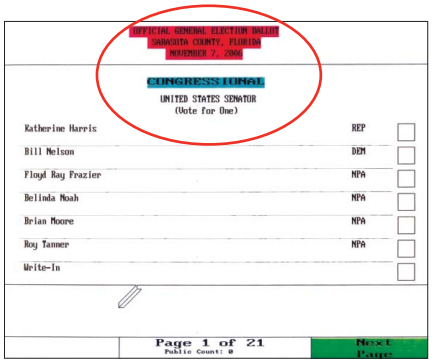
According to a report from the Brennan Center for Justice, tens and sometimes hundreds of thousands of votes are rejected or miscast because of known bad ballot designs. Intuitive design is especially important because approximately 50 million people each year encounter a ballot design for the first time, either because they’ve moved, are new to voting, or because the ballot has been revised. People who are most vulnerable to ballot design disenfranchisement are people living in poverty, older voters, and new voters.

Some problems with ballot designs:

  • Including all instructions at the beginning of the ballot instead of alongside each task.
  • Passive voice; negatives.
  • Small or unreadable fonts, like this:

6

  • Unnecessarily complex language.
  • Listing candidates for a single office on multiple pages.
  • Including more than one contest per page.
  • Centered, all-caps, and dense text, like this:

3

  • Inconsistent use of font or failure to differentiate different kinds of information with shading or font.
  • Confusing indications as to how to indicate the voter’s choice.
  • Publicizing sample ballots that don’t match actual ballots.

There are many examples of good and bad ballots at the Brennan Center’s report, Better Ballots.

The Brennan Center asserts that these problems are easily identified. Unfortunately, many jurisdictions aren’t paying attention: very few pre-test their ballot designs to discover problems and few examine results of election to discover which counties’ elections are most undermined by lost and miscast votes. Some jurisdictions, moreover, are operating under laws that require the use of ballot designs that we know are bad and many are using voting machines that are not flexible enough to accommodate good design.

Good ballot design, the report emphasizes, is non-partisan, well understood, inexpensive, and simple to implement. It may not be the most scandalous way to lose hundreds of thousands of votes, but it’s a real and substantial problem, and one that can be easily fixed.

Lisa Wade, PhD is an Associate Professor at Tulane University. She is the author of American Hookup, a book about college sexual culture; a textbook about gender; and a forthcoming introductory text: Terrible Magnificent Sociology. You can follow her on Twitter and Instagram.

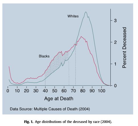
Black people in the U.S. vote overwhelmingly Democratic. They also have, compared to Whites, much higher rates of infant mortality and lower life expectancy. Since dead people have lower rates of voting, that higher mortality rate might affect who gets elected. What would happen if Blacks and Whites had equal rates of staying alive?

1b

The above figure is from the recent paper, “Black lives matter: Differential mortality and the racial composition of the U.S. electorate, 1970-2004,” by Javier Rodriguez, Arline Geronimus, John Bound and Danny Dorling.  A summary by Dean Robinson at the The Monkey Cage summarizes the key finding.

between 1970 and 2004, Democrats would have won seven Senate elections and 11 gubernatorial elections were it not for excess mortality among blacks.

At Scatterplot, Dan Hirschman and others have raised some questions about the assumptions in the model. But more important than the methodological difficulties are the political and moral implications of this finding. The Monkey Cage account puts it this way:

given the differences between blacks and whites in their political agendas and policy views, excess black death rates weaken overall support for policies — such as antipoverty programs, public education and job training — that affect the social status (and, therefore, health status) of blacks and many non-blacks, too.

In other words, Black people being longer-lived and less poor would be antithetical to the policy preferences of Republicans. The unspoken suggestion is that Republicans know this and will oppose programs that increase Black health and decrease Black poverty in part for the same reasons that they have favored incarceration and permanent disenfranchisement of people convicted of felonies.

That’s a bit extreme.  More stringent requirements for registration and felon disenfranchisement are, like the poll taxes of an earlier era, directly aimed at making it harder for poor and Black people to vote.  But Republican opposition to policies that would  increase the health and well-being of Black people is probably not motivated by a desire for high rates of Black mortality and thus fewer Black voters. After all, Republicans also generally oppose abortion. But, purely in electoral terms, reducing mortality, like reducing incarceration, would not be good for Republicans.

Cross-posted at Montclair SocioBlog.

Jay Livingston is the chair of the Sociology Department at Montclair State University. You can follow him at Montclair SocioBlog or on Twitter.

Flashback Friday.

I have borrowed the information and images below from Jeff Fecke at Alas A Blog.  His discussion, if you’re interested, is more in depth.

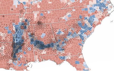
There is a winding line of counties stretching from Louisiana to South Carolina, a set of states that largely voted for McCain in 2008, that went for Obama.  The map below shows how counties voted in blue and red and you can clearly see this interesting pattern.


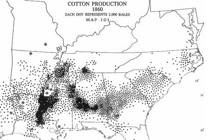
These counties went overwhelmingly for Obama in part because there is large black population.  Often called the “Black Belt,” these counties more so than the surrounding ones were at one time home to cotton plantations and, after slavery was ended, many of the freed slaves stayed.  This image nicely demonstrates the relationship between the blue counties and cotton production in 1860:


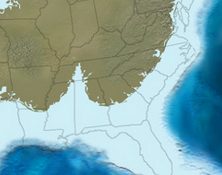
But why was there cotton production there and not elsewhere?  The answer to this question is a geological one and it takes us all the way back to 65 million years ago when the seas were higher and much of the southern United States was under water.  This image illustrates the shape of the land mass during that time:

I’ll let Jeff take it from here:

Along the ancient coastline, life thrived, as usually does. It especially thrived in the delta region, the Bay of Tennessee, if you will. Here life reproduced, ate, excreted, lived, and died. On the shallow ocean floor, organic debris settled, slowly building a rich layer of nutritious debris. Eventually, the debris would rise as the sea departed, becoming a thick, rich layer of soil that ran from Louisiana to South Carolina.

65 million years later, European settlers in America would discover this soil, which was perfect for growing cotton.

So there you have it: the relationship between today’s political map, the economy, and 65 million years ago.

Lisa Wade, PhD is an Associate Professor at Tulane University. She is the author of American Hookup, a book about college sexual culture; a textbook about gender; and a forthcoming introductory text: Terrible Magnificent Sociology. You can follow her on Twitter and Instagram.

A single event can take on great symbolic importance and change people’s perceptions of reality, especially when the media devote nearly constant attention to that event.  The big media story of the killing of Trayvon Martin and the trial of George Zimmerman probably does not change the objective economic, social, and political circumstances of Blacks and Whites in the U.S.  But it changed people’s perceptions of race relations.

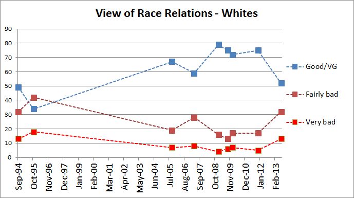
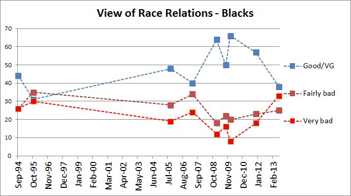
A recent NBC/WSJ poll shows that between November of 2011 and July 2013, both Whites and Blacks became more pessimistic about race relations.

1 2

Since 1994, Americans had become increasingly sanguine about race relations.  The Obama victory in 2008 gave an added boost to that trend.  In the month of Obama’s first inauguration, nearly two-thirds of Blacks and four-fifths of Whites saw race relations as Good or Very Good (here’s the original data). But now, at least for the moment, the percentages in the most recent poll are very close to what they were nearly 20 years ago.

The change was predictable, given the obsessive media coverage of the case and the dominant reactions to it.  On one side, the story was that White people were shooting innocent Black people and getting away with it.  The opposing story was that even harmless looking Blacks might unleash potentially fatal assaults on Whites who are merely trying to protect their communities.  In both versions, members of one race are out to kill members of the other — not a happy picture of relations between the races.

My guess is that Zimmerman/Martin effect will have a short life, perhaps more so for Whites than Blacks. In a few months, some will ascend from the depths of pessimism. Consider that after the verdict in Florida there were no major riots, no burning of neighborhoods to leave permanent scars — just rallies that were for the most part peaceful outcries of anger and anguish.  I also, however, doubt that we will see the optimism of 2009 for a long while, especially if the employment remains at its current dismal levels.

Cross-posted at Montclair SocioBlog.

Jay Livingston is the chair of the Sociology Department at Montclair State University. You can follow him at Montclair SocioBlog or on Twitter.
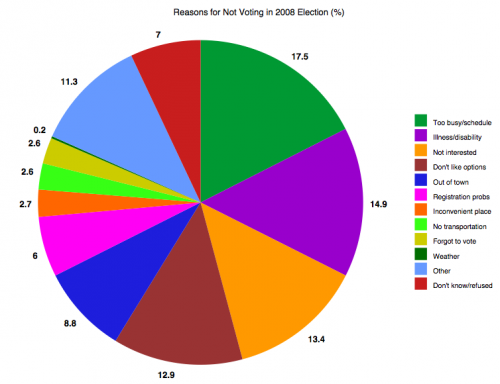
Last week I posted about voter turnout patterns. In 2008, about 64% of eligible citizens voted. So what reasons do non-voters give for not taking part in the election? The Census Bureau asked. I created a chart of the data found on p. 14 of the report by Thom File and Sarah Crissey.

UPDATE: Please note this data is for registered non-voters; about 89% of this group votes, significantly higher than that for eligible citizens overall. I apologize that I didn’t make the distinction clearer in my initial post.

Here are the reasons registered non-voters gave:

So the single most common reason (17.5%) for not voting was that the person was too busy or their schedule conflicted with available voting hours (at least those the respondent was aware of). Other common reasons were illness or disability (14.9%), the person just wasn’t interested in the election (13.4%), didn’t like the candidates or issues (12.9%), and other (11.3%).

Many of these barriers to voting could likely be addressed by the same basic changes: expanding voting options. Scheduling conflicts, being too busy or out of town, lack of transportation, and problems caused by illness or disability might all be ameliorated by expanded early voting and/or making it easy to vote by mail.

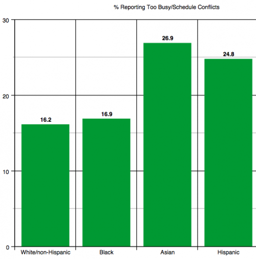
These issues were not equally problematic for all racial/ethnic groups. For instance, Asian-Americans and Hispanics (of any race) were more likely to report being too busy or that voting conflicted with their schedule than were White non-Hispanics or African Americans:

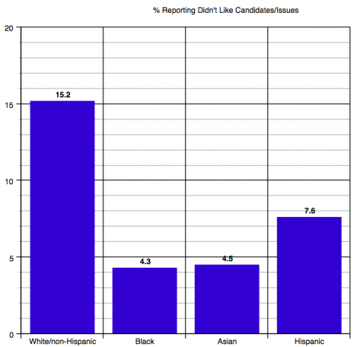
White non-Hispanics were more likely than other groups to say they didn’t vote because they didn’t like the candidates or issues:

The report also breaks responses down by age and education, so check out p. 14 if you’re interested in the patterns based on those demographics. It also includes data on why people don’t register, either — the most common being lack of interest or involvement in politics.

Gwen Sharp is an associate professor of sociology at Nevada State College. You can follow her on Twitter at @gwensharpnv.

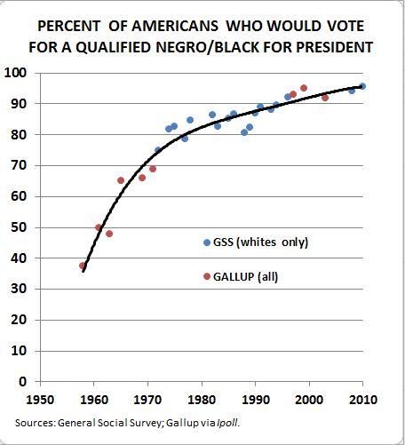
Over at his blog, Made in America, Claude Fischer discusses data showing that the percentage of (White) Americans who say that they will vote for a qualified Black president has been rising since the 1950s. Today it sits at about 96%.

Fischer rightly observes that it’s difficult to know exactly what to make of this information. The trend likely reflects a combination of a real decrease in prejudice and a rising appreciation for the fact that it’s unpopular to admit that you wouldn’t vote for a Black person, even on a survey.

Still, assuming for the moment that it represents real attitudinal change, Fischer asks, is “the glass 96 percent full or is it 4 percent empty?”  Given our two-party partisan political system, elections are frequently decided by margins this narrow.  Obama won with just 53% of the popular vote in 2008.  Political scientists estimate that there was a 5 point racial penalty (that is, if he had been White, he would likely have won 58% of the vote).

Tomorrow is election day and it’s difficult to know if race will play more or less of a role than it did in the last election.  On the one hand, most people who were worried that Obama would be a racially radical President now know that he is not (some people will never be convinced) and others may have become more used to seeing an African American face in the White House.  On the other hand, racial progress usually incites a backlash.  That face in such a venerated position of power may have aggravated people who are now actively racist instead of complacently so.

Finally, as Fischer observes, we have absolutely no data on the penalty Romney will pay for being Mormon.

Happy election day eve, America. May we all end tomorrow with a strong beverage of consolation or celebration.

Lisa Wade, PhD is an Associate Professor at Tulane University. She is the author of American Hookup, a book about college sexual culture; a textbook about gender; and a forthcoming introductory text: Terrible Magnificent Sociology. You can follow her on Twitter and Instagram.

Now that we’re in the last full week of the presidential campaign, let’s look at voting patterns in the U.S. Who votes in national elections? And how many of us do so?

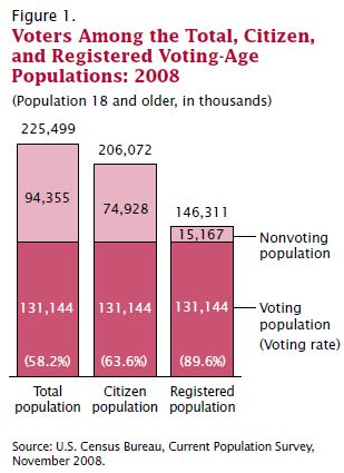
Voter turnout data is often somewhat misleading. The turnout rate is often reported as a % of the total voting-age population — that is, what percentage of people over age 18 voted? But that broad measure of voter turnout will be artificially low because it includes non-citizens living in the U.S., who aren’t eligible to vote. A more accurate measure would be to look at turnout among citizens over age 18; as we see in the data from the 2008 presidential election, the difference between these two measures of voter turnout was more than 5 percentage points:

It’s worth noting that the citizen measure doesn’t reflect those citizens who have been disenfranchised because they live in a state where individuals convicted of felonies lose the right to vote, often permanently.

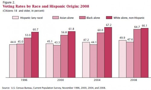
If we look at voter turnout among citizens in 2008, we see significant differences by race/ethnicity. White non-Hispanics have the highest turnout, with African Americans about 5-7 percentage points behind, though the gap narrowed in 2008. Asian Americans and Hispanics are less likely to vote, with just under half of eligible citizens from these two groups voting in 2008:

Both parties are keenly aware of the steady growth in voter turnout among Hispanics; as the largest racial/ethnic minority group in the U.S., increasing participation in elections promises growing political influence in the future, a source of both opportunities and challenges for the parties as they vie for those votes.

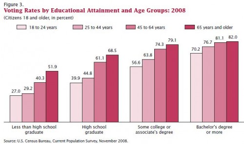
Not surprisingly, age and education affect voting behavior. Within every educational level, the voting rate goes up steadily with age.

For more information on voting patterns, the Census Bureau has an interactive website that lets you select elections between 1996 and 2010 and see a map and graphs broken down by sex, race/ethnicity, age, and so on.

Gwen Sharp is an associate professor of sociology at Nevada State College. You can follow her on Twitter at @gwensharpnv.