
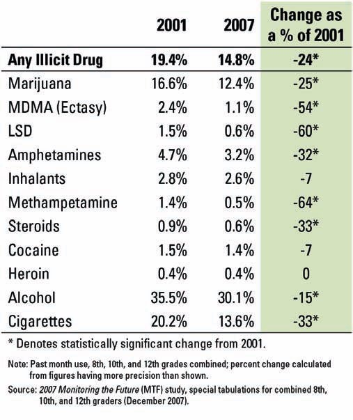
Chris Uggen has a nice discussion of this graph (see here) showing the (it turns out more or less linear) change in drug use between 2001 and 2007. In particular, he offers a nice idea for how to use it to talk about the difference between cohort, age, and period effects.
Graph originally found here.
Comments