By now most readers are likely familiar with the idea that the American middle class is shrinking. Most income and wealth gains over the past 40 or so years have gone to the richest Americans, while poverty is spreading and getting deeper. As a result, the percent of Americans who can reasonably claim to be middle class is shrinking.
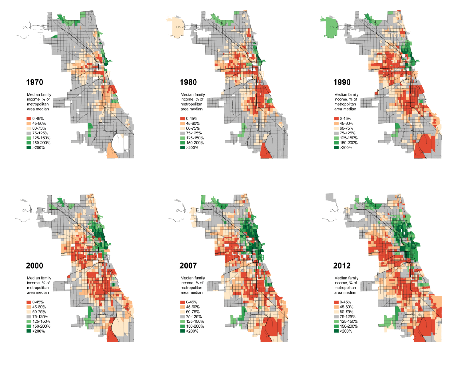
I found a fantastic animation illustrating this process in the neighborhoods of the city of Chicago. Borrowing data from education scholar Sean Reardon and sociologist Kendra Bischoff, Daniel Hertz calculated where the median family income of each Census tract fell relative to the entire metropolitan area. Orange tracts are ones where the median family income is 0-45% of the median for Chicago as a whole (struggling families), dark green tracts are ones where the median is 200% or more (resource rich families). Grey is, literally, middle class.
For simplicity’s sake, here is 1970 and 2012 right next to one another. Notice that the 1970 map involves a lot more grey (middle class) and the 2012 map involves a lot more green (rich) and especially orange (poor).
Here’s the animation:
 For another interesting measure of the shrinking middle class, see our post showing increases in high paying and low paying jobs, but decreases in jobs that pay middle income wages.
Lisa Wade, PhD is an Associate Professor at Tulane University. She is the author of American Hookup, a book about college sexual culture; a textbook about gender; and a forthcoming introductory text: Terrible Magnificent Sociology. You can follow her on Twitter and Instagram.


