
By now most readers are likely familiar with the idea that the American middle class is shrinking. Most income and wealth gains over the past 40 or so years have gone to the richest Americans, while poverty is spreading and getting deeper. As a result, the percent of Americans who can reasonably claim to be middle class is shrinking.
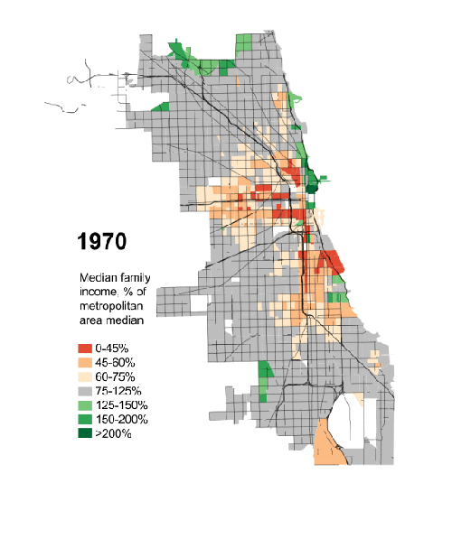
I found a fantastic animation illustrating this process in the neighborhoods of the city of Chicago. Borrowing data from education scholar Sean Reardon and sociologist Kendra Bischoff, Daniel Hertz calculated where the median family income of each Census tract fell relative to the entire metropolitan area. Orange tracts are ones where the median family income is 0-45% of the median for Chicago as a whole (struggling families), dark green tracts are ones where the median is 200% or more (resource rich families). Grey is, literally, middle class.
For simplicity’s sake, here is 1970 and 2012 right next to one another. Notice that the 1970 map involves a lot more grey (middle class) and the 2012 map involves a lot more green (rich) and especially orange (poor).

Here’s the animation:
 For another interesting measure of the shrinking middle class, see our post showing increases in high paying and low paying jobs, but decreases in jobs that pay middle income wages.
Comments 22
pduggie — April 3, 2014
here is an odd thought. So the places that the middle class lived in 1970 are now places where the poor live in 2012.
Are the properties they live in the same properties? If so, they live in places the middle class thought were acceptable in 1970. Maybe thats an improvement for them.
On the other hand, maybe they're living in subdivided apartments in larger homes. (I'm clueless as to the typical house in Chicago, so mutatis mutandis)
Ricky — April 3, 2014
That's terrible, that city needs a good community organizer.
Michael, Sugar Grove — April 3, 2014
The inevitable result of decades of liberal governance.
Maceo — April 4, 2014
Actually the poverty rate has been pretty stable over the last 40yrs according to the US Census ( http://www.newyorker.com/online/blogs/johncassidy/2014/01/the-successful-war-on-poverty-in-four-charts.html ). What's happened to Chicago specifically is that the middle class fled for the 'burbs. So the map is terribly misleading.
disqus_yYAjEhW93I — April 4, 2014
The analysis has a profound flaw. The median household income used is calculated from the entire Chicago metropolitan area, while the map is only of the city of Chicago. In 1970 high income households were almost all out in the suburbs, but gentrification has brought many of them back to the city.
Bill R — April 4, 2014
I often wonder what these inequality graphics would look like if the statistics controlled for age, since a) there's an understandable correlation between age and wealth measures like income and net worth, and b) the much of the boomer generation is in peak earning years or retired and sitting on enviable nest eggs.
In any event, at the individual level, getting an education/skills training in a field that is highly valued in the labor market and saving/investing smartly are obviously keys to middle class or better.
I'd be interested in how others believe the country and the individuals involved can improve the economic opportunity for the bottom 25% or so.
Maceo — April 5, 2014
OMG, what a idiot I am. I just looked at this again. This doesn't take RACE into account! ALL this map shows is the flight of the BLACK middle class to the 'burbs. Chicago was very segregated in 1970. Blacks lived primarily on the South Side (with an additional segment on the West Side). Hispanics lived primarily on the West Side. The expanding poverty zones in the West and South simply show what's happened to median incomes as the black & Hispanic middle class left the city for the bigger homes and lots in the 'burbs.
On The Edge Of A U.S. Retail Apocalypse — April 11, 2014
[…] […]
CHICAGO’S DISAPPEARING MIDDLE CLASS | Welcome to the Doctor's Office — April 17, 2014
[…] by Lisa Wade from SocImages […]
Modelling Urban Development – Follow Your Arrow — October 10, 2017
[…] the use of Google Maps street view to look at the different areas and a graphic I found on this page, I cross-referenced the information to make sure the information was relatively […]